This map depicts the carbon emissions and major industry sectors for each census division in British Columbia, Canada.
The choropleth map represents the carbon dioxide emissions across BC census divisions, for this equal interval classification is used and the data is normalized by population. The weight of each of the five major industry sectors in each pie chart is proportional to the percentage of the working class population involved in those respective industries.
Datasets used in producing the map: Emissions Data and Industry Data.
This cartogram was created to represent the magnitude of forest cover for each respective country in South America in spatial units. To do that, the spatial units (in this case squares) were scaled to be proportional to the the forest area (each square is ten thousand square kilometers of forest cover).
See this attachment for data that was used to create the cartogram: Forest Area.
Absolute Scaling
Perceptual Scaling
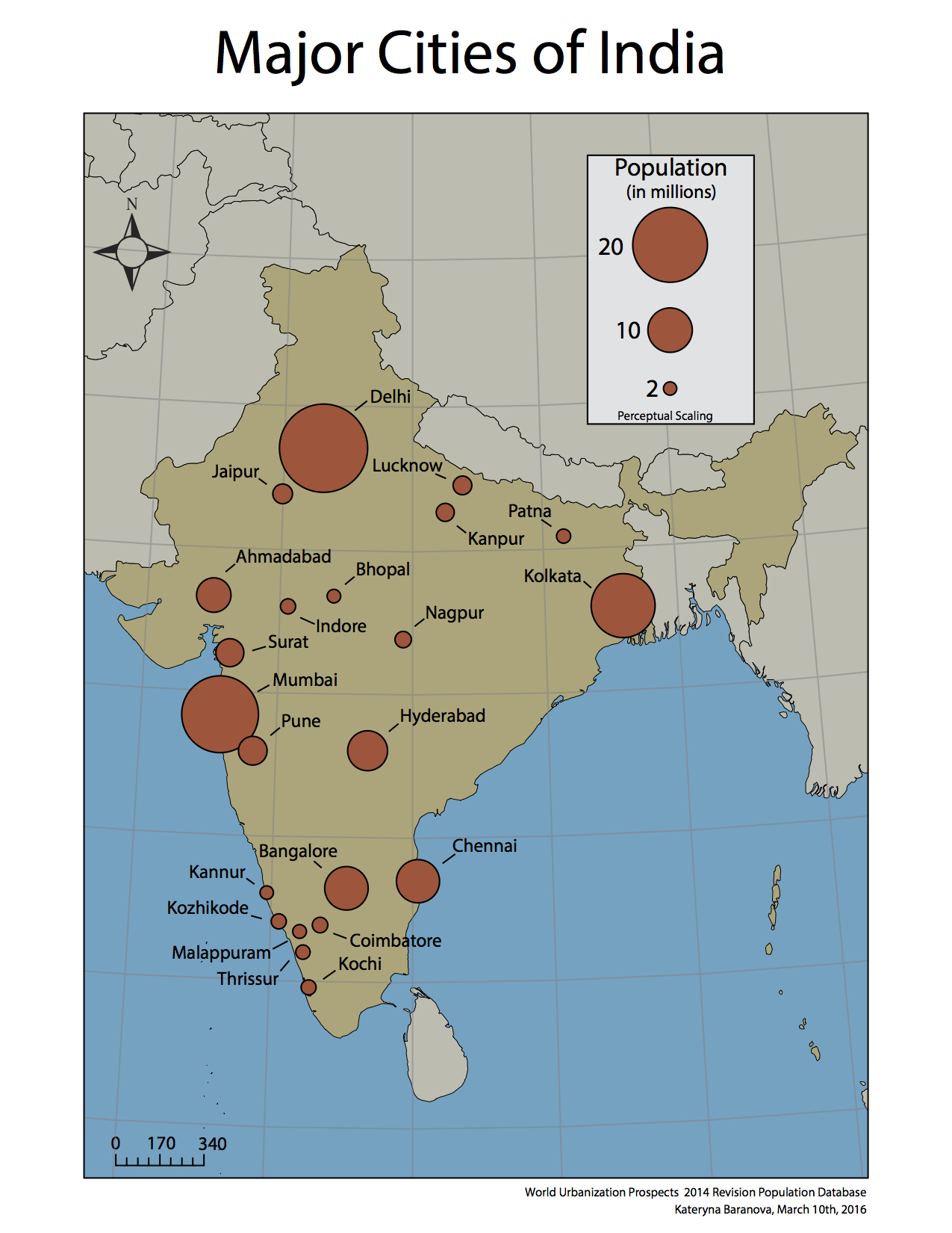
The perceptual scaling used in the second map leaves the biggest circle unchanged but makes all the other ones successively smaller. This also allows seeing the cluster of circles in the Southwest part of India more clearly as they do not overlap anymore. In the map with absolute scaling of the circles, the map-reader can measure each circle and using the legend determine the exact population. This would not be possible with perceptual scaling, as the circles do not represent the true values. However, the latter scaling method is much more useful in perceiving the circle areas correctly in relation to each other. People tend to greatly underestimate areas especially in relation to each other, so the perceptual scaling method accounts for the human error in area perception. For example in these two maps, the circles that have absolute scaling are harder to perceive the relative size of. Since the changes between the populations of cities ranging from 3 to 2 million are so small, they all seem to be the same size and it is almost impossible to tell which one is bigger or smaller without accurately measuring them. Therefore, I believe that for the purpose of this map, which is to represent the relative population sizes of the major cities of India, the perceptual scaling method is better. It allows the map-reader to easily determine the relative population sizes of the cities and then compare them to each other to determine which has a greater or smaller population.
To see the datasets used for the creating of these maps click on the links for Absolute scaling and Perceptual scaling.
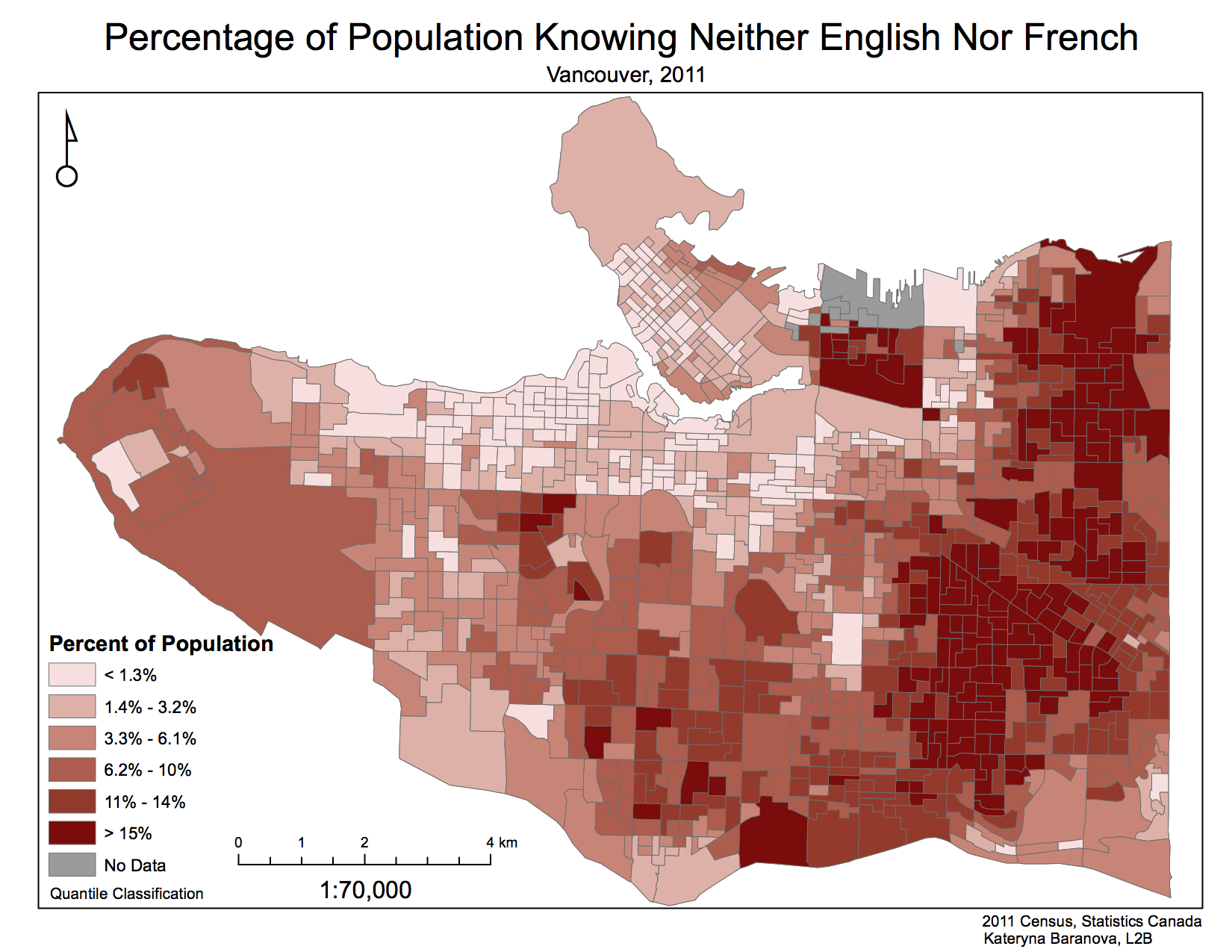
This is a choropleth map that depicts the percentage of population in each census tract in the Vancouver area that does not speak neither French nor English. The greater colour saturation corresponds to the greater percentage class with the grey areas depicting no data.
Target Audience: A translation services entrepreneurship.
Variable: Knowledge of official languages: neither English nor French.
Normalization: Variable normalized by population to represent the percent of people within a given area who don’t know any of the official languages.
![final project [Converted]](https://blogs.ubc.ca/katerynabaranovasgis/files/2016/04/final-project-Converted.jpg)


