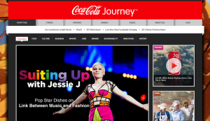
The relaunch and dare I say, reinvention, of Coca Cola’s new website really impressed me, and I admire that Coca Cola is stepping up its game and redefining itself as a global brand to reinforce its own social DNA. Coca Cola has always been an iconic brand, but this website has cemented its reputation, redefined its brand presence, tied its stories neatly together and engaged the customers in a meaningful manner.
I decided to apply the 7 Cs of Customer Interface to this website, as well as overall usability in terms of accessibility, identity, navigation and content.
Context – 8/10
Aesthetic – The content resembles that of a slick magazine, with emphasis on relevant international news stories. The site has an appealing and professional color scheme which is very eye-catching. The colors are consistent and match the images and overall cohesiveness of the website.
Functional – The home page is neatly categorised into different sections according to whatever engages the user and looks very professional as it has ‘Stories’, ‘Opinions’, ‘Brands’, ‘Videos’, ‘Most Read’, ‘Most Shared’, ‘Most Watched’ and social media plugin sections which are clearly separated and displayed.
However, the website seems to be available only in English.
Ease of Navigation – Consistent logo and menu bar at the top of the page. Drop down menus under clear menu categories makes it easy to navigate.
Content – 9/10
The content is arranged to resemble a slick magazine or digital media brand’s website, with the emphasis on international stories. “The more editorially-focused website creates, aggregates and curates content while maintaining the core functions of a corporate website (careers, investor relations, press releases, executive bios)”.
Good combination of text, blogs, well-placed graphics and videos; engaging editorials and relevant pages and content.
Communication – 7/10
Coca Cola’s website has strong communication features. Site-to-user communication includes email notifications and social media plugins and live newsfeeds.
User-to-site communication is either by email, the toll-free hotline, snail mail, or the option to submit an idea or newsletter subscription.
Commerce – 2/10
The website lacks a transactional capability, as its main purpose is not to promote a product or service, but the brand as a whole. The ‘Brands’ section of the website could be considered one of its advertising features.
Customization – 2/10
Customization is not really allowed as visitors do not have the opportunity to personalize the site. The student zone allows interested applicants to filter their career preferences through the search options.
Connection – 6/10
Links to Facebook, Twitter, Youtube and other social media networks are clearly visible. Links to press releases and company statements are displayed. There could be more relevant links to external sites.
Community – 8/10
There is a strong sense of community due to social media plugins such as Facebook, Twitter, Flickr, Google+, Linkedin and YouTube, as well as the blogs and breaking news. This helps to achieve the goal of the website which is to encourage debate and different perspectives, building an engaged and well-informed community.
Embedded below is an example of one of Coca Cola’s advertisements, a clever mix of advertising with an underlying social mission which emphasizes its “Coming Together” campaign.

Overall, I feel that Coca Cola’s website leverages on the value of customers and word of mouth. It has built a strong conversation prism by creating a more organized picture of the new web to better harness the Social Web’s potential, activity and overall reach.
Furthermore, I admire its detailed and organized social map for how it targets social networks and communities and is clear about its social media usage, intent and powerful capabilities.


