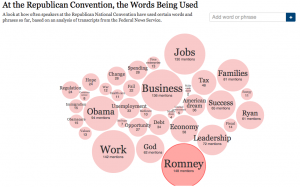
While simply counting words and phrases doesn’t provide a deep analysis of text, it can be a start in identifying basic themes or ideas for further analysis. This example from the NY Times is a simple count of frequently used words and phrases during the Republican party’s convention. The intermediate analysis value lies in part in the graphic illustration of the word count and the quick reference to examples of full text where those words/phrases appear. The graphic quickly orients the viewer to the fact that the candidates are most frequently mentioned (as is the anti-candidate Obama) ~ not to surprising, but also to those ideas that are most present in the speeches, for example, work, business and jobs are the main theme followed by leadership, families and god. Clicking on any word or phrase then highlights it in context in excerpts from variou speeches.

 Follow

This is a terrific example of providing structure for text data. Although the data are not analyzed, the visual is still useful and informative. It would be great if there were programs that allowed researchers to do this, but as far as I know, one needs programming skills to create something like this.
There is a load of freeware for creating interactive infographics ~ check out this list http://www.makeuseof.com/tag/awesome-free-tools-infographics/ for starters.
The Tag Cloud approach to being able to see most commonly used words is a feature of some qualitative software (e.g. NVivo 9 and 10). But the trick to sleuthing meaning is to not just look at large-sized tags for what has been the most common feature of discourse, but also at smaller tags to see what has been of less concern. And looking for missing terms is also important because that tells what has been left off the agenda.
QDA Miner and WordStat are two text analysis tools that help to do this kind of analysis.
http://www.provalisresearch.com
I think that the freeware version of QDA Miner can also do some word counts, but i am not sure about that.
I found the idea of using simple word counts and visual data displays surprisingly insightful. It shows how even basic analysis can uncover deeper patterns in qualitative research. In my experience managing digital and physical assets, I’ve noticed that having clear, structured data visualization makes tracking far more effective. That’s one of the reasons why I appreciate tools like itemit, which turn complex asset information into accessible dashboards and reports. Combining the clarity of visualized data, as discussed here, with reliable asset tracking creates a stronger foundation for decision-making and efficiency across any organization.