Categories
Uncategorized

Planning a vacation? Can’t wait for summer?

Now are you thinking about summer and swimwear? Excellent!

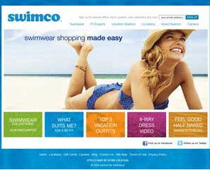
For a retailer, making an online presence is a great way to attract new customers as well as maintain your loyal customers. Now I may be bias because I work there, but I believe that Swimco has made an excellent presence online – they have a fantastic website, facebook page, twitter account and not one but two blogs!

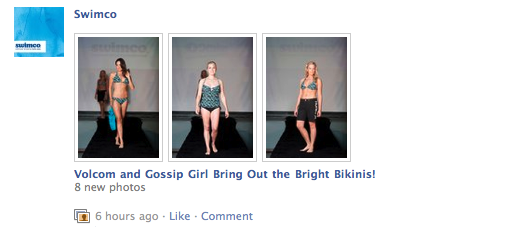
On Facebook, in addition to keeping customers informed with what’s going on at Swimco, they have been recently posting albums of some of the recent bathing suits that have arrived in stores – giving customers a chance to look at styles and trends before shopping. Customers are also using the facebook page to its full advantage by posting any questions they have regarding their already purchased swimwear, as well as commenting on incoming styles.

The blogs are also great. One blog, Feel Good Half Naked, is written by Lori Bacon, the President and Owner of Swimco. This blog gives readers a chance to see upcoming styles and trends as well as a look into her life as the Owner of Western Canada’s premiere Swimwear Retailer. Lori’s son Brett writes the other blog, Swimco’s Man Down Unda. This blog focuses more on the male customer with stories from his adventures in Australia (where he is currently living), as well as it includes posts about the surfing world.

The facebook page and blogs are all linked together through Twitter. Swimco tweets about updates to all three of these pages as well as news from the swimwear world.

Start planning for summer and get informed – “like” Swimco on facebook, “follow” them on twitter, and read their blogs.
Categories
Uncategorized

The Queen of Pop

February 17, 2011 marked a very important day in music history, the true Queen of pop released her much-anticipated music video for her hit single Hold it Against Me. I would say Britney’s back, but let’s be honest she never really left our hearts.

YouTube Preview Image

If you look past the awesomeness of this video you may notice that several products are being promoted. The main products are the dating website Plenty of fish, Sony, Make Up For Ever, and Britney’s own perfume, Radiance. It is reported that Britney earned approximately $500,000 for having those products in her video.

The brands are using Britney as a social influence over potential consumers – much like the Got Milk campaign from my previous blog. I believe that product placement in music videos is a win-win situation for both the artist and the product’s company; the artist is able to make a bigger budget video and the product is being viewed millions of times as well as being associated with the celebrity.

The placement of the website Plenty of fish is a perfect example; they paid to have their website displayed/featured in the video and TMZ reports that Plenty of fish had “a 20% spike in traffic the day after the video premiered.”

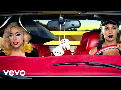
Now that we are all aware of product placement, how many products can you count in the music video for Telephone by Lady Gaga feat. Beyonce?

YouTube Preview Image

For more information on product placement in music videos check out this New York Times article.

Categories
Uncategorized

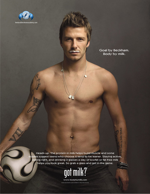
Got Milk?

Every week I go through the same process of trying to figure out a new blog topic and this week was no different. I found my topic after reading fellow classmate Rebecca Abel’s blog, in her most recent post “GLEEK 4 LYFE”; she mentions the Got Milk campaign, which is my topic this week.

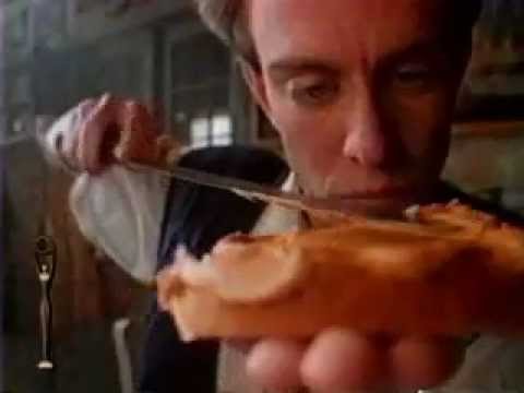
Once decided on my topic, I went to the Got Milk website to research their marketing campaign. Some background knowledge first, the Got Milk brand was formed in 1993 by the milk processors of California who all agreed to give 3 cents of every gallon of milk sold to go towards promoting the consumption of milk. Since they have been advertising for well over a decade, I decided to focus on their “Aaron Burr” television ad and their famous milk mustache posters.

YouTube Preview Image

This famous Aaron Burr commercial, I say famous because it won a lot of awards and was even listed as one of the top commercials of its decade (1990’s), was the original ad for the Got Milk campaign. I would say that this commercial is affective. It makes the viewers feel somewhat compassionate towards the guy trying to answer the question, but at the same time it makes them laugh because the whole situation is rather funny.

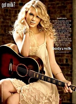
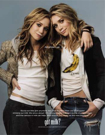
Moving on to the milk mustaches. Everyone has seen the posters; they feature celebrities ranging from the Olsen twins to David Beckham and from Beyonce to Hugh Jackman as Wolverine. Using celebrities act as a social influence over potential consumers. Most people have a celebrity, be it an athlete or a musician that they aspire to be like – celebrities act as an indirect social reference group.

The obvious question taken away from their advertising is, do you Got Milk?

Categories
Uncategorized

A Book’s Cover

As you all know part of this blog assignment requires us to mention an outside blog, so I thought this week would be a good week to do so. Since I didn’t know of any marketing based blogs, I simply googled “marketing blogs” and found the blog shape+colour by Jeremy Elder. Now, I felt that this blog was more of a personal opinion and not really focused on marketing, but it did give me an idea. In Jeremy’s most recent post, he mentions the effects of good cover art and that got me thinking of the famous saying:

I know this saying does ring true on many occasions, but whenever I find myself looking at CD’s or books, I am constantly judging them by their covers. Since my sister works at the library I decided to ask her if she still judges books by their cover. Instantly she says that she always judges books by their covers.

I believe that covers act as packages for the book, which is the product. The product itself is a key part of the marketing plan and is responsible for creating value. Along with price, placement, and promotion, products make up the marketing mix – an eye-catching cover will attract potential consumers and possibly turn them into buyers.

As Jeremy mentions,

I might have passed over Glasser if I hadn’t been stopped dead in my tracks by the gorgeous cover.

Clearly, I am not the only one who is influenced by cover art. Covers are the first impression a consumer gets from a book or CD, so to anyone who is planning on writing a book or releasing a CD, make sure the cover is outstanding.

Categories
Uncategorized

Super Bowl = Super Commercials

After the Steelers and Packers won their conference titles on Sunday, Super Bowl mania has been in full force. Each year, the Super Bowl is watch by approximately 100 million people, making the three-hour game a prime time for advertisements. The networks are very aware of this fact and charge the low price of 3 million dollars for a thirty second commercial. The main question here is, is it worth it? I would say definitely. Super Bowl commercials are remembered for being spectacular and even after the game they are watched countless times online. To prove my point, I asked my sister if she remembers any commercials from the superbowl last year.

YouTube Preview Image

Clearly this commercial was memorable since it is nearly a year later and she still remembers what the commercial is selling, as well as what happens in the commercial. When analyzing this commercial I would say that Bud Light is using two types of influences on consumers: affective and cognitive.

• Affective: The commercial is affective because it makes the viewers laugh. Having an enjoyable commercial to watch is going to associate laughter and thus a good memory with the product, Bud Light does this perfectly.
• Cognitive: Bud Light’s commercial is cognitive because it tells the viewers information about the beer. Merely saying, “refreshingly smooth” is telling future consumers about their beer.

The Super Bowl is a prime time event for advertising, and hopefully companies will continue to provide some comedic relief for the viewers with their commercials. I will definitely be watching on Sunday to see the commercials.

Categories
Uncategorized

GAP – Old vs. New

With the recent news of Starbucks changing their logo, I was reminded of this past October when Gap briefly changed their logo.

Gap’s logo changed from the navy blue box with the capitalized white name to a simple black name with a smaller blue box in the top right corner. According to Gap, the reasoning behind the new logo was to help them appear more modern and trendy instead of their usual American style. When the logo was revealed, criticism was immediate and wide spread. The majority of disapproval could be found online; people blogged, tweeted and used facebook to share their negative thoughts on the logo. While the new logo is not a graphic masterpiece, the original was very simplistic as well. However, due to the large amounts negativity towards the new logo, after one week the original logo was brought back. To me, the Gap logo has always been an iconic symbol and even though they had good reasoning behind changing the logo, I fully agree with their decision to go back to the original.

What I wonder now is how the Gap will be able to transition into their desired market? Will they ever be successful in breaking away from their traditional designs? Or will the general public continue to criticize their attempts?

Categories
Uncategorized

Hello world!

Welcome to UBC Blogs. This is your first post. Edit or delete it, then start blogging!

Spam prevention powered by Akismet