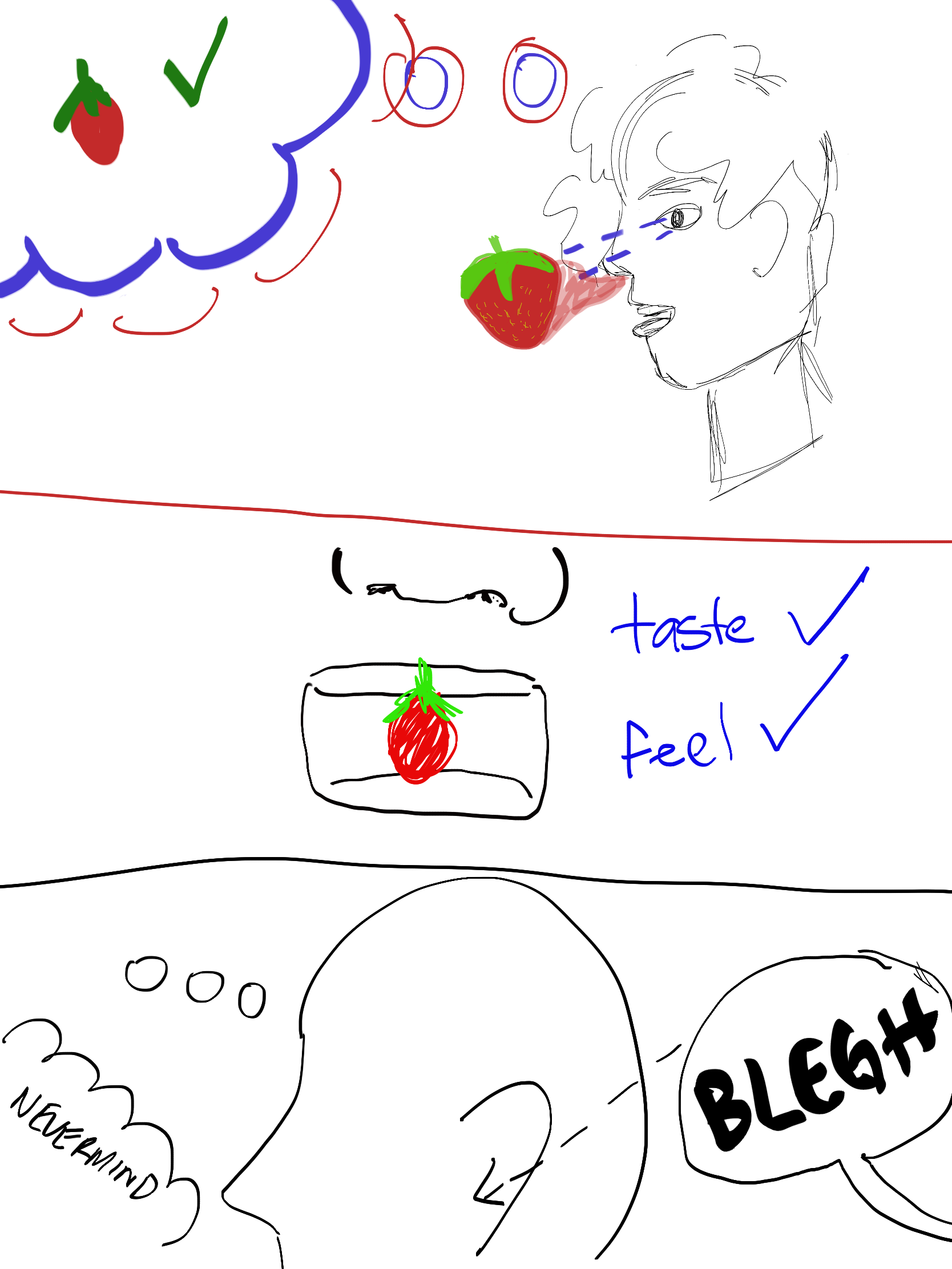
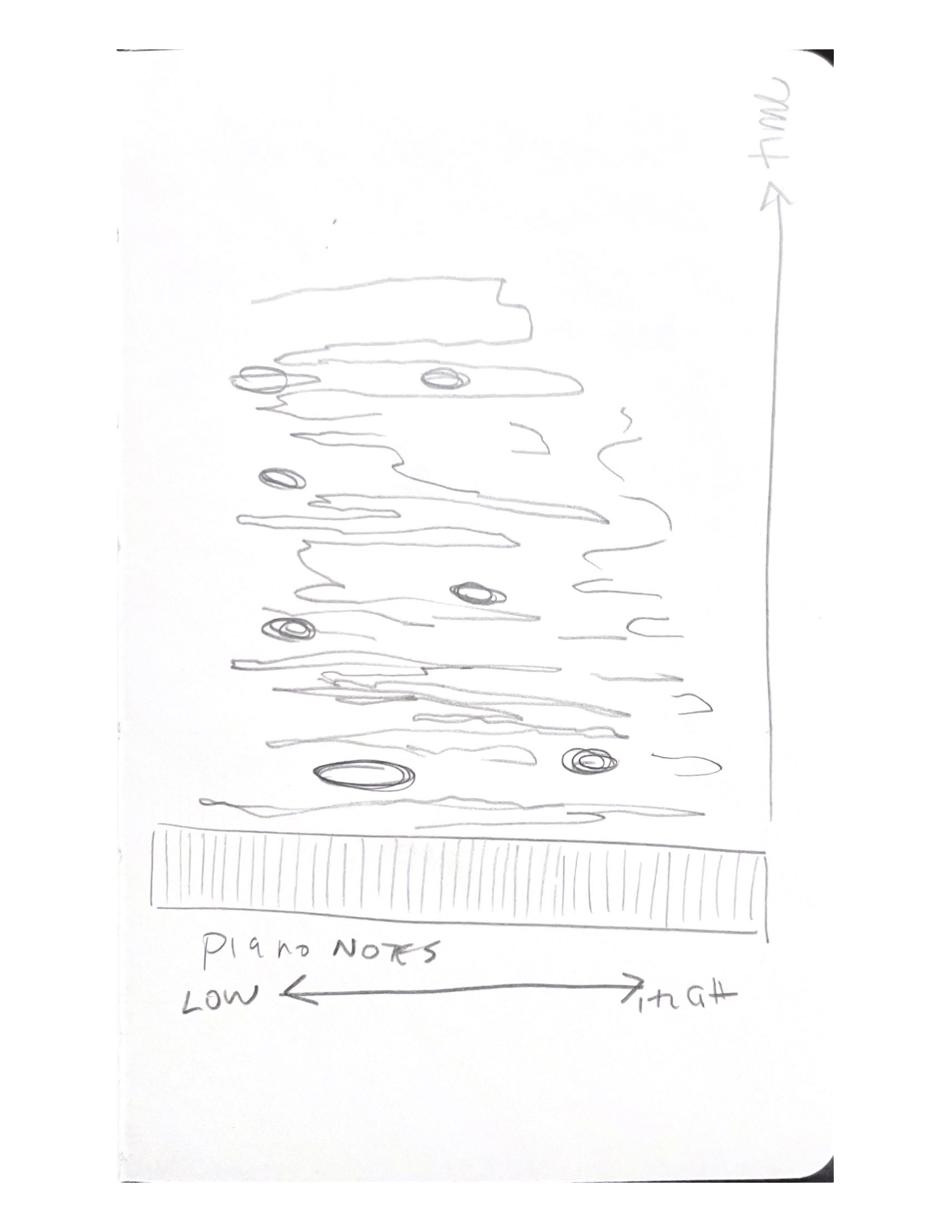
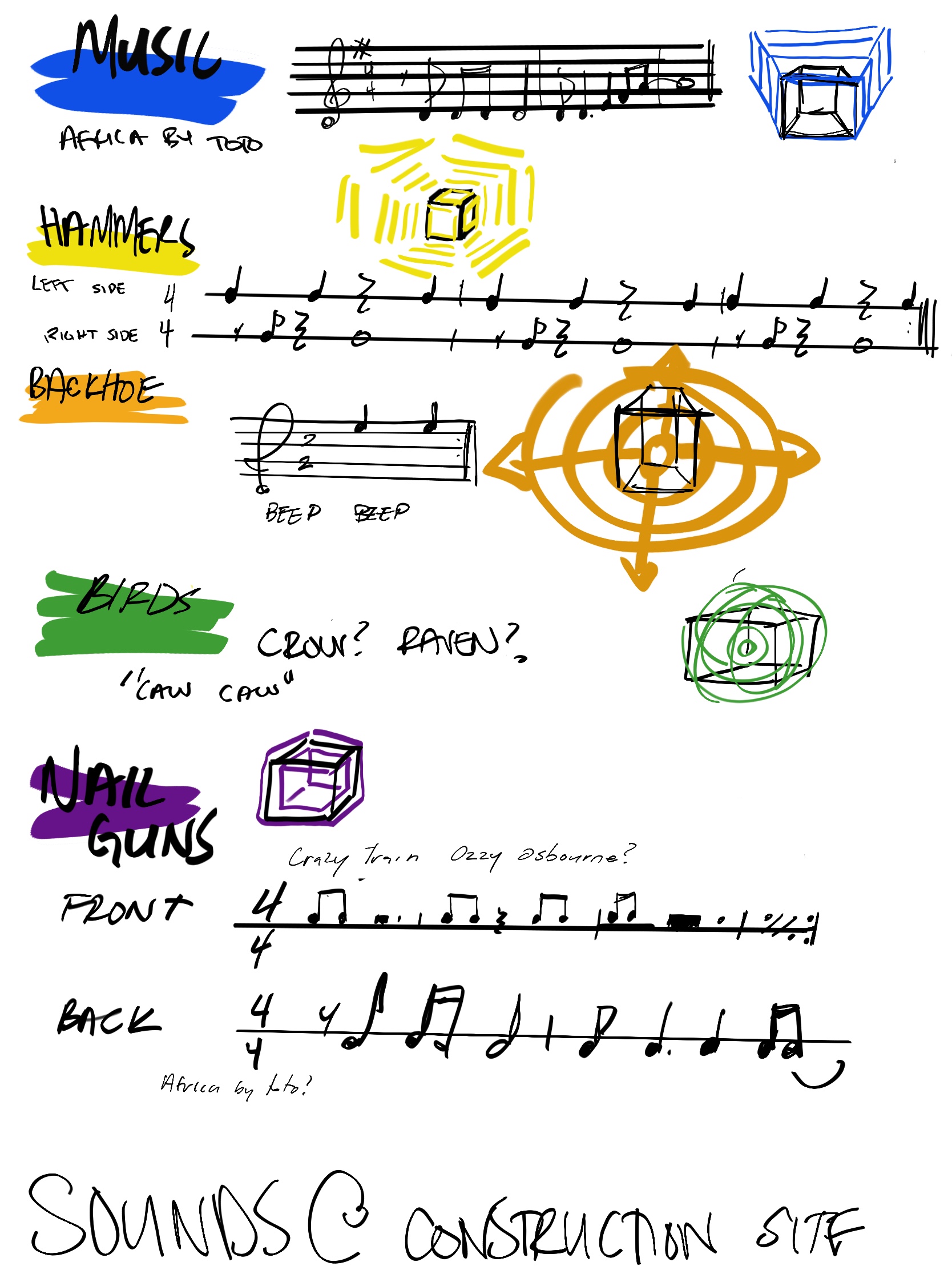
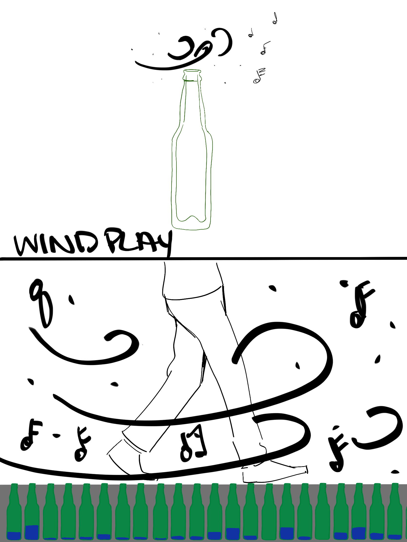
A3: Mapping – Arevik Petrosyan

At Home –

To the grocery store and back

red lines indicate the trip to the store, blue lines are the trip back. Dashed lines are walking, the solid line is on the bus. I realized I could’ve taken a faster route on the way there if I had walked diagonally.


At the grocery store

In the kitchen


Tracked my roommate’s movement in the kitchen while cooking. This kitchen would be considerably easier to use
if the oven were moved over a bit and the counter was extended around the corner.

A4: Above, At & Below – Arevik Petrosyan

At home –

I noticed the drainage system from the roof of the nest is poorly designed. This portion of the wall is pitched, so any rain that hits it creates a waterfall at the bottom that you have to walk through if you want to get into the building. There’s drainage directly underneath it, so I guess they anticipated that there would be a lot of water coming down in this exact spot, and then didn’t fix the pretty obvious issue?

A7 : Movement – Arevik Petrosyan

At Home


I looked at the different kinds of paving near the nest and bus loop as I ride though there on my skateboard often. I hate this area because there’s a lot of variation in paving and almost all of the paving is brick, which is not well suited to riding a skateboard on.


Analysis of comfortability and distances travelled on each pavement per 1 push. Pavement D, which is the smooth concrete on the basketball court is by far the best. I am proposing a path system running through this area to improve mobility for people on skateboards.


It would be interesting to conduct this same analysis on a wheelchair. I am curious if the experience of this space is much different for a wheelchair user as opposed to a skateboarder.

A8: Tuning In and Windplay Arevik Petrosyan

in class:

guessing where on the piano is being played , vertical axis is time, horizontal axis is the piano.

At home

I went on a walk in my neighborhood and sat on a bench near a fence and some trees. I couldn’t see behind the fence or trees at all, but I could hear this was a construction site of some sort. This is a map of where I could hear sounds coming from the site, and my subsequent analysis.

Pt 2: Windplay


Taking advantage of a tunnel to get more airflow.

Assignment 9- Smell Notes Arevik Petrosyan

in class/at home


I am REALLY sensitive to smell, and sometimes if a smell is too strong it makes me feel ill. Ocean smell in particular has always been very unpleasant for me. This is a map of where I felt most ill at the beach. I realized the algae smell made me more ill than the seawater, which was bad too but a lot milder.

Then we walked past this playground and I remembered this fire truck.

The first time I saw the pacific ocean was when my family visited this same beach on a trip to Vancouver over ten years ago. I went swimming in the ocean and choked on the seawater because I can’t swim,  and  threw  up.  Then  I went  looking  for  seashells  and  found  a really  big  one.  I picked  it  up  to  show  my  sister. It grew legs. It was not a seashell.

It was a crab.

I threw it into the water and started crying.

A few years before that my mom accidentally served me the head of the fish at dinner. I hadn’t yet made the connection that fish the animal and fish the food were the same thing. Its eye was staring at me. I cried. I don’t eat seafood anymore, anything fishy grosses me out.


The conclusion I’ve come to is that smell is something that can be very personal. I had a bit of a tough time with this portion of the site visit, and I was surprised to see that nobody else was grossed out. I hadn’t realized that ocean smell is something that a lot of people enjoy? My experience of this particular smell is shaped not only by my biological reaction to it, but also by some of my earliest memories, and everyone else in the world experiences the same smell differently for a variety of equally valid reasons. Definitely something to be mindful of when designing.

Assignment 10 – Arevik Petrosyan

IN CLASS

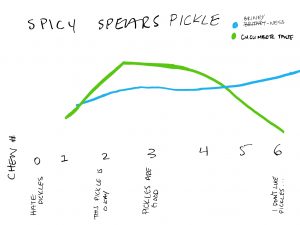
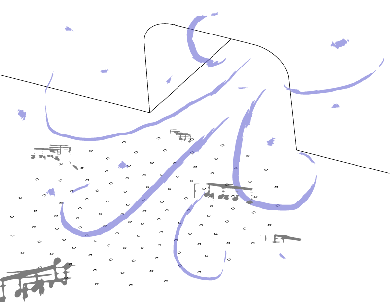
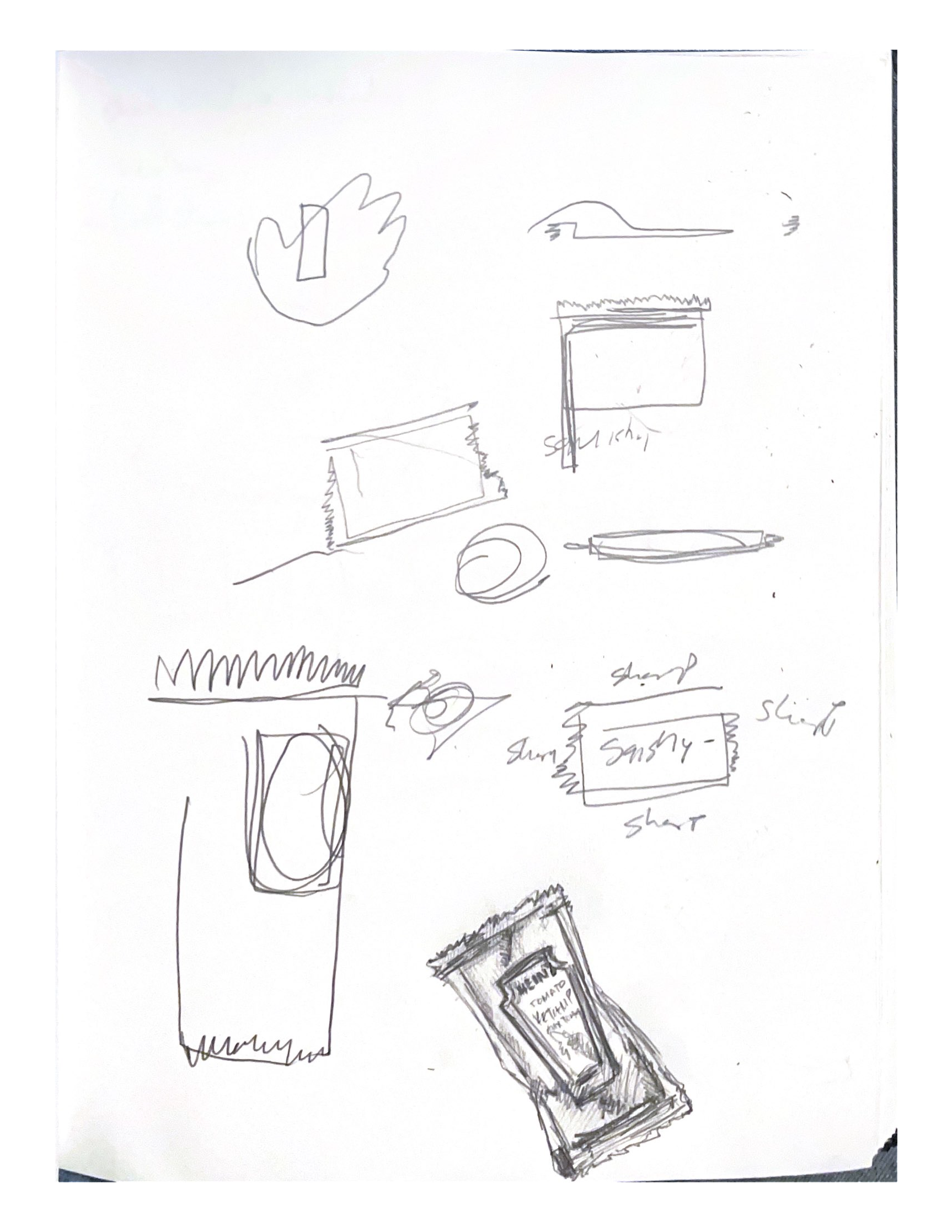
I really really do not like pickles but I thought the one I tried at Granville was okay. I graphed the relative brineyness in relation to the relative cucumbery-ness for each chew. I noticed that while the cucumber taste was dominant i thought it was pretty good, and when the brine taste took over again I didn’t like it anymore.

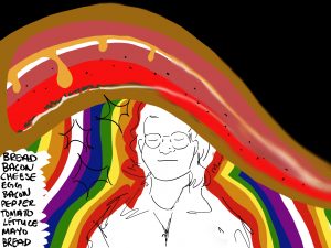
I got a sandwich from the market, and I think it’s the best sandwich I have ever eaten. I cannot put into words how good it is. Initially, for a brief moment, I could only taste the bread. Then, the rest of the ingredients came forward. I could taste them each individually and they were all good separately, but better and perfectly balanced each other together. As I kept chewing they mushed into one and were still ridiculously good. I tried to capture the euphoria of eating this sandwich as well as the combination of tastes as I was chewing.
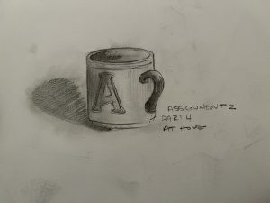
At Home –

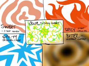
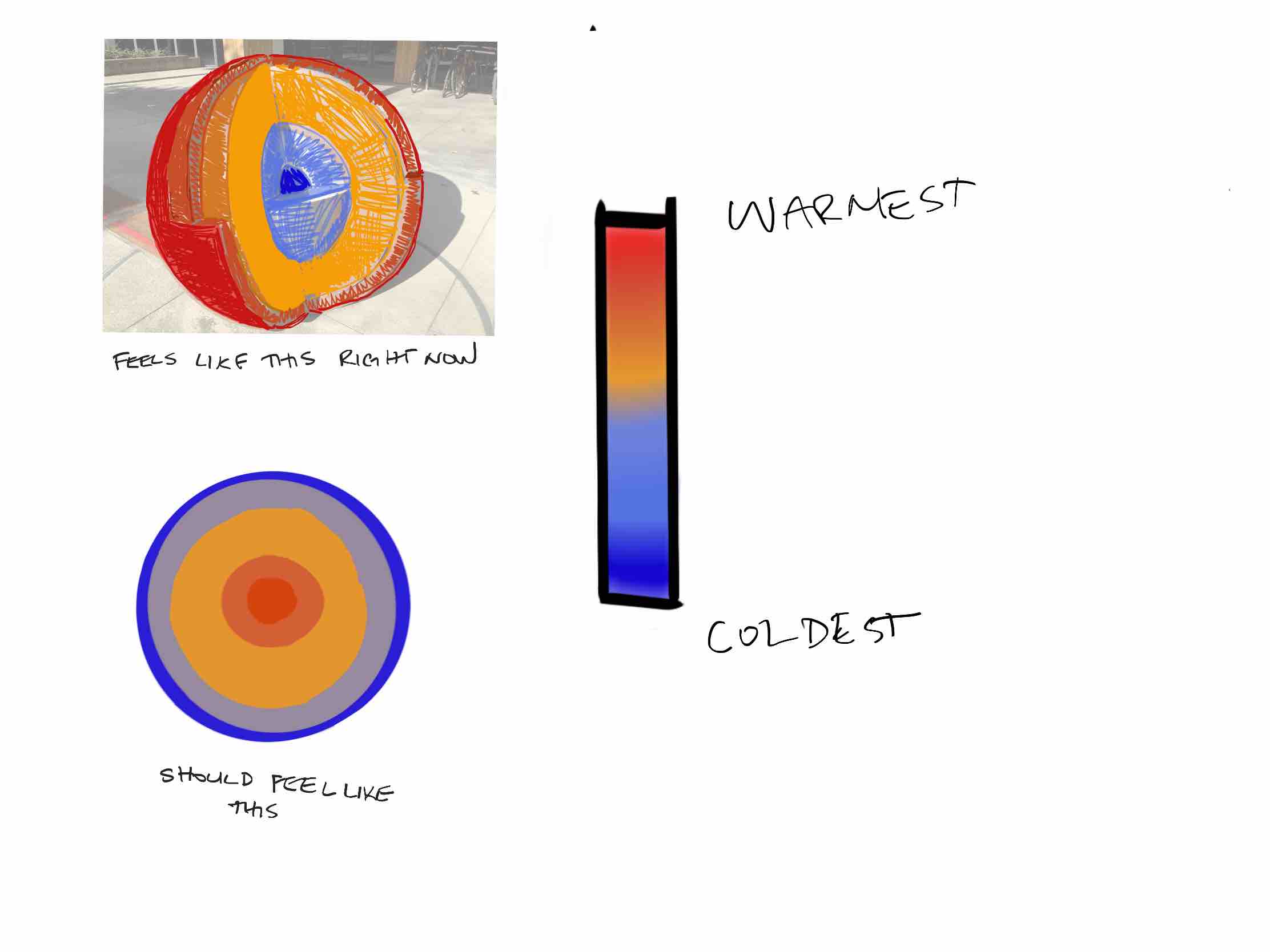
These are my best approximations of what it felt like to eat these things. I tried to show how the bitterness, saltiness, and sweetness tastes started from the centre of my mouth and moved outwards. Conversely, the spiciness moved from the bottom of my mouth upwards, and the sourness was all over the place and felt sharp.

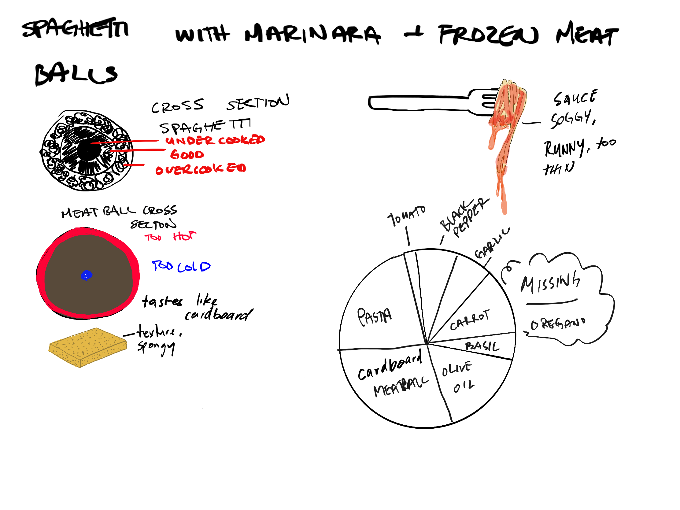
I made spaghetti with frozen meatballs. I didn’t put enough sauce in so the flavours weren’t balanced well.

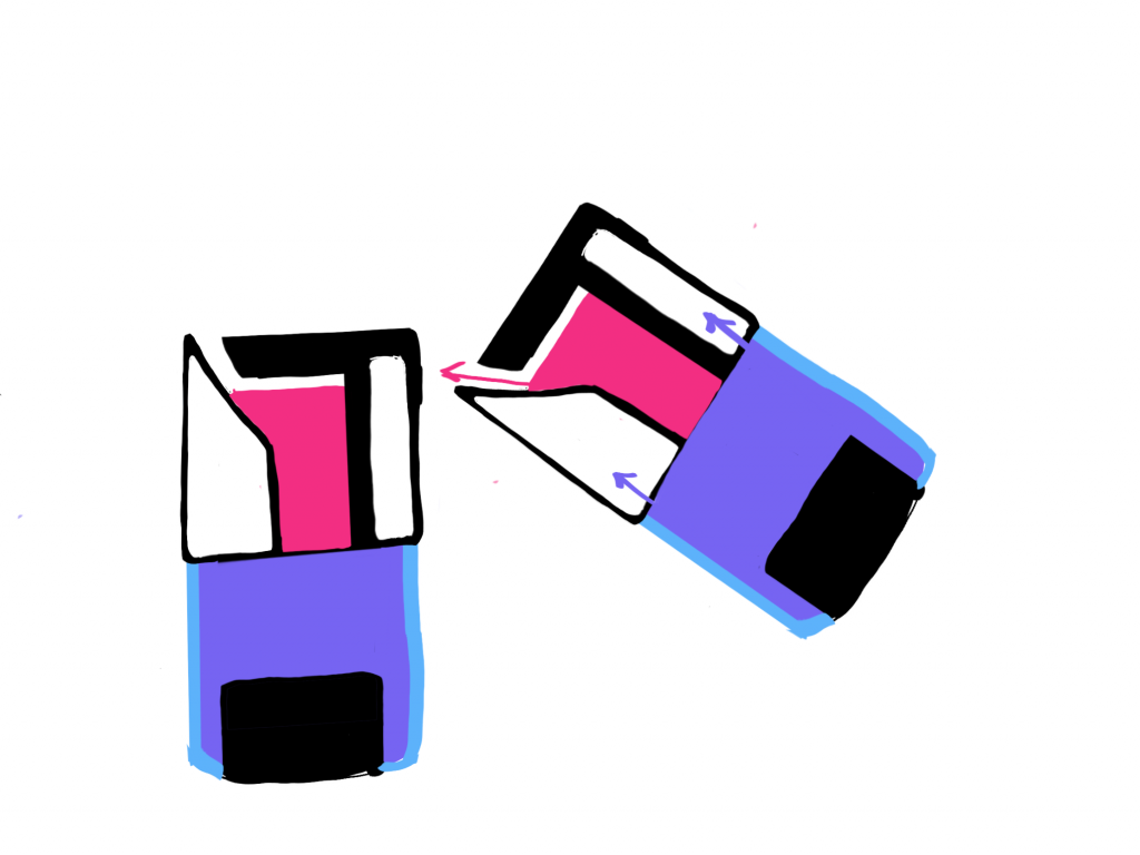
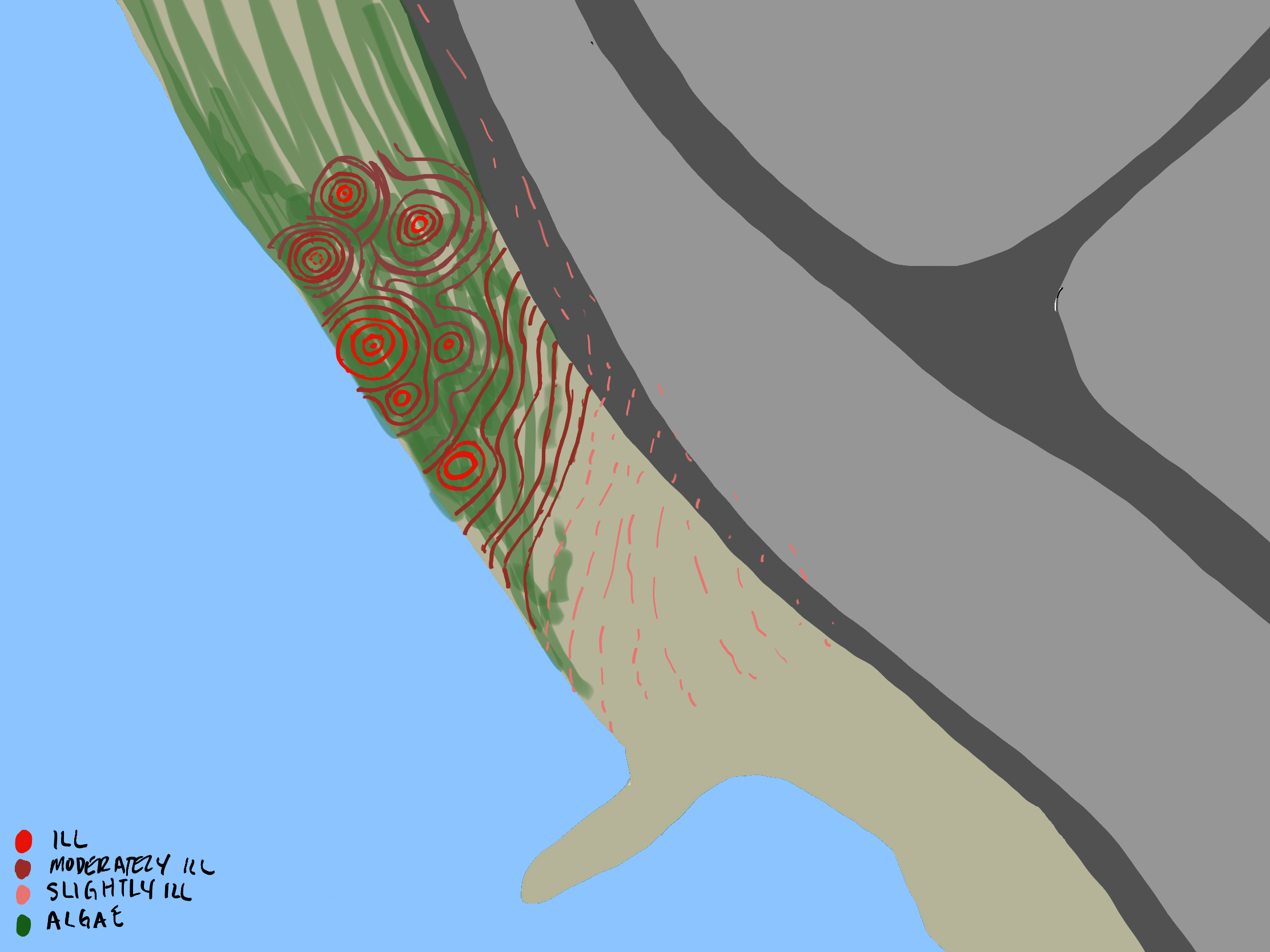
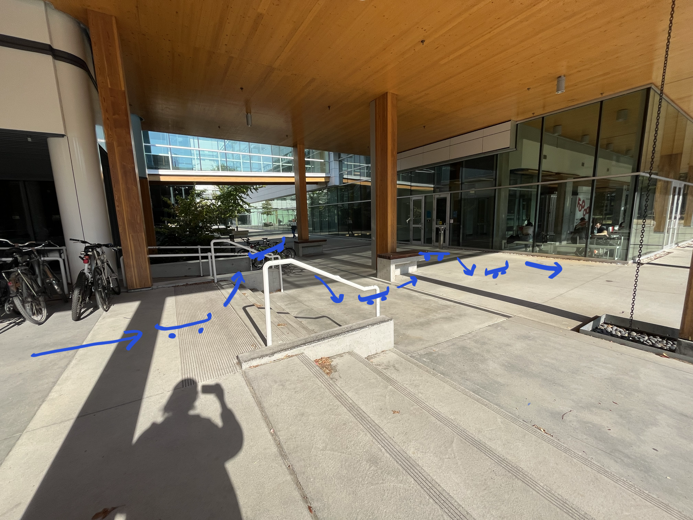
At home – Drinking Glass Design

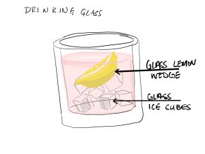
My idea was to have realistic looking glass ice cubes and a lemon wedge as part of the cup. They’d add weight and decrease the useable volume while still resembling things that would normally be present in a cup. This is a bad idea because you can’t clean that.

I then thought of these baby bottle toys that were popular when I was a kid. When you tip it over to “drink” from it all of the liquid fills into the lid and disappears.


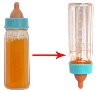
With the same principle, the purple liquid would fill the lid and “disappear” there as you drink, the opening for it would be a lot larger than that of the pink liquid so there would be more flow.

The pink liquid would be what you’re actually drinking, and it would be in the lid, which is opaque with a very small spout. You’d be tricked into thinking you’re quickly drinking a lot of liquid, while actually slowly drinking a small amount of liquid.

A6: Arevik Petrosyan


In Class

I noticed this bench was quite uncomfortable for me as the seat is quite high off the ground and I’m only 163cm tall. I had to climb onto it.

The seat itself is made of wood, which could maybe be removed to make the bench a more comfortable height, though this isn’t ideal as the concrete beneath is cold, and still just a little too high up.

In thinking about why this might be the case, there’s two things that I would like to point out.

The pegs at each end of this bench are anti-skate infrastructure, and so are the bars on these other benches. This is a form of hostile architecture, which aims to prevent people from skateboarding in public areas by putting in these “skate stoppers” that stop skaters from being able to slide on certain surfaces.

The extra height on that first bench is probably for the same reason. Because of it’s location, it would be a very good ledge to use in a line with the staircase. However, because of the extra height, most people probably wouldn’t be able to get enough speed to jump that high within the small run up between the end of the stairs and the bench. If the bench was at a comfortable sitting height it would work a lot better.


From the texture of this ledge, (waxy and damaged on one side) I can tell that people have been skating here anyway. I’m surprised they didn’t make the effort to put skate stoppers here, it’s a pretty obvious potential skate spot to me.


Second, this globe is a very neat tactile learning tool, but i think it could be improved. When the sun is out, the outer layers are warmer than the inner layers. In reality the core is the warmest part of the earth. I was thinking it would be more effective if each layer was a different metal with differing heat capacities, with the innermost layer being the most heat conductive, and the outermost layer being the least conductive.

A5: Arevik Petrosyan

In Class


At Home

First Object:


Second object

For the in class assignment, I was able to figure out that I had some sort of animal figure, but I didn’t know for certain if it was a gorilla or grizzly bear. I recognized the pencil sharpener after a few seconds, and I knew the ketchup packet was a packet of some sort,  but thought it could be mustard or mayo or hand cream or something.

It was challenging to not know exactly what the reference object looked like, but I think more challenging to not know what I was drawing. I focused on shapes and textures, but there’s more to an object than  that, and that’s not easy to represent when you don’t know what you’re doing on the page. If I “lose my spot” when touching the object, I can feel around the object to find the same spot again. With paper, no matter how much you modify the page by putting ink or graphite on the paper, it will always maintain the same uniform texture. I noticed I was avoiding picking my pencil up because I did not want to lose my spot.

Spam prevention powered by Akismet