Category Archives: Uncategorized
An interesting look at what we could consider a map – The First Maps of the Internet – ARPA NETWORK, LOGICAL MAP, MAY 1973

Also, related to this here is a geographically depicted map of the map above. The First Map of the Internet:
Sam
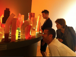
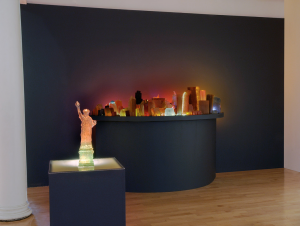
A Closer Look at Jelly NYC
I found it interesting to take a closer look at Liz Hickok’s project “Fugitive Geography: Jelly NYC,” which was featured in Harmon’s You Are Here: NYC. On her website, she describes her process and intent, and includes photographs of the installation. The photographs give the project a different sense of scale compared to the human body, and begin to represent how you would see and interact with a map made out of Jell-O.
“Working with Jell-O and other gelatinous materials enabled me to play the role of architect and reimagine New York City. The material took unexpected turns as it bent, glistened and melted, revealing the hidden fragility of the familiar city grid. The buildings in Jelly NYC assume a human quality as they lean on one another for support.”
(Liz Hickok)
From “You Are Here, Mapping the Psychogeography of New York City” Exhibition at Pratt Manhattan Gallery, NY

600 years of war and peace, in one chart
Article from: Vox
You would not know it from the headlines, but today we’re living through one of the most peaceful times in human history.This great chart from Oxford‘s Max Roser — which shows the global death rate from war over the past 600-plus years — shows just how lucky we are.
The red line in Roser’s chart shows the worldwide rate of war deaths per 100,000 people, streamlined over a 15-year moving average. Each red dot shows an individual war or episode of killing; larger dots mean more people died. The blue line, based on a different data set, shows combatant casualties only.
/cdn.vox-cdn.com/uploads/chorus_asset/file/3816326/ourworldindata_wars-long-run-military-civilian-fatalities-from-brecke1.0.png)
What you basically see is a pretty consistent amount of war over the centuries — but with some of the highest highs and lowest lows in the 20th century.
The red line stops at 2000, which is right about when global conflict was on its way to a plunge toward historic lows. You can see that in the blue line’s drastic decline.
If you zoom in a little bit on the 21st century, this trend becomes much clearer. At the dawn of the 21st century, according to both Roser and some more recent data from Steven Pinker, battle deaths appear to drop to close to zero per 100,000 people:
/cdn.vox-cdn.com/assets/4708176/battle_deaths_chart.png) (Joe Posner/Vox)
(Joe Posner/Vox)That’s pretty extraordinary: periods with five or 10 battle casualties per 100,000 people look like they’ve been pretty common throughout history, in addition to huge wars such as the Thirty Years’ War, the Napoleonic Wars, or World War II. By historical standards, humanity today is extraordinarily safe from war.
This is why one of the biggest and most important questions today is whether our so-called “Long Peace” will last.
A recent paper, by Nassim Nicholas Taleb and Pasquale Cirillo, argued that our current peaceful era was a statistical myth: that dips in war deaths should be expected, as Roser’s chart shows, and that there’s no reason to believe this time should be different. Pinker and others argue, by contrast, that things really have changed: that the rise of democracy, capitalism, industrial civilization, and international institutions like the UN have radically transformed the way global politics operates.
It’s impossible to know who’s right for sure. But Roser’s chart makes clear that, whatever the reason, we should be counting our blessings today.
This reminds me of your map of Africa, Samaneh – A Face Map of African Heads of State
In relation to our discussion about the use of photography and the use of symbols in how to depict Africa as a continent, I thought this was an interesting piece of content to bring to light. What happens when one individual is used to depict a geographical area?
Sam
Korean DMZ: Uncovering the Agency of Unknown Armistice Maps
“How we understand territories and nation-states—more importantly how we imagine them—depend on how we map them.”
http://www.thesitemagazine.com/read/the-first-iteration
![[Image 4: Dongsei Kim assisted by Jack Isles. Detailed crop of “Uncovering the Agency of Unknown Armistice Maps: The First Iteration” 2015. Print on canvas, 4756 x 841 mm. Image credit © Dongsei Kim, 2015]](https://static1.squarespace.com/static/5671ee0a0ab3774b3457b1ad/t/573e763660b5e9e0a0a3e31b/1463711311004/?format=1500w)
Sophie Calle – Take Care of Yourself

On Friday we spoke briefly about the work of writer/photographer/performance artist Sophie Calle. One of her projects that I have always connected with was her ‘Prenez soin de vous’ project, translation ‘Take Care of Yourself’. The introduction to the project is as follows:
I received an email telling me it was over.
I didn’t know how to respond.
It was almost as if it hadn’t been meant for me.
It ended with the words, “Take care of yourself.”
And so I did.
I asked 107 women (including two made from wood and one with feathers),
chosen for their profession or skills, to interpret this letter.
To analyze it, comment on it, dance it, sing it.
Dissect it. Exhaust it. Understand it for me.
Answer for me.
It was a way of taking the time to break up.
A way of taking care of myself.
This project has been exhibited in many different galleries and was also installed at the Venice Biennale in 2007. It’s longest lasting form is a book. In the context of our mapping course, it could be said that this project interprets grief and seeks to map out an understanding or a way forward. Sadly it is not a project that explains itself well with a google search. If anyone is interested in seeing the book I would be happy to bring in my English translation of it on Monday. Let me know.
Here is a link to the original press release:
<https://www.paulacoopergallery.com/exhibitions/sophie-calle-take-care-of-yourself/press-release>
MAP 005 CHERNOBYL
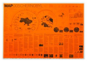
By: MAP at David Garcia Studios, 2012
Check out the website: http://davidgarciastudiomap.blogspot.ca for more maps by MAP (Manual of Architectural Possibilities). They released a variety of series, this one in particular was done in commemorating the disaster of Chernobyl, there are others on Floods, Quarantine, Antarctica et cetera. Each series is made as a pamphlet that displays infographics on varying issues on a given theme as well as a historical briefing.
If you find this type of representation interesting I would also recommend checking out the Toronto based firm Lateral Office at http://www.lateraloffice.com, their project Making Camp also uses the pamphlet as a representational style in nostalgia for local hiker and camping pamphlets that are traditionally used. Specifically you can find it here http://www.lateraloffice.com/MAKING-CAMP-2015.
BASE MAPS – OPEN SOURCE DATA
Happy Saturday,
I’m sure most of you know, but the City of Vancouver has many open source DWG and SHP files here http://data.vancouver.ca/datacatalogue/
Vanmaps is also a good resource if you’re mapping Vancouver.
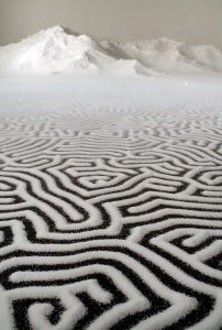
SALTSCAPES – Motoi Yamamoto
https://www.yatzer.com/return-to-the-sea-motoi-yamamoto
Regarding his work, the artist has said that: ”Drawing a labyrinth with salt is like following a trace of my memory. Memories seem to change and vanish as time goes by; however, what I seek is to capture a frozen moment that cannot be attained through pictures or writings. What I look for at the end of the act of drawing could be a feeling of touching a precious memory …”