Category Archives: Methods

Methods

This study examines the COVID-19 impacts in 4 ways in order to identify areas in Vancouver that are: physically at-risk, individually economically at-risk and business-areas at-risk. All 3 of these layers were then combined to create a summarized multi-criteria evaluation model for the COVID-19 impacts in all three of these areas. An additional analysis involving occupational data was done as well in order to identify areas that had high resilience as well as high negative impacts on employment.

Below is a flow chart on the methods used for each layer.

Methods: Physically at-risk age only

The first step we wanted to take in our research is to identify those who were the most physically vulnerable to COVID-19. In this project, we considered age and exposure to air pollutants as the major factors that determine the at-risk population in terms of physical health. The population was divided into four groups: 50-59 years old, 60-69 years old, 70-79 years old and over 80 years old. As for air pollutants, we examined residents’ exposure to fine particulate matter (PM2.5).

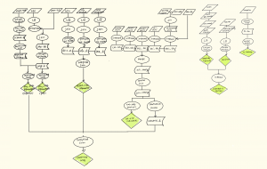
To make an integrated analysis on above factors, we conducted Multi-Criteria Evaluation (MCE). CHASS provided the 2016 census data and a shapefile of the transportation network was downloaded from Statistics Canada.

MCE for Age Groups

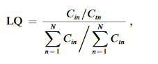
Location quotients (LQ) were calculated for each factor to identify dissemination areas (DAs) with higher levels of at-risk groups.  LQ is the ratio of the percentage of a given age group in a DA to the percentage of that age group in the whole city of Vancouver. For instance, in DA59150701, there are 530 people over the age of 50, of whom 30 are over the age of 80. In Vancouver, there are 633,125 people over the age of 50, of whom 27,525 are over the age of 80. Therefore, the LQ value of people over 80 years old for this DA calculated is:

LQ = (30/530)/(27525/633125) = 1.30.

If the LQ is greater than 1, the DA has a disproportionately larger share of a particular group of age. We would therefore look at these LQs and normalize those with values of 1 and below to 0. The normalized LQ data were joined to the DA layer and then converted into raster layers for each age group.

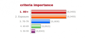
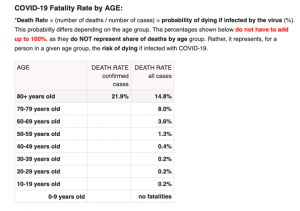
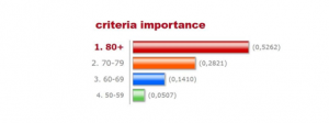
Taking into account the different responses to COVID-19 in different age groups, we weighted it according to the respective mortality rates provided by New York City Health as of April 14 (Figure below). The death rate shows the risk of dying if infected with COVID-19, for a person in a given age group. Weighted importance of each of the four factors was chosen using the analytic hierarchy process (AHP). After comparison of each factor, the weights are as in Figure 2. The final weighted map was then created using Weighted Sum.

The final weighted map was then created using Weighted Sum.

* There was uncertainty involved in this step. The 80+ age group is 11 times more important than the 50-59 age group, but we set the importance index at 9 because it is the maximum on the AHP calculator.

Methods: Physically at-risk age and PM2.5 exposure

MCE for Age Groups and PM2.5 Exposure

Studies have shown that people with COVID-19 who live in regions with higher levels of air pollution, especially PM2.5, are more likely to die from the disease (Wu et al., 2020). Therefore, we considered long-term exposure to high levels of PM2.5 as another factor in the MCE analysis.

We first created a finer grained surface to show different risk levels with exposure to PM2.5 on a local scale. The major transportation routes included highways and major bus routes were selected from the transportation network data, this layer was then converted into a raster surface.

By using this raster surface, we created a Euclidean Distance surface. Raster calculator was used to normalize the distance surface, and the expression we used was as follow:

( (max value of distance surface – [distance surface] ) / max value of distance surface ) ) *10

The output surface represented the residents’ exposure to PM2.5. It ranged from 0 to 10 and 10 was the closest value to the main road.

To determine the weight of this factor, we referred to the research from Harvard University (Wu et al., 2020), which tells for every 1um/m3 increase in PM2.5 concentration, covid19 mortality increased by 15% (95% confidence interval). Official data shows that from 2009 to 2014, the average concentration of PM2.5 increased by about 1 um/m3 (Government of Canada, 2016) .Therefore, we assume that at least 15% of the deaths of covid19 in vancouver are caused by this increase. The weight of each factor was then recalculated, and the result is shown as below. The final weighted map was also created using Weighted Sum.

* There was uncertainty involved in this step. We assumed that all the roads are weighted equally. A more nuanced representation can be done by using different weights for the different types of roads.

Methods: Individuals economically at-risk

The second step we wanted to examine was to identify individuals who would be economically most at risk from the COVID-19 lockdown. This was identified in three aspects: those spending 30% of their income or more on shelter costs, those who are retired (ie. aged 65+) and those who belong to occupations where there are high numbers of employees being laid off or not paid.

Data was provided by CHASS for all of the above variables by dissemination area in Greater Vancouver for 2016. Occupations identified under CHASS were:

  • Management occupations
  • Business, finance and administration occupations
  • Natural and applied sciences and related occupations
  • Health occupations
  • Occupation in education, law and social, community and government services
  • Occupations in art, culture, recreation and sport
  • Sales and service occupations
  • Trades, transport and equipment operators and related occupations
  • Natural resources, agriculture and related production occupations
  • Occupations in manufacturing and utilities

The top occupations lost according to Statistics Canada are those within the accommodation, restaurant and food services industry (2). Other occupations, including information, culture, recreation, business, finance, building and support were also hit. By examining the metadata file that CHASS organized each occupation under, we decided to include “sales and service occupations” as most if not all occupations listed were identified to be the most hit. Other fields were not included for the final analysis as occupations listed had some that were not hit by COVID-19 or it’s unknown if people were continuing to be paid or not.

Location quotients (LQ) were calculated for each variable using the following formula:

Where the numerator represents the regional specialization and the denominator is the total Vancouver specialization. LQ was then normalized, where values between 0 and 1 inclusive were given a value or 0 while all other values remained the same.

The file was then merged with the dissemination areas provided by Statistics Canada, and each variable layer was converted to raster format. A weighted sum (MCE) was done, with equal weights of 0.33 for each variable. Weights were chosen to be equal as we assumed overall economic  impact would be similar across each group.

Methods: Commercial industries at-risk

The third step was to define commercial industries that were very likely to be affected by the COVID-19 lockdown. In response to the previous step which examined the economically impacted individuals from the disease, the most at-risk industries we took into consideration included restaurants, accomodations, retails, as well as tow recreation sectors — cinemas and ski centres (City of Vancouver, 2020).

Point data was provided by CanMap for all of the above variables except for restaurants, which was obtained from Statistic Canada and the data format was CSV.

We joined the spread sheet of restaurant to an existing layer, then intersected all 5 layers with the DA layer. Each output layer shows the location for a particular sector in Vancouver. These layers were merged into one single layer, the total number of all 5 factors in each DA were then counted by using a spatial join.

Finally, a hotspot Getis-Ord Gi* analysis was conducted to show the “hot” areas where DAs contain commercial industries that were more at-risk.

Methods: Combined impacts

We then combined our health-at-risk map with our individuals economically at risk and commercial industries at risk to create a final MCE map to show areas most affected if including all of these variables.

All of the raster files were already done from previous steps. The weight we chose for each layer was 0.33 as we estimated that the impacts would be the same for each layer. Hence here are the following weights used:

Physically at-risk 0.33 Economically (individual): 0.33 Commercial: 0.33
80+ : 0.114015

PM2.5 Exposure: 0.114015

70-79: 0.06039

60-69: 0.030195

50-59:0.011319

Retired: 0.11

Sales occupations: 0.11

30% income or more on shelter costs: 0.11


Methods: Exploration on occupations

The main goal of this exploration is to identify regions that have high occupational risk of being laid off, as well as identify areas that are more resilient. Additionally, an examination on the diversity of occupations in an area deemed “at-risk” to “resilient” was conducted.

First, all occupation data was downloaded from CHASS. All of the occupation data was classified into 4 categories as the following:


Most at risk Most likely at risk Unknown impacts Resilient
  • Sales and service
  • Education, law and social, community and government services
  • Art, culture, recreation and sport
  • Trades, transport and equipment operators
  • Business, finance and administration
  • Natural and applied sciences
  • Natural resources, agriculture
  • Management
  • science
  • Those not applicable to any category
  • Health
  • Manufacturing and utilities


Categorization was done based off of Statistics Canada reports on decrease/increase in occupations from February to March, as well as other news reports. If an occupation change in employment was little, we decided to put it under “unknown impacts” as the significance in change wasn’t enough to attribute to COVID-19.

A diversity index was performed on excel using the formula:

Where n represents the amount in each category, and N is the total number employed.

The diversity index was then plotted as a hot spot map to find areas of high and low diversity

Additionally, an LQ analysis was done (similar to the other maps above) for the category “most at risk + most likely at risk” and for “most resilient”. Then, a hotspot map for the 2 categories were done. By using select features, we then filtered to find areas by intersect to find areas in our “most at risk + most likely at risk” hot spot map that had a GI_BIN value > 0 and “most resilient” GI_BIN value < 0 and vice versa. This was done to find any similarities between the two maps.