Tutorial 1
Spatial stats using Modelbuilder
In this tutorial, we used Modelbuilder to create yearly hot spot maps of Heart Disease. The following is a summary of the tutorial and my results.
Overview
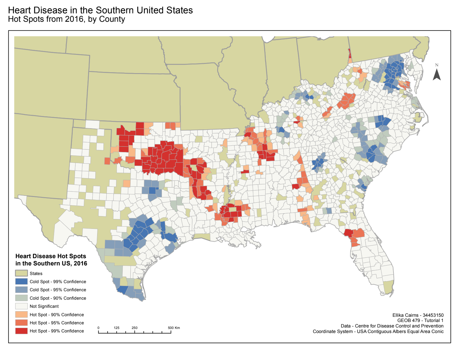
The map produced in this tutorial employed data sourced from the Center for Disease Control and Prevention, of mortality from heart disease for the years 1999-2016 in the Southern United States. The data has been presented by county with statistically significant “hot spots”, which are spatial clusters of high values, and statistically significant “cold spots”, which are spatial clusters of low values. On these maps, the hot spots have been shown in red and the cold spots shown in blue, with the darker hue indicating a more extreme high or low value. The use of this hot spot analysis in ArcMap allows the map reader to understand if the patterns in the data are due to random chance or if they are clustered and thus statistically significant. In order for a county to be classified as a statistically significant hot spot, it must have a high value and also be surround by neighboring counties that also have high values.
Results
The map below shows mortality from heart disease for the year of 2016 in the Southern United States. There are several statistically significant clusters of hot spots, such as in Oklahoma, Arkansas, and Louisiana. This indicates that in these regions there were clusters of high rates of mortality from heart disease. It thus appears that there is a spatial autocorrelation between mortality from heart disease and these specific regions, which could be caused by a number of different factors such as culturally typical food choices, average age of the population, or accessibility to preventative treatment and medical care. Nonetheless, this map does not indicate what the reason for the spatial clustering, but rather solely its presence in certain regions. There are also several statistically significant cold spots, such as in Texas, North Carolina, and South Carolina. These cold spots indicate low rates of mortality from heart disease in statistically significant clusters, which again could be a result of various different factors, such as accessibility to healthy food or low average age of the populations. Overall, this map provides an indication as to which counties in the Southern United States had statistically significant high or low rates of mortality from heart disease in 2016, and thus could be useful for private medical health campaigns, allocation of governmental funds, or identification of regions for the focus of scientific research of heart disease.