fragile childhood – monsters
Categories
fragile childhood – monsters
Link to image:
https://plus.google.com/109641290533350643200/posts/Y3jq6CgkB5b
Over the years, United Colors of Benetton has released a series of controversial ad campaigns in order to create awareness about certain social justice issues. The most recent ad campaign from their “Unhate” series depicts manipulated images of world leaders kissing to promote world peace. Until 2000, the man behind the camera for Benetton, Oliviero Toscani, revolutionized the purposes of advertising by combining commerce with social awareness as exemplified in the images above. In Lesley S.J. Farmer’s “I see, I do: Persuasive Messages and Visual Literacy”, she encourages educators to give students the tools to interpret images in a critical way since “mass media producers who understand the language and connotations of visual literacy can manipulate images to elicit desired responses” (Farmer 30). Such critical analysis of images is valuable when reading advertising that is targeted at the consumer’s bank account. However, I find that the process becomes more complicated and challenging when presented with the startling images of the United Colors of Benetton ad campaign.
“Shockvertising” becomes a double-edged sword when the image repulses rather than invites the very consumers or audience that the advertisement is targeted at. Critics have labeled Toscani’s ad campaigns as “shock advertising” due to the shock value used in his images to bring about awareness of social justice issues. It was rumoured that Toscani left the company in 2000 following uproar towards Benetton’s ad campaign surrounding the death penalty in the U.S. Department stores began boycotting Benetton’s products, which led to Toscani’s departure from the company. In a recent interview with CNN, Toscani stated that a shocking photograph does not exist, but rather “there is shocking reality that is being reproduced through photography to the people who aren’t there.” His statement left me questioning the challenging issues that arise in analyzing these images. When does reality become “too real”? Why does reality or “true” depictions of different subjects disturb us?
Depicted against Toscani’s distinct sparse white background, the advertisement that shows a newborn in its most real and unwashed state at birth was the most “shocking” image to me. The image was included in Benetton’s 1991 AIDS ad campaign to raise awareness of child deaths due to the disease. While some have claimed that it was one of the most natural and real depictions of life, the image still remains startling, unreal, and repulsive to me. Though eye-catching, I am not sure that the image invites me to soberly consider the issue of child deaths and AIDS. However, I find that Toscani must be doing something of value as he claims that “people get shocked because they aren’t really civilized yet, because they don’t want to belong or face the problem of civilization. Maybe it’s the duty of the photographer to shock them, bringing in front of them something that they probably don’t want to look at” and “there they are and you have to come down with yourself.”
I should preface by stating that I’ve been having trouble accessing the reading… and if anyone can help me with that it would be much appreciated.
So I took the topic of the week “Persuasive Visual Media” and considered something a little differently… something a little more personal!
If you haven’t read George Orwell’s novel “1984” … you should. While the story is a bit dated (originally produced in the 50s) it’s even more relevant in today’s society. I read it for my grade 12 theatre class. We were reworking it into a script for the stage with a specific focus on the relationship between the Ministry (the producers) and the proles (the consumers). The reason I feel as though 1984 is a relevant point of discussion is because 1. many high school English Language Arts classes include it in their curriculum; and in 1984 20-some years after the books release many people panicked about the predictions from the 50s. 1984 itself is full of persuasive language: the protagonist, Winston Smith, worked day in and day out in by editing news postings and books into “doublespeak” an edited form of English to an unidentifiable disintegration of grammar and language.

When we transferred the story onto the stage the mise-en-scene took on a visual representation of producing commercial product for the ministry, while the ‘proles’ setting was the leftovers of the ads that we see today. Consider this commercial from Apple’s introduction to the market:
While there is some competition between Apple and PCs in today’s market doesn’t this commercial seem to contradict the way that Apple has risen to the top? Personally I can’t leave the house (never mind my room) without my iPhone! All I want for Christmas is an iPad since I already have my two front teeth! It’s a strange balance between dependency and useful productivity. Maybe not everyone in this class uses and iPhone and MacBook… but can anyone say they use an mp3 instead of an iPod? Have we become the ministry of drones to Apple’s Big Brother take over? Does Apple use persuasive visual media? Or are people like me just so dependent on the company that seeing the persuasion has become impossible? My lifeline depends on the new iOS updates and possibility for an upgrade?
I find this idea of “persuasive visual media” interesting as well in regards to propaganda and the street art world. In another of our classes a group of us are making a lesson plan between three different subjects based around the idea of “propaganda”. One key artist that came to mind was Banksy and the documentary associated with him “Exit Through the Gift Shop”. I’m running out of words here so I’ll just attach the Wikipedia synopsis: . The interesting part about this film is that one of the subjects of the film, Thierry Guetta, is overtaken by Banksy’s ideals (art that forces a deeper thought process and commentary on current social questions) but when his own desire for fame creeps in, his morals go out the door…
Wow… I just realized I went from 1984 to Exit Through the Gift Shop in 500 odd words… I’d like to leave with this image… my point being that it is easy for us to become manipulated by something so simple…

Brendan
In the I See, I Do article, the piece that stood out the most to me, is the “technology-rich activities for critical visual thinking”. I really liked the idea of asking students to go out into their “world” and take pictures of things that are real for them. I feel like I could use this as a project, to not only involve students in what is going on around them, but also have them “stop and smell the roses” so to speak. I feel like in a world of technology that kids are watching their worlds go rushing by them. They want web pages to load instantly, (yes I expect that too…) they are no longer enjoying the basics in life. Kids are becoming obese in a place where we are safe to go outside and play. They are redefining “play”. It has gone from playing a game of flashlight tag, to sitting inside all weekend playing Dungeons and Dragons. Yes, technology can help us, but is it helping when the only social skills a kid is learning is through a head set and computer screen.
However back to the article. While reading the part about what colors and lines create, I had to stop and think about all of her analogies. I am not sure if the emotions we are supposed to learn are ingrained, but I don’t relate to what the shapes imply. I don’t feel that “Squares are stable, triangles are active, circles are organic, and spirals are cyclical”. I am curious as to where she got the ideas from, or if I am wrong and we are taught these at a young age. I was also confused with some of the color ideas and lines. Usually a line for me is the closing of a box, underlining something, or drawing directions. I feel like lines have start and end points and don’t think too much farther then that. Maybe its my own ignorance, but I feel like colors invoke different messages for different people. What if someone is colorblind? How are they to create feelings from colors that they do not see correctly?
I liked how she added resources for the reader to look at, but without a conclusion I am a little confused about her point and how she got to her ideas.
Sarah
So I was watching TV last night and I saw this add and I had to share it. I haven’t had time to analyze it specifically in relation to the article we read, but I also couldn’t get it out of my mind and needed to share it.
I am not sure what visual media techniques it employs beyond using an adorable hedgehog. I will look into that before Wednesday. To be honest, I don’t even care what it is about… I just love it! I am not sure if that means they were successful because I won’t forget it… or unsuccessful because the star of the commercial outshines what it is supposed to be advertising. Either way, I am looking forward to discussions about this kind of stuff on Wednesday!
Fluzone commercial featuring an adorable Hedgehog by pfyrestorm
Melissa
Wow. This has been an instance of getting lost on the World Wide Web. (But also a fine example of how we must examine our sources, critically.) I start with the article we are supposed to read, and end up doing searches for “Google images pro-life signs”. How? Here we go…
The Farmer article led me to the Centre for Media Literacy website; which is a fabulous resource for educators. For those of you who haven’t checked it out, there are some useful tools for us.
Their definition of Media Literacy is important, as it pertains to us, as educators. But they also share a Canadian definition, as published in Media Literacy Resource Guide:
“Media Literacy is concerned with helping students develop an informed and critical understanding of the nature of mass media, the techniques used by them and the impact of these techniques. More specifically, it is education that aims to increase students’ understanding and enjoyment of how the media work, how they produce meaning, how they are organized, and how they construct reality. Media literacy also aims to provide students with the ability to create media products.” (Ontario Ministry of Education, 1989).
Ok. That is what I expected to see on this site. But then I started looking at their archives…
Their site hosts articles from their previous incarnation as a print journal Media and Values. I started reading an article from 1977, “Are We Afraid of Media Technology” and realized that the “we” was the voice of Catholics and that the “moral” in the title was one of Christian morality. The article was interesting, in terms of the timely call to their readership to use technology to help in their “education”. The author asks: “Do media manipulate? Of course they do. All the more reason for us to get involved. Our pro-life apostolate should include sensitivity to how media manipulate humankind. How can we protect ourselves and others from this manipulation if we don’t have the data? We must be media-aware.” (Forde-Plude, Frances, 1977.)
So interesting; right? When you think of the highly influential and “successful” pro-life print campaigns that commenced during this period of social and political perspective shifts on this topic during this era. (Roe v. Wade in 1973, and the first March for Life in 1974.) I then did a Google search to see just how successful media “education” on this subject has been, and found hundreds of images and sites dedicated to this political/religious stance online. So, their call to use media technology for “educating” was definitely heard and acted upon.
The author ends with this proclamation: “Media are at the very core of learning systems today; they’re not “extras.” Encourage visual literacy programs in our schools. This doesn’t mean that we downgrade reading books. We must be aware, though, that people also “read” visually. A vigorous national communications thrust is needed in the Church. However, grass roots media use is vital.” (Forde-Plude, Frances, 1977.)
Back I went to their website. The “About Us” tab doesn’t link to any information mentioning their Christian background and influence to the organization, however, a “is the Centre for Media Literacy Christian?” Google search gives multiple websites for Christian organizations who site the CML as a resource for information on faith-based media literacy.
It’s so very interesting how organizations choose to represent themselves through their online presence. And very critial that students know how to ask questions about their sources of information.

After reading Lesley Farmer’s article, “I See, I Do: Persuasive Messages and Visual Literacy”, the first thought that popped up in my mind was the use of posters during Obama’s 2008 campaign for presidency. The infamous posters (pictured above) are quite simple: a headshot of Obama looking off into the distance in a somewhat contemplative yet stoic manner. His image itself has been digitized, manipulated to take on the appearance of a comic book character, perhaps even the image of a superhero. The message written underneath his portrait consists of a single word, whether it be “Hope”, “Change” or “Progress”. The message is simple, concise, and creates a bold message, absent of any gimmick or jingle, something that voters often complain about. Perhaps what is most interesting about the poster is the use of colour. The contrasting shades of red, white and blue appear, on the surface, as a patriotic tribute to the colours of the American flag. However, I was curious about the persuasiveness of those colours and decided to do some research on the psychology of colour. Interestingly enough, blue evokes a sense of steadfastness, dependability, wisdom and loyalty. It is also a colour most individuals associate with the feeling of calm. Red, as most can attest to, is used to draw attention. It is a colour associated with energy, and evokes a sense of excitement. And finally, white, aside from being associated with cleanliness and purity, has also been associated with safety.
Whoever was behind Obama’s 2008 campaign appears to have put a lot of thought into this compelling poster. As I recall, there was a huge push to get people to vote, as voter turn out was at an all-time low. Years after Obama was elected, that image remains burned in my memory. Whether it had persuasive abilities to get voters to not only vote, but to vote for Obama, is something worth exploring. But in the context of this class, the analysis I conducted could be a great exercise for students to critically engage in analyzing political ads to determine what techniques are used to win over voters.
PS. After researching further, I discovered that the poster’s creator, Shepard Fairey, is a street artist who works for the skateboard company, OBEY. This adds an interesting dimension to the persuasiveness of the ad, considering the choice of artist may have been a deliberate attempt to reach out to younger voters. Also fascinating is the fact that Fairey illegally used an image of Obama captured by the Associated Press as inspiration for his poster and eventually faced criminal charges! What a crazy turn of events!
Kiran Aujlay
Sources:
Psychology of Colour:
http://www.precisionintermedia.com/color.html
Image of Obama:
http://en.wikipedia.org/wiki/Barack_Obama_%22Hope%22_poster
News article about Shepard Fairey:
http://www.huffingtonpost.com/2012/09/07/shepard-fairey-sentenced_n_1864785.html
At slightly past midnight, I’m still sitting behind my illuminated computer screen hammering away at the keys. And then I feel it – a sudden niggling sensation that tugs my attention away from the words I’m typing. It’s a familiar feeling that usually strikes me this time of day, when my body hovers somewhere between exhaustion and the illusion of productivity.
It’s the urge to procrastinate.
I justify the need to lean back in my chair and update my Facebook status, because surely my friends in Bosnia need to know what I do at one in the morning. “Drinking coffee,” I type. “With French vanilla cream.” I type these words with reverence, as if they are my gift to the world – words of deep thought and enlightened knowledge, as my sleep deprived brain tells me.
Assuming that it is safe to wait another minute before I update my status and let my eager audience know that I have finished my coffee, I let my fingers glide over the keyboard and find their way to Google. Another blank rectangular box mocks me as I think of the words to fill it. I let my mind free associate letters and phrases before it settles on “Wordle.” I have a vague recollection of having heard it somewhere recently and type it in.
I look at the little screenshots of other Wordles on the site and silently seethe with envy, but the phrase “copyright infringement” prevents me from immediately creating my own. I look for text to paste across the public domains, but nothing intrigues. I float in a black cloud of despair until a small portion of my brain – a diminutive speck, really, not yet poisoned by caffeine overload or sleep deprivation – tells me I have a folder of original work.
With a smile wider than the Cheshire Cat’s, I paste half a chapter of my novel into the box and look on proudly as my computer screen fills with colourful words.
Satisfied that I have the most beautiful Wordle in the world, and my urge to procrastinate abated, I begin to think of the more practical applications of my Wordle besides bragging…
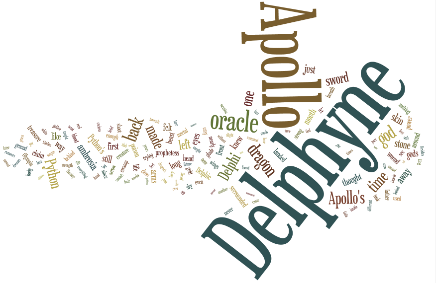
Since the Wordle was created from the first half of the first chapter of my novel, the number of times a word occurs could be associated with setting, mood and character. Usually the main character of a young adult novel is introduced in the first chapter, so the size of “Delphyne” or “Apollo” could suggest something about the importance of these characters.
Likewise, if I was going to use a Wordle as an anticipation exercise for a novel I may be teaching in class, I could ask the students to guess the events that may occur in the first chapter by piecing together some of the larger words in the novel. The students could connect their stories by the themes suggested by some of the words, in this case “sword,” “oracle” or “god.” The students could later compare their guesses to the actual chapter of the novel they will be studying – and in actuality, they are more likely to do this now that they are personally invested in the reading.
On that note, you are all welcome to guess the events of the first chapter as suggested by my Wordle. 😀
-Kiran Heer
(Click on the Wordle to see a larger image.)
here is my wordle based on my notes on the subject of persuasive visual media. sex sex sex.  what’s the opposite of subliminal, super-liminal?!

Hello All,
I want to provide you with a link to the Graphic Novel I brought to share with the class today. I believe it to be a very benificial resource for educators.
These graphic novels, based on Shakespearean plays, are based on the No Fear Shakespeare series which has the original text juxtaposed with modern, colloquial English (parallel texts). This popular series has now expanded to include the Graphic Novel versions (written ONLY in modern English, without accompanying Shakespearean, or parallel text format.)
Much like the tantalizing version of Romeo and Juliet introduced to us this evening during Kiran’s presentation, this text is an appealing and accessible way to introduce a widely taught, but often difficult to connect with, text.
Of course, there are pros and cons to teaching texts without their original language. Although we would not be using this version to teach Shakespeare’s language, the plot still unfolds the same as the original, with the action occurring in the same Acts and Scenes, so there is still “authenticity” to reading this modernized text. (And let’s remember: people in Shakespeare’s day weren’t reading his plays; they were watching them!)
If the students read this text, or are introduced to the play through this format, then educators can focus on the concepts in the play, significance of Shakespeare, teaching literary devices, etc. But first we *have to get the students committed to the text*; these graphic novels are an exciting way to do this.
I wanted to share this series of Graphics with you because we all know that Shakespeare can be challenging to read (not to mention teach!) so I feel like any resource that makes his works more engaging and accessible should be shared.
Thanks!
Maya