When you pose a question to students about a non-trivial concept, and they get it wrong, it’s not obvious where the error occurred, which step they missed or misunderstood.
Every now and then, though, you find a “diagnostic” question that clearly discriminates between the people who have a certain morsel of knowledge and those who don’t. I found one of these questions in the #astro101 class I’m working on.
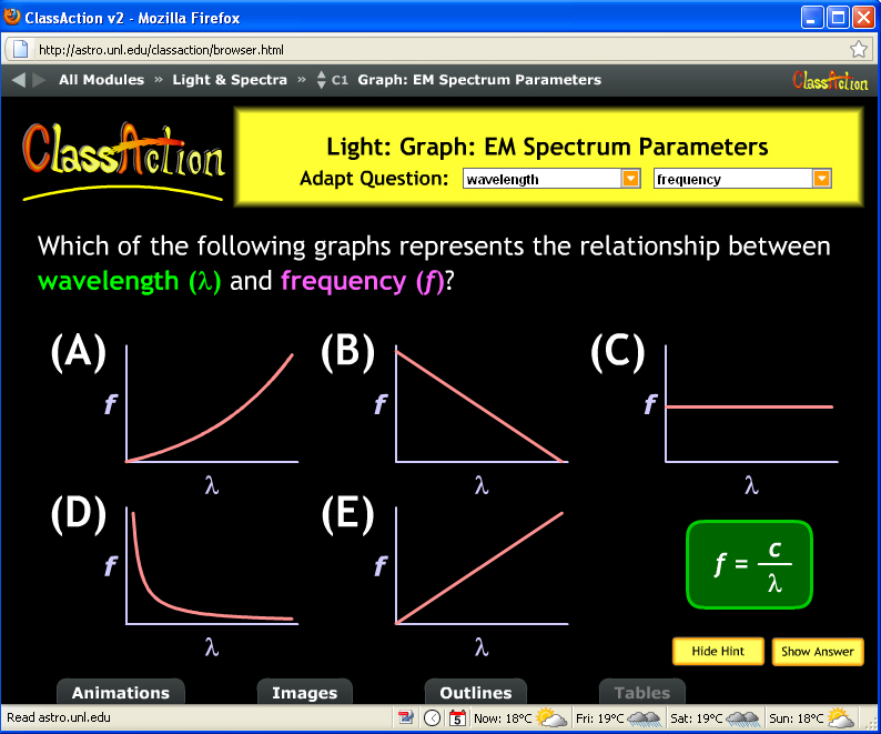
I gave a brief PPT lecture about light, reaching the point where I’d introduced wavelength, frequency, and the relationship between them. In words, the longer the wavelength, the lower the frequency. As a formula, f = c/lambda where f is frequency, lambda is wavelength and c, the speed of light, is a constant. Classic inverse proportion. Then I posed this think-pair-share question from the fantastic ClassAction collection of astronomy questions at UNL.
First, the N=125 students voted solo. Choice A: 3 B:67 C:1 D:48 E:2
Hmm, 50-50 split between B (linear with a negative slope) and D (inverse relationship, the correct graph). Perhaps some peer interaction would clear up the confusion? After the students talked to each other, the second vote came in
A:1 B: 64 C:0 D:60 E:0
I was, er, perplexed by the lack of shift to the correct graph, D. We discussed it and eventually got to graph D but I wasn’t too satisfied. Neither were they.
So what happened? Nothing like hindsight: 124 of the 125 students correctly demonstrated they understand that light with long wavelengths is low frequency, light with short wavelengths is high frequency. Awesome! That’s all we really wanted!
Here’s where the “diagnostic” part comes in: 50% of the class is able to graphically interpret the relationship f=c/lambda, 50% are not. It’s not the astronomy they’re stuck on, is a particular mathematical skill. And it’s no surprise at all that 50% of the class doesn’t have that skill. Interpreting formulas and graphs is non-trivial, a real diagnostic of novice-like, expert-like familiarity with data and mathematics.
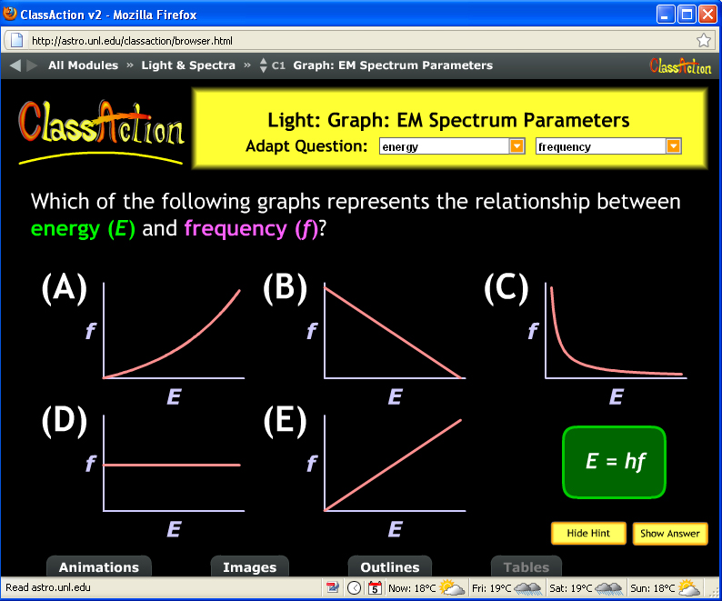
I’d like to say as a good scientist, I ran another experiment to test my prediction. But, in fact, I asked another formula/graph question the next class because I thought it was so easy, they’d all get it. I mini-lectured with 2 slides showing that the energy of a photon of light is related to its frequency via E=hf, where h is just a constant. Classic direct proportion. And then posed another ClassAction question:
The results? A:30 B:0 C:0 D:0 E:90
Success! 100% of the students made choices showing they know energy increases with frequency. (Okay, technically the graphs show frequency increases with energy, f=E/h but E and f are still directly proportional.) Except 30 of the 120 did not choose the graph that represents the mathematical relationship. More evidence for my theory about students’ graph interpretation skills.
(It’s a bit alarming that 25% of these undergraduates do not match direct proportion to the linear graph, but that’s another story…)
I’ll be writing more about interpreting graphs…


