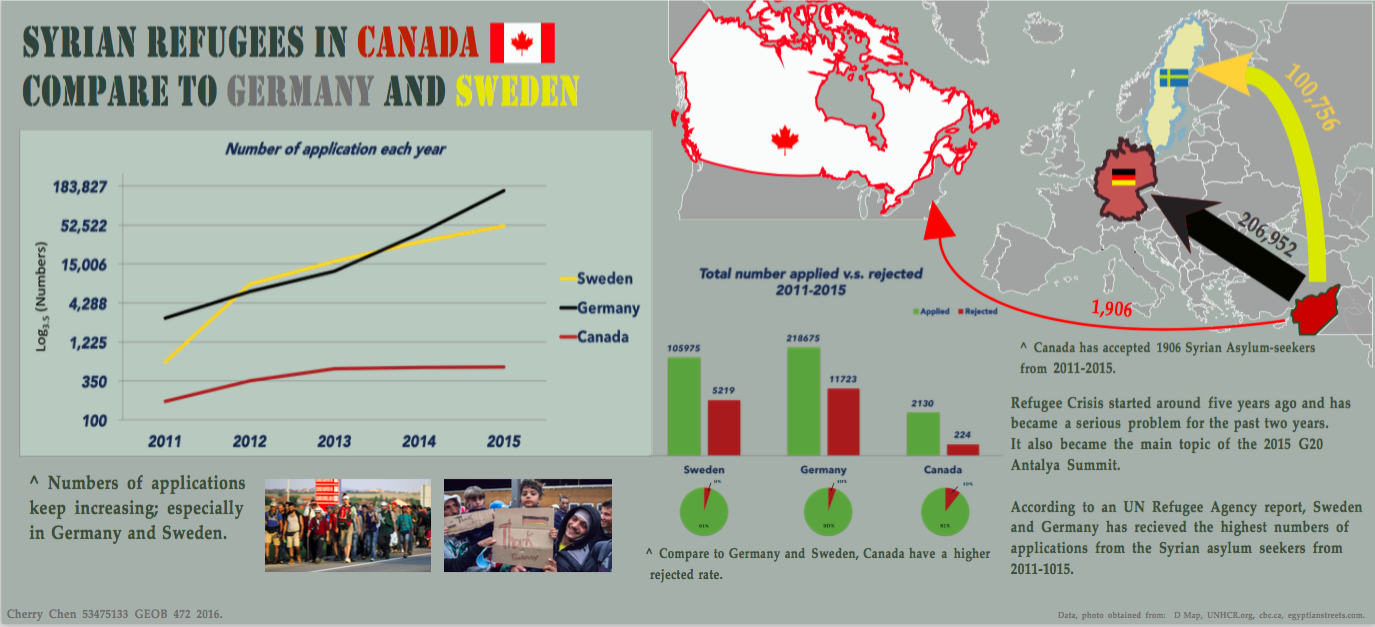
An Infographic on Syrian Refugee Crisis
When we look into the UNHCR website, the first thing we see is an interactive visualization showing the asylum-seekers and refugees from worldwide especially from the middle east.
First of all, the appearance is clear and neat, and that make the whole visualization an effective one since we can clearly see those circles on the map. In the label under the map, it clearly indicate what each colour in the circle stands for. When we click on a certain colour, it tells you the number of population in that category which make us easy to understand the number.
Secondly, under the map and labels, there is an interactive histogram which the data can changed by click on different types of population, and I personally think this is a smart design with only one histogram shown on the page but contains different data set. This front page visualization is a very impressive one due its laid-out and display, but if there is a title of the visualization, that will be even better.
Thirdly, as we can realize there are words and information written down below to describe the data set and UNHCR’s concern about different question, I will say it’s a smart way of using the space. In the whole infographic, there are three main sections and each one is made clear to understand and that is how an effective visualization should look like.
Based on the data obtained from UNHCR website, here is my infographic on Syrian Refugee crisis:
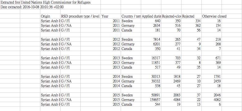
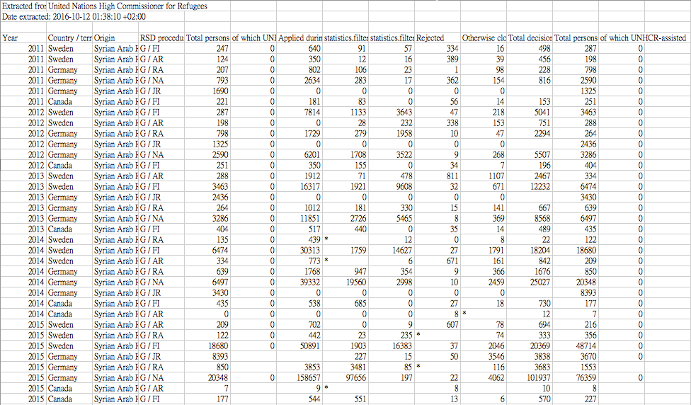
Here is my original data:
For the RSD column of the data, I only choose G/NA for Germany and G/FI for Canada, and G/FI for Sweden.