Deconstruction Critique Interactive Web Map
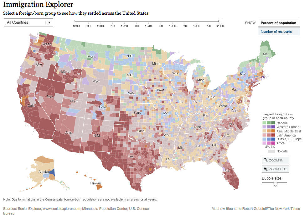
I obtained my map from The New York Times and the map is an interactive map showing the U.S. demographic composition change from 1880s all the way to 2000. As we can see from the top of the map, there is a bar that readers can drag and switch in between different years, and the census tracks are depending on each county within the states. The census tracks are in different colors showing the largest foreign-born population; in each census track, readers can find the total population as well as foreign-born population. Also, in the upper right corner, readers can change the population from exact number to percentage, and notice that if the map is shown in percentages, the map will be changed from choropleth map into a proportional dot map. From the upper left corner, there is also a list provided to choose the foreign-born groups to see the settlement of each of them. This map contains a huge amount of information, in terms of data acquiring, the author must gathered all this census information across the whole U.S from 1880s to 2000 and that is a lot! So if readers have moved the overhead bar back a little bit, we would start to see some gray areas, which indicates the lack of data. From those raw data that obtained from the U.S. Census Bureau, the author need to parse the data, which means the data needs to be provided with some structure for their meaning and ordered into types (categories.) Then the non-interest data need to be moved and only left with the data of interest. Finally is the data mining process, which is applying methods from statistics to put data in mathematical context, in this whole process, the data set should be organized and get ready to use. This step is very important, so it needs to be done very carefully to avoid further errors that may lead to a bias map.
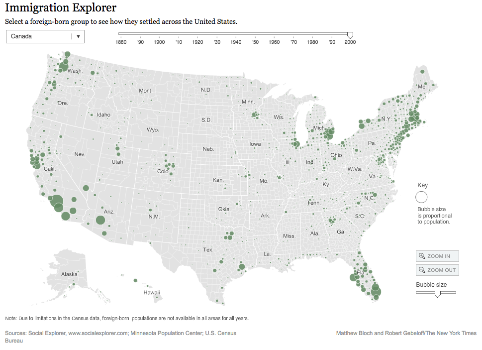
In terms of visualization, this interactive map is very impressive as it is clear and provides all the population in both exact number as well as percentage for every single county in every single state although there are some data missing in the old days. Once the readers click onto a census track (a county,) we will receive the census information as well as the largest foreign-born population is also shown in different colors. From this map, the readers cannot only get the demographical information, but also “reading the geography and history” from the map. That is quite interesting! As we can see from 2000, the northern states got their largest foreign-born origin from Canada, and Florida and California and all southwest states, the larges foreign born population is from Latin America. While back to 1880’s there were a lots of European immigrates.
As this map is a map showing the demography, there is no intension to try to “hook” the readers to focus on, instead, it provides a lot of information throughout the whole map; times and display method are changeable, and foreign groups are selectable, and every single census track (county) is clickable. The visualization is impressive as the readers move along with the time scales. This map is interesting to play around and see the demographic chances.
**Map obtained from The New York Times.
Immigration Explorer
(Click above to see the map)