I recently came across a video that made me instantly want to share it with everybody in SCIE 300. Not because of the content (although that is interesting on its own) but because of the presentation: it is hands-down the best example of effective visual communication. It’s not just me, the top comment for this video on reddit.com/r/videos is:
“I wish in no way to seem like I am glorifying the tragedy that this was; but this video was fantastic. It was clear, to the point and a very solid and concrete explanation as to what happened. It was incredibly informative and showed just how devastating what happened was. “
The video aims to present the investigative report of the MH17 crash in the Ukraine in 2014. A document of several hundred pages has to be somehow turned into a captivating, informative and easy-to-understand video, and the Dutch Safety Board rose to the challenge.
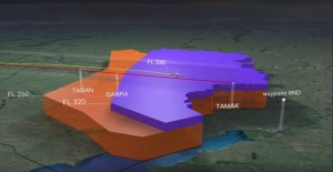
I invite you to watch the video first to gain some context. If nothing else, watch the stunningly concise and conclusive analysis and conclusion (until the man with the white hair stops talking at 14:50) Notice how they chose to represent certain information, from simple things like a flight route to more complex zoning of altitude restrictions.
Source: The Dutch Safety Board, Youtube
More interestingly, the video looks like a scientific paper reads, up to and including well-visualized references! (bet you never thought you’d like watching references). It’s a fantastic visual presentation of thorough scientific investigation, and a great example of how to communicate science to the public.
What makes this video so easy to understand and such a pleasure to watch, despite the somewhat dry data that has to be conveyed?
The video did not go over top with visual effects and kept it as simple as it could while making it look appealing. There is no ‘checkerboard flip and rotate from the left’ slide, the presentation has a very polished feel. It manages to include all the basics without going overboard.

Appropriate graphics make understanding a complex situation: The original flight altitude restriction was FL260, the recent one was FL330. The airplane was above both at the given locations.
It uses concise, appropriate language. Despite the technical aspects of the investigation the presenters manage to translate the concepts into something most people can understand and follow.
It appears that visual communication is a catalyst for effective science communication. The potential effective communication has for science is apparent: The above video has over a billion views. Similar videos like the ESA’s AMBITION short movie or the adorable short animated series have garnered a similar widespread reception, promoting science in a very approachable way.
I am especially curious to read what you guys thought made the video effective. More importantly, what aspects can we translate into our own work, for example power-point slides?
Lorenz Buehler
