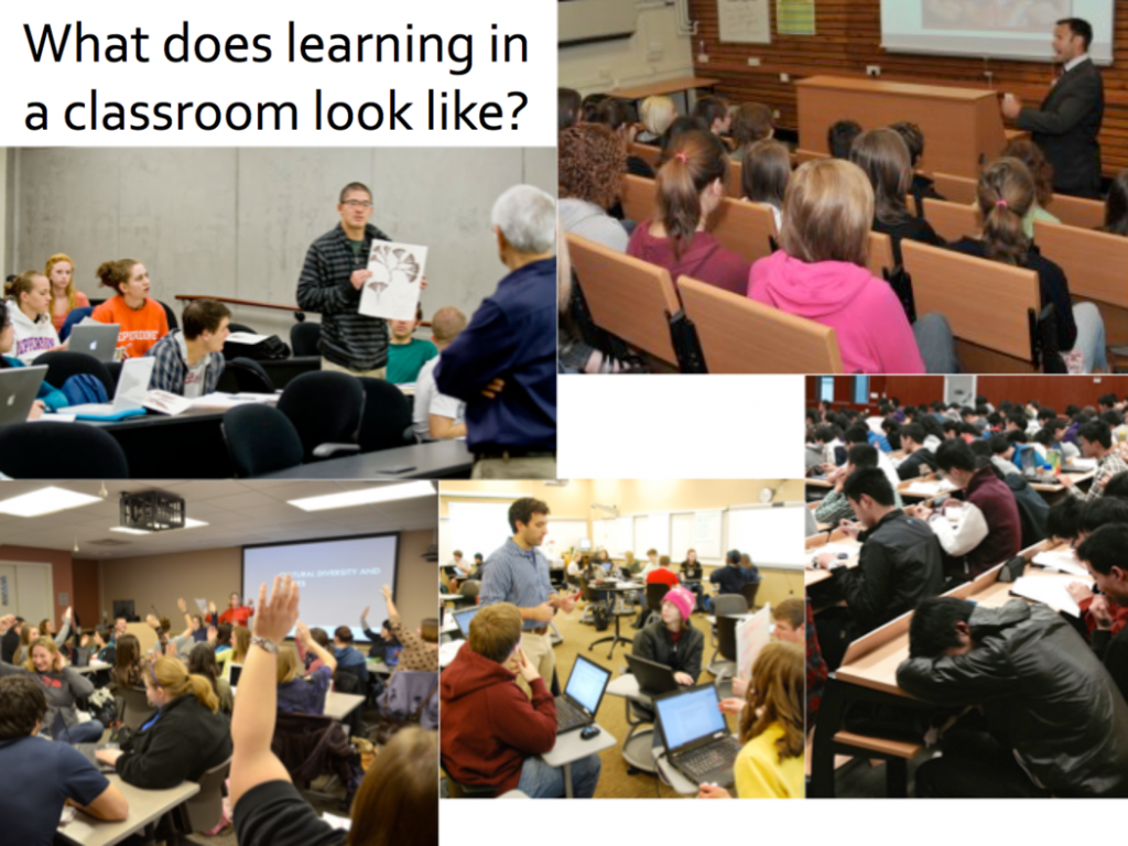
Working against the WeBWork clock: What are the behaviour patterns of students who struggle to complete online calculus assignments?
Alain Prat is a Science Teaching and Learning Fellow in the Math Department at UBC. His research focuses on understanding and supporting the lowest performing first year calculus students. He writes:
“Since 2010, the math department at UBC has been gradually adopting the WeBWork online homework system in most first and second year courses. Instructors typically give students several days to complete their WeBWork assignments, and allow students several attempts at each problem. Despite this, many students struggle to complete their online assignments. In this talk, I’ll discuss how the timing of answer submission recorded in WeBWork log files can reveal the behaviour patterns of students who struggle with WeBWork. In particular, students who don’t complete the WeBWork start the assignments closer to the deadline, have shorter login sessions and don’t persist for as long once they encounter a problem they can’t solve. I’ll discuss what these observations can reveal about the mindset of struggling students, and how assignments could be restructured to help increase their completion rate.”
On Sep 25th, Abdel Azim Zumrawi (Statistician, UBC Centre for Teaching and Learning) and Leah Macfadyen (Program director, Evaluation and Learning Analytics, UBC Faculty of Arts) spoke about challenges of meaningfully capturing, summarizing and presenting Student Evaluations of Teaching and Learning (SEoT) data at UBC.
Leah opened the session by talking about history of SEoT at UBC. The UBC Senate has been considering student evaluations ever since 1974. Then later in 2007, an updated policy, recommended by Teaching and Learning Committee, was approved by the senate that requires every course section or learning experience to be evaluated by students every time it is offered (with some exceptions). For more information visit http://teacheval.ubc.ca/.
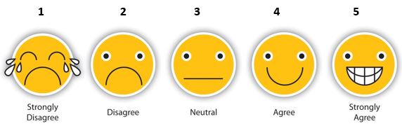
Based on this policy, a modular model is implemented at UBC, where the student evaluations questionnaire includes university-wide questions, as well as, faculty and department specific ones. Most of these questions adopt a 5-point Likert scale to measure respondents agreement. The response categories are then translated into quantitative scores. Below is a visual representation of a Likert scale.
Note: images are not present in the original evaluation questionnaire.
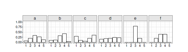
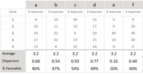
The original SEoT data is ordinal and not ratio scale, meaning that the points are ordered along one spectrum but the distance between them is not known. This poses some challenges when summarizing and presenting SEoT data, as pointed out by Abdel Azim. For instance, using “average” to compare evaluations across individuals and units can be misleading. To demonstrate his point, Abdel Azim shared an example of 6 distributions of SEoT scores that all have the same average but clearly show very different patterns.
One would naturally think that a measure of variability is required to better describe and distinguish these patterns. Abdel Azim argued that “standard deviation” is not an accurate measure of variability for ordinal SEoT data. He suggests adopting a simple and intuitive “dispersion index” suited for ordinal data instead. A dispersion metric would range from 0 (complete agreement) to 1.0 (a 50-50 split between the two extreme scores).
In addition to dispersion index, Abdel Azim suggests looking at “percent of favorable responses” (i.e., those rated 4 or 5) when summarizing SEoT data. Several years of data at UBC shows that overall, students tend to give instructors higher ratings of 4 and 5. However, the percentage may differ from one course offering to another.
Revisiting the 6 distributions of SEoT data in the earlier example, Abdel Azim pointed out that while averages are exactly the same, both dispersion index and percent of favorable responses are very different per case. This signifies the necessity of adopting appropriate metrics for summarizing SEoT data.
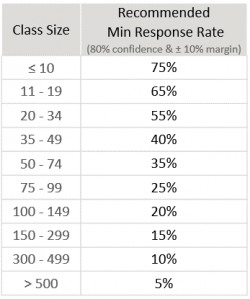
Abdel Azim explained that “response rate” is one other factor that should be taken into account when analyzing SEoT data. Not all students in all classes choose to complete the evaluations, resulting in varying response rates. Extensive statistical analysis of UBC SEoT data has been done to determine minimum recommended response rates for generating reliable score distributions for class sizes, where scores were classified as “favorable” or “unfavorable”.
Justin Lee (Programmer Analyst, UBC’s Faculty of Land and Food Systems) closed the session by sharing his visualization work that allows users to explore SEoT data for his faculty using the above metrics in one interactive dashboard.
Ian is a Learning Technology Specialist in UBC’s Faculty of Education, and will talk about the Mattermost tool: what it is, how it works, and whether we can get data out of it that might tell us anything useful about learning or engagement. He writes:
“Mattermost is an open source communication tool that facilitates communication and collaboration in a chat-type environment. You could call it an open source and UBC-hosted Slack alternative. I’ll be going over the pilot so far, how Mattermost was selected, how it is currently being used in Education, followed by a hands-on demonstration and then opening things up for discussion. That discussion might include analytics potential as well as whether it would be useful for the LAVA group to connect between meetings.
A PhD student from the Department of Language and Literacy Education will be joining me, as he’s interested in using Mattermost as part of a study on team collaboration tools for language learning. I’m hoping he will be willing to share a little about his research.”
Ahead of the meeting, Ian would like to encourage people to register for the Mattermost LAVA group. This was created a few months back in conversation with Leah. It’s just an experiment for now but who knows!
In January 2017, the Institute for the Scholarship of Teaching and Learning and the Learning Analytics Visual Analytics group held Hackathon 2.0 at UBC. The two-day event brought together over 80 students, researchers, faculty and staff to explore educational data. Organizers welcomed participants with a range of expertise, and encouraged beginners to sign up to the event.
“My interest in having a hackathon was to bring people together who either want to learn more about doing data analysis, know about data analysis but want to bring into a new context, which is learning analytics, or don’t know anything about either of those things but are generally interested,” said Alison Myers, data analytics specialist at the UBC Sauder School of Business.
This year the hackathon began with a series of workshops on visual analytics, temporal data analysis and statistics using the R software. The idea was to support participants in expanding their knowledge base and making first steps with their analyses.
Hackathon participants were given data from two UBC Massive Open Online Courses: one course focused on Chinese philosophy, the other focused on the science behind climate change. Data included event-trace data, student demographics, discussion-forum posts, attitude surveys, and summative data, enabling a broad range of analytical approaches. Participants formed groups depending on their expertise and interests.
“I have done research on learning data in the past. Patrick is doing computer science so he knows more about coding. And Vesta has experience with visual analytics,” explained Mario Cimet, a student studying Cognitive Systems at UBC, about his team.
The event was an opportunity for like-minded people to meet and share their passion for data analysis. The hackathon was also aimed at raising the profile and visibility of learning analytics. Learning research data can give instructors feedback about their teaching approaches and resources, and how they’re working in their classrooms. It can inform departments about why certain classes are more popular than others and thus support planning at the program level.
“Learning analytics is using evidence about learners to improve the process [of teaching],” said Cimet. “I think it’s important because any decision that you make that is going to deal with their education, you should do it with as much evidence as possible. You should do based on facts.”
Here are three examples of what the participants were able to achieve during the hackathon weekend:
Course tree, where circle size shows either activity level across all learners, time spent per learner, or frequency of this being the last visited page of the course: http://link.landfood.ubc.ca/courseTree/ by Anh Nguyen, Shirley Lin and Justin Lee
Another course tree, where the width of a line represents the movement from node to node, the size of the circle is the number of unique learners, and the colour of a circle shows whether this was a student’s last activity in the course: http://static.useit.today/ubcxhack.html by Patrick Coleman, Mario Cimet and Vesta Sahatciu
Reflections on the hackathon experience by data presenter/scientist/instructor Dr. Megan Barker
I’d been looking forward to the hackathon for a few months, and it completely blew away my expectations! As a data presenter at the hackathon, my role was to share ideas and data from my collaborative project characterizing classroom practices in UBC biology – all in the hopes of tempting data-savvy hackers to play with the data for the weekend. In my research project team, we currently have pedagogical expertise but are sorely lacking skills in visual and data analysis. This hackathon was a perfect opportunity for us to share the dataset with analysts and students looking for real educational data to work with. The event was a smash success: we built teams, worked on real projects together, and had tangible successes by the end.
In our research, my colleagues and I ask the basic question:
We approach this by observing and collecting data from many classes in our department…..Read the full article.
I’ll be discussing my work at the Visual Cognition Lab under Dr. Ron Rensink, where my team and I study the perception of correlation in visualizations. The purpose of this is two-fold. Using visualizations as a stimuli can help us understand how the visual system gets statistical information from scenes. Conversely, this understanding can lead to better visualizations by giving us rigorous ways to measure the effectiveness of a design.
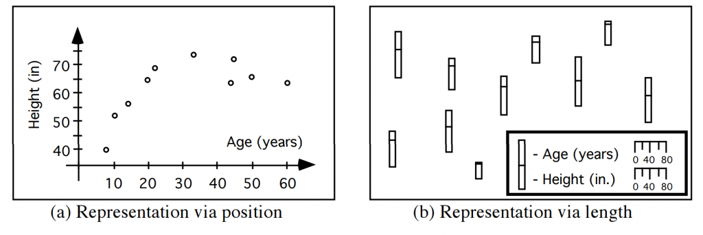
For example, consider the pair of graphs below, each representing an identical set of age and height measurements for a group of individuals.
The graph on the left is clearly superior, revealing relationships that are invisible in the graph on the right. But we don’t really know why. As designers of visualizations, the best we can do right now is appeal to our intuition, to the “best practices” identified by our colleagues, or to the results of field studies.
While these methods may have worked well enough so far, they may not scale well as visualizations become increasingly complex and high-dimensional. In my presentation, I’ll show our research can eventually let us develop methods to judge visualizations from first principles.
Meetings have moved to a new time (every other Monday, 3pm) this term.
Note temporary different meeting space on Feb 1st: DL-011 (the boardroom in the Sauder building where we have met in previous terms)
This first meeting will be a planning and brainstorming session. Pleasesend Alison 2-3 slides that a) introduce yourself and your work and b) propose a presentation/demo/workshop/paper/talk that you would be willing to give to the group. We will then spend time on the 1st by going through the slides and creating a schedule for the coming meetings.
If you can’t make the meeting, please still send the slides along with a little blurb and I will share with the group.
Rama has been working on building an Evaluation Visualizer, “EvalVis” which gives an overview of some of the ISoTL projects going on at UBC (http://isotl.ctlt.ubc.ca/). “EvalVis” is an interactive visual interface that will show innovation projects, area of impact, and evaluation approach. Rama will be showing the in-progress version of the tool, as well as discussing some of the challenges of the project so far.
Work in Progress: Development of an app to visualize a learner’s own learning data
In this session, final year COGS student Valerie Wyns will give a ‘work in progress’ presentation on her project to develop an app, ‘modusloci’, that will allow learners to visually analyze their own ‘learning data’ (e.g. school notes). This development project builds on the hypothesis that if learners can visually make the connections between sources, subjects, topics (particular->general) it will offer them a new perspective on the meta-system in which their knowledge resides, and allow them to understand what they need to understand in a deeper way. Valerie will offer more details of the logic of her project and will explain her plan to visualize both a data map of a learner’s input data, and patterns of the learner’s habits. In particular, she will concentrate on the data mapping function, asking: What aspects of data are salient in a meta-system way? How can she create a platform that is playful, fun, and ultimately useful to the end user?
Visiting scholar and HCI pioneer Dr. Ben Shneiderman will lead an informal workshop meant to teach use of EventFlow software – a tool developed by his team for temporal sequence analysis and visualization. Bring your laptop and your data!
ABSTRACT Event Analytics is rapidly emerging as a new topic to extract insights from the growing set of temporal event sequences that come from medical histories, e-commerce patterns, social media log analysis, cybersecurity threats, sensor nets, online education, sports, etc. Our current work on EventFlow (www.cs.umd.edu/hcil/eventflow) supports analysis of point events (such as heart attacks or vaccinations) and interval events (such as medication episodes or long hospitalizations). In this hands-on session, Dr. Shneiderman will show how domain-specific knowledge and problem-specific insights can lead to sharpening the analytic focus so as to enable more successful pattern and anomaly detection.
BEN SHNEIDERMAN (http://www.cs.umd.edu/~ben) is a Distinguished University Professor in the Department of Computer Science and Founding Director (1983-2000) of the Human-Computer Interaction Laboratory (http://www.cs.umd.edu/hcil/) at the University of Maryland. He is a Fellow of the AAAS, ACM, and IEEE, and a Member of the National Academy of Engineering, in recognition of his pioneering contributions to human-computer interaction and information visualization. His contributions include the direct manipulation concept, clickable web-link, touchscreen keyboards, dynamic query sliders for Spotfire, development of treemaps, innovative network visualization strategies for NodeXL, and temporal event sequence analysis for electronic health records.
Ben is the co-author with Catherine Plaisant of Designing the User Interface: Strategies for Effective Human-Computer Interaction (5th ed., 2010) http://www.awl.com/DTUI/. With Stu Card and Jock Mackinlay, he co-authored Readings in Information Visualization: Using Vision to Think (1999). His book Leonardo’s Laptop appeared in October 2002 (MIT Press) and won the IEEE book award for Distinguished Literary Contribution. His latest book, with Derek Hansen and Marc Smith, is Analyzing Social Media Networks with NodeXL (www.codeplex.com/nodexl, 2010).