From Where to Where: Immigration Clusters in Vancouver

HELLO, PLEASE NOTE THIS SITE HAS BEEN ARCHIVED AND THE CONTENT HAS BEEN RE-POSTED ON MY NEW SITE HERE:

http://healthycitymaps.blogspot.com/2013/11/immigration-clusters-in-vancouver.html

——————————————————————————————-
Very few people who live in Vancouver were actually born here. I, for one, am a transplant like many others drawn to this beautiful city from Toronto by the mild climate and outdoor recreation opportunities. Many others have immigrated from all over the world to pursue their dreams in Canada. In fact, there are over 830,000 foreign-born people in a population of 2.1 million people living in Greater Vancouver (Statistics Canada, 2006).

Do you wonder where immigrants who have settled in this area moved from? Or perhaps you are curious why and where many people from the same origin region tend to cluster together into distinct geographic areas that are often called ethnic enclaves. I began exploring these questions when took Dr. Daniel Hiebert’s course at UBC Geogrpahy and I learned there are frequent criticisms that immigrants are settling in concentrated residential spaces and developing separate social worlds. Professor Hiebert’s research challenges this point by showing that immigrants actually inhabit multicultural places. What do you think is the ‘right’ amount of clustering?

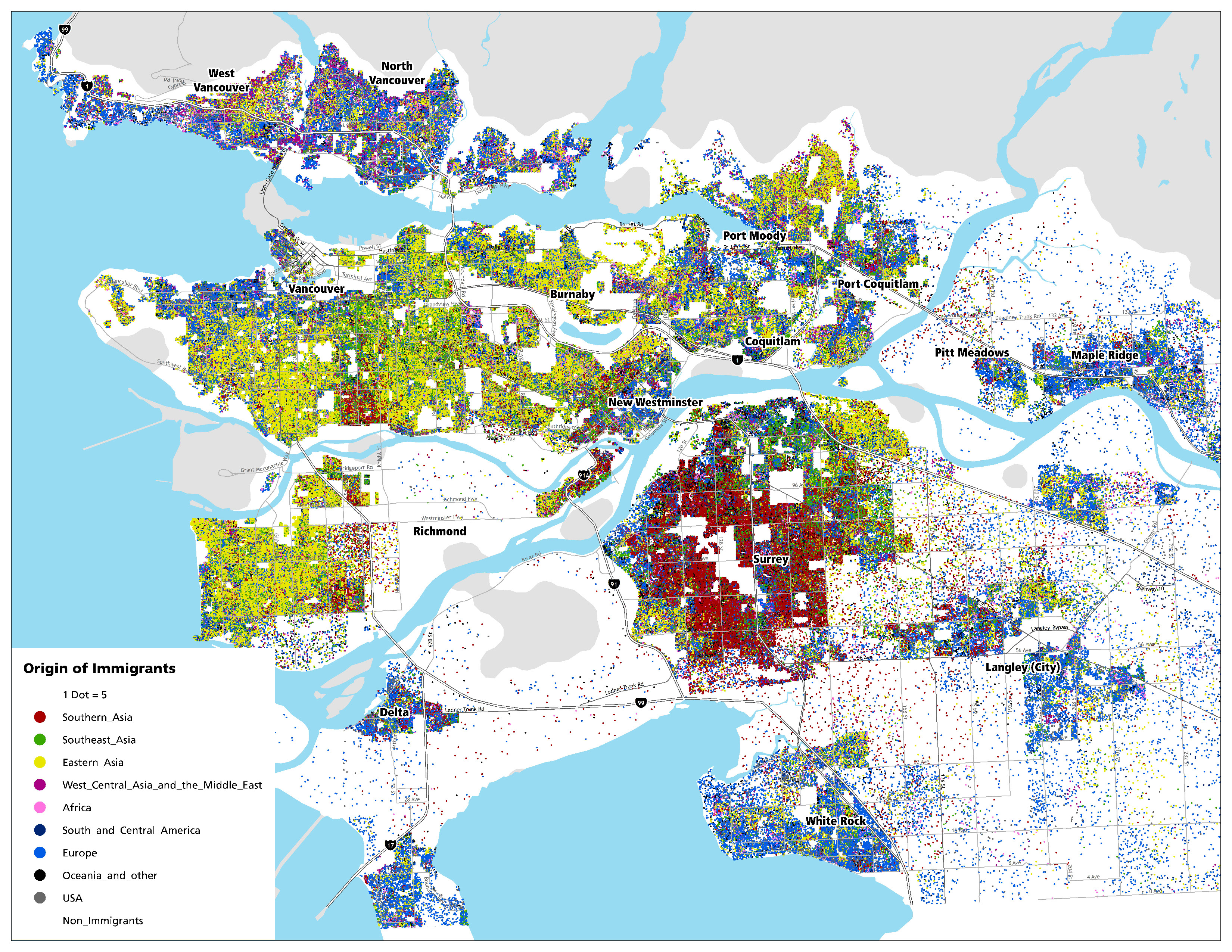
I prefer to explore questions using the best available data, so I used Census data collected by Statistics Canada in 2006 to create a dot-density map that shows one dot for each five immigrants. These dots are also coloured to categorically display the region where people have immigrated from.  Can you spot any interesting patterns?

You can also click or scroll to zoom into the interactive map below to explore local clusters. Can you spot any interesting patterns?

For those who are curious how I created this map, I used Arcmap 9.3 with a VERY large page layout size. The data are for dissemination areas, but the display of dots is restricted within the populated lands or ‘ecumene’ area (more on this here). If you have any other questions or ideas related to this post, please leave a comment below.
Posted in Data Visualization, Immigration, Interactive, Maps, Population | Leave a comment

New Mapping Portfolio

After many months of organizing, reformatting and categorizing all the maps I have ever made, my new portfolio is now online! The full collection of maps is available under the Portfolio tab of this site but read on below to learn more.

I considered creating groups based on geographic scale (local, regional, national etc.) or map type (choropleth,proportional symbols, interactive etc.) but in the end I decided to categorize my maps into the following project types:

  1. Human Early Learning Partnership Maps – Projects I have completed over my four years of employment at UBC.
  2. Contract Maps – Projects I have completed independently for paid contract projects.
  3. Poster Designs – Integration of my own research and layout/design work.
  4. Experimental – Independent projects I have completed for fun and to learn new skills.
  5. Academic – Work I completed during my undergraduate years.

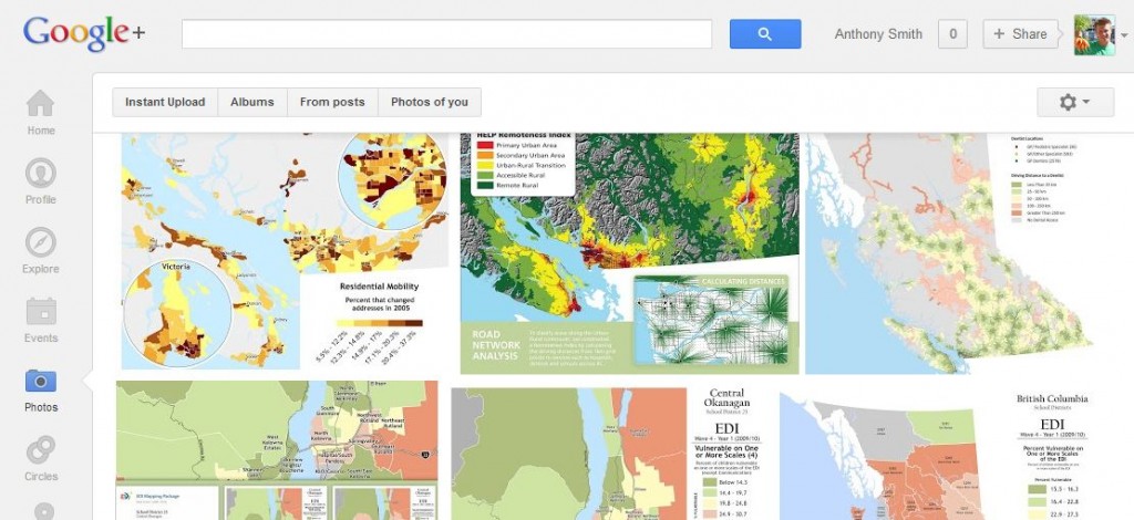
I also experimented with various formats for displaying these new collections but I am very happy with the excellent features of Google+ Photo Galleries combined with some custom tricks to embed slideshows and gallery links into this site. Each of these categories are shown using automatic slideshows that look like this:

Human Early Learning Partnership Maps

Additionally, if you would like to review all maps in a gallery, you can click on the link below each slideshow to launch the Google+ Album that looks like this:

View live gallery of all Human Early Learning Partnership maps

I look forward to your feedback on this portfolio or individual maps using the comment box below or by posting directly on Google+. I would also love to hear about your experiences creating your own portfolio and any ideas you have for me to improve the user experience on this site. You can also subscribe to this blog’s RSS feed to receive future portfolio updates and other mapping and data visualization updates.

If you would like to hire me to make maps or do some other type of data analysis for you, I welcome you to browse the collaboration tab of this site.

Thanks for visiting!

Posted in Data Visualization, Maps, Portfolio, Social, Web Design | 1 Comment

Mapping Your Motivation with Strava

HELLO, PLEASE NOTE THIS SITE HAS BEEN ARCHIVED AND THE CONTENT HAS BEEN RE-POSTED ON MY NEW SITE HERE:

http://healthycitymaps.blogspot.com/2013/11/physical-activity-mapping-with-strave.html

——————————————————————————————-
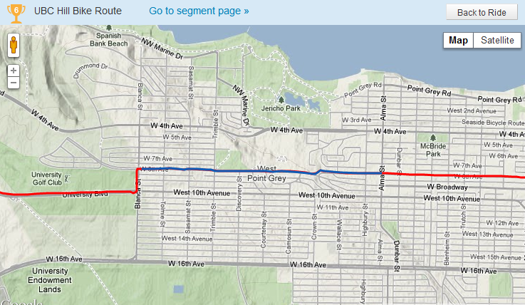
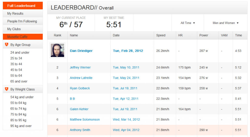
Last week while riding my road bike with a new friend, I was enlightened by a tale of a new website/app that allows you to upload GPS tracks of your running/cycling efforts and compare your results across specific segments with thousands of other users from your own neighbourhood and around the world. Here is an example of a especially challenging hill I climb on my daily commute from home to UBC – it is particularly rewarding to race 200 other people as I ride:

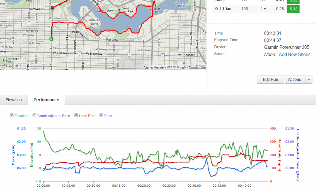
I am also very impressed by the other features for viewing your route, speed, elevation and heart rate all simultaneously. I have used other products before like Polar Protrainer, Garmin Training Centre, and MapMyRun/Ride but none come close to being this slick:

If you would like to learn more you can visit www.strava.com or visit my personal page here: http://app.strava.com/athletes/367619 and feel free to follow me or give me kudos!

Posted in Analysis, Cycling, Data Visualization, Fitness, GPS, Interactive, Social | Leave a comment

School Search BC

An quick interactive map showing the locations and contact details, enrollment by grade, and other information about all Public / Independent schools and StrongStart Centres in British Columbia, Canada. Note: Click on the icons at the bottom of the map to filter results. Data were obtained from the BC Ministry of Education

Click here for a full screen version.

Posted in Educational, Interactive, Maps | Leave a comment

Mapping Bicycle Accidents in Greater Vancouver

PLEASE NOTE THIS POST HAS NOW BEEN ARCHIVED AND UPDATED CONTENT CAN BE FOUND ON MY NEW BLOG HERE:

http://healthycitymaps.blogspot.ca/2014/05/Historic-bicycle-accidents.html

I found some very interesting open data a few days ago and I decided I had to map it. I have also been experimenting a lot over the past year with the kernal density functions of ArcGIS and with using deep zoom to map very detailed local data across large geographic areas. Click on the map to zoom right in and see streets with labels…I hope you enjoy playing with this!

This map was intended to be a first step in unpacking this data, and I am planning on creating a series of maps that will show all five years of data in sequence. I also have some preliminary summary charts that break this data down by year, by month, and by all cities in British Columbia. If you like you could subscribe to this blog to keep informed.

Please leave a comment below or send me a message on twitter to let me know what you think about this maps design, the accident data itself or using zoom.it as a map viewing platform. Let’s have a conversation about what has been done over the past five years and what still needs to be don’t to make Vancouver a safer city for cyclists like you and me!

Posted in Analysis, Cycling, Data Visualization, GIS, Interactive, Maps, Personal | 2 Comments

Mapping Population and Remoteness Patterns in BC

HELLO, PLEASE NOTE THIS SITE HAS BEEN ARCHIVED AND THE CONTENT HAS BEEN RE-POSTED ON MY NEW SITE HERE:

http://healthycitymaps.blogspot.com/2013/11/mapping-population-and-remoteness.html

——————————————————————————————-

I designed this poster template to complement HELP’s recently developed common look and feel. I then designed these two posters to present at the 4th international GEOMED Conference in Victoria BC. The first is a summary of my undergraduate honours thesis and the second is a summary of a recent project I have been working on with Jay at HELP. I would be happy to share either of the data sets (shapefiles) described in these posters – just send me a note on twitter @AnthonyNSmith.

Posted in GIS, Maps, Population, Posters, Remoteness | Leave a comment

Sexual Health Maps, Analysis and Poster Design

HELLO, PLEASE NOTE THIS SITE HAS BEEN ARCHIVED AND THE CONTENT HAS BEEN RE-POSTED ON MY NEW SITE HERE:

http://healthycitymaps.blogspot.com/2013/11/sexual-health-maps-analysis-and-poster.html

——————————————————————————————-

This is a project I worked on at HELP over the past year. I personally created each of these maps (and many more!), conducted this simple correlation analysis and then designed this poster that was presented at an international sexual health conference in Washington DC.

Posted in Analysis, GIS, Maps, Posters, Public Health, UBC | 1 Comment

Interactive Family Resource Map

HELLO, PLEASE NOTE THIS SITE HAS BEEN ARCHIVED AND THE CONTENT HAS BEEN RE-POSTED ON MY NEW SITE HERE:

http://healthycitymaps.blogspot.com/2013/11/mount-pleasant-family-asset-map.html

——————————————————————————————-

View Mount Pleasant Family Resource Map in a full screen map

Posted in Educational, Interactive, Maps, Public Health | Leave a comment

New Web-Based Map Delivery

During the day, I work at Human Early Learning Partnership as a Spatial Data Analyst and Cartographer. A large part of my teams work is producing provincial, regional, and neighbourhood scale maps of the state of early child development accross BC. For the past 10 years, this project has published PDF and PPT files for people to download, but this year we are now also hosting image files that can easily be viewed online without waiting for a download. Please take a look at this new delivery platform and submit any comments or questions that come to mind.

Posted in Data Visualization, Maps, UBC | 128 Comments

Now on Twitter

I have decided to focus more on the world of social media so I have created a new twitter account and am now devoting a half hour per day to oberserving and contributing to the twitter universe. Please follow me by clicking here and join the conversation!

Posted in Social | Leave a comment