‘WalkMap’ Preview

HELLO, PLEASE NOTE THIS SITE HAS BEEN ARCHIVED AND THE CONTENT HAS BEEN RE-POSTED ON MY NEW SITE HERE:

http://healthycitymaps.blogspot.ca/2013/10/walkmap-preview.html

——————————————————————————————-

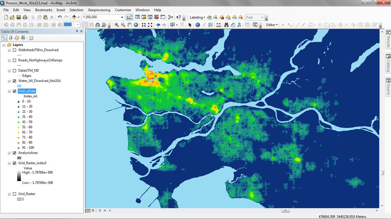
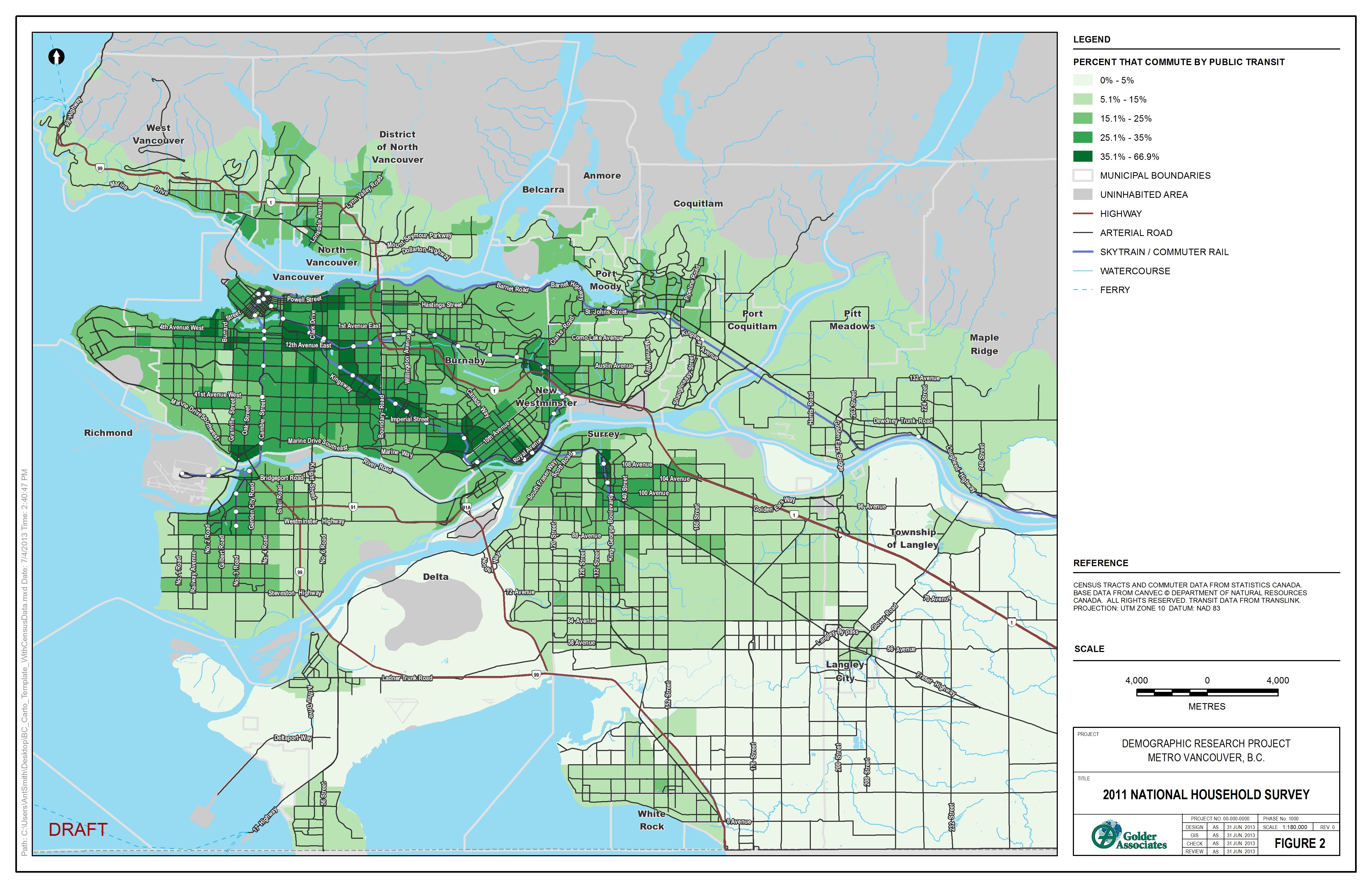
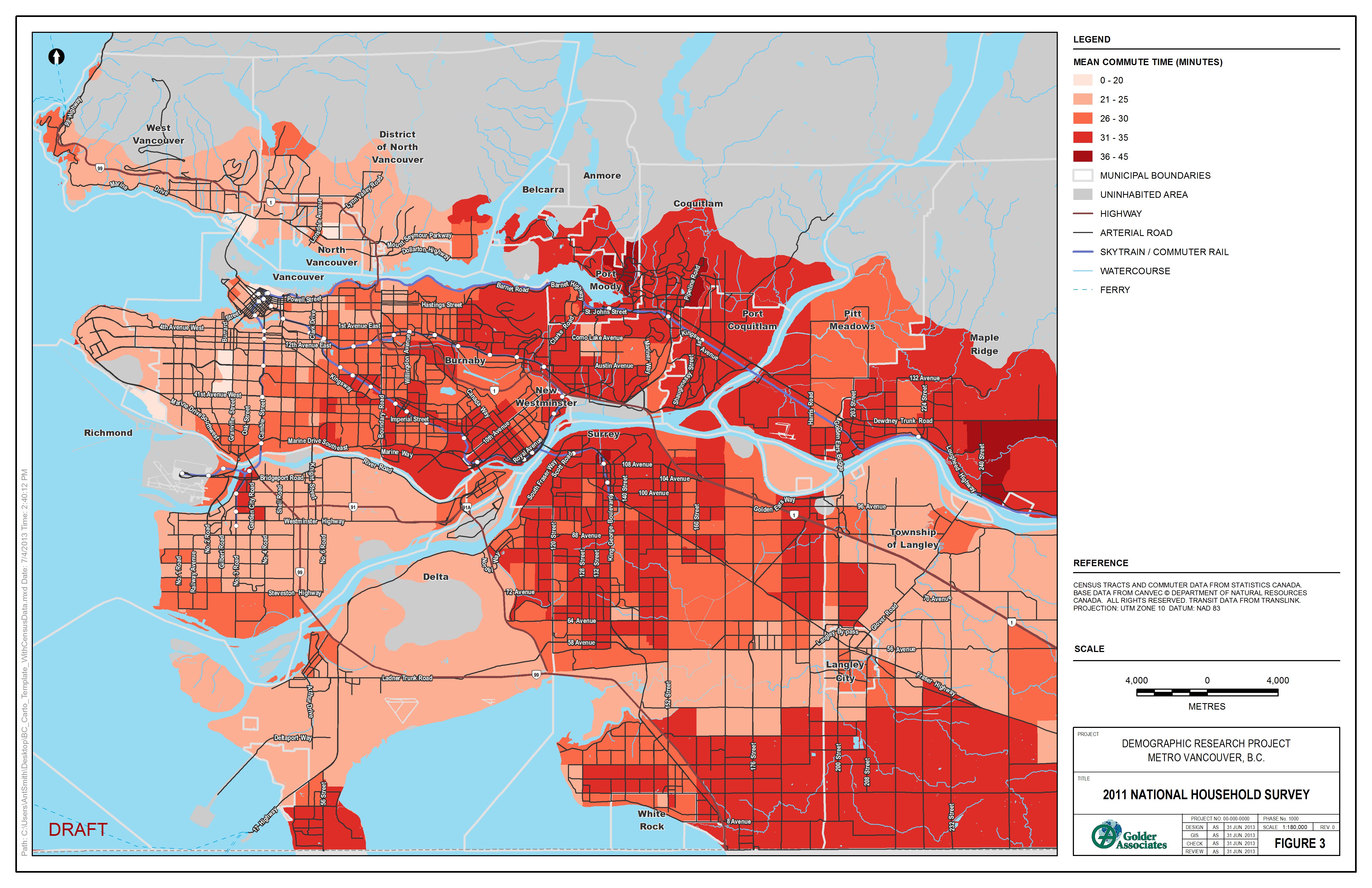
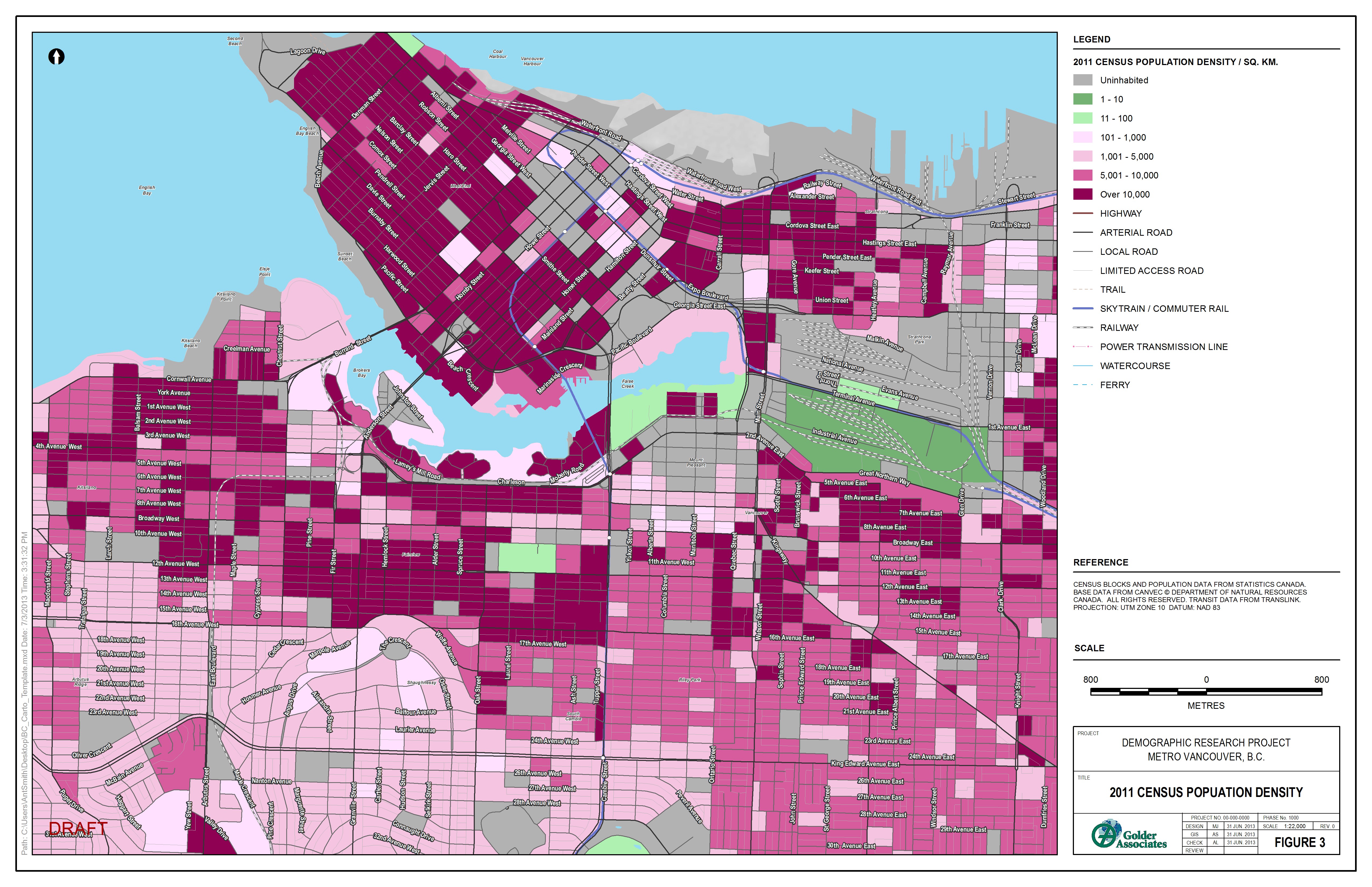
I am in the home stretch of creating a new open source walkability dataset I am calling “WalkMap” based on open data obtained from Open Street Map. The key benefit of using the OSM data is it includes all urban walking paths and trails in addition to main roads. I am currently refining the processing model for the Greater Vancouver area and hope to make this data available for all of Canada in the next few months. Currently Walkscore (TM) provides a great user interface but their data are fairly coarse-grained and very expensive to obtain. Therefore, my work is based on a unique 100m processing grid and I am planning to provide both the methodology and outputs via an open source licence.

My goal is to create one primary WalkMap Index, as well as specific measures of the following WalkMap components:

  1. Walkable Area – The total area you can access by walking 800m along a road or trail in every possible direction
  2. Connectivity – The density of street street intersections
  3. Destinations – The number of shops, cafes or other businesses within walking distance.
  4. Infrastructure – The number of crosswalks, benches, water fountains, and other pedestrian infrastructure.
  5. Nature – Proportion of the walkable area that is natural vegetation, recreation or park space.

I will also visualized my results on a simple mapping portal with cartography handled by MapBox, another exciting tool I am learning to use:

I have not designed a legend yet, but here is the basic story:

Green = More Walkable, Red =Less Walkable, No colour = Not Walkable

Please subscribe to this blog for future project updates or post a comment below.

Posted in Analysis, Fitness, Open Data, Public Health, Walking | Leave a comment

Elevation Contour Comparison

Which route would you prefer?

Here here is another way to look at the same two charts: http://picasion.com/i/1VKv3/

Long story short, I support a separated AAA bike route along Cornwall, because it is the most direct and flattest route from downtown and kits to various destinations further east such as Kitsilano and Jericho Beaches and UBC. I think the lost parking on Cornwall is justified by the increased cycling activity. This is also currently the most used cycling route in Kits as shown on the cycling density map below created using data from here:

All that said, any improvement is better then no improvement, so if the City of Vancouver can pass the current proposal 2A as outlined here and then build a seperated route in 4-8 years, that would make me happy too.

Posted in Cycling, Elevation, Fitness, GPS, Public Health | Leave a comment

Vancouver Community Gardens & Food Trees

HELLO, PLEASE NOTE THIS SITE HAS BEEN ARCHIVED AND THE CONTENT HAS BEEN RE-POSTED ON MY NEW SITE HERE:

http://healthycitymaps.blogspot.com/2013/11/vancouver-community-gardens-food-trees.html

——————————————————————————————-


This interactive map shows the locations and attributes of community gardens and food trees in the City of Vancouver. While these community food assets are located within city boundaries, and some on City of Vancouver and Park Board lands, the vast majority of these locations are not administered by the CoV. This dataset was downloaded from the City of Vancouver’s Open Data Portal on July 15, 2012.

Please remember that lots of love and hard work goes into growing food so please do not remove food from a community garden plot without permission from the owner! I am a member of Cypress Community Garden and we were very sad to loose some rhubarb last month. If you would like to learn more about locally grown food, just ask…in my experience most gardeners are happy to talk about their crop and might even be willing to offer you a taste!

CLICK HERE FOR FULLSCREEN MAP


Posted in Data Visualization, Environment, Food, Interactive, Open Data, Public Health | 8 Comments

2011 Commuter Patterns in Metro Vancouver

HELLO, PLEASE NOTE THIS SITE HAS BEEN ARCHIVED AND THE CONTENT HAS BEEN RE-POSTED ON MY NEW SITE HERE:

http://healthycitymaps.blogspot.com/2013/11/CommutingData.html

————————————————————————————————–

Percent that Commute by Bicycle

Percent that Commute by Public Transportation

Mean Commute Time (new survey question added to 2011 NHS!)

Posted in Cycling, Data Visualization, Maps, Open Data, Public Health | Leave a comment

2011 Census Population Density at Three Scales in Vancouver

HELLO, PLEASE NOTE THIS SITE HAS BEEN ARCHIVED AND THE CONTENT HAS BEEN RE-POSTED ON MY NEW SITE HERE:

http://healthycitymaps.blogspot.com/2013/11/2011-census-population-density-at-three.html

——————————————————————————————-

What do you notice looking at these maps? Add a comment below…

Posted in Analysis, Data Visualization, Open Data, Population | 2 Comments

Pecha Kucha Presentation: Mapping Healthy Built Environments

HELLO, PLEASE NOTE THIS SITE HAS BEEN ARCHIVED AND THE CONTENT HAS BEEN RE-POSTED ON MY NEW SITE HERE:

http://healthycitymaps.blogspot.com/2013/11/pecha-kucha-presentation-mapping.html

——————————————————————————————-

I am very grateful for having had the opportunity deliver a Pecha Kucha presentation at the British Columbia Society of Landscape Architects Annual Conference called ‘Depth of Field’. My goal for this presentation was to convey my love for maps and my belief that GIS should be utilized more widely in the practice of landscape architecture to analyze multiple scales and layers of context surrounding site-specific work. I illustrated my talk with many maps I created at the Human Early Learning Partnership and other exploratory projects I created out of personal interest. Please post below the video if you have any questions or comments!

YouTube Preview Image
Posted in Cycling, Data Visualization, Environment, Fitness, Immigration, Maps, Personal, Public Health, Video | Leave a comment

Value of All City of Vancouver Awarded Contracts

Here is a details of all contracts issued by the City of Vancouver in 2012. I downloaded this data from the Vancouver’s Open Data site. There are also additional rows about bids that were not selected and several additional contracts that are conspicuously missing any dollar values. Please zoom in for more detail…

Posted in Data Visualization, Open Data | 3 Comments

Spatial Disparities and Travel to Abortion Clinics in Canada

HELLO, PLEASE NOTE THIS SITE HAS BEEN ARCHIVED AND THE CONTENT HAS BEEN RE-POSTED ON MY NEW SITE HERE:

http://healthycitymaps.blogspot.com/2013/11/spatial-disparities-and-travel-to.html

——————————————————————————————-
A few years ago I created a package of very interesting maps under contract to the University of Ottawa. The research question was simple: how far do women travel to access abortion services in Canada? The data had been collected using a voluntary survey in partnership with several clinics across the country and each women had recorded home postal code or city name. My job was to match up the origins and destinations, aggregate the data to protect individuals privacy, and analyze the socioeconomic patterns in the data.

These maps have now been published in the Women’s Studies International Forum. Here is one map from the paper.

I also created several detailed regional views featuring proportional symbols to illustrate the number of women travelling from each origin census subdivision.

The full paper abstract is below:

Access to abortion services is uneven throughout Canada. As a result, women cross provincial and territorial borders to garner access to abortion services. In this first-time study, the travel women undertake to access abortion services at freestanding clinics across the country was systematically tracked, mapped, and analyzed using questionnaire-based data. A total of 1186 women from 17 freestanding abortion clinics provided information about their journeys. The mapped data reflect the acknowledged importance of the “spatial turn” in the health sciences and provide a graphic illustration of spatial disparities in abortion access in Canada, namely: 1) the paucity of services outside urban centers; 2) the existence of substantial access gaps, particularly for women living in Atlantic, Northern and coastal communities; 3) the burdensome costs of travel and, in some cases, the costs of the abortion procedure itself, especially for younger women who travel the farthest; 4) the unique challenges First Nations and Métis women face in accessing abortion services.

Posted in Analysis, Data Visualization, Public Health | 2 Comments

Healthy City Maps

HELLO, PLEASE NOTE THIS SITE HAS BEEN ARCHIVED AND THE CONTENT HAS BEEN RE-POSTED ON MY NEW SITE HERE:

http://healthycitymaps.blogspot.com/2013/11/physical-activity-mapping-with-strave.html

——————————————————————————————-

This post explores two new experimental maps I created after browsing the City of Vancouver (CoV) Open Data site and reviewing my archive of GPS data from workouts over the past year. What do these two topics have in common you may ask? Both contain spatial data about WHERE people become healthier, indoors and out.

I recently discovered the CoV publishes all current business licence information and for some reason my first thought was “I wonder where all the yoga studios are!” After further inspection, I realized it was very difficult to tease apart yoga only studios from all other types of fitness facilities. So I opted to include all ‘Fitness Center’ records based on the business category, and all records containing the word ‘yoga’ in the Studio, and Instruction Business categories. The resulting selection contained 399 unique locations, that I was able to map with the X/Y coordinates provided in WGS1984 format. After re-projecting to UTM Zone 11, I used a kernel density function to calculate the point density within a 500m bandwidth. After some careful cartography, I am happy to share my first new map:

My second new map was over one year in the making, that is because I have been collecting about 80% of my running and cycling activities using a Garmin Forerunner 405. I usually do this to track my total workout distance, pace, elevation gain, and interval times, but this was a nice way to get some value added out of the data.

First of all, I downloaded the 77 workouts from the Garmin Connect website as individual .KML files. I then used Google Earth to bundle these all into a single .KMZ. This trick saved me a lot of work over importing each .GPX file directly from my watch and converting them one by one to shapefiles. After importing the .KMZ file to ArcMap, I simply converted the KMZ. to a new projected the line file in a geodatabase. Finally, I proceeded to run a kernel density function with a 100m bandwidth as shown below:

As you can see I tend to run around the False Creek and Stanley Park seawalls while my cycling adventures are more diverse. I may be the first to have done this type of route mapping in Vancouver; however, there is also a great example using Nike+ data in New York City that I discovered after designing my map. I would love to get access to a large data-set like MapMyRun.com and create a running density map for the whole city. Please let me know if you have done any thing like this or have seen other great examples online?

Posted in Analysis, Cycling, Data Visualization, Fitness, GPS, Maps, Personal, Public Health | 4 Comments

Rooming Houses in the DTES of Vancouver

I was reading an article called “Vancouver hotels that house the poor to get $144 million in renovations” and I wanted to know where the properties are located… So I made the following map using Google Fusion Tables. This is a great free way to geocode and display any address information with only a few basic steps. If you have some address data you want mapped, contact me for some tips on using this method : )

I was shocked they are spending this amount of money ($1100 per square foot!) to simply renovate these buildings when they can spend less and rebuild them. However, I definitely understand it is a tough situation as there is nowhere to move the residents if they were to rebuild. I am also happy the heritage value of the properties will be maintained. What do you think they should do with these properties?

Posted in Data Visualization, Interactive, Maps, Public Health, Social | 1 Comment