HELLO, PLEASE NOTE THIS SITE HAS BEEN ARCHIVED AND THE CONTENT HAS BEEN RE-POSTED ON MY NEW SITE HERE:
http://healthycitymaps.blogspot.com/2013/11/physical-activity-mapping-with-strave.html
——————————————————————————————-
This post explores two new experimental maps I created after browsing the City of Vancouver (CoV) Open Data site and reviewing my archive of GPS data from workouts over the past year. What do these two topics have in common you may ask? Both contain spatial data about WHERE people become healthier, indoors and out.
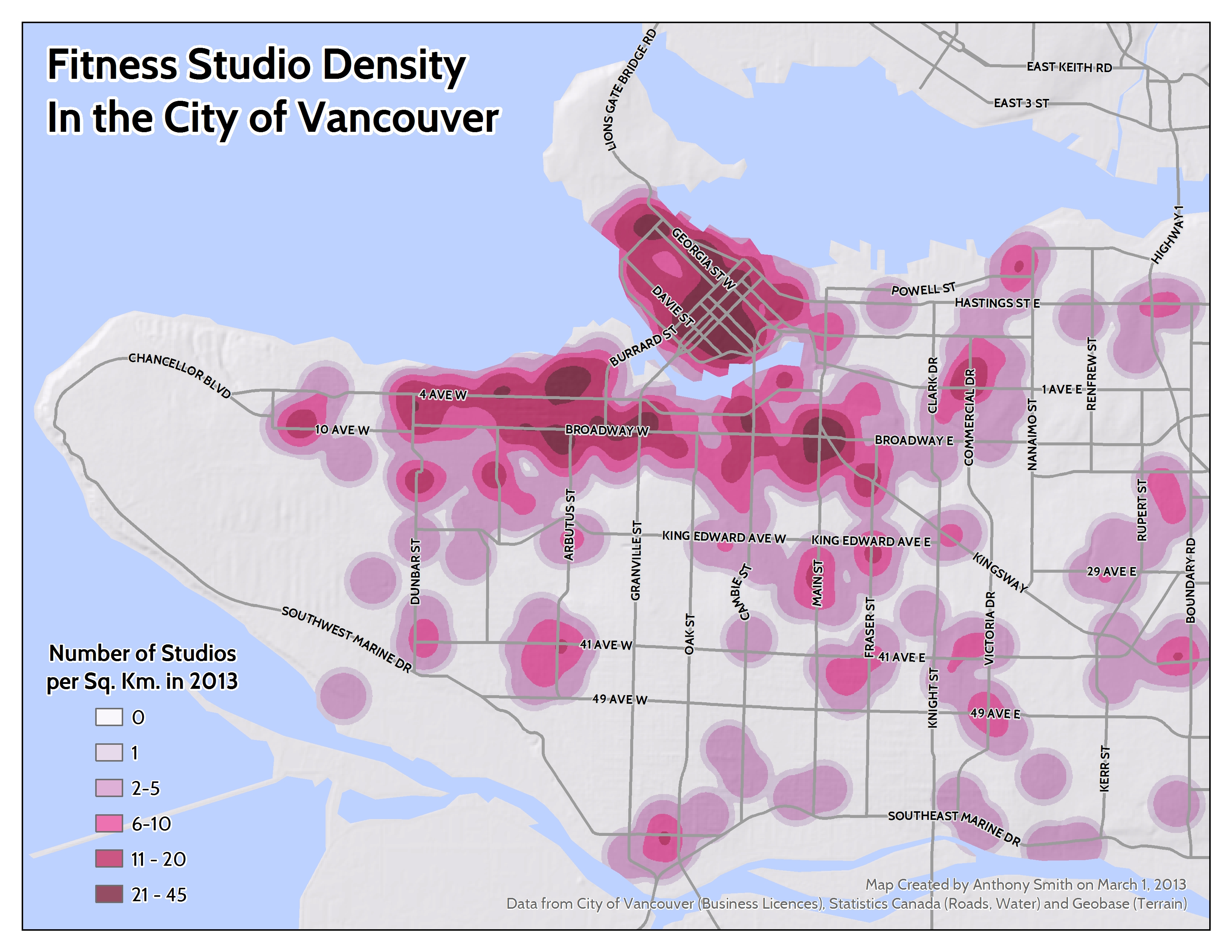
I recently discovered the CoV publishes all current business licence information and for some reason my first thought was “I wonder where all the yoga studios are!” After further inspection, I realized it was very difficult to tease apart yoga only studios from all other types of fitness facilities. So I opted to include all ‘Fitness Center’ records based on the business category, and all records containing the word ‘yoga’ in the Studio, and Instruction Business categories. The resulting selection contained 399 unique locations, that I was able to map with the X/Y coordinates provided in WGS1984 format. After re-projecting to UTM Zone 11, I used a kernel density function to calculate the point density within a 500m bandwidth. After some careful cartography, I am happy to share my first new map:
My second new map was over one year in the making, that is because I have been collecting about 80% of my running and cycling activities using a Garmin Forerunner 405. I usually do this to track my total workout distance, pace, elevation gain, and interval times, but this was a nice way to get some value added out of the data.
First of all, I downloaded the 77 workouts from the Garmin Connect website as individual .KML files. I then used Google Earth to bundle these all into a single .KMZ. This trick saved me a lot of work over importing each .GPX file directly from my watch and converting them one by one to shapefiles. After importing the .KMZ file to ArcMap, I simply converted the KMZ. to a new projected the line file in a geodatabase. Finally, I proceeded to run a kernel density function with a 100m bandwidth as shown below:

As you can see I tend to run around the False Creek and Stanley Park seawalls while my cycling adventures are more diverse. I may be the first to have done this type of route mapping in Vancouver; however, there is also a great example using Nike+ data in New York City that I discovered after designing my map. I would love to get access to a large data-set like MapMyRun.com and create a running density map for the whole city. Please let me know if you have done any thing like this or have seen other great examples online?

How do you make such maps? Do you use any special gps softwares like Garmin?
Hi,
I’m an instructor at Langara College – I’m teaching Recreation Facilities Systems Management in the fall semester.
I was wondering if I could use your Fitness Studio Density map as part of my lecture slides. I’m teaching them about GIS and it’s applications in a recreation setting. They don’t have a geography background, so I was looking for some applied examples of what happens when geography meets recreation.
Hello Yes I would be very happy if you use any of my maps for academic purposes. Please just cite me as @HealthyCityMaps from twitter. Thanks! Anthony.
I use a combination of many software tools, but mostly ArcGIS from ESRI.