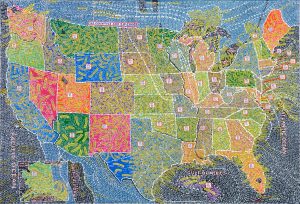
Paint one pixel. Wait 5 minutes. Paint another.
http://knowyourmeme.com/memes/events/rplace
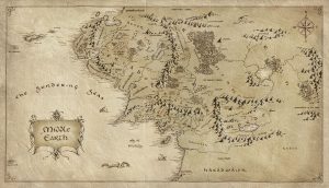
An interesting case study of how maps can generate a very realistic atmosphere within a fantastical world. The use of scale, direction, denoting mountain ranges and other sleight topography, as well as annotation all help add to the realism of this fantastic dream-made world.
Image from: http://www.majorindependence.com/map-of-middle-earth-lotr/map-of-middle-earth-lotr-10-middle-earth-map-lord-the-rings/
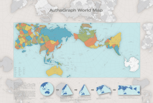
This past year the “Authagraph projection” projection map won the Good Design Award in Japan. This type of map provides significantly less distortion than the Mercator projection, and works by splitting up the earth’s surface into 96 triangulations. This type of mapping has been used in Japanese textbooks for over a decade, and was invented by Hajime Narukawa in 1999.
The most striking differences in the the Authagraph projection compared to the Mercator is the size of Africa (which is actually much larger than North America), and the apparently meager sizes of both Greenland and Antarctica.
In addition to its increased accuracy, the Authagraph projection won the award for its series of constructible maps that can be formed into cones or spheres.
Still, the map appears to possess some limitations; namely the distortion and decreased legibility of the lines of latitude and longitude, which bend and run of the boundaries of the page. Can anyone else think of limitations with the Authagraph projection? Do you believe it will be (or should be) adopted for widespread use beyond Japan?
Further reading:
‘A More Accurate World Map Wins Prestigious Japanese Design Award’ (2016)
I am interested in the mapping in bottom up approach. Using human as sensors can always recall the forgotten substances which are in fact existing but become invisible due to the limited information and access, or absence of interest of the top-down mapping group. I will keep on looking for more various ways of bottom-up mapping.
Human as sensors :”Recently a great deal of attention has been devoted to the concept of sensor networks. The observational objectives of Earth science, as well as the objectives of security and surveillance, can be addressed at least in part by the installation of networks of sensors across the geographic landscape. Commonly cited examples include the network of video monitors in many major cities, proposals to instrument the ocean and seabed with sensors in the interests of science and early warning of tsunamis, and networks of traffic sensors that can provide useful information to planners, as well as realtime pictures of congestion.”
“Goodchild Michael F., “Citizens as sensors: The World of Volunteered Geography”, GeoJournal (2007):211- 221, acccessed May 17, 2017, doi:10.1007/s10708-007-9111.”
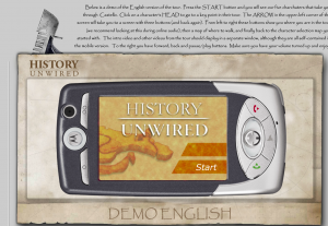
History Unwired is a walking tour through one of Venice’s more hidden neighborhoods, delivered over location-aware, multimedia phones and PDAs. Developed in 2005, this project was a first-ever mix of mobile video, animation, audio, and bluetooth locative technologies in the tourism sector. The tour takes visitors around the neighborhood of Castello, guided by the voices of Venetian citizens who depict a particularly local experience of art and craft, history and folklore, public and private spaces.
In this book, Jane Wolff hand draws images on cards to map, describe and analyze the California Delta. See article for more info.
[aesop_document type=”pdf” src=”https://blogs.ubc.ca/2017mappingtheinvisible/files/2017/05/delta-primer-a-field-guide-to-the-california-delta.pdf” caption=”A review of the book by Mark Anderson”]
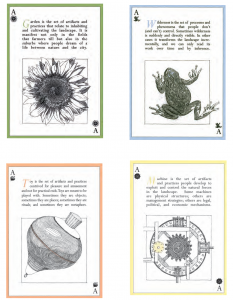
If anyone has a copy of Jane Wolff’s book, I would like to borrow it.
In an interesting use of mapping technology, Arcade Fire created an interactive music video with Google Maps that transports you to the town you grew up in.
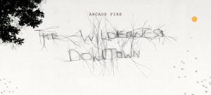
“Choreographed windows, interactive flocking, custom rendered maps, real-time compositing, procedural drawing, 3D canvas rendering… this Chrome Experiment has them all. “The Wilderness Downtown” is an interactive interpretation of Arcade Fire’s song “We Used To Wait” and was built entirely with the latest open web technologies, including HTML5 video, audio, and canvas.” (chromeexperiments.com)
Created in 2010 and directed by Chris Milk.
Click the link below, enter your home town and experience the experimental production:
http://www.thewildernessdowntown.com/
(Its recommended you watch the video with Google Chrome)
[aesop_image img=”http://wpmedia.vancouversun.com/2017/05/vancouver-bc-may-18-2017-sam-greers-map-at-all-nations.jpeg” credit=” Arlen Redekop / PNG | Source: http://wpmedia.vancouversun.com/2017/05/vancouver-bc-may-18-2017-sam-greers-map-at-all-nations.jpeg” align=”center” lightbox=”on” caption=”Mapping used as a means to lay claim to land.” captionposition=”left” revealfx=”off”]
A (true) story in our own back yard of a man and a map and some lies and some land. And also proof that if you hang onto old maps you can make good $.
A little sneak peak:
The CPR tried to put a rail line and telegraph poles through Greer’s claim, but he tore up the rail ties and cut down the poles. The railway retaliated by tearing his house down when he was away, twice.
Hilarity ensues at The Vancouver Sun.
[aesop_map sticky=”right”]
This amazing work of animated graphical score captures multiple dimensions: rhythm, pitch, volume, instrument, and tone quality. The work translated one of the greatest and most complex pieces of the modern musical history: Stravinsky’s Rite of Spring. In the description blow, the author thoroughly explained the idea, method, and program used in the translating process.
An interesting read about how the Athabasca-Mackenzie River Basin was photographed and documented. What are the implications of this form of mapping? Could the way this area was mapped have lead to the rise of the resource exploitation of the Alberta tarsands (which this area is now known for)?
http://www.aupress.ca/books/120176/ebook/04_Finkel_et_al_2010-West_and_Beyond.pdf