For the online digital storytelling course called DS106, week 3 (last week) was all about telling stories in photos. I managed to do one of the assignments for that week, just yesterday: a photoblitzing safari. For this assignment, one has 15 minutes to take pictures, trying to fit as many of the following categories as one can:
- Take a photo dominated by a single color.
- Take a photo of an interesting shadow.
- Take a photo of something futuristic.
- Take a photo at an unusual angle, e.g. looking looking up at something or looking down at something, or from the view of an ant.
- Take a photo into bright light.
- Take a photo of someone else’s shoe or foot.
- Make an inanimate object look alive.
- Make a photo that uses converging lines to draw us into the photo
- Take a photo of two things that do not belong together.
- Take a photo that shows a repeating pattern.
- Take a photo where you move the camera as you take the photo, so it gives the subject a suggestion of motion.
- Take a photo that is looking through a frame or opening to something else.
- Take a photo that represents joy.
- Make a photo that is abstract, that would make someone ask, “Is that a photograph?”
- Take a photo that represents a metaphor for complexity.
I did a similar kind of photoblitz about six months ago, for the Headless version of ds106 that ran in the Fall of 2013. Here’s my post on that one on Tumblr. Most of my ds106 stuff is on that Tumblelog, but this time I wanted to do it on a Word Press site so I could take advantage of something else I learned from this week’s ds106 assignments: creating a gallery of images in Word Press. These instructions from Word Press work a bit differently than what I had to do here on this blog, because this one has an extra step when uploading media, during which one has to avow that what one is uploading doesn’t violate copyright. But I figured out how to do a gallery nevertheless.
So here it is …
- End time
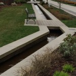
- Repeating pattern and converging lines
- Colour and complexity
- Repeating pattern?
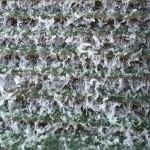
- Abstract (and also complexity)
- One colour
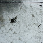
- From below
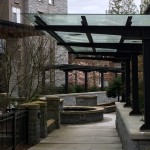
- Double frame
- They sort of belong together, sort of not.
- Converging lines
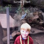
- Start time
Now, it looked fine until I realized I didn’t have the right version of one of the photos, and when I changed it out the whole gallery went into reverse order (the “end time” photo is at the beginning and the “start time” at the end). Now, no matter what I do, no matter whether I say “ascending” or “descending” order, it won’t change the order. There seem to be little boxes where I could put numbers in to force the order, but I don’t seem to be able to type into those boxes. So now I’m stuck with this order unless I delete the whole gallery and start over (which is not an option at this point, given that actually creating the gallery was not terribly straightforward and I might have to re-upload all the images).
So while this might work very well on WordPress.com blogs, on UBC Blogs it’s not working very well. Alas. I also can’t seem to control the fact that all one can see are thumbnails until clicking on the images; this is the only option I have for a gallery on this blog; there are more options for WordPress.com blogs.
Thoughts on these images
I went to about the same place where I did my photoblitz last Fall, not because I thought it was the best place, but because it is on the way to and from my home to work (yes, I work on Sundays too!), and it has the most variety of things. I tried a different place on my walk home, but as I was looking around there just wasn’t that much in the way of variety of things, patterns, colours, etc.
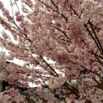
The light was not great (again, just like last Fall). It was cloudy rather than sunny, so I couldn’t get bright light or shadows–whaddya want, it’s Vancouver. I kept all the photos just as they came out on my phone, except the one of the tree with pink and white blossoms. It was just so utterly dull without a little apping up; all I did was play around a bit with iPhoto on my computer, adjusting things like exposure, contrast and saturation.
The “From below” image was taken under one of the frames in the “Double frame” image. I was going for something like the rule of thirds, with the top line at the top third and the leaf on the left third, but the top line is a little too high. Still, I think that (with the caveat of the crappy light), that’s kind of a nice image. We have lots of awnings made of glass here in Vancouver that get all dirty from the rain and debris from trees, and they look kind of yucky. But this image made it look less yucky and more kind of interesting, possibly abstract.
The picture of the daffodil was supposed to be one dominated by a single colour, not just b/c the flower takes up so much of the frame, but also because it is such a bright and vibrant colour. I didn’t have to mess around with any settings on that one; it’s just how it came out on my phone. Not the best closeup image by far, but not bad for an iPhone. There’s even a little bokeh in the background!
My “abstract” photo was of a waterfall. It didn’t come out quite as abstract as I wanted; you can still tell pretty easily that it’s a photograph, and one that is blurry where the water is moving. It looked cool when I took the photo, but not as great when it came out on the computer. Part of the problem is that whenever I zoom in with my phone, the image comes out blurry and pixellated a bit. I needed to have a real camera with me to do this image well. It also represents complexity, as fluid dynamics is extremely complex!
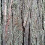
The first repeating pattern image is not really all that repeating–I just thought the bark looked interesting, with the lichen on it. I think this is a cedar tree of some kind.
My second colour and complexity image, the one I adjusted a bit in iPhoto, looks closer to what these flowers look like in good light (not in cloudy light). It’s also an image of complexity, given how branches buds grow (fractals and such).
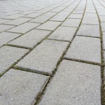
With the last repeating pattern image, I liked how the lines curved in the foreground and then started converging in the background. There isn’t as much convergence as I wanted in the background, though.
Of all these images, I think I like the “From below” one best. It is just the most interesting image, to me, visually. It’s not that easy to tell what it is, why there’s a leaf in it. And it’s close to the rule of thirds, just not quite!
Concluding thoughts
I really like doing these photoblitzes–they are challenging but fun, and they definitely get you to pay close attention to your surroundings in a way you wouldn’t do before. I found myself looking at lampposts and rubbish bins to see if any angle on them might lead to an image of something “futuristic,” for example (didn’t come up with anything), or whether any inanimate object around me could be photographed in a way that made it look alive (again, nothing). I played around with moving my phone while taking a picture to simulate motion (didn’t work), and I was looking for converging lines, repeating patters, and complexity all over!
I’ve decided that it’s definitely time for me to take #phonar and finally get my photography skills in better shape. Looks like the next one isn’t until Sept/Oct 2014, though, when I’ll be super busy with teaching again. Sigh.

