Quick Case Studies #1: Preventing Millennials From Chegg-ing Out
Category: HR | Who: Chegg Inc., an online textbook-rental service based in Silicon Valley.
Problem: Employers are in high demand of millennials, but millennials also have their own high demands. In addition, baby boomers are retiring. Employers are trying to replace them with millennials, but have been encountering high turnover rates. How can they attract and attain the young generation emerging into the job market?
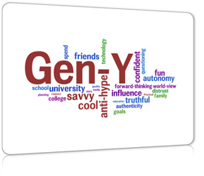
Analysis: Gen Y’s are ” tech-savvy, racially diverse, socially interconnected and collaborative.” They have high demands themselves – they want good working hours, they want additional benefits, they want to be heard, they want to contribute something useful, and they really want to like their jobs.
Solution: Chegg “eliminated some middle-management positions to give younger hires more exposure to projects, and they introduced an unlimited paid vacation policy. He said no one has abused that policy.” Another company, Aprimo, guaranteed “recent college graduates a promotion within one year, assuming performance is up to par.”
Results: For Chegg, “the annual turnover rate among millennials has since fallen by 50% each year for the last two years.” As for Aprimo, “100% of participants have received a promotion and salary bump,” not to mention “helped double the share of millennials at the 1,200-person company to roughly 20%.”
Personal Learnings, Comments, and Recommendations: To retain millennials and not upset their seniors, unique incentives should be implemented but not without strategy. It is important to effectively and clearly negotiate to all employees to make sure no group feels segregated or mistreated because of new policies or incentives that they are not receiving. How? I would dive back down to assess the basics of human nature starting from McClelland’s Human Motivation Theory and Sirota’s Three-Factor Theory and then make executive decisions on what incentives to implement after:
Millennials
Achievement (more dominant): They want to feel like they are contributing, and they want to receive active feedback for how they are doing. They are motivated by challenge and the chance to fully use their talents. They like being directed with goals, and want their jobs to be non-routine. Affiliation: Millennials were brought up in a diverse and collaborative environment, so they are comfortable. At the same time, millennials prefer change and a little risk. They are more likely to hop companies and try new things. Power: They look for opportunities for growth and, well let’s be honest, more money to buy their iPhone 5’s and ultrabooks. |
Baby Boomers
Achievement: Baby boomers have more years in the field, and thus they tend to follow the system for feedback.They have good work ethic and are alright with routine. Affiliation: They tend to be more independent, and would likely would find motivation in passing on their knowledge and exemplifying their skills to the younger, arrogant generation who couldn’t properly wear a suit if their lives depended on it. Power (more dominant): They want to feel important and respected, and could feel threatened when they feel as if their seniority is not being enforced. They are more likely to enjoy a bit of competition and are quite good at communicating their needs. |
Both
Equity/fairness: At the same time that millennials should be able to receive incentives, baby boomers must not be neglected because ultimately, “they were there first.” They want to ensure job security. Achievement: In that sense, incentive programs that could promote/motivate millennials should be countered with programs to recognize seniors. Boomers want to know that their wages are still relatively competitive. Camaraderie: Of course, the best case scenario is that the two generations get along. This will help increase employee morale and productivity. |
It’s really interesting to read about the actual trends in employee attraction and retention as I prepare to emerge into the job market as a Gen Y myself. How fast will the market change in 2 years?
—
About Quick Cases:
In order to train my critical thinking and analysis skills, I have decided to blog about case studies at least twice a week. The ultimate challenge? Complete each one within an hour. I will summarize the case and comment on any ideas I absolutely loved, or anything I would have done differently. Stay tuned for another!
—
Update:
Just came across another case study talking about youth unemployment and Benetton’s solution: the “Unemployee of the Year” campaign. Interesting read!
My Top 5 Most Anticipated New Touchscreen Laptops of 2012
On a crazy new hunt to find a new personal laptop, I have been roaming the tech forums. According Computex reports, the trend this year is a series of hybrid, multi-purpose Windows 8 laptops that boast of their light weight, long battery life, and high processing power. I personally believe that, with the rise of Windows 8, the trend for computers in the future will move towards not just touch screen now, but towards “All-In-One” – screens not restricted to phone/tablet/laptop that allow multiple inputs (fingers, palms, pens) by multiple users at a time, allowing more use for the laptop. The new Microsoft Office was an upgrade long overdue, and it will be the perfect finishing touch.
1. ASUS Taichi
I first saw this laptop on Tech2’s post. After some intense Googling, I came across Engadget’s photos and reviews of the beast.
- Two screens (one of which is a touchscreen), both LED backlit, IPS panels with Full HD resolution
- tablet when notebook is closed, but apparently Asus claims you can use both screens at the same time
- lightweight, offered in 11.6-inch and 13.3-inch
- Intel’s 3rd Generation Ivy Bridge CPUs
- matte silver and black interior, backlit keyboard
- SSD
2. Samsung Series 5 and 7 Hybrid PC
I have personally never been a fan of any Korean electronic product for their constant poor quality and short life span, but I’m trying to be hopeful about this hybrid PC for its pen integration. Crossing my fingers that it will not be laggy. This is supposed to be a Transformer-style tablet PC with a S-Pen (yes, like the ones from Galaxy Note).
So this doesn’t officially count as a tablet PC, but its amazing specs and functionality have rendered it onto my consideration list. The difference with this compared to other tablets, regardless of Android or iOS, is that besides Windows RTS, it will also offer Windows 8 Pro, which means that it should have capabilities comparable to a laptop. With a quad core and up to 128GB of internal storage, it should be an extremely amazing student companion device. It is set to release October 26, 2012.
What astounds me is ASUS’s ability to dual boot Android and Windows 8 on a tablet. Surprisingly, this device is neither laptop nor tablet; it is a giant 18.4 inch desktop.
A beautiful, sexy and sleek laptop that duals as a tablet! Good thing they offer it in 13.3 inch models, as tablets are usually 10-some-odd inches. Not many specs have been released about this laptop yet, but it looks very promising. However, as ultrabooks as this usually use SSD, I am gauging prices to be expensive even for 128 GB. Still better than 32GB on a tablet though!
That’s it for now. I’m sure there will be more as the time goes on, but I am very excited to see how this trend progresses. Perhaps I’ll make an update entry!
Will.i.am Revives Vinyl Records
“Even in media, sometimes an old idea is worth revisiting. Budweiser’s latest campaign in Brazil is actually a collection of old ideas. Securing a high profile musician to front a campaign has been a standard advertising tool for many years, but when the combination fits, it works perfectly.” – Cream Global
Before I was even born in the early 90’s, vinyl records had disappeared from mainstream music. With our generation came the rise of car radios, CD walkmans, mp3 music players, iPods, iTouches, and eventually even smartphones.
Beer, as we all know and love, is the go-to drink for TV, sports, and the “occasional” game of beer pong. Budweiser, the Anheuser-Busch InBev brand, had a major challenge at hand. Their solution?
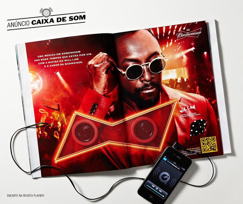
Budweiser made some music fusion in Brazil by promoting modern club music sensation Will.i.am through a hipster retro music format. They made a print ad that could be inserted into magazines as well as on a vinyl record player! The first use of such disposable vinyl records was actually in 1930, so it is nothing new… but the way that Budweiser used this technique added to the song’s exclusivity, helping both the singer debut his new song “Great Times” as well as helping the magazine sell out. Of course, Bud’s name also gained massive popularity during that time. Alternate versions of the ad were made into rudimentary speakers that you could plug smartphones into, as well as a scannable QR code for exclusive online access.
What a smart way to mash together something old and something new.
—
Hi Blog, it’s been a while. I hope to update you more often now.
University: A Foster Home for Innovative Ideas
“I remember Lego sets back in the day. There was a time when they did not come with a manual. ” – Eric Gales
Windows has been my technological companion from humongous gray blocks to paper thin laptops. I joined the Windows Campus Rep Program in November 2011, and was sent out to Toronto for training at Microsoft Headquarters with the other UBC Campus Reps. You can find me sitting cheerfully at the PC section (yes, it’s there and it coexists peacefully next to the Macs) in the UBC Bookstore.
On April 3rd, I was lucky enough to be a part of the Microsoft Round Table Discussion with Microsoft Canada President, Eric Gales, and Associate Dean Murali Chandrashekaran from the Sauder School of Business at UBC. Eric was such a pleasure to listen to, and even more engaging to talk to. The event was even published on the front page of the Business Section in the Vancouver Sun!
In the discussion, the three topics of discussion were:
• What students need to be doing to set themselves up for success in the workforce
• Why students need to be more risk-tolerant and curious in order to establish and build career success
• How students can leverage technology to be more innovative, efficient and productive than the competition
I found that the main takeaways from the discussion, however, were of a slightly different focus. If I could summarize the talk in a nutshell, I would say the three main points were rather:
• What is innovation?
• What are entrepreneurs?
• How can students find innovation and help society?
What is innovation?
What is innovation? Innovation isn’t all about “designing that new break-through product” or “making the next, crazy do-all portable device.” Eric defines innovation as: “Doing something in a new way.” Continuing on this concept, Social Innovation BC defines it in their discussion paper about social entrepeneurship as “seeing things differently and imagining that which could be. It is about asking questions of ourselves and our institutions and wondering whether we can do better.”
Innovation is looking at a mug and seeing a coathanger. Innovation is making things larger than life. Innovation is making reality into illusion. Innovation is figuring out how two things can fit hand in hand.
What are entrepreneurs?
Entrepreneurs are people who convert ideas into action. They see through risk and put weight into rewards. They know their views, but do not hold a heavy bias so that they can openly disagree with themselves if they see fit. They are business leaders that attract ideas. And most importantly, they are not alone. Innovation is all about a cumulative; language exists for a reason, and that is for humanity to record, communicate, share and combine these ideas into a collective pool of information, and entrepreneurs think of ways to mold something out of them.
Business leaders: idea attraction: how to capture, cultivate and action: capture system? come from people closest to action
How can students find innovation and help society?
The problem in Canada, specifically, was identified in the discussion to be a large productivity gap and slower rates of adoption in technology in Canada. The reasons mentioned were perhaps the lack of competition, having all the tools for execution but not actually executing, an ineffective capture system for innovative ideas… the list goes on. To foster an innovative environment, we can start from university. We don’t really have issues with generating ideas, but more of what to do once you have one.
As an aspiring entrepreneur, the discussion really inspired me to stop being afraid of taking that first step or of making mistakes, because the biggest difference between people who dream big and people who breathe life into their big dreams is action. Eric commented that it is a “dog eat dog world,” but that should not be discouraging as long as you come into the world prepared. Be prepared to believe that there is a better way, as he put it. Be prepared to be wrong, but have the inner confidence to challenge yourself. Be prepared to invest your thoughts in the benefits for motivation, instead of fearing the risks.
We’re young, and it’s a good time to make mistakes. Bill Gates one said, “At Microsoft there are lots of brilliant ideas but the image is that they all come from the top — I’m afraid that’s not quite right.” There will be many people with more years (and experience) than you, but you have the advantage of coming from the source, closest to action. I am discovering so many wonderful opportunities in Sauder alone in terms of clubs, events, workshops and courses, and from what I hear, there will be an additional project-based course in development. Your university is one of the biggest foster homes for innovation, so make use of what’s available to you. It’s time for us to take charge, take risks, and take a chance.
Are you ready to be the change?
Business Cards: The Brand in Your Hand
A student’s guide to the business card design and printing process.
First of all, I want to follow up on my previous blogpost. I find it fascinating that within days after publishing it, I already received comments from web surfers as well as peers, and even an employee from a business I blogged about. Businesses are constantly monitoring social media just as often as consumers follow businesses. Tiffany Pai’s blog explores such effects of web presence and specifically its impact on the consumer population. It is evident that establishing a strong web presence is important, but we mustn’t forget personal branding in the “physical” world as well.
‘Tis the season for personal branding. Business cards are every Sauder student’s quintessential must-have tool, and with the profusion of great networking events in the New Year from Style in the City 2012 and BizzComm to NIBC and Enterprize, this winter break is the perfect time to brainstorm, design, and print your own business cards.
As a design and networking addict, the Sauder business cards were not distinctive enough for my tastes. Thus, I set out on a journey to research and develop my own business cards. Here are, from my experience, the top 3 tips for creating personal business cards with respect to the design and printing process:
1. Remember the purpose of your card.
Business cards should be memorable, simple and informative. Think about how long you would look at a card if someone were to hand their card to you. Keep your content basic and visible; never clutter with all your Twitter, Facebook, and LinkedIn accounts. If you’re a student with no business or clubs, just include your name, phone number, and e-mail. If you are an executive of a club or owner of a business, include your company name and title, fax, mailing address, as well as a corporate website. Make sure the phone you use is direct; there’s a reason why you see businessmen with a Blackberry, iPhone and Android.
2. Do your research and don’t be afraid to spend a little more – pick your printing company carefully.
My advice is either to read customer reviews, or to go to the store to meet the employees and check their printed samples before ordering from a company, because the “more-for-more” strategy doesn’t always apply. I recently had experience with a 3 – 4 day print service at a printing company in Downtown Vancouver that had a very clean and professional website, priced between $55 and $60. Although the staff was kind, the overall service and quality lacked the professionalism and promptness I expected for their price point.
Also, something to take note of is that different printing companies will have different specifications on how to prep your business card design for print. Generally, make sure your design in Adobe Illustrator or Photoshop is prepared with:
· 300 ppi (resolution)
· canvas size at the standard cut size 3.5 x 2 inches (89 x 51 mm)
· add an additional quarter inch bleed all around (always add guides to show where bleeds are)
· produce CMYK colour mode.
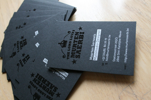
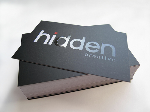
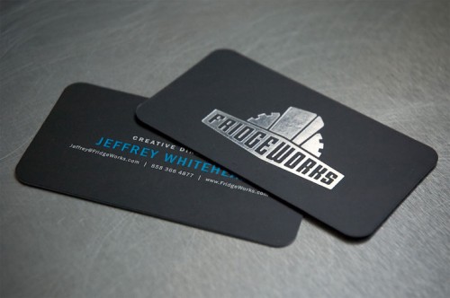
Another reason why choosing a good printing company is extremely important is that different places will offer different paper textures, paper thickness, and printing techniques. Generally, I’d go with a heavier matte card stock (at least 12pt, and at best, 14 or 16 pt) so people it is easier to write on. Silk lamination is a current trend because of their durability (tear and water-resistant) and elegance (smooth, matte finish). This, combined with either spot UV or metal foil printing (overlaying either a gloss with a shiny embossing effect or a metallic sheen) can create a spectacular and elegant effect:
16 pt card, silk finish, spot UV
16 pt card, silk finish, UV coating over text, silver foil
3. Remember that there are FREE resources everywhere.
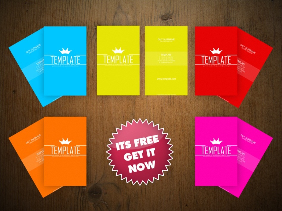
If you are unsure how to set up your file or even just where to start, there are free templates everywhere on the web. Refer to other people for inspiration, or browse for templates on sites like DeviantArt. Find a beautiful colour scheme on Kuler, and then choose a premium font like Quicksand or Zag. Remember the different connotations colours give, and ensure that the font is simple
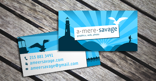
(usually sans serif), and readable (no less than 8 pt). A good font is pretty much the difference between an amateur and professional business card. The current trend in business card revolves around minimalism, simple icons, clean vector lines, and a uniting colour (often tri-colour) or pattern theme on front and back. Here’s a great example:
To sum it all up quickly, remember that in addition to the actual design (colours and fonts) of the business card, you can play around with the actual print and card stock itself. Make it simple but to the point, with a unifying colour scheme or even text-as-a-logo. Make the card bilingual if your environment requires so, or if you want to show diversity. I hope that after reading this, you have gotten a better grasp of business card designs, and I leave you with one last bonus tip – NEVER START LATE. Business cards may be small, but take hours and hours to perfect.
Taking Over the World… Wide Web
“Social media” — two words that we Generation Y’s have been constantly bombarded with these past few years.
It is very interesting to look back at the progression of social media and migrating trends on the interwebs (as I affectionately call it) thus far, from MySpace to Facebook to Twitter and Youtube, as well as the evolution in the definition of the word itself. An interesting blog post describes a wide variety of definitions for social media, leading to a hefty discussion about what social media really is. What amazes me is the deviance between definitions given by people of different statuses, roles, or industries.
For example, Wikipedia defines social media as “web-based and mobile technologies to turn communication into an interactive dialogue.” A response to the blogpost suggested that “social marketing is the art of encouraging consumers to shift between audience, author and influencer.” European marketing professors, Andreas Kaplan and Michael Haenlein, emphasize the technical aspects of social media as “a group of Internet-based applications that build on the ideological and technological foundations of Web 2.0, and that allow the creation and exchange of user-generated content.”
Personally, acknowledging that there is no set definition, I believe the blog definition comes extremely close to grasping the essence of social media in its current state. A pessimist would say that social media has deviated from pure social interaction to strategic engagement, usually with monetary benefits. However, the way I see it, social media is just a simple method organizations or companies are using to interact with individuals through a more personable approach, and in this case, individuals would be the audience. Consumers can also play the role of “author” by creating online materials to respond back (for instance through blogging), and then “influencing” peers by sharing pages or tweeting news about organizations. This “online presence” that acts as a link between consumers and the online community has become increasingly important.
Out of personal experience, in an application for an innovative technology solutions company, I was asked to my amusement the amount of Facebook friends and Twitter followers I had. Has online presence has somehow become correlated to influential power, social skills and credibility? After immediate research, I noticed that it wasn’t just the technology industries. Even the hotel industry is looking to increase revenue and booking volume by investing in more social media which, according to the article, has become as popular as pay-per-click or more.
All of this just leaves me to wonder, has social media become integral to all aspects (of life, of business, of jobs, and even of education) in our generation, and can it keep being revamped and innovated, or is it just another trend that is about to reach its plateau?
Design Diary: Logos and Branding
Although I’ve never taken official classes in design, I have done quite a lot of research on aesthetics in design (part of the job for being creative executive), and here are some of my findings on logo research.
Logos. What are they? I define them simply as graphic identities or representations. It is the look and feel of a company. The best logos are usually…
So if I were designing a logo, where should I start?
The consensus for the design process of a logo is to start by getting a design brief from the person/ firm requesting the logo. Some helpful questions to ask:
- text-based?
- black and white?
- representative colours?
- modern or traditional?
- flat or 3D?
- motto and ideals?
- target demographic?
- do’s and don’ts
With recent trends in logo designs, clean lines are more effective. So, vectorization of logos is crucial, especially since it also makes the logo infinitely scalable. Also to keep in mind are aspect ratios (golden ratio, rule of thirds) that draw attention to important features of the logo. Shape and placement on various medium should also be considered in addition to different colour schemes which can contribute to the feel of a company, suggesting easy customization (for instance Google’s occasional logo revamping). And perhaps the most important of all, great fonts.
The link provided for the font list is to an external blog by Vitaly Friedman for Smashing Magazine, one of my favourite design blogs. She comments that “the choice of a unique and beautiful typeface…manages to fulfill three basic tasks. Support the corporate identity, enrich the visual appearance and is compatible with the overall design.” There is a reason why companies pay hundreds of dollars for the right to use a certain font or make their own — a text-based logo is clean, powerful, affective, identifiable and memorable in itself.
Simpsons: funny, quirky, happy, friendly, family-oriented, old-school fun.
Kleenex: comfortable, substitute word for tissues, clean, necessity
Hershey’s: chunky, chocolatey, dividable
Coach: high class, trendy, expensive, superiority, golden
Tropicana: fun, happy, exotic (humid + hot)
IBM: Clean, simple, business, professional
Vaio: Stylish, trendy, clean, metallic
“Add Sound… Preserve the Quiet”
Inventor Woody Norris, 2005 winner of the $500,000 Lemelson-MIT Prize
The title of this blog post comes from the tagline of Audio Spotlight by Holosonic, a company specializing in focused audio technology.
So what exactly is this technology? SearchMobileComputing defines directional or isolated sound as “a technology that concentrates acoustic energy into a narrow beam so that it can be projected to a discrete area, much as a spotlight focuses light” akin to the light waves of a laser. It uses ultrasonic sound, a high frequency and focused wave, to carry sound information that manifests after it hits any solid object, recreating the original audio so it is audible to the human ear. It is almost as if the sound is “being created right at your ears.” Then, “if you step out of the beam, the waves have nothing to distort and mix them, so the inaudible ultrasonic waves slide silently past.”
I’ll leave it to physics-inclined experts to describe how the invention works in detail (click here to learn more about how it works) as I go on to talk about the major applications of this technology.
As a marketing tool:
- shopping malls – paired with either motion sensors or proximity detectors, various advertisements could target and attract customers on a more personal level. Wal-Mart has been looking into the technology, and as seen in the Youtube video below, stores have already implemented directional sound.
- pair with geotagging – to tie things back to my previous blog post, there is a huge opportunity for directional audio to work together with geotagging technologies to create highly innovative and interactive marketing campaigns
As an informational tool:
- guidance – if someone gets lost, they could follow voice instructions that can guide them to their destination without affecting the people around them. A realistic application would be at crosswalks to help blind people.
- museum or exhibit explanations – perhaps the audience wants to know more about a piece of art or a poster. They can then stand in front of the poster to learn more about what they’re looking at.
- This Johnnie Walker exhibit in the Miami International airport uses Audio Spotlight to create a unique interactive experience (August 2011).
As entertainment:
- music – now people can share the same space but enjoy different music without affecting one another. Concert performers can target different areas in the audience for a new type of interaction.
- art – will we see new art forms emerging? An art piece could be simultaneously visual and audio.
- amusement parks – Disney. Need I say more?
As a weapon:
- subduing criminals – emit a high frequency sound to inflict pain among suspects.
- noise cancellation – for fighter jets, noisy engines or loud machinery.
- tricking enemies – fake the direction of attack.
As seen, this technology could have infinite applications. However, keeping in mind that this technology is not new at all (2002), why hasn’t it become mainstream yet? My guess is that a lot of development is needed to ensure quality and control, not to mention considering how to mitigate complaints in violations of privacy.
New Mapping Technologies: Stalking Made Easy?
The evolution of web mapping technology has been extraordinary.
Google Maps was one of the very first online web mapping technologies. Created in early 2005, it now dominates in online and mobile web-mapping technology. The power of Google Maps is probably with its route-planning and route-calculating elements that allow anyone with wireless access or even on the go with a smartphone to be have a directional guide. Shortly after Google Maps, Google Earth came along with its incorporation of incredible satellite images, and eventually Bing Maps in 2010.
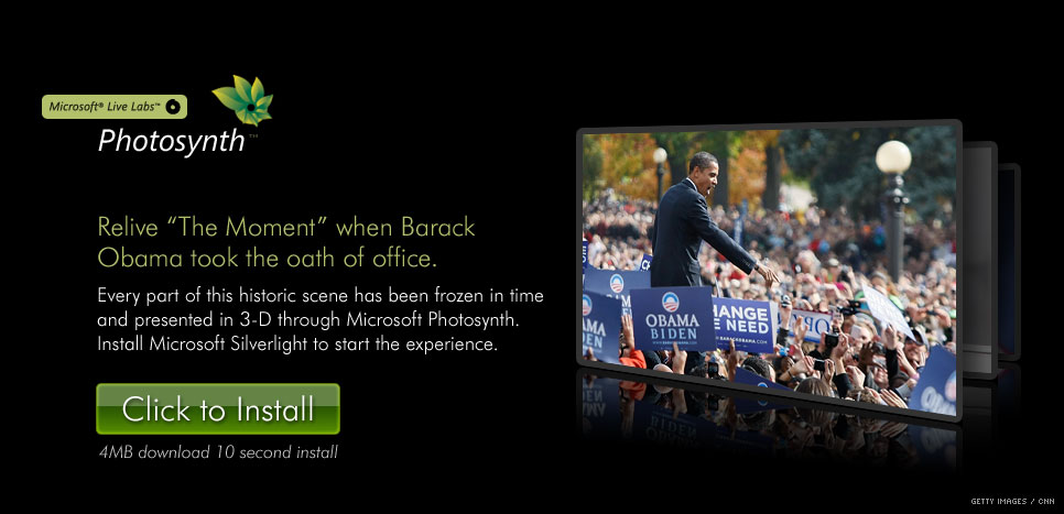
What makes Bing Maps superb is the use of Microsoft’s Seadragon technology, which allows seamless zooming regardless of resolution or file size that is optimized for online browsing. With this kind of technology, Bing Map users can zoom in with their mouse wheels from a satellite or map view to a point where it automatically transitions into street view, all with little load time. To understand what DeepZoom (based off of Seadragon) looks like in action, check out this amazing demonstration: Hard Rock Memorabilia. Fascinating as that was, don’t drop your jaw yet! Just when you think you’ve seen it all, Microsoft Live Labs releases Photosynth, a software to create 3D views of a particular location that can then be uploaded to Bing Maps.
Photosynth allows for an “augmented-reality mapping technology.” Photos taken by the public can be integrated into the map itself to create a virtual reality with infinite zooming, viewing angles, and even time frames, integrating cartography with imagery, as the developer of Bing Maps, Blaise Aguera y Arcas, puts it. It can even be used in real time, as Blaise showcases in his ground-breaking TED Talk.
And that brings us to the topic of geotagging. Geotagging is the process of linking locations to photos by embedding an extra piece of information (longitude and latitude) into the photo. Eye-Fi is an example service-provider for geotagging and uses the Wi-Fi Positioning System (WPS) to do so. It has now even been integrated into newer technologies such as the HTC Flyer and Huawei MediaPad. After witnessing Photosynth and Seadragon, one can imagine its unlimited applications with the addition of geotagging, especially in terms of promotions and advertising. However, with great power comes great responsibilities… and great threats. Mythbuster host Adam Savage was a victim of geotagging when he accidentally tweeted a geotagged photo and revealed where he lived.
So this new technology – amazing technological advancement and advertising tool or stalking made easy?
Tubifi – What’s All the Hype?
“Tubifi (Tübe-ê-fy) verb. To democratize the creation of world-class video at a 1/10th of the price and a fraction of the time.”
Launched just 4 days ago, Tubifi has been a primary topic of discussion amongst various tech and social media blogs. So what is Tubifi, exactly, what do they do, and how does it work?
Tubifi, developed by John Belchers, Harbaldeep Singh, and Micha Barnum, is essentially a powerful online tool to create high quality video ads. They position themselves as the prime inexpensive solution, targeting small and medium-sized businesses with tight budgets (basically with limited money, time, and talent).
What they do is offer a database filled with stock audio and visual materials as well as media directly downloadable from content providers. The website can also monitor the video performance (even by the second) as well as the number of times the link is shared through social media. Tubifi stresses that social media and mobile technology are booming and can end up sucking dry the promotional budget. Thus, Tubifi’s USP is simply that it’s insanely inexpensive and fast.
The following video was created through Tubifi for Alpha Five, an app development and security business for the web and mobile devices in the software industry.
“World-class advertising comes at a price. A very low one.”
Tubifi estimates the costs of traditional advertisement to be nearly $300,000 over the span of however long it would take to shoot at the various locations and create CGI. By using its online tools, Alpha Five was able to produce this at $15,000 within 3 days. They are able to do this because Tubifi minimizes production costs with pre-existing footage.
I’ll definitely be keeping a lookout for firms using this innovative online tool for future advertising!