Tag Archives: 270

Final Project: Assessing Vancouver’s Livability for Seniors

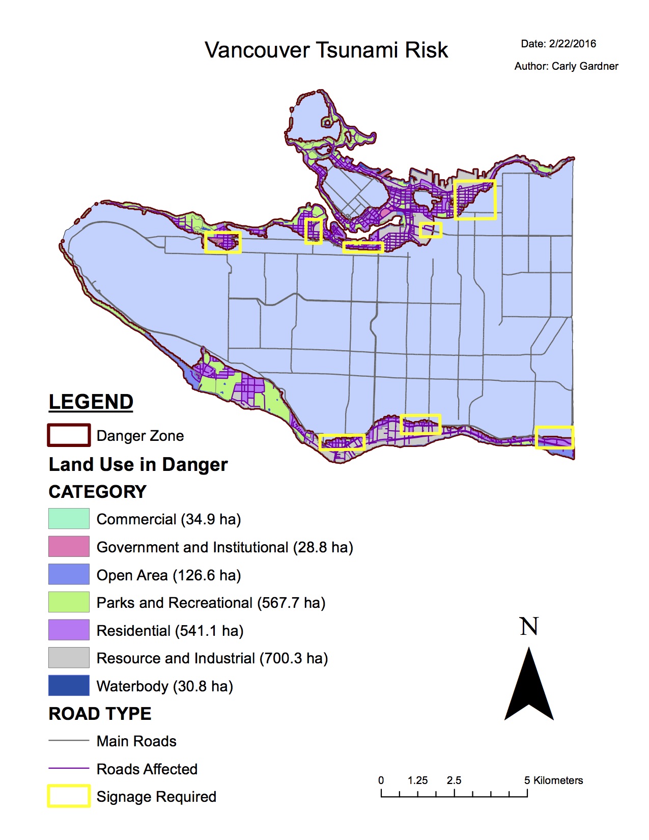
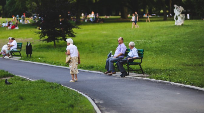
This project aimed to determine which neighbourhoods of Metro Vancouver are best suited for senior citizens. Our analysis was based on the assumptions that seniors would prefer areas of low housing costs, low crime rates, and that have senior-targeted amenities within an accessible walking distance.

Click here to see the Final Project Report!

Our team met at least once every week to construct the maps together. We typically had one member operating ArcMap, with another looking over their shoulder offering guidance and looking up instructions and online help. Another group member would be recording the steps taken in order to assemble a flow chart at the end of the project process. The final report was divided into sections amongst the group to be written up, but was edited together.

According to our analysis, the three best neighbourhoods for senior citizens in Metro Vancouver are:

  1.  Renfrew Collingwood

  2. Strathcona

  3. Marpole (eastern portion)

The project helped us be to become more familiar with the spatial join tool in particular. This skill allowed us to normalize data points, such as break and enters, over neighbourhoods. This suited our goal of comparing Vancouver neighbourhood crime rates and other factors.

We also became more comfortable with retrieving data from external sources. Census data was simple to find. We had originally planned to include grocery stores in our amenities analysis, but had significant difficulty in locating data. We acknowledge that this would be a good thing to include in future analysis of liveability in our report.

Group projects, particularly with GIS, face a multitude of challenges. There are several people working on the same set of maps which means that communication is key. We found that creating a Google doc to record notes, steps taken, and thoughts/ideas throughout the project process allowed all group members to stay on the same page. It was handy for both facilitating good group communication and later for creating the flow charts. It also made data management much more simple, because names of files were recorded with a description.

We also created a Facebook group for efficient communication. This was what we used to schedule group meetings and send documents/maps.

LAB 1-3 Accomplishment Statements

Accomplishments so far?

Lab 1: Completed an introductory ArcGIS course offered by ESRI and reviewed examples of GIS applications to gain foundational knowledge for future GIS projects.

Lab 2: Gained practical working knowledge of coordinate systems and projections and how to fix misaligned or improperly referenced spatial data for geographic analysis.

Lab 3: Used spatial and tabular data sets to perform geographic analysis of Vancouver’s tsunami risk, generated a  corresponding map and useful statistics.

LAB 4 Part 1: Quantitative Data Classification

In Lab 4, we accessed Canadian census data to map the affordability of Ottawa and Vancouver.  The objectives were to familiarize with the various methods of classifying data and to explore their potential ethical implications.

Click here to see my Data Classification Maps!

Part of the lab instructed students to pretend we were journalists hired to report on the affordability and liveability of Vancouver. Which data classification method would a journalist use to display affordability of Vancouver? As a journalist, I would likely choose manual breaks because it would allow me to compare a map of Vancouver’s housing costs to maps of other cities’ (that have the same breaks). This could illustrate that Vancouver’s housing is extremely unaffordable, even when compared to other areas (or visa versa) – the potential for a story.

However, if I were a real estate agent preparing a presentation  for prospective home buyers near UBC, I would use standard deviation as my data classification method.  UBC property appears to be relatively inexpensive with this classification. Because it is located next to areas that appear very pricey, potential buyers might view purchasing UBC property as an opportunity for investment (UBC might be predicted to follow the rising housing values of the surrounding area).

It is important to note that the different methods of classification may influence the interpretation of data on maps, and that there might be ethical implications. Is if fair to choose classifications that overemphasize ‘affordable’ and ‘unaffordable’ areas of Vancouver? That might mislead potential buyers. What if the division of your data classes is confusing to viewers?

LAB 3: Planning for a Tsunami

Map of Vancouver Tsunami Risk

Click to enlarge map

This lab was designed to help me familiarize with spatial analysis, tables, and editing in ArcGIS. Click this image to see my map of Vancouver’s tsunami risk.

In my spatial analysis, I found that :

15.5% of the total area of the City of Vancouver is in danger of a tsunami. 

For the purposes of the lab, I simplified the immediate tsunami danger zone from a 15-metre wave to be at low lying areas at or below 15 metres within 1 km from the shoreline.

To do this, I performed buffer proximity analysis by creating a 1 km buffer on either side of Vancouver’s shoreline. I also reclassified my DEM data to include only low lying areas at or below 15 metres. My lowland data was raster, so I used ArcToolbox to convert it to vector. Then I could intersect my lowland layer with my shoreline buffer (using the overlay tool)  to determine which areas were susceptible to tsunamis.

By clipping this new layer solely to the city of Vancouver (Vancouver_mask), I could determine the total area of Vancouver in tsunami danger (~ 20302078 square metres).  If I divided this by the total area of Vancouver (the sum of shape area in Vancouver_mask ~131010600 square metres), the resulting percentage is 15.5%.

Vancouver’s educational facilities in danger of tsunami:

  • St. Anthony of Padua
  • Ecole Rose Des Vents
  • Heritage 3R’s School
  • Vancouver Montessori School
  • False Creek Elementary
  • Emily Carr Institute of Art and Design (ECIAD)
  • Henry Hudson Elementary
  • St. Johns International
  • St. Francis Xavier
  • Institute of Indigenous Governance (IIG)

Vancouver’s health care facilities in danger of tsunami:

  • False Creek Residence
  • Broadway Pentecoastal Lodge
  • Coast West Community Home
  • Yaletown House Society
  • Villa Cathay Care Home

These educational and healthcare facilities at risk of tsunami were determined by intersecting the areas of Vancouver susceptible to tsunami risk with layers containing educational and healthcare facilities of Vancouver. If the facilities were found within 1 km of the shoreline and were at or below 15 metres elevation, they are considered at risk.

LAB 2: Coordinate Systems and Spatial Data Models

In this lab, I learned about coordinate systems and projections, and how to fix misaligned and improperly referenced spatial data.

If spatial data is misaligned or improperly referenced, it may be necessary to project the data into a different coordinate system. Which coordinate system you choose depends on the purpose of the map and the region covered by the data layers.

Projecting-on-the-fly processes are used to quickly combine data layers with different coordinate systems and align them together. Spatial data coordinates are not changed; the data just appears to be in the same coordinate system. It is important to note that this process requires all spatial reference information to be available in the data files. Projecting-on-the-fly might distort angles, distances, and spatial analysis (because it assumes all the data is in the same coordinate system when it isn’t).

ArcToolbox Project and Transformation commands are also used to combine data from different coordinate systems. In this process, however, the data will be modified to create a new version of the layer that will match the other coordinate system. So when data is combined, the projected layer will be in the same coordinate system as the other layers (rather than just appearing to be).


I also learned about the advantages of using remotely-sensed Landsat data for geographic analysis.

Remote sensing has drastically improved the quality and quantity of geographical data.  Landsat satellites can collect data without sending people out on foot, which means data from remote areas can be collected more frequently and efficiently. As technology evolves, these measurements become more and more precise.

Landsat data is particularly useful for comparing land-use change over time. The remote sensing program has been in use since 1972, which allows almost all areas of the globe’s surface to be compared over a significant time scale. For instance, in this lab I compared  Mount St. Helen in July 1979 (pre-eruption) to that of July 2002 (post-eruption) to observe changes in landscape. I could visually confirm the damage to area features noting debris, lake formation, and vegetation changes.

Another common use for remotely-sensed Landsat data is for mapping ice cover. For instance, I could research how sea ice extent in Arctic areas has changed over time, selecting a region such as Greenland as a geographical location of focus. I would use data recorded in both September (minimum sea ice extents) and March (maximum sea ice extents) annually to be part of my analysis in order to understand both seasonal and annual variations over time. When portraying the data in GIS, I could choose to display the data at 20 year intervals in order to clearly see the changes in sea ice extent since the 1970s.

There are so many interesting possibilities when using Landsat data in GIS!