One of the questions for the weekly discussion for week 1 of Teaching with WordPress is: “What’s your biggest challenge in designing for open?”
I have several course websites on WordPress, and one of the challenges I’ve faced in designing each of them is determining just where to put things and how to hierarchize them in menus so they can be easily found. I don’t know if this is my biggest challenge, but it is one I face each term as I think about redesigning my sites. It is made more important by the fact that the sites are public on the web, and I hope that others who visit them might find the information there useful. So they have to be clear even to people who are not in the course and don’t get the benefit of me talking about where things are on the site!
Here are the sites I have so far:
Introduction to Philosophy (PHIL 102): https://blogs.ubc.ca/phil102
Introduction to Moral Theory (PHIL 230): https://blogs.ubc.ca/phil230
Continental Philosophy seminar (PHIL 449): https://blogs.ubc.ca/phil449
Where are the lecture notes?
When I created the PHIL 102 site in the Fall of 2013 I made a mistake that I rectified when I taught that course again in the Summer of 2015.
 When I first created the site, I had a “weekly schedule” so students could find each week and see what they are supposed to read before class and what we’ll be doing in class. I created the weekly schedule as a way to be able to quickly update what students need to read/what we’re doing in case things change over the course of the class (which always happens!), rather than having a static syllabus/schedule. You can see the weekly schedule for the Summer 2015 version here: https://blogs.ubc.ca/phil102 Having a weekly schedule like this I still think is a good idea.
But I decided to put the lecture notes after each class on each of the weekly pages. So, the lecture notes for Plato’s Gorgias would be on the page that discusses what students are to read before the class in which we discuss the Gorgias. I honestly don’t know what I was thinking, because I can’t imagine that was very useful for students. They’d have to go to each page in the weekly schedule to download the lecture notes. And then I realized later that if anyone coming upon my site on the web wanted to see the lecture notes from the course they wouldn’t know where to look.
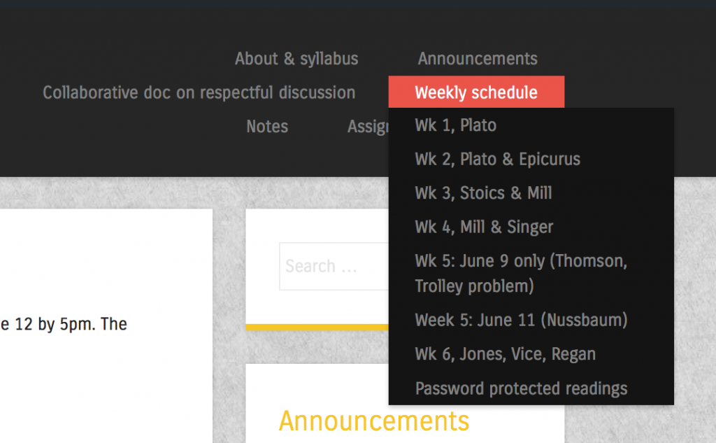
So now I’ve created a separate page in the course with just the lecture notes: https://blogs.ubc.ca/phil102/lecture-notes/ On the top menu of the course site I have a section called “notes,” and under that are the lecture notes and also notes from the students’ small group discussions in class. I think that’s pretty clear, though perhaps not perfect.
Too many menu items
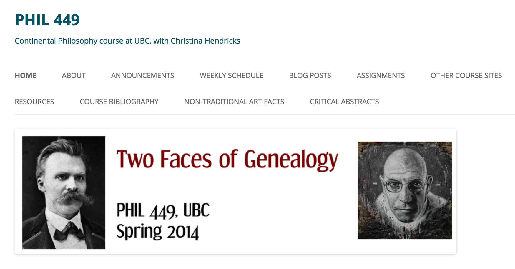
In my PHIL 449 course (https://blogs.ubc.ca/phil449) I have too many items in the top menu.
It’s just hard to read/find things. There were some things I wanted students to be able to find right away, like the bibliography (which they needed for their research papers), the critical abstracts (where they could read each others’ summaries and reviews of research articles or books), and the “non-traditional artifacts” (which were assignments students chose to do instead of essays). And I couldn’t think of a good way to put those things under something else. I’m still struggling with that, even a year later–I’m not sure how I’d categorize things differently so that there are fewer items in the top menu.
One thing I did differently for the PHIL 102 site is to combine the “home” and “about” pages so I don’t have to have two menu items for that, like I did for the PHIL 449 site. I also put the syllabus on the “about” page for PHIL 102 so I don’t have to have that in a separate menu item either (the menu item is called “About & syllabus”).
Re-naming the weekly schedule
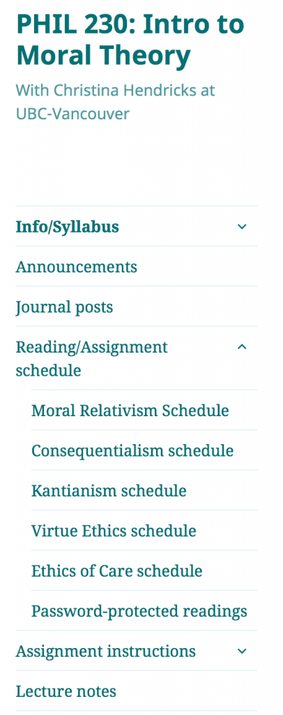
In my course site for Introduction to Moral Theory (PHIL 230), I didn’t make a “weekly” schedule, but instead did it by topic (moral relativism, utilitarianism, Kantianism, etc.). This was because I thought that students would be less likely to find things by remembering which week it was in, than by remembering the topic.
I think this was a good idea, but it also makes each page for each topic longer than they were before. And when I designed the PHIL 102 site for this summer, I went back to the “weekly” idea (but labelled each week in the menu with the author of the readings or the topic) because the pages were already pretty long just by having the schedule for two days on them. That’s because I include not only required readings, but lots of optional resources.
Where to put various resources?
In many of my courses I have handouts or links to other resources that are useful throughout the course. Sometimes I put them under a menu item called “resources” (see, e.g., the PHIL 449 site), but then I thought that students might not find them there. So for PHIL 102 for this summer I decided to put some of them under “assignments,” such as the page with “writing help.” If you click on “Assignments,” then “writing help” is part of the drop-down. And other resources I put directly on the pages where they are needed for assignments. For example, in PHIL 102 students need information on finding and using public domain and CC licensed works, so I put that directly on the page with the assignment they need this information for: https://blogs.ubc.ca/phil102/assignments/philosophy-in-the-world/
For that page I used the “wiki embed” plugin that UBC has installed on UBC Blogs, which allows me to write up the information on a wiki page and then use it in multiple sites. If I change the wiki page, then all the sites that have it embedded are updated. I did this with the public domain/CC licenses information because I figured I’d be using that in other courses as well.
Adding images
When designing the PHIL 102 site for this summer I added images to each of the pages in the weekly schedule. I realized that the pages were very boring with ust text, and I wanted a bit more visual appeal. So I found an image related to the readings for each class meeting and included it there. See, for example, the week we discussed John Stuart Mill and Peter Singer: https://blogs.ubc.ca/phil102/weekly-schedule/week-4/ They’re not the most interesting images, but at least it’s a start.
This is not really related to the issue in this post, which is where to put what/how to organize, but I thought I’d mention it as a change I made to try to improve my sites over time.
What do you think?
I’m curious if anyone has thoughts about the issue of organizing/hierarchizing/making things easy to find for students and others, or any of the problems/solutions I’ve discussed above. I think I still have some ways to go to make my sites as clear as they can be.


That’s a lot of serious work! I love being able to see how other people do this stuff and it really helps other people to see the examples and hear the thinking that went into the design.
I tend to lean much harder on posts and categories/tags to get the pieces to show up where I need them (usually w/in pages). I use the display posts plugin. It’ll let you use a shortcode to include posts by category or tag and display them in all sorts of ways (even sort oldest to newest). I do that here and try to explain it here and here.
You might also like the accordion divs we use on sites like this one. It helps keep them from getting too long and works well for optional resources. That particular one is tied into a Bootstrap theme but there are a bunch of plugins that do that.
Oh geez I am so behind not only in commenting on other posts, but in replying to comments I’ve gotten! Thanks for the suggestion of using categories and tags rather than making all these organizational pieces into pages. I think it’s just that pages are super easy and shortcodes still kind of make me back away, but I’m getting better about that. As long as i have a list of shortcode codes to follow I’m good. UBC has a lovely one, here. The display posts plugin looks really easy, and it turns out we already have it on UBC Blogs so I can start playing around with it. Cool!
We also have the accordion option; we are using it on the Teaching with WordPress site. That was the first time I had seen it (I am not the one in charge of the site itself…I am learning a lot just by how we built it!).
Thanks for the tips, though; I really want to make the structure of my sites more flexible and less 300-things-in-the-top-menu heavy.