I am taking the Creative Commons Certificate course for Educators this summer, and the assignment for the end of the first week is this (this is one of the two options):
Create a video, slide presentation, podcast, wikibook content, an infographic (or choose another medium) in which you describe the key historical events leading up to the launch of Creative Commons and the state of Creative Commons today. Rather than a disconnected list, create a narrative (tell a story) that ties events and people together. Try to create something that would be useful and interesting to someone who just heard about Creative Commons and wants to learn more.
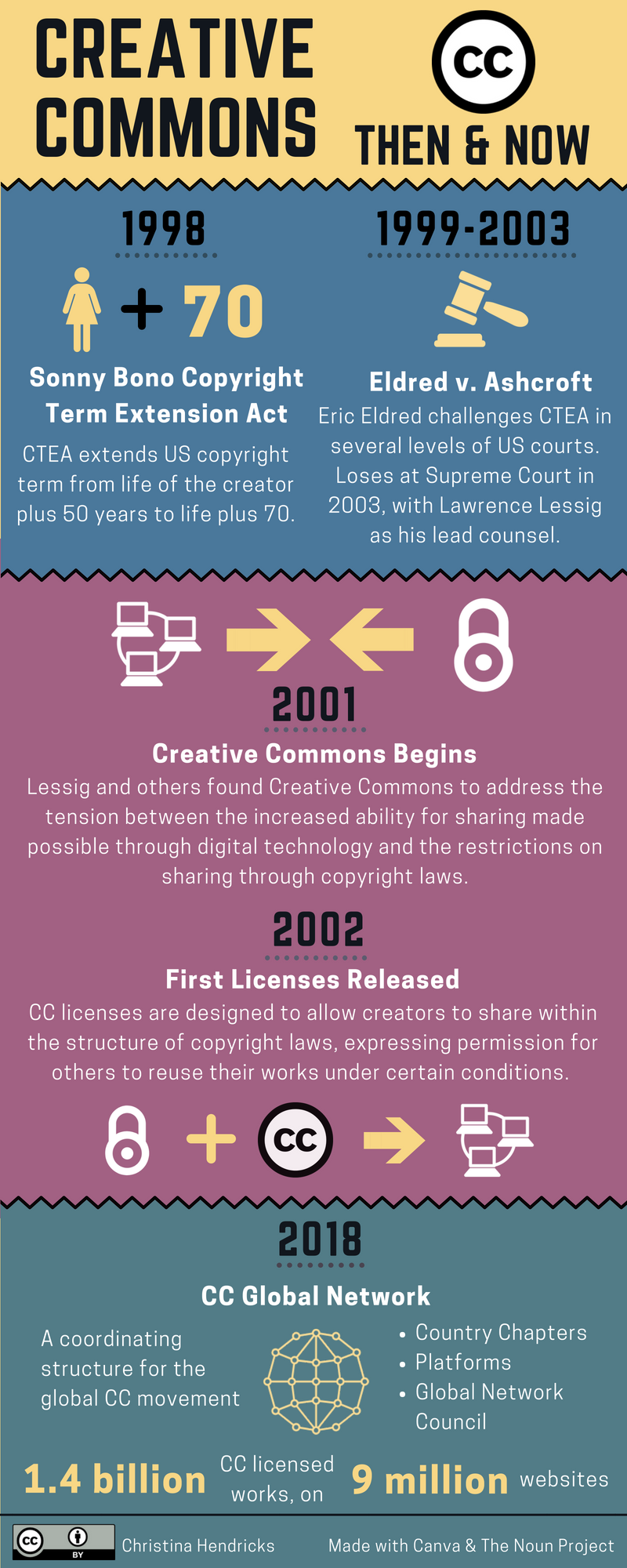
There was also a list of elements of the story that need to be included, and I just barely managed to fit all of them on the infographic I created! (You can see all of the documents for the course, including the assignments, on the Certificate Resources page.)
I made it with Canva, and most of the icons were purchased through a subscription to The Noun Project. Besides trying to make the elements look good visually and be readable, the thing that took me a surprisingly long time was working on the colour contrasts on the infographic to try to conform to web content accessibility guidelines (WCAG) for colour contrast. The default colours on the template I used from Canva did not conform to those guidelines.
I used the WebAIM colour contrast checker to play around with the background colours and the text/icon colours to make the contrast fit WCAG 2.0 AA guidelines. I am not certain I 100% succeeded; it was a laborious process with Canva, to find the hex codes for each colour and input them into the contrast checker. I just made the decision not to make the dotted lines under the years conform to the guidelines; it’s not a problem if those are difficult to see, as they don’t convey any meaning but are merely decorative.
When will we get to the point where templates on tools such as Canva just automatically conform to accessibility guidelines, or at least automatically have a checker that can help you test if they do and fix if they do not?
Overall, this took quite a bit of time this week, and if I took even more time I expect I’d be happier with it, but at some point one has to stop and move on to the next task!
Seeing this as we start a new cohort. Thanks for the link to Color Contrast checker. I tried it and realized red on white background is never good enough (also realized your blog links are red by t he theme default…and that the turquoise ish blue for my blog titles and links is also not accessible and i should figure out what to do about it…).
I also really like the conciseness of the infographic but feel bad u had to pay for some of the elements in it… i know it wasn’t necessary…but it does look good!