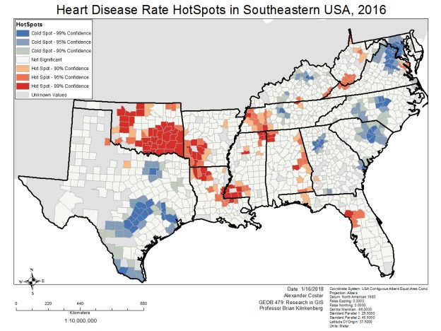
This lab has been a instructional course on how to obtain data from an outside source (heart disease data from CDC), ‘clean’ the data so it can be stored in a geodatabase for use in ArcMap, create two models to process the data into individual feature classes (one for each year) and calculate hot spot analyses ( Getis-Ord GI* on each year feature class). The data is animated under state lines to show the prevalence of heart disease for each state in the southeastern USA.
A statistically significant hotspot will be surrounded with similarly high or low valued features. The larger the z-score, the more intense the clustering of high values (a hot spot). The smaller the value for statistically significant negative z-scores, the more intense the clustering of low values (cold spots). The Hot Spot Analysis tool can help answer questions such as where many incidents occur, where high/low values for a particular attribute cluster spatially, or finding areas with unexpectedly high values in relation to some other variable.
If we look into data concerning public health services, state regulatory health laws, smoking, obesity, and fast food consumption, we may be able to draw links between the most significant factors for heart disease.