Going over the exam

How often have you heard your fellow instructors lament,

I don’t know why I bother with comments on the exams or even handing them back – students don’t go over their exams to see where they what they got right and wrong, they just look at the mark and move on.

If you often say or think this, you might want to ask yourself, What’s their motivation for going over the exam, besides “It will help me learn…”? But that’s the topic for another post.

In the introductory gen-ed astronomy class I’m working on, we gave a midterm exam last week. We dutifully marked it which was simple because the midterm exam was multiple-choice answered on Scantron cards. And calculated the average. And fixed the scoring on a couple of questions where the question stem was ambiguous (when you say, “summer in the southern hemisphere, do you mean June or do you mean when it gets hot?”). And we moved on.

Hey, wait a minute! Isn’t that just what the students do — check the mark and move on?

Since I have the data, every student’s answer to every question, via the Scantron and already in Excel, I decided to “go over the exam” to try to learn from it.

(Psst: I just finished wringing some graphs out of Excel and I wanted to start writing this post before I got distracted by, er, life so I haven’t done the analysis yet. I can’t wait to see what I write below!)

Besides the average (23.1/35 questions or 66%) and standard deviation (5.3/35 or 15%), I created a histogram of the students’ choices for each question. Here is a selection of questions which, as you’ll see further below, are widespread on the good-to-bad scale.

Question 9: You photograph a region of the night sky in March, in September, and again the following March. The two March photographs look the same but the September photo shows 3 stars in different locations. Of these three stars, the one whose position shifts the most must be

A) farthest away
B) closest
C) receding from Earth most rapidly
D) approaching Earth most rapidly
E) the brightest one

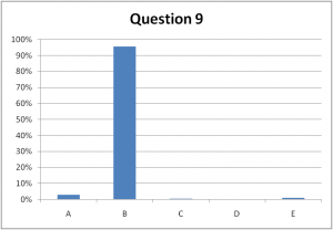
Students' choices for Question 9. The correct answer is B.

Question 16: What is the shape of the shadow of the Earth, as seen projected onto the Moon, during a lunar eclipse?

A) always a full circle
B) part of a circle
C) a straight line
D) an ellipse
E) a lunar eclipse does not involve the shadow of the Earth

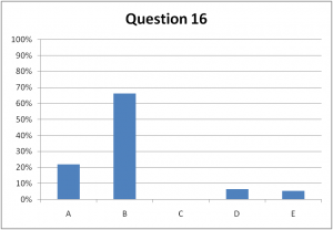
Students' choices for Question 16. The correct answer is B.

Question 25: On the vernal equinox, compare the number of daytime hours in 3 cities, one at the north pole, one at 45 degrees north latitude and one at the equator.

A) 0, 12, 24
B) 12, 18, 24
C) 12, 12, 12
D) 0, 12, 18
E) 18, 18, 18

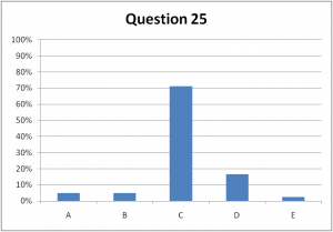
Students' answers to Question 25. The correct answer is C.

How much can you learn from these histograms? Quite a bit. Question 9 is too easy and we should use our precious time to better evaluate the students’ knowledge. The “straight line” choice on Question 16 should be replaced with a better distractor – no one “fell for” that one.  I’m a bit alarmed that 5% of the students think that the Earth’s shadow has nothing to do with eclipses but then again, that’s only 1 in 20 (actually, 11 in 204 students – aren’t data great!)  We’re used to seeing these histograms because in class, we have frequent think-pair-share episodes using i>clickers and use the students’ vote to decide how to proceed. If these were first-vote distributions in a clicker question, we wouldn’t do Question 9 again but we’d definitely get them to pair and share for Question 16 and maybe even Question 25. As I’ve written elsewhere, a 70% “success rate” can mean only about 60% of the students chose the correct answer for the right reasons.

I decided to turn it up a notch by following some advice I got from Ed Prather at the Center for Astronomy Education. He and his colleagues analyze multiple-choice questions using the point-biserial correlation coefficient. I’ll admit it – I’m not a statistics guru, so I had to look that one up. Wikipedia helped a bit, so did  this article and Bardar et al. (2006). Normally, a correlation coefficient tells you how two variables are related. A favourite around Vancouver is the correlation between property crime and distance to the nearest Skytrain station (with all the correlation-causation arguments that go with it.) With point-biserial correlation, you can look for a relationship between students’ test scores and their success on a particular question (this is the “dichotomous variable” with only two values, 0 (wrong) and 1 (right).) It allows you to speculate on things like,

  • (for high correlation) “If they got this question, they probably did well on the entire exam.” In other words, that one question could be a litmus test for the entire test.
  • (for low correlation) “Anyone could have got this question right, regardless of whether they did well or poorly on the rest of the exam.” Maybe we should drop that question since it does nothing to discriminate or resolve the student’s level of understanding.

I cranked up my Excel worksheet to compute the coefficient, usually called ρpb or ρpbis:

where μ+ is the average test score for all students who got this particular questions correct, μx is the average test score for all students, σx is the standard deviation of all test scores, p is the fraction of students who got this question right and q=(1-p) is the fraction who got it wrong. You compute this coefficient for every question on the test. The key step in my Excel worksheet, after giving each student a 0 or 1 for each question they answered, was the AVERAGEIF function: for each question I computed

=AVERAGEIF(B$3:B$206,”=1″,$AL3:$AL206)

where, for example, Column B holds the 0 and 1 scores for Question 1 and Column AL holds the exam marks. This function takes the average of the exam scores only for those students (rows) who have got a “1” on Question 1. At last then, the point-biserial correlation coefficients for each of the 35 questions on the midterm, sorted from lowest to highest:
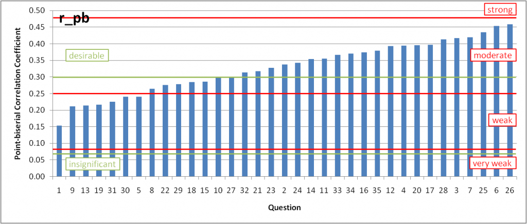
Point-biserial correlation coefficient for the 35 multiple-choice question in our astronomy midterm, sorted from lowest to highest. (Red) limits of very weak to strong (according to the APEX disserations article) and also the (green) "desirable" range of Bardar et al. are shown.

First of all, ooo shiney! I can’t stand the default graphics settings of Excel (and PowerPoint) but with some adjustments, you can produce a reasonable plot. Not that this in is perfect, but it’s not bad. Gotta work on the labels and a better way to represent the bands of “desirable”, “weak”, etc.

Back to going over the exam, how did the questions I included above fare? Question 9 has a weak, not desirable coefficient, just 0.21. That suggests anyone could get this question right (or equivalently, no could get this question right). It does nothing to discriminate or distinguish high-performing students from low-performing students. Question 16, with ρpb = 0.37 is in the desirable range – just hard enough to begin to separate the high- and low-performing students. Question 25 is one of the best on the exam, I think.

In case you’re wondering, Question 6 (with the second highest ρpb ) is a rather ugly calculation. It discriminated between high- and low-performing students but personally, I wouldn’t include it – doesn’t match the more conceptual learning goals IMHO.

I was pretty happy with this analysis (and my not-such-a-novice-anymore skills in Excel and statistics.) I should stopped there. But like a good scientist making sure every observation is consistent with the theory, I looked at Question 26, the one with the highest point-biserial correlation coefficient. I was shocked, alarmed even. The most discriminating question on the test was this?

Question 26: What is the phase of the Moon shown in this image?

A) waning crescent
B) waxing crescent
C) waning gibbous
D) waxing gibbous
E) third quarter

It’s waning gibbous, by the way, and 73% of the students knew it. That’s a lame, Bloom’s taxonomy Level 1, memorization question. Damn. To which my wise and mentoring colleague asked, “Well, what was the exam really testing, anyway?”

Alright, perhaps I didn’t get the result I wanted. But that’s not the point of science. Of this exercise.  I definitely learned a lot by “going over the exam”, about validating questions, Excel, statistics and WordPress. And perhaps made it easier for the next person, shoulders of giants and all that…

Posted in astro 101, clickers, interpreting graphs | Tagged , , , , , | 12 Comments

Constructing your own knowledge is not “edu-babble”

First, a disclosure: I’d love to pepper this posting with links to journal articles here, there and everywhere. But the truth is, if I try to do that, I’ll never get it written. If only I had a massive library of refs in my head like some of my colleagues. So here goes the “I’ll add refs later” version.

On February 8, the Vancouver Sun published a column by Michael Zwaagstra entitled “Purdue University study confronts edu-babble” (Hat-tip to @chrkennedy.)

<raised>hackles</raised>

The lead paragraph concludes

Instead of telling students what they need to learn, teachers should encourage them to construct their own understanding of the world around them. The progressive approach to education is far more useful to students than the mindless regurgitation of mere facts.”

A reasonable philosophy. One I agree with, in fact. And no, I didn’t forget to copy the opening quotation mark. It was omitted. Maybe that’s Vancouver Sun style. Or maybe it’s to hide the fact that this paragraph is a strawman about to knocked down by the author, who begins his actual column with

“Anyone involved in education knows these types of edu-babble statements are often heard in teacher-training institutions. Education professors continually push teachers to move away from traditional methods of instruction.”

The author goes on to cite a new study in Sciencexpress (20 Jan 2011) Science (11 Feb 2011) by Jeffrey D. Karpicke and Janell R. Blunt, “Retrieval Practice Produces More Learning than Elaborative Studying with Concept Mapping.” Let me describe that research first and then come back to how Zwaagstra presented it.

Karpicke and Blunt did quite a nice study comparing, among other things, the final test scores of four groups of students

  1. study-once: students studied the text in 1 study session
  2. repeated study: students studied the text in 4 consecutive study session
  3. elaborative studying with concept mapping: after instruction on how to create a concept map, students created concepts maps of the concepts in the text. This activity plays the role of “constructing their own knowledge” in the journal article and Zwaagstra’s newspaper column.
  4. retrieval practice: students studied the text in one study session, then practiced retrieval by trying to recall as much as they could. Then they restudied and recalled a second time. The authors made sure the students in this group and the concept mapping group had the same time-on-task.

When these learning activities were complete, all students wrote the same short-answer test which contained both “verbatim” questions testing knowledge stated in the text and “inference” questions that required students to assemble various facts. For both types of questions, the retrieval practice group scored the highest, followed by the repeated study, concept mapping and study once groups. In both types of questions, the retrieval practice scores were statistically significantly higher than other scores. The article goes on to describe how they replicated the study, with similar results.

Hmm, interesting result. I wonder… no, sorry, back to the Vancouver Sun article.

Fine. Studying helps students succeed on tests.No one would argue against that. And concept mapping certainly has its strengths but it is just one approach to “constructing your own understanding.”

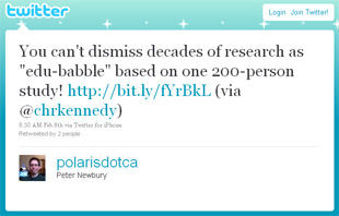
Zwaagstra uses the Purdue result to support the practice of testing students regularly on content knowledge. No problem with that. And that Provinces which are abandoning standardized testing are falling prey to “anti-testing mantra”. Hmm, not sure about that. And that learner-centered instruction is “edu-babble”. Okay, that pissed me off:

I’m relieved to say I wasn’t the only one, based on the handful of RTs and replies I received from @cpm5280, @mcshanahan, @ScientificChick, @chrkennedy, @sparkandco and @derekbruff, all tweeps whose opinions I value.

Right – everyone is entitled to their opinion. Zwaagstra is sharing his, just like I’m sharing mine. But wait, this isn’t an opinion piece – it’s a newspaper report:

Well, in fact, a friend tells me the online Vancouver Sun just tacks “Vancouver Sun” credentials onto the author. At the bottom of the article, we discover Mr. Zwaagstra is a research fellow with the Frontier Centre for Public Policy, a “think-tank” [their quotes] supporting Canada’s prairie provinces. So this is not an objective piece of journalism about new result in education research. It’s an opinion piece written on behalf of the Frontier Centre to support their philosophy. The Vancouver Sun should have made that a lot clearer. And did they really have to use the most sensational word in the entire story, “edu-babble”, in the headline? How about a little less tabloid next time, huh? In hindsight, maybe that pissed me off just as much as Zwaagstra’s lampooning of decades of education research and practice.

So, I’ll stay vigilante to stories which misrepresent science. But in the end, I’ll also follow Derek Bruff’s advice:

Posted in communicating science | Tagged , | 6 Comments

Clicker votes when students guess

I’m working with a veteran gen-ed astronomy (#astro101) instructor to make his classroom more learner-centered. We’re working hard on effective clicker implementation. The benefit of using clickers for think-pair-share (TPS) questions is the instructor can use the students’ votes to guide the instruction.

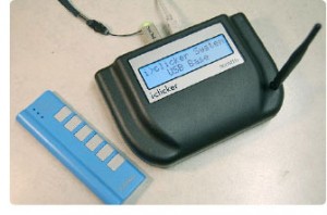
i>clicker receiver and clicker (sorry, can't find credits for this pic.)

If everyone gets a question right, just confirm the answer and move on – don’t waste valuable class time re-teaching something everyone already knows! Conversely, if the students have no clue what the answer is and simply guess, you’d expect 20% for each choice A-E, 25% each if there are 4 choices, and so on. If that’s how they vote, either there’s something wrong with the question (a critical typo, perhaps) or the students haven’t learned the concept yet. Teach it again BUT NOT JUST LOUDER. Teach it again in a different way.

The “sweet spot” is when there’s a nice split between 2 or choices. The students have thought hard enough to formulate and pick the choice they feel is correct, which means they’re prepared to interact with their peers. In cases like this, we ask them to “turn to your neighbours and convince them you’re right.” Then you sit back and let them teach themselves. Ahhh.

(Well, actually, you shouldn’t sit back. You should wander around the room and eavesdrop – you’re going to hear some great ideas you can use for choices on the final exam!)

The hard part for instructors is knowing when to move on or when to get the students to discuss the question. Is 90% correct enough? Yes, probably. What about 80%? What about 60%?

In today’s astronomy class, the instructor asked the students a TPS question and the distribution of votes was A 0, B 0, C 67%, D 20%, E 13%. The instructor wasn’t overjoyed, but 67%? That means 2/3 of the students got it, right?

Wrong. Some knew the answer. And the rest guest. Er, guessed.

I did a little thought experiment with the instructor afterwards. “Suppose only half the students knew the answer and the rest just guessed. What vote distribution would you get?”

“Er, 50% then 10% for each choice, so a 60 and 10’s.”

“Great,” I said. “Suppose 2 of the 5 choices were obviously wrong. Then what.”

He thought for about 2 seconds. “67-17-17.” Our numbers from that today. “Oh.”

That’s right, when there are only 3 valid choice and only half the students know the answer, you still get about 67% success. And you might be tempted to move on even though half the students don’t know what you’re talking about!

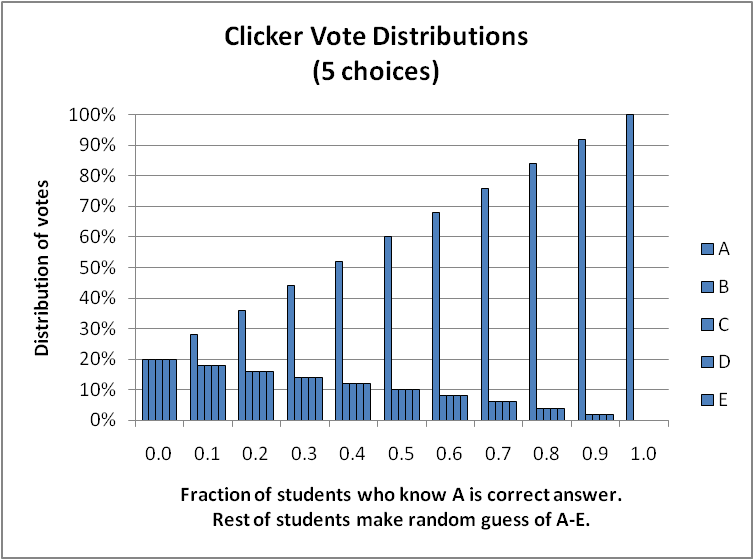
That got me thinking – suppose fraction f of the students know the correct answer and the rest guess. What do the clicker vote distributions look like? I cast a spell with Excel (I’ve finally reached novice Excel spellcaster) and found these results:

Distribution of votes when fraction f of students know the correct answer is A and the rest of the students make a random guess. Each set of 5 bars show the votes for A, B, C, D, E.

(Quick limit test that us math-types do: when no one knows and f=0.0, the votes are 20% for each choice. And when everyone knows, it’s 100-0-0-0-0. Got it.)

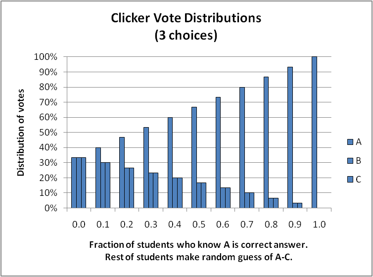
For example, when the peak vote is 60%, only 50% of the students actually know the answer. And it gets worse when there are fewer choices (or equivalently, when you can eliminate some of the 5 choices because they’re obviously wrong.) Here are the distributions when there are 4 choice and 3 choices:

Distribution of votes when fraction f of students know the correct answer is A and the rest of the students make a random guess. Each set of 4 bars show the votes for A, B, C, D.

Distribution of votes when fraction f of students know the correct answer is A and the rest of the students make a random guess. Each set of 3 bars show the votes for A, B, C.

This last chart shows our 67-17-17 vote distribution corresponding to only 50% of the students knowing the right answer.

This isn’t ground-breaking research. I bet many clicker users have done this, too. Or at least, worked out a few special cases.

The moral of the story, though: the fraction of students who choose the correct answer is always higher than the fraction of students who know the correct answer. Don’t move on to the next topic unless you get a very strong peak.

What’s your threshold for moving on or doubling-back with a pair-share?

Posted in astro 101, clickers | Tagged , , | 4 Comments

Galileoscope eyepieces

Galileoscope co-designer Stephen Pompea peers through his creation. (Dean Coppola / Contra Costa Times from Cosmic Log by Alan Boyle)

“I put my Galileoscope together. How do I use all these eyepieces?”

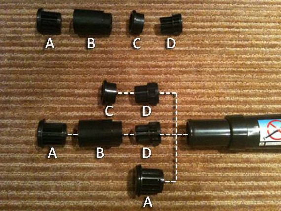
That’s a question I get all the time. There are three different eyepieces depending on how you assemble the components:

There are three eyepieces for the Galileoscope depending on how you assemble the components.

Creative Commons License Galileoscope eyepieces photo-illustration by Peter Newbury is licensed under a Creative Commons Attribution 3.0 Unported License.

The easiest way to use your Galileoscope is with eyepiece A. It gives a fairly widest field-of-view (you can see the largest region of the sky) with a 25x magnification. This is the combination I recommend to new users, parents and kids, and school groups. With this eyepiece, you can easily see the craters and shadows on the Moon and the moons of Jupiter.

The combination A+B+D gives an eyepiece with 50x magnification because B+D create a Barlow lens that doubles the magnification. The increase in magnification comes at a cost: a much smaller field-of-view and fainter image. It is almost impossible to use this 50x combination without a tripod (which the designers anticipated by building a nut into the bottom of the Galileoscope that fits any standard camera tripod.) If you have a tripod and a clear, dark skies, you can see the rings of Saturn. Yes, the rings of Saturn! And that’s magical.

Finally, there is a special lens combination included for historical (and educational) reasons. You see, the Galileoscope was designed as a cornerstone project of the 2009 International Year of Astronomy (IYA2009). That celebration marked the 400th anniversary of Galileo using his telescope to observe the Moon, Venus and, in 1610, the moons of Jupiter. The special “Galileo eyepiece” C+D mimics the view Galileo had, with a meager 17x magnification over a tiny field-of-view. The image appears right-side-up, though, unlike the 25x and 50x combinations which invert the image as most refracting telescopes do.

With all these eyepieces and magnifications, I still recommend the simplest one, just the 25x. In fact, when I’m doing “sidewalk astronomy” I keep the Barlow lenses in my pocket and pull them out only with the more advanced telescope users. Going from naked-eye to 25x already opens up a Universe of wonders.

Parents, teachers, sidewalk astronomers: The Galileoscope design team has put together a great collection of resources. You can order Galileoscopes directly from them, from Learning Encounters or check your local telescope store.

I’m really interested in learning to take pictures through my Galileoscope. If you’ve taken some good ones and have any tips, I hope you’ll share them below.

Posted in astro 101, outreach | Tagged , | 2 Comments

Why do we teach astronomy?

I just spent a week in Seattle at the 217th Meeting of the American Astronomical Society. If you’re here via my Twitter feed, you’ve been bombarded with my #aas217 tweets. I’ll be sharing some thoughts and experiences in future posts. There was one experience that really sticks in my memory, though.

Ed Prather from the Center for Astronomy Education led a workshop that I attended. I’ve been to a number CAE workshops with Ed. He’s intense. You don’t have “thin” conversations with Ed.

Ed and his colleagues are dedicated to teaching (and teaching  teachers to teach) “Astro 101”, the general education course that 100,000’s of non-Science undergraduates take each year. It’s likely their first, last and only science course. As Ed proclaims, and with which I wholeheartedly agree, we need to teach these people science. Not because they’re on their way to becoming scientists – that audience isn’t taking “Astro 101”. Rather, these people are the next generation of teachers, lawyers, politicians, journalists, parents.  In this age of technology, medical advances and global warming, it’s vital that the next generation of voters be scientifically literate.

Yes, YES! Just the pep talk that gets my heart pounding! And then Ed continued…

Why it is so critical? Because high-tech, science-related jobs in the United States are not being filled by Americans.

Wazzat?

Don’t get me wrong — there is nothing wrong with patriotism. In fact, I admire how strong his convictions are. And if I dig deep enough in my brain and heart, I’ll probably say the same thing about Canadian kids. But I haven’t thought about it that way. I’m still at the “let’s do this for our kids because they’re inheriting our mess.” Maybe that’s naive of me. Or maybe it’s a Canadian/American thing. Either way, we all agree that scientifically literate citizens are critical to our — all of our — future.

Posted in astro 101 | Tagged , , , | 3 Comments