Mapping 50 Years of Melting Ice in Glacier National Park
from NYT
As Donald Trump tries to silence the EPA on climate change the glaciers are melting. An example of maps that communicate much more effectively than words alone.
from NYT
As Donald Trump tries to silence the EPA on climate change the glaciers are melting. An example of maps that communicate much more effectively than words alone.
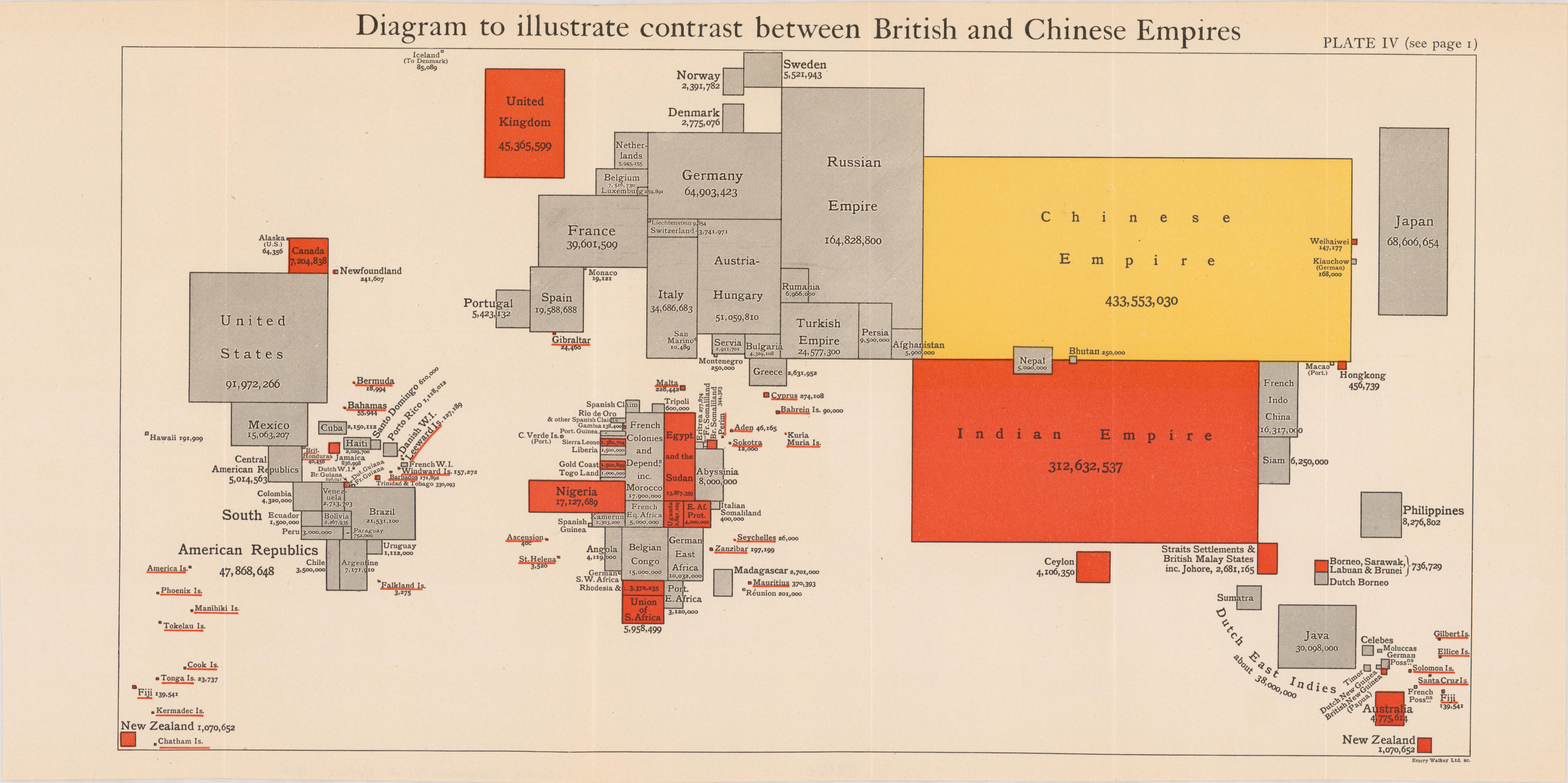
Can a cartogram be a map? Can population by area in proportional relation to one another can be a form of mapping, and as such, a form of territorializing?
Sam
Michele Mauri
Cover Mania
Information is Beautiful prize winner: Cover Mania, a map showcasing the most covered songs from 1958-2010.
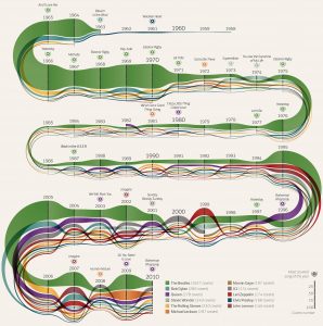
http://www.informationisbeautifulawards.com/showcase/436-cover-mania
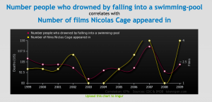
Today’s conversation about the map of Napoleon and the Russian Campaign of 1812 made me question how fully we can trust the correlation between sets of data in maps and graphs (i.e. the seemingly direct relationship between temperature and death rates). Surely there must have been other factors at hand.
‘Spurious Correlations’ an absurd website that links sets of nearly identical, yet completely unrelated sets of data.
Example pairings of spurious data pairings include:
See more uncanny pairings here.
Interesting group to check out with an array of data visualization projects.
“DensityDesign is a Research Lab in the Design Department of the Politecnico di Milano. It focuses on the visual representation of complex social, organizational and urban phenomena. Although producing, collecting, and sharing information has become much easier, robust methods and effective visual tools are still needed to observe and explore the nature of complex issues.
Our research aim is to exploit the potential of information visualization and information design and provide innovative and engaging visual artifacts to enable researchers and scholars to build solid arguments. By rearranging numeric data, reinterpreting qualitative information, locating information geographically, and building visual taxonomies, we can develop a diagrammatic visualization—a sort of graphic shortcut—to describe and unveil the hidden connections of complex systems. Our visualizations are open, inclusive, and preserve multiple interpretations of complex phenomena.
DensityDesign is committed to collaborating with other researchers and organizations devoted to academic independence and rigor, open enquiry, and risk taking to enhance our understanding of the world.”
Cool demonstration of how different locations could affect the quality/expressions of sound!
I found myself in a bit of a smell-mapping wormhole after listening to Act Three of episode 110: Mapping of This American Life (I live in Hastings-Sunrise, so am subject to the putrid smell of the West Coast Reduction on north-west windy days.) In doing so I stumbled upon the work of Kate McLean, “an artist and designer, creator of smellmaps of cities around the world.” McLean’s full portfolio of work is available HERE.
“Smell remains an under-valued and under-researched sense which possesses the capacity to induce time-travel and momentary location-displacement, translating anonymous space into personalised place.” – McLean, K (2013) PhD Abstract Version 3
Related Resources:
Lee, Vivian. 2014. “Data for a New York ‘Smellmap’ Collected Sniff by Sniff” New York Times. https://www.nytimes.com/2014/09/12/nyregion/the-data-for-a-map-collected-sniff-by-sniff.html?_r=1
Young, Molly. 2011. “The Smelliest Block in New York.” New York Magazine. http://nymag.com/guides/summer/2011/smelliest-block/
McLean, Kate. Daniele Quercia, Rossano Schifanella and Luca Maria Aiello. 2015. “Smelly Maps: The Digital Life of Urban Smellscapes” In Proc. of the 9th International AAAI Conference on Web and Social Media (ICWSM).
Daniele Quercia, Luca Maria Aiello, Rossano Schifanella. 2016. “The Emotional and Chromatic Layers of Urban Smells” In Proc. of the 10th International AAAI Conference on Web and Social Media (ICWSM).
Good City Life. Smelly Maps. http://goodcitylife.org/index.html
Enlarge

Enlarge

Enlarge

http://www.boredpanda.com/fun-maps-they-didnt-teach-you-in-school/
This site above has a good collection of interesting and fun mapping projects that can help ignite some inspiration for the next project. It covers all kinds of studies from the map of Pangea to a more serious map of beer names in Europe.
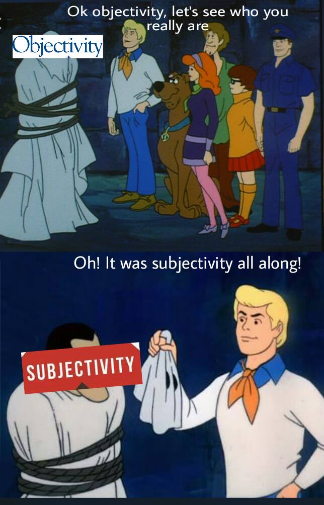
Subjectivity masked as objectivity is a common trope, it turns out, and not just in maps!
