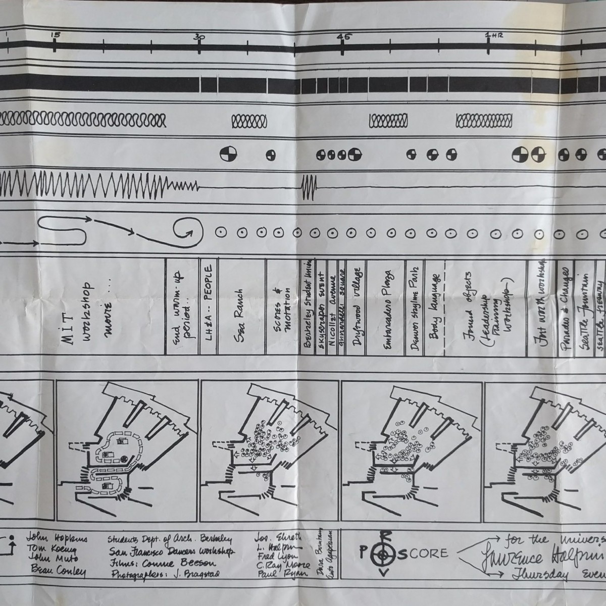
Temporary conversion_Insurgent Cartograpgy

DN_Asignment 1_Temporary conversion 1.0

Deconstructing & Assembling

As a point of departure to deciphering the Temporary Conversion map, it is deconstructed into different layers. These layers are then used as faces of a box, and are thus packaged anew.

The packaging mimics the inherent functioning of maps as tools and mediums which package selected information and data in intentional manners to reveal or hide information.

This revelation is paralleled in the box, as the original map is revealed within the box.

Game of Thrones: made with cogs and wheels

Games of Thrones opening credits
First aired: April 17, 2011
Location: Westeros (fictional) | created in Santa Monica, CA (digital)
Media: CG model built in Maya (made to look like natural materials)
Title designer: Angus Wall, with a team of 25-30 people
Original size/scale: intended for widescreen home TV’s
Projection system: map projected on the interior of a sphere
Target audience: fans of the Game of Thrones books

Readers of the Game of Thrones novels flip to the map at the front of the book if they need to orient themselves in the fantasy world of Westeros – and in the same way, viewers of the Game of Thrones television series watch the opening credits at the beginning of each episode. This opening sequence translates the printed map into an animated landscape that sets the tone for the show. Now with an animated form, the map is in a constant state of flux and change, just as characters and cities likewise change within the narrative. Very few title sequences are the same from episode to episode, just as nothing remains static for very long in Westeros. The gears and intricate mechanisms working beneath the surface of the map also represent the hidden and interlocking schemes of the characters vying for the throne – using the form of the map to help tell the show’s story in a new way.

http://www.artofthetitle.com/title/game-of-thrones/

Halprin’s Score: Symbolization of the Creative Process

Enlarge

Halprin
Source: http://graphbooks.com/image/books/_1200/Halprin.jpg

[Halprin Workshops]. Halprin, Lawrence, et al.

Experimental Workshop Score for the UC Berkeley Art Museum (1971).

Lawrence Halprin
Paper, 13 x 22″

The late Lawrence Halprin used scores as a means to visualize his creative process. By graphically communicating the abstract,  Halprin creates an open map that invites collaborators to become involved in the process.

SonaR

SonaR
A Map of Orange Cell Phone Activity in Paris

https://vimeo.com/157655906

Year Completed: 2016
Location: Paris
Media: Video
Authors: Catherine Ramus, Cezary Ziemlich, Pascal Taillard, Marc Brice, Orange Labs

Information+ Exhibition June
16–17, 2016, at Emily Carr University of Art + Design in Vancouver, BC, Canada.

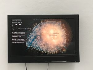
The SonaR project visualizes the Orange cell phone activity in Paris in three different days: a normal day, “Je suis Charlie” Rally Day, and New Year’s Eve. Each point on the map represents for a cell tower. The brightness of that point shows the level of activity of that cell tower. The data is collected from Orange, a mobile phone operator in France.

On January 11, 2015, “Je suis Charlie” Rally Day, 3.7 million people gathered on Place de la Repbulique and marched towards Place de la Nation in tribute to those killed by terrorists. We can easily find photos, videos and news reports of this rally. However, the video of SonaR project recorded this event from a different angle. We can see from the video that before 8:30, only very few people used their cell phone. Then the cell phone activity gradually increased in the morning but is still evenly distributed, which is not surprising because that day is Sunday. People start gathering at Place de la Repbulique from noon. At 3 pm, cell phone activity reaches the climax. After that, the brightest part moved towards Place de la Nation and disappeared gradually at 7 pm.

This video only uses the data of Orange cell phone users, so the activity of other mobile phone companies is not shown. The parks, river bank and railway areas are not shown on the map. The accuracy of the map is also limited by the location of the cell towers. The brightness of any point on the screen doesn’t reflect the level of cell phone activity on that point. The map is only accurate if you look at the overall trend, not specific points.

BIKEMAP.ORG

BikeMaps.Org
A Crowdsource Tool for Global Mapping
of Cycling Safety
May 2007 to May 2017

BikeMaps.org is a website that bikers can share their cycling experience through this website. This website collects the information about cycling safety, hazards and bike thefts
and then uses GIS and statistics to identify hot spots of cycling safety, risk, and crime.
Excepting for the hot spots of incidents, this website also shows rider density data. This data comes directly from the Strava cycling and running mobile tracker application. Using Strava, bikers can track their commutes and recreational rides using their Android and
iPhone. This website can show data that collected in recent ten years and the map shows data reported by bikers and official report(such as ICBC report).

Compared with the cycling map made by Vancouver government. I think the advantages of bikemaps website are that the website keep updating the latest data and bikers are able to find the real-time density in the bikeways.

link:

http:// bikemaps.org

http://vancouver.ca/streets-transportation/cycling-routes-maps-and-trip-planner.aspx

ComplexCity

LEE JANG SUB   ComplexCity   Year Completed: 2008

 “This project is an exploration to find a concealed aesthetic by using the pattern formed by the roads of the city which have been growing and evolving randomly through time, thus composing the complex configuration we experience today. I perceive the city’s patterns as living creatures that I recompose to form an urban image.”

— Lee Jang Sub  http://www.leejangsub.com/

The geographical information provided by this map is not important. It is the author’s action: selection, neglection, and elimination that transformed his personal imagination to comprehensible graphics that gives the map new significance.

‘Africae novo’ map

  • Its geographic representation is quite accurate. The artistry of this map is breathtaking. The vivid colors, the artwork around the border, the fanciful creatures scattered over land and sea, all add to the sense that this was as much a work of art as a map.
  • The continent of Africa portrayed on the map is actually a close illustration of the scale and shape of the continent.
  • The map reflects European exploration bias.

Think about it: How much can we trust the information of the map when we know like most cartographers of the time, he was not an explorer himself and he drew his maps from the accounts of explorers, traders, and travellers?

http://chnm.gmu.edu/worldhistorysources/unpacking/mapsanalysis.html#