
In Arts One this week we read Osamu Tezuka’s Buddha: Kapilavastu, which is the first volume in Tezuka’s Buddha series.
As usual for Arts One, there was so much to talk about and I wanted to raise some issues and questions that we didn’t get time to discuss. The problem is that I left my book in my office and am now trying to write a blog post over the weekend with just my notes. Not so great when you’re writing about manga, where the images matter a lot and I might not remember all aspects of them. But I’ll try.
Visual language
One thing I focused on this week while reading Buddha Vol. 1 is what Cohn & Ehly (2016) call “visual language”:
Just what is meant by ‘‘visual language’’? Humans use patterned ways of communicating in the visual-graphic form (i.e., drawing) just as they do in the verbal form (i.e., speaking). However, there is a terminological gap between these modalities with regards to the system employed in this process: we speak in a spoken language, but we draw in __?___. The answer to filling this gap is a ‘‘visual language” …. (19)
A visual language, as I understand it, is a way of communicating through images without words (because words themselves can be taken as images, as we discussed today in class–the Japanese characters seem to “fit” better in some of the images than the English letters/words because of their shape).
Cohn and Ehly (2016) go on to talk about something like words in visual language:
… graphic patterns are stored as schemas of form-meaning mappings in the long-term memory of their creators, similar to the way that verbal patterns are stored as schemas (words) in spoken languages of the world (Cohn, 2013b). To the extent that people might share the same cognitive patterns, we might say that they draw in a common visual language. (19)
So there can be image-meaning units like there are word-meaning units. Cohn and Ehly (2016) call these “visual morphemes,” and a list of some of the visual morphemes they say exist in manga, according to their research based on what Japanese researchers have said and their own study of many manga themselves, can be found here: Morphology of Japanese Visual Language.
Now, it’s worth noting that their research is not without its critics, of course (as any good research isn’t). in this post Nicholas A. Theisen calls out Cohn for essentializing “Japanese” visual language as if we could focus all visual language in manga down to a single kind of essence. He also criticizes Cohn (and others) for making arguments based on a biased empirical sample:
In formalist Japanese manga studies discourse (e.g. Natsume, Takeuchi, or Yomota), the basic features of manga in toto are first identified in comics for men/boys and only thereafter are the stylistic conventions of many shōjo/josei manga seen as variants thereof. An honest question: why isn’t it the other way around? Why aren’t shōnen/seinen the variants?
So I’m not going to make any claims about a particularly “Japanese” visual language here.
What I’m interested in is just paying attention to the idea of visual language and how we can see certain images as regularly suggesting a certain meaning/range of meanings, just as words will be regularly connected with a (range of) meaning(s).
Visual language in Buddha: Kapilavastu
Where can we see in Tezuka’s text particular images/symbols that are regularly associated with a meaning that we can get just from the image itself? Of course, there are lots of things like drawings of faces, people, horses, ducks, etc., that are representative of certain entities in the “real world.” What I’m interested in are the more abstract images.
Motion lines
So, for example, movement is expressed in certain regularized ways in this book and in other comics too. Quite often, motion lines are used to show how an object is moving or has moved within a panel. Here’s a simple example:
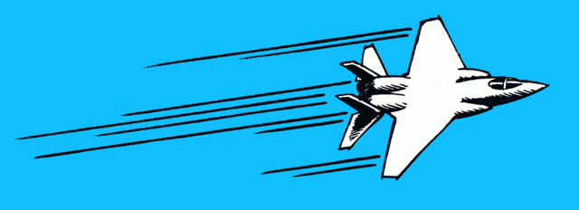
Fast Aeroplane with Motion Lines, Derivation by Chris McKenna of a work by Carlos Latuff, Wikimedia Commons, licensed CC BY-SA 4.0
We see these a lot in Buddha Vol. 1, and we also see a different kind of motion line in numerous places in the text as well. Instead of the lines streaking from an object, they take up more of the background of a panel but still suggest motion. This page has a good example of what I’m talking about–see the last image in the vertical series of motion lines (since the page doesn’t say one can reuse the images, I can’t re-post the image here).
One example (and here’s where I wish I had my book with me!) is when Chapra first gets on the horse that Tatta has possessed, and before he finds Budhai being attacked by crocodiles. One of those panels has a background with lots of horizontal lines and the horse is galloping (I’m pretty sure this is from p. 129, if my notes are correct). The lines aren’t going from the horse, but are behind the images in the panel. In one of the panels on p. 129 Chapra is on the horse who is rearing up (if I remember correctly) and the lines in the background are circular rather than horizontal like they are when the horse is galloping. I still get a sense of movement from the circular motion lines, even though clearly the horse and rider are not spinning around in circles. But I’m not sure what kind of motion I’m getting from it, or why the circles might make sense in that context.
What’s interesting to me is that for me, the motion lines like the ones coming from the aeroplane above just feel more natural, they feel more like they are indicating motion. The ones that are in the background of the frame feel less so. Scott McCloud, in Understanding Comics, argues that these latter kinds of motion lines are more common in manga than in American or European comics (112-113), and perhaps I am just more used to expressing motion with a different kind of “visual language” than the lines in the backgrounds of panels.
Other symbols
Many of the visual morphemes in Buddha Vol. 1 made sense to me, probably because they’re part of a common visual language that I understand.
For example, there are a number of places where things hit one another (swords on shields) or people hit one another, and there are stars that seem to come out of the impact point. That’s a common symbol I’ve seen a lot in cartoons and North American comics. Similarly, when Tatta is disoriented on p. 102 there are stars that look like they’re going around in a circle (is that right? again…working from notes w/o a book) and then in another panel there are those little funny circle things that look like he is disoriented, like those icons with four lines on top of this guy’s head:

It’s clear to me that Tatta is dizzy, partly by the context of what is happening, of course, but also because of those icons that just shout drunkenness or disorientation to me.
In addition, the use of musical notes on pp. 50, 232 and 240 make sense to me. The ones on p. 50 are when Chapra is about to get his cloth back after Tatta stole it, and it seems to me they are signaling him being happy about it–he is reaching out to the cloth and excited to be getting it back. Later, I think on 232, the girls who come to fawn over Chapra have both hearts and musical notes above their heads–the hearts clearly signaling love or desire and the musical notes signaling, perhaps, something like joy or excitement. Chapra has music notes near him on p. 240, but there I think he might actually be singing what the words are saying.
Symbols I am not sure about
Then there are some I find more puzzling, one of which I think I get and the other I don’t.
First, there are a lot of speech bubbles with just ellipses in them in this text. Looking at the context of those, it seems that the characters are not saying anything, and somehow the ellipses mean more than just pure silence. They are somehow a meaningful silence. As I mentioned near the end of class today, they suggest a silence that calls attention to itself. So then I did a web search on ellipses in manga, and Wikipedia says this (okay, yes, maybe those who wrote it don’t know what they’re talking about, but it resonates with how the ellipses feel to me):
In manga, the ellipsis (i.e. three dots) is also used to express silence in a much more significant way than the mere absence of bubbles. This is specially seen when a character is supposed to say something, to indicate a stunned silence or when a sarcastic comment is expected by the reader. (Wikipedia, Speech Balloon)
The one that’s still puzzling me, though, is the symbol that looks a bit like a mushroom that has been cut from the ground and still has some stem on it. It’s found on p. 94 (I think in a panel with Budhai laughing), then on 202, 210 and 216 in the scene with the snake (in two of those it is near the snake’s head when the snake is dead or dying), and again on 377 and 379 (my notes don’t tell me what is going on on those pages). I just didn’t get what that might refer to. And it occurs often enough that I don’t think it’s just a fluke; it seems to be there on purpose, for some reason.
I’d love to hear your thoughts on any of this, and/or some particular symbols you found interesting or puzzling…

On pg129, where you mention the frame where the motion lines are circular rather than horizontal, I feel like it signifies the motion of a horse rearing up, like it goes both forward and upwards. And as for the motion lines in the background, I feel like they’re less indicating the motion of the horse and rider and more so the scenery passing by.
One of the frames that I don’t get but I also somewhat do is the bottom right hand frame of pg68. It;’s the one where the slaveowner(?) is thrown up into the air by tiger-Tatta and he rolls into a bunch of bowling pins. I find it so awkward and out of place, but at the same time it makes sense. To me, if this were a scene in a book, it would be something like, “…and suddenly the tiger clamps onto the back of his pants, shakes him in the air violently, before tossing him to the side like a bowling ball in a strike.” That image evokes the same thing you picture in your head when you read a simile. In that way, it makes sense to me. Still feels very very out of place though.
The sound effects in fight scenes are also weird to me. Without them, the fights would be less exciting, but sometimes they look distracting on the page. I’m looking at page226-7 specifically. The gallop, gallop, gallop, gallop is a bit redundant and annoying and the whee of the arrow is just a little ridiculous, but I think the translation also makes a difference. Like Elliott mentioned in class, Japanese can use single characters as sounds, rather than in English, they’re much more clunky and long. Perhaps that’s why they don’t look or feel as seamless as it may if we were reading a Japanese version.
One thing I loved though, is how Tezuka makes use of the frames themselves as part of the art. For example, on 378, the vizier bounces up and down and the frame acts like walls for him to bounce off of. On 285, Chapra seems to break the frame in anger. Sometimes things portrude from the frame and into the gutter, like an indication of the seamlessness of action (again, like the fight scene on 226-228). I think it adds an extra dimension and makes it look interesting.
As for the mushroom shapes, I’m still not sure. So I took to Wikipedia (my best friend) and found this: “An odd white shape (more often than not, something close to a mushroom) that appears during an exhale represents a sigh of awkward relief or depression.” https://en.wikipedia.org/wiki/Manga_iconography
Very oddly specific, but I guess eventually we need a symbol for everything!
Ah, good point about the circular lines in the background of Chapra and the horse on p. 129. And it also makes sense that it’s the background moving when they are riding, with the horizontal lines on the bottom of that page. That’s what McCloud and others claim is a difference in manga, that sometimes the motion lines are showing the motion of the background while the reader/viewer stays with the subject of the action so that the subject of the action seems to be stationary (the horse and rider) while the background blurs as if it’s moving. So we’re moving with the subject, the horse and rider rather than them moving past us.
I, too, was taken a bit aback by the slaveowner being thrown and running into a bunch of bowling pins. It was at that point in the book that I thought, okay, this is really an interesting mixture of the serious and the comedic. It did seem very out of place to me. I like your translation of this into words–that makes sense!
I am so glad that we had Elliott and others who could translate the original to show that for some of the words we have as “sound effects,” there are more descriptive sounds in the Japanese rather than words per se. At least, for the “silence” word on p. 229. I wish I could get a sense of how the characters can fit better into the pictures than our words can; I can only imagine what that must be like. Our words really stand out AS words, and become clunky as you note.
I was going to bring up in class the point about people bouncing around in the panels, but ran out of time! There’s also the spread on p. 86 where Tatta is running towards his family in the burning village, and he not only bounces around the panel and out of it at the bottom left, falling into the one on the very bottom left; he also punches through the panel into the area behind it, and then back out to the front. With that one, and with the one with Chapra on p. 285, I feel like their emotions are so strong that they can’t be contained within the frames of the panels. Tatta is so frantic he wants to search everywhere for his family, even behind the frames. Chapra is so angry that he wants to take control, to show he has control, rather than being contained in frames drawn by someone else. Bandaka has just taunted him as if he is worthless, and perhaps he wants to show his strength.
Good to find something that suggests what those strange mushroom things are! I found another one, on p. 107, where a man is killed by the soldiers. So it is sometimes connected to people or animals dying, but sometimes to other things. On p. 377 it’s the vizier who has it, when he is saying in surprise, “You love him?” to Malikka. On p. 379 it’s someone in the court of the king who asks Chapra’s mom whether it was too hard for her to say whether she gave birth to Chapra or not. Those don’t quite fit what Wikipedia says I think. But maybe Tezuka was just making up a symbol for his own work. Or maybe it’s just a coincidence that he uses the same thing for multiple ideas, and it’s just a kind of random thing he drew. Somehow I think it’s more purposeful, though!