Multiliteracies in ELA Classrooms

Entries Tagged as 'Visual Literacy'

Performance Poetry

July 20th, 2014 · 2 Comments

“You will write if you will write without thinking of the result in terms of a result, but think of the writing in terms of discovery, which is to say that creation must take place between the pen and the paper, not before in a thought or afterwards in a recasting…It will come if it is there and if you will let it come.” Gertrude Stein

My second multimedia project for this course focuses on the process of poetic composition. I used Quicktime to screen capture my creative process as I wrote. When I showed this performance to my class they suggested that the poem might do well to be scored. I instantly thought of Mozetich’s “Postcards From the Sky” (look it up). So, as for my piece–watch it and consider having your ELA classroom experiment with their own performance poems. Don’t worry about a “rubric”. This is a process, remember? It’s all about feedback. Have a conversation about it. Have 3.

My performance can be seen here.

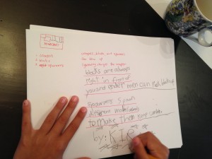
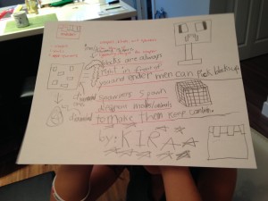
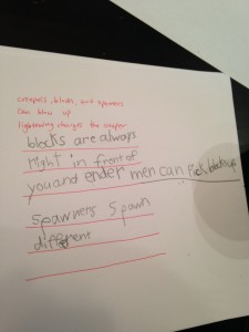
Incidentally, here is the process of an 8 year old in action writing about Minecraft and then drawing a picture inspired by her poem:

photo 1

photo 2

photo 3

Tags: gaming · Media Project II · multiliteracies · Visual Literacy

An Education for Instability

July 16th, 2014 · 4 Comments

In his article “A Curriculum for the Future”, Gunther Kress writes that a radical shift in thinking and curriculum in ELA classrooms is due to occur in response to the different needs of the contemporary adult in 21st century society. He states that the world has changed so much that the 19th century model of education is just not applicable anymore. Kress calls for a shift in curriculum from an education for stability to one for instability:

“Associated with this are the new media of communication and, in particular, a shift (parallelling all those already discussed) from the era of mass communication to the era of individuated communication, a shift from unidirectional communication, from a powerful source at the centre to the mass, to multidirectional communication from many directions/locations, a shift from the ‘passive audience’ (however ideological that notion had always been) to the interactive audience. All these have direct and profound consequences on the plausible and the necessary forms of education for now and for the near future.” (138)

The notion of a multi-directional communication and a shift to an interactive audience is what stands out for me in Kress’ assertion. As such, I have designed an activity for use in an ELA classroom that allows students to be creators and participators in such a communication. Using a variety of online tools, students are able to work collaboratively to create a co-authored product. The product can be inspired by whatever you are currently studying in your class—it could have a thematic or topical connection to a literary text, or it could simply be a pre-writing exercise begun with a prompt. The only stipulation is that the activity be carried out in silence thus disturbing the notion of passivity and activity, telecommunication and proximity, and the product of the individual vs. that of the group. So far in this class we have explored the following topics:

• modes of representation in ELA classroom/21st century literacy
• visual literacy and rhetoric
• media literacy
• social media and the notion of participation
• new literary forms/e-literature
• computer mediated communication
• gaming

I also designed this activity to address pieces of all of the things we have discussed thus far in regards to these topics.

Activity:
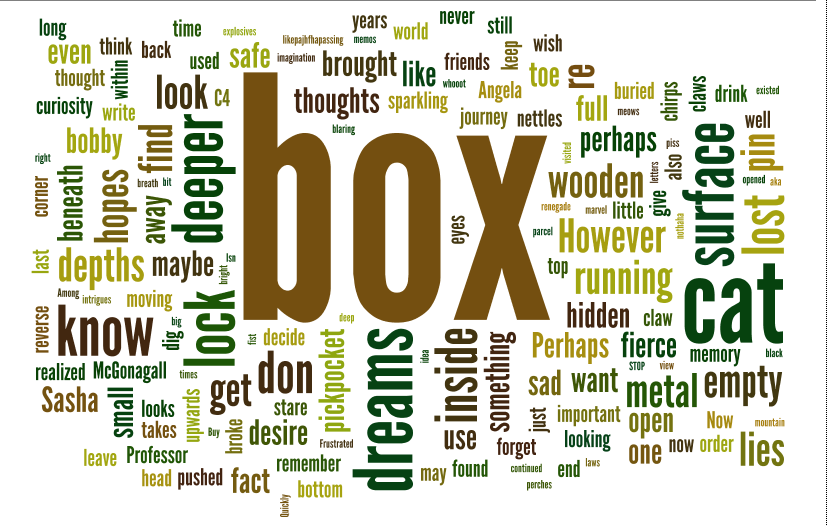
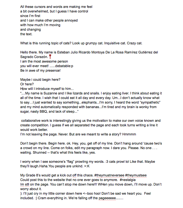
In a group setting, students will work in silence to participate in a back channel conversation while they co-author a textual document with a particular purpose. This purpose may be nebulous or fixed. The backchannel application I use is Today’s Meet and the document will be created in Google docs. Each student will be invited to share the document and simultaneous editing will be possible. Google docs also has a “chat” capability which may or may not be used. I will begin the class by explaining the task and the “rules” as well as work with the students to determine the loose direction of the task. Once we have a sort of trajectory, we will begin and allow the interaction to take us where we will. The backchannel and the doc will be projected on the screen for all to witness (though it occurs to me that maybe just the backchannel might be appropriate). After the time is up, we will take the product (the created text) and render it in a text visualization tool. A teacher could then take this one step further and have the students create a found poem from the word cloud that serves as their reflection on the task.

After I execute this today, I will post the products as an exemplar.
-gunita.

Works Cited:

Kress, G. (2000). A curriculum for the future. Cambridge Journal of Education, 30(1), 133-145.

The Products:

wordle

Screen Shot 2014-07-16 at 3.45.43 PM

The Today’s Meet chat transcript was lost to the ether but, interestingly, the group chose to communicate via in-doc Google chat instead.

Tags: computer-mediated communication · e-literature · Lesson Plans · multiliteracies · Presentation · Seminar Prompts · Social Media · Visual Literacy · Weblog Activities

“Passionate Shepherd to His Love” and “The Nymph’s Reply.”

July 9th, 2014 · 1 Comment

LLED 368 Media Project Response <- Our rubric, commentary on project/process, and sources. http://toondoo.com/ <-This is what I used to create the “comic elements.” Cheers, Elaine and Sarah

Tags: Visual Literacy

Robb, Rahela, Justin, Peter, and Brian’s Media Project One: Visual Media Literacy

July 8th, 2014 · 1 Comment

For our “Media Project: One”, we  decided to experiment with using images to respond and represent an iconic and canonical English language poem: W.B. Yeats’ ” the Second Coming”. The process of creating this product is described in the below .pdf:

Media Project One – Visual Media Literacy

To view the film that we produced, please visit Youtube and leave a complimentary comment!

Tags: multiliteracies · Visual Literacy

Response to “I See, I Do: Persuasive Messages and Visual Literacy.”

July 7th, 2014 · No Comments

I believe that visual literacy is an important skill that often goes underdeveloped (or is neglected altogether) in current teaching practice.  The primary context in which these skill are taught is in the visual arts (which, to an extent, are elective courses).  As a result, the development of these skills can be interpreted as “elective” as well and therefore unimportant.  This is far from the case as much of the media that our students engage with on a regular basis and that we are routinely exposed to as well usually has a visual component that is often central to the meaning of the piece.  In order to be considered “literate” in contemporary society, students must be taught the skills necessary to “read” these images and identify the meanings and ideas that they represent, or else they will find themselves in a situation that is equivalent to signing a contract that they cannot read, or navigating an urban terrain full of signs written in a foreign language.

Because visual media has become such a central part of our everyday experiences, we process images so quickly that it is easy to absorb those persuasive messages without realizing that we are doing so.  To this end, I really appreciated the guidelines that this article recommended as they provide a simple framework that students can use to “cross-reference” the visual media that they are presented with; they can incorporate these questions into their daily practice and engagement with visual media without even really having to think too hard about it. The tools and questions that were provided in the article can easily be used in an English Language Arts classroom to promote visual literacy in conversation with “conventional literacy” and critical thinking.  The concepts presented in the article, like the intended purpose of a persuasive image, the explicit and implicit content presented in an image, inferences that the author/artist is making (and is asking the audience to make as well), and the technical devices that are being used to convey those messages are also “transmedial” so an activity where a student “reads” a persuasive image can be used to scaffold skills that they could then use to criticize the literature that we are reading in class.

Since we are largely in the business of teaching critical thinking skills, I think we have a responsibility as educators to use whatever resources we have available to us (such as those presented in the article) to integrate visual literacy into our teaching practices so that our students can be literate across all platforms when they leave our classrooms.

(Sarah Lowen)


Tags: Visual Literacy

“Using Graphic Novels, Anime, and the Internet in an Urban High School” Reading Response

July 6th, 2014 · 1 Comment

In their article, Using Graphic Novels, Anime, and the Internet in an Urban High School, Nancy Frey and Douglas Fisher provide an interesting discussion on the use of graphic novels within the classroom as a way to develop visual literacy and writing skills amongst students. According to Frey and Fisher, graphic novels are a form of popular culture that has the potential to engage students in authentic writing and allows for the scaffolding of important literary skills by teachers. As a teacher candidate who used a graphic novel during my practicum, I found that they are an engaging tool for developing students’ writing skills and introducing them to critical visual literacies that are relevant to modern society. However, while Frey and Fisher have successfully demonstrated effective teaching approaches to using graphic novels in the classroom, they do not stress the importance of teachers being well versed in how to read and understand graphic narratives before they begin to teach it to a classroom of students.

While on practicum at John Oliver Secondary, I decided to use the graphic novel Maus in my Communication 11 classroom in order to help develop writing techniques and visual literary skills of my students. During our exploration of the text, I found that simple elements, like the quality of cartooning, served as a basic yet helpful tool to teach my students about literary devices like hyperbole and metaphor. By analyzing these intentional features of the text, my students developed a better understanding of these literary devices and how cartoonists use them to create meaning in their graphic novels. During our study of Maus,we also explored the historical ramifications of the Holocaust, and critically analyzed certain reappearing themes in the graphic novel like family, memory, guilt and war. Thus, while graphic novels are helpful tools to develop writing skills, I also found that they could be linked to certain cultural or social issues for the purpose of class discussions.

In many ways, I agree with the root argument put forward by Frey and Fisher; that graphic novels can be an effective and inexpensive way to introduce critical literacy concepts and develop writing skills. However, early in the article Frey and Fisher state that “students seemed reluctant to discuss [graphic novels], perhaps because it would disclose a literary form belonging to their generation” (Frey & Fisher, 19). While this may be the case for many adolescents, I found that most of my students lacked a basic understanding of how to read graphic novels as well as the visual literacy skills needed to critically analyze the text. Therefore, I think that before students can use graphic novels to improve their writing skills they must be taught how to engage with a graphic novel properly. Teachers must understand the specific form of integrated literacy that is required to elicit meaning from a graphic novel and must also be well versed in how to read the text before they can begin to teach their students. Before my students started critically analyzing the main themes of Maus or using the text to develop certain writing techniques, we discussed the basic elements that graphic novelists use to create meaning on the page. Whether it is the style of lettering, the ordering of the panels, or the use of a speech balloon to set mood or tone, each element in a graphic novel is carefully chosen by the author as a way to communicate their message to the reader. Students must be aware of these elements prior to reading a graphic novel in order to fully understand it.


-Cody Macvey


References:

Frey, Nancy and Fisher, Douglas. “Using Graphic Novels, Anime, and the Internet in an Urban High School.” The English Journal 93.3 (2004): 19-25.

Tags: graphic novels · Visual Literacy

Seminar Lead Response – I See, I Do: Persuasive Messages and Visual Literacy

July 6th, 2014 · No Comments

With an article devoted to “addressing persuasive visual messages” (Farmer 33), and which opens with the line that “if a picture is worth a thousand words, then a few images can constitute a persuasive argument” (Farmer 30), I found myself taking a closer look at the image presented at the beginning of the article, and generally paying more attention to the visual layout of the article, in an attempt to analyze it in the same ways that it suggests that teachers should train students to analyze advertizing and other media. The article suggests that what makes an image persuasive is “content, context, and connotation”, so with that in mind, I delved deeper into the article’s visual presence.

The initial image content is of a young woman in a blue shirt, with crossed arms and a skeptical expression on her face. At first glance, we might take the contextual meaning that she is a visual model for the championed stance of skepticism and critical thinking. Looking deeper at context and connotation, and applying some of the analysis techniques recommended by the article, such as considering “who created the message”, “why was the message created”, and “what values, lifestyles, and points of view are represented or omitted” (Farmer 32), I took time to think about why the image was included, why that image was specifically chosen, how it influenced me, and whose values and intentions were being communicated. I was certainly struck by the use of colour, as my second look prompted me to realize that the young woman’s shirt was the same cool azure as some of the accent text, bullet point markers, and dividers between sections. I questioned the effect of the colour scheme, and also questioned whether the young woman’s photo was changed to make her shirt match the scheme, or whether the colour scheme was matched to her actual shirt colour as photographed. The colour scheme of azure, rust red, white, and a much paler azure used in some of the charts, not only granted a coherence and cohesiveness granted by the continuity of the colour scheme, but it also had aesthetic and emotional effects. It is a non-threatening and visually appealing colour scheme, which created an emotional feeling of calm, stability, and authority, that I feel encouraged me to take on a trusting demeanor. The colour scheme connotated an environment of comfort and trust, and helped convince me of the textual argument. Taking a cultural perspective and trying to further understand their “visual coding system” (Farmer 31), I also suspect that as this article was produced in the United States of America that there may have been a subtle connection to their flag, whether it was a conscious or unconscious decision, and that the basic red-white-blue colour scheme would be likely to evoke an American’s patriotic sensibilities and cause them to feel an ethical responsibility to their students and by extension, a responsibility to the wellbeing of the country as a whole, in an endless feedback loop.

These visuals were subtle, yet had a powerful impact of the article’s effectiveness. My own education in visual literacy, possibly augmented by the approaches recommended by this article, have equipped me to unpack the article at both textual and visual levels, and to better understand the meaning being communicated. These skills assist me in assessing visual and textual messages every day, and while I am able to recognize the techniques being used to persuade me in this article, I am the one who has carefully weighed and considered, and decided that the argument has merit, rather than being passively led to agree with Farmer’s conclusions.

Question to Consider:
Visual literacy extends beyond the critical analysis of illustrative or photographic image, and includes all of the visuals included in a given product: the colours, shapes, fonts, and layout. What conventions of this layer of communication do you consciously understand and interpret, and how much of it is interpreted on a subconscious level?

References

Farmer, Lesley S.J. (2007). I See, I Do: Persuasive Messages and Visual Literacy. Internet @ schools, 14(4), p. 30-33.

By Amanda Cameron
Tags: multiliteracies · Presentation · Seminar Prompts · Visual Literacy · Weblog Activities

Adapting the Adaptations– A Fair Comparison?

July 6th, 2014 · No Comments

Adapting the Adaptations– A Fair Comparison? By Justin Bolivar.

Daniel Radcliffe is Harry Potter, Jennifer Lawrence is Katniss Everdeen, Leo is Romeo, Gregory Peck is Atticus Fitch, but there is no way in hell that Rooney Mara is Lisbeth Salander.

Why is it imperative in our roles as readers and viewers that we have specific bonds with characters? Do we feel violated when a film adaption casts someone in a role that is not what meets our mind’s eye? Do we also feel cheated when a character is adapted that does meet our expectations?

In Bortolotti and Hutcheon’s article “On the Origin of Adaptations: Rethinking Fidelity Discourse and “Success” — Biologically,” they discuss the idea that “[a]s a biologist and a literary theorist, [they] decided to look to the possibility of new questions and answers for narrative adaptation theory by investigating the relevance to cultural adaptation of the insights about adaptation in post-Darwinian biology.” (444) In the work, they establish that there is a homogenous relationship between Darwinian biology and how we culturally adapt texts. The key question that the article asks is “how useful is this kind of reductive judgmental discourse in determining either the artistic significance of a work or its cultural impact or even its vitality?” (444)

When considering that an adapted text “stands on its own as an independent work, and can be judged accordingly” (444-445), I think back to Wolfgang Iser’s text “Interaction Between Text and Reader.” Iser states that every “literary work has two poles, which we might call the artistic and the aesthetic: the artistic pole is the author’s text, and the aesthetic is the realization accomplished by the reader.” (391) If a text is presented to the reader or viewer, and they adapt the text to their own meaning. If we split a text into the artistic and aesthetic poles, then every time we read or view a text we adapt it to our own lens, and impose a personal adaptation. So even if a text is adapted from folklore or a book to a visual representation, as a reader or viewer we then adapt the text again. Since we are in a mode of constantly adapting, I agree with Bortolotti and Hutcheon’s idea that adaptations need to stand alone as independent works, and that it is not a fair to either text to look at them in unison.

When we think of literary adaptions in the classroom, we tend to favour print texts over visual texts. Why is this the case? Looking at the example of “Romeo and Juliet,” my school advisor was adamant that the 1996 Baz Lurman film be shown at the end of the unit, and that we should stick to reading the play as a class. However, if we are studying the text as a play and not a community reading activity, then are we really teaching it effectively? When approaching the unit, I first started with the community reading approach, but found that our classroom “adaptation” was not conducive to learning, so I sought out several visual versions of the play, and as a class, we discussed the differences in film, stage, and oral adaptions of “Romeo and Juliet.”

Works Cited:

Bortolotti, G. and Hutcheon, L. (2007). “On the Origin of Adaptations: Rethinking Fidelity Discourse and “Success” — Biologically.” New Literary History, 38(3), pp. 443-458.

Iser, Wolfgang. “Interaction Between Text and Reader.” Book History Reader. Eds. David Finkelstein and Alistair McCleery. Oxon: Routledge, 2006. 391-396.

Tags: adaptations · multiliteracies · Visual Literacy

Response to “I See I Do: Persuasive Messages and Visual Literacy”

July 5th, 2014 · No Comments

One of the earliest commercials I remember having an impact on my was that of the House Hippo. It was a message from Concerned Children’s Advertisers, and was probably the coolest thing I had ever seen. Did I know there were no such things as house hippos, of course; but even to this day I hear my peers talking about that commercial. Visual media can make quite the impact. Lesley Farmer’s article, “I See I Do: Persuasive Messages and Visual Literacy”, makes some very salient observations about the lengths that media is manipulated in our society, and how this can often be directed at students. While the house hippos of my childhood were not meant to sell anything, and the use of image manipulation in other ads at that time was, at least to my recollection, fairly mild, in today’s society there seems to be no escape. 

Farmer’s article has a number of lists that I think could be very useful in the classroom, due to not only their content, but the accessibility of the language. In addition to listing some basic principles of images (30-31), another list had a lot of suggestions on how to tell whether or not an image has been manipulated, such as “[s]hadows fall at different angles or lighting is inconsistent” and “[i]mage resolution varies in different sections of the composition” (31). When I did a critical media literacy unit in Planning 10 during my practicum, I only had one lesson to talk about advertisements. Due to the limited amount of time, my class jumped right into analyzing things such as who the ad was targeting and how they were doing this, but I wish I had had both more time and this article so that before the advertisement lesson, we could have covered some basic image manipulation tricks, and scaffolded up.

When reading this article, a brief discussion in Claire Ahn’s LLED 449 class came to mind, in which she talked about visual rhetoric in young adult literature. She showed numerous book covers for the same novel, and the class picked which ones would appeal to which readers, in terms of age range. When we discuss how images are changed and why this is important with our students, I think we also need to touch upon why are we seeing this one particular image in the first place.

One activity that Farmer suggests is “[a]sk students to locate online images about an international issue; each student (or small group) might choose a different country or culture. Ask them what visual principles appear to be universally applied or culturally defined. To what extent does culture impact the message?” (31) This helped me identify a possible issue when assigning some of the other activities suggested. As Farmer notes, if students lack cultural capital, and do not know our particular culture’s coding, they may very easily misinterpret signs and, therefore, meaning (31). This is something that I had not considered very much when conducting my lesson with my Planning 10 class, but feel I need to be very aware of going forward, and ties into my discussion question.

Question for discussion:

The article talks about how important it is for students to be aware of visual manipulation, and suggests multiple different ways of introducing projects aimed towards this in the classroom. Bearing potential class compositions in mind, what are some possible difficulties that may present themselves, or how might these activities where students are producers need to be adapted?

Work Cited:

Farmer, Lesley S.J. (2007). I See, I Do: Persuasive Messages and Visual Literacy. Internet @ schools, 14(4), p. 30-33.

Tags: Visual Literacy

Farmer Article Response for Seminar Lead Assignment (Weblog #1 – Ashley Slade)

July 5th, 2014 · 1 Comment

Lesley Farmer’s brief, four-page, article has been one of the most practical articles I have read since September. As part of our Education program, we have been exposed to many theories and questions surrounding literacy: what is literacy? how many literacies are there? how do we use them? define them? etc. Farmer’s article aims to clarify the concept of visual literacy, and readers are not only provided with a definition of what visual literacy is, but we are also given examples of construction concepts and principles, deeper level thinking prompts to ask our students, extra resources on the topic, the reasons why teaching visual literacy is important, and much more. Overall, the article was laid out in simple language which made it a pleasure to read, and, coincidentally, the layout of the paper made the text more appealing to the eye. I felt that the most important parts of the article, when looking for theoretical discussion points, were the introduction and the last page as they discuss what visual literacy is and why it is important. The rest of the article was filled with the technicailities behind visualliteracy and examples of how to discuss this with, and develop it in, your class.

In the introduction, Farmer describes visual literacy as the ability to be “critical visual consumers and producers” (2007, p. 30). This means that our students need the skills not only to understand and analyse presented visuals, but also to create their own visual pieces. I found this extremely interesting, because when I have thought about literacy in the past, I have only thought of it in the sense of reading, or internalizing something, not creating it. However, I see the benefits of having the term literacy include both understanding and production. In order to start developing an understanding of visual messages, we should have students “evaluate visual messages in light of what the producer is trying to convince the viewer to do or think” (p. 33). This relates to the traditional English classroom definition of literacy in that in understanding a literary work, we try to analyze the author’s tone, mood, and intention. In order to further establish this literacy, though, we need to have students move on from understanding to actually using these manipulation techniques themselves (p.33). Such techniques can include altering digital images through cropping to remove a certain context, changing visual sequences to alter the cause-and-effect implications, and changing the size of certain items to change perceived importance (p. 32).

The most intriguing and most beneficial part of this reading, in my opinion, is the section (on the last page) in which Farmer outlines specific ways in which students (or any audience) can identify image alterations. By providing us with this information, Farmer is providing us with tools to identify manipulative images. I feel that this will highly benefit our students who live in a world where they are subject to a bombardment of photo-shopped, and otherwise altered, images that tend to have more of a negative impact on their mental health than anything.

Question for Discussion during the Seminar:

Some digital images are edited so well that it is impossible for the average person to tell if an image has even been altered. Do you feel that critical viewing should only be applied to photos that have been altered? Or should we assess and evaluate all visual images regardless of editing?

References

Farmer, Lesley S.J. (2007). I See, I Do: Persuasive Messages and Visual Literacy. Internet @ schools, 14(4), p. 30-33.

Tags: Presentation · Seminar Prompts · Visual Literacy · Weblog Activities