Tag Archives: VisualAssignments

I hate it when spiders just sit there

[I usually do my ds106 stuff on Tumblr, but animated gifs over 1 MB become just gifs there, and I couldn’t make this one small enough without changing it substantially. Damn Tumblr.]

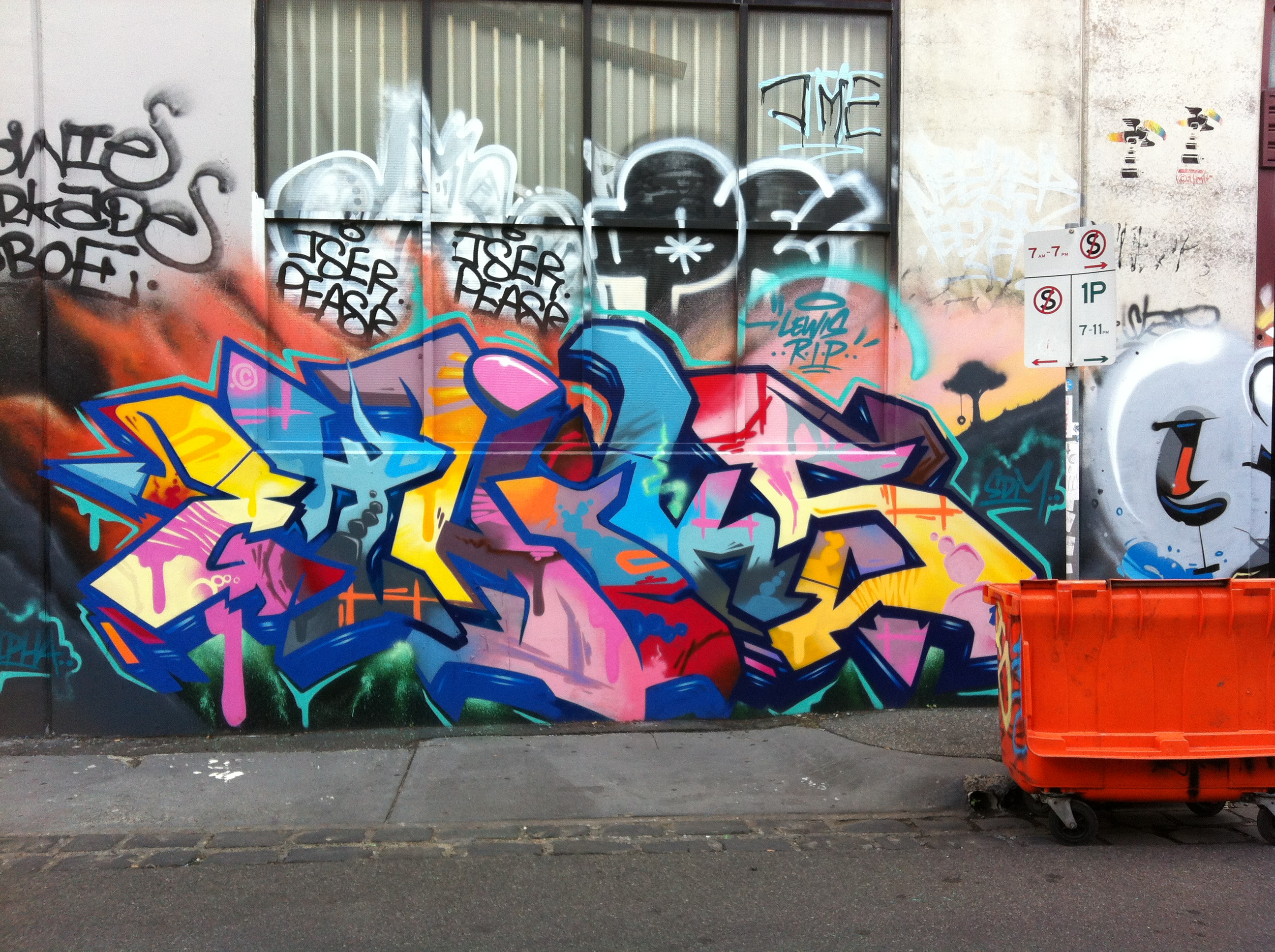
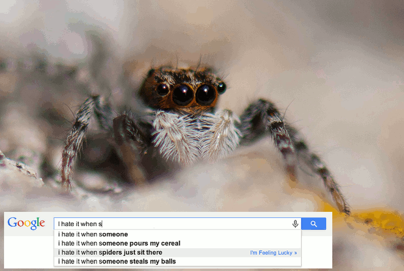
So there’s a new visual assignment for ds106 called “Illustrating odd autocompletes.” I think it’s pretty self-explanatory, especially with the example I’ve made here. I won’t comment on the last autocomplete above.

The idea of hating it when “spiders just sit there” struck me as very odd. I mean, what does one want them to do instead? Wave their legs and scream at you? I think I’d kinda rather they just sit there than, say, jump around wildly.

Of course, having a spider just sit there would be a plain static image. But I wanted to make it so the spider is sitting there doing something. I came up with the idea of having its eyes move, like it’s just waiting for you to do something, or for you to go away, and looking around in the meantime.

I wasn’t sure exactly which way to make the eyes move. At first I thought about making them move in different directions, but that seemed like it would just make the spider look like it had lost its mind, and that wasn’t really the effect I was going for. I thought about trying to make the eyes move back and forth sideways, but wasn’t sure how to do it. I could figure out how to rotate them (see below), but having the white part of the eyes move back and forth in the middle would have been trickier because I would have had to just move the white “glare”, and there is glare on the top of the eye as well as around the bottom. It just wouldn’t look right, I feared. So turning in the same direction it was. I was going to have the eyes go further around, but got tired of dealing with so many layers!

I made a version with just the two front eyes moving and was going to leave it at that, but then my 6-year-old son said: “Mommy, you should make the other eyes blink.” Sure, I thought, that’d be cool, but not gonna happen. But of course, once he planted the idea, I had to figure out how to do it. The blinking doesn’t look like real eyelids, but that wasn’t what I was going for. I just wanted to see if I could make it look like blinking at all! When I was done, my son said: “that’s pretty cool, but why doesn’t the blinking part go all the way down?” I had to tell him that I was just too lazy.

So I found a CC-licensed closeup of a spider (there are some really gorgeous ones on Flickr when you search for “spider close up”!): “Bearded Jumping Spider,” by Thomas Quine, licensed CC-BY. I then set to work on it in GIMP.

The process

I’m out of practice. I learned the first time I did ds106 that I should take screenshots during the process so I can explain what I mean in images rather than only in words. But now that I’ve merged most of the layers (steps 5-7, below), I can’t take any useful screen shots showing the various layers I made.

1. I made a duplicate or two of the original image, so that I could mess around with one and have at least one other one that was intact.

2. To make the eyes move, I needed to isolate them and put them on their own layers. I used the “lasso” or “free select” tool in GIMP to go around the spider’s right front eye, and then I went to Selection->Float, which made a floating layer with the selection. I then went to Layer->To New Layer, which put the floating layer onto a new transparent layer. I did the same thing with the front left eye, and made numerous copies of these (7 or 8, I think). That way I could do a gradual rotation with the layers.

3. But then I discovered a problem. When I floated the selections and put them on new transparent layers, what happened was that those portions of the original image were removed, leaving white space for the eyes. Not a problem if the layers above just cover over that space completely, but when you start to rotate them the white shows through (because they aren’t perfectly round. Given that the eyes are black, this was easily fixed. I just painted in the white areas on the original image with black, using first the “fuzzy select” tool to get most of the white area and then the bucket fill tool, and then, since there was a pixel or two still white around the edges, I used the paintbrush tool to cover over the rest of the white with black.

4. So now I had 7 or 8 each of the right eye and left eye layers, with the eyes surrounded by transparent areas, all stacked on top of the original image with the eye sockets now painted black. Time to rotate. I selected the first right eye layer and used the “rotate” tool to rotate it a certain number of degrees, and then did the same number with the left eye layer above it. Repeat, with the next right eye layer being a little more rotated, etc. Then, about halfway through I reduced the rotation of each eye so that the eyes would go back to their original position.

5. In GIMP, if you try Filters->Animation->Playback with things on different layers like they were, it will animate each layer separately, which means I’d get the right layer, then the left eye layer, then the right eye layer, etc., which doesn’t really show me what it looks like. So I merged the first right eye layer with the first left eye layer, the second right eye with the second left eye, etc. (by control-clicking on the one on top and choosing “merge down”). I also had to merge the first right eye/left eye layer (those two layers now merged) onto the original image, because the original had just black eye sockets and GIMP was animating that separately from the eye layers above it.

6. But there was a slight problem that I wanted to fix. The spider’s left eye isn’t as round as its right in this image, and when I rotated the left it covered over part of the hairy part around the eye, and then when it went back to the original this part showed through again. It was bugging me. So I used the paintbrush tool and painted some of that hairy part around the left eye black, where the eye rotated. Now you can’t see that happening at all.

7. So at this point is when my son said, hey, why don’t you make the eyes on the sides blink? To do this, I had to duplicate the original image that now had the black painted around the left eye as noted in #6, and with the first eye layers merged onto it. I made as many copies of this as I had eye layers. I then gradually painted brown onto the new spider image layers in a way that would look like the brown was going down, then up.

8. Last step was to merge the eye layers with the new spider layers that had brown eyelids painted on them. This was because the new spider layers had eyes rather than black eye sockets (given what I did in #5). And when I animated the layers I got the rotated eye layers interspersed with the original eye positions, so it was going back and forth strangely.


The ds106 daily create for today is to make the most boring video on YouTube. When I asked my son for what would make for a really boring video, he looked at this animated gif and said, “well, that’s pretty boring.”


Street art — selective colourization (#ds106 assignment)

I’m participating in ds106 at the moment, as an open, online participant. It’s a crazy, compacted summer course for students taking it on campus at the University of Mary Washington–just see what they need to do for week 1 (which has just finished). Here’s the full syllabus for the on campus participants.

As an open participant, I’m free to do what I want (a lot) and have time for (not much). I’ve managed to do two assignments so far, an animated gif assignment and the one discussed here. Plus, I did quite a few “daily creates” from last week, which are posted in my daily create set on flickr. But this is a tiny fraction of what many people are doing. I have to cram all my ds106 work into 2-3 hours after my son goes to bed at night, and I’ve been staying up pretty late to get even these things done. Having a blast doing them, though.

The image below was done for theFocus on one colourassignment: “Either in your room or a room in your house [take a photo] and use gimp or any other photo editor to focus on one color in the room.” Well, looking around the apartment I’m renting in Melbourne, Australia right now, most of the rooms are really dull in colour–white, grey, brown. Not much colour happening here. So I decided to use a photo of some street art I had taken earlier and do selective colourization on that. I realize it doesn’t quite fit the assignment, but I doubt anyone will mind much.

Here’s the original image:

Street art in the Fitzroy neighbourhood, Melbourne, Australia


And here’s the selectively colourized version:


Street art selectively colourized

There were quite a few colours in the image, so first off I had to choose which one to focus on. I picked the yellow first, because: it was spaced pretty evenly over the image, there was enough of it to stand out (not so with some of the colours), there was not too much of it (which was important too, because it woudn’t stand out from the greyscale as well if there were a lot of it; this would have been the case if I did all the shades of blue, for example), and I thought it would look pretty nice against the greyscale image. Of course, the pink could have worked too, or just the light shade of blue alone. I didn’t do red because there just wasn’t that much of it.

I was just going to do the yellow, but thought the orange would look nice with it as a colour (and much of the yellow was close to an orange shade anyway). Plus, doing the orange too  would highlight a couple of other areas in the image that I thought would provide a nice balance. So not only did I not follow the assignment instructions for taking a photo of a room, I also didn’t follow them for picking one colour.

Process

I did this the hard way, I think. I used GIMP and wanted to work a bit more with layer masks, which I had only tried once before. So even though there are lots of tutorials like this one about how to do selective colourization with GIMP using the eraser tool, I thought I’d try to do it with a layer mask. Which meant I came up with a process on my own (partly because I couldn’t easily find a tutorial on selective colourization with layer masks, and partly because I wanted to see if I could figure it out on my own). If there are easier ways to do this with a layer mask, or better ways for some reason, please let me know!

I’ll be explaining in detail, because I don’t yet really understand all this and need to explain it in detail to firm it up in my own mind. It might also be helpful for other total novices like me!

First I created a duplicate layer of the original image; actually, I created two duplicates so I always had the original image without touching it, just in case I messed something up with the two layers I was going to use (most people won’t need to do this, and it’s probably unnecessary, but I wanted to make sure I could always go back to the original easily, w/o having to do “undo” a bunch of times). I turned off the original layer (or whatever it’s called: I clicked the “eye” button next to the layer so it’s not visible) so I just had two layers with the same image.

On the top layer I created a layer mask. I’m pretty sure I did this backwards: I had the top layer coloured and the bottom layer greyscale (I used Image>desaturate to make the bottom one greyscale), and then I used a layer mask on the top image to make transparent all the colours except the yellow and orange–thus the greyscale from beneath would show through and the yellow/orange would stay from the top layer. Here’s a screenshot of my layers:

It would have been more intuitive, probably, to have the top layer greyscale and create a mask so that the only the yellow/orange parts were transparent and thus showed through from the bottom image. But it ended up working fine.

Here’s a screenshot of my layer mask, with white for the stuff that’s opaque (the yellow and orange) so that the greyscale from beneath doesn’t show through, and black for the transparent stuff that ends up greyscale.

I could have used the paintbrush tool to paint white all of the stuff I wanted to be coloured–the yellow & orange bits–or I could have used the lasso tool to select those bits. But I wanted to play around with the fuzzy select and colour select tools, so I used those instead. The colour select selects everything in the image that is the same colour as what you click on, and the fuzzy select selects everything that is that colour that is also contiguous to that colour. That was a LOT of work, as it turned out, because what seems like one colour is actually many different colours, so when you use either of these tools you only get a small portion of the “yellow” or “orange” sections. There was a whole lot of clicking going on to get all of it, and I still missed some of the edges of the colours. So really, the paintbrush or lasso tool would have been better. But I’m not yet proficient at using the lasso tool with a mouse for detailed work.

I would have liked to have selected some of the yellow right below the street sign in the original image, near the tree part of the painting, but it was really fuzzily blended with the pink on top of it. I didn’t know how to do a fuzzy selection where it blends into the next section. I would have gotten this hard line where there isn’t a hard line. Can anyone help me with getting a more fuzzy line for my selection? Or is that only possible if I used the paintbrush to paint the white parts rather than a selection tool?

I then created a layer mask on the top, coloured layer and set it to “selection.” It automatically made the selection white and the background black, which is what I wanted, but I think you can invert that pretty easily if you want it to be the opposite (haven’t tried, so not sure how–anyone know how?).

And that was it, really–I had two layers, coloured on top with a mask that had white on the yellow and orange bits so they were opaque, and black for the rest so the greyscale image below showed through.

Happy to hear any comments on the image or process!