For this assignment, students in ETEC565A were asked to fully develop a unit within their newly developed Learning Management Systems (LMS). The minimum requirements of this task were to establish:
- learning objectives or learning tasks for this unit;
- content elements logically structured and presented in instructional format;
- assessment tools and the description of the assessment procedure;
- communication tools and the description of the course communications;
- graphic and/or media elements, to facilitate learners engagement; and
- navigation elements (those available with the LMS and/or embedded functions), for the quality of user experience (Bourlova, 2015)
To view a tour of my content module, please click here.
Having had the steep learning curve of Moodle design behind me, I began this assignment with bounds of optimism that I would be able to produce a unit swiftly and without complications. Sadly, I was wrong on both counts, however ultimately, I am pleased with the final result.
Target Audience and the Chosen Unit
As previously mentioned in the Assignment 2 documentation, I work in a small high school of approximately 600 students. Although by large-city standards, the school is not situated in a dangerous or notorious location, for Victoria, it is considered to be “inner city”. Many of my students work part-time jobs to pay for their cell phones, their preferred attire and/or their social lives, as not everyone has two parents at home, let alone only one parent with sufficient disposable income to dispense to dependents.
I chose to focus on is Foundations/Pre-Calculus Math 10, a course that I have taught every year since I began teaching in 1999. It is the academic stream of mathematics, so the majority of my students have post-secondary goals that may require academic math pre-requisites. Typically, about one-quarter of my students really struggle with the material—they arguably should have signed up for the non-academic math stream, however, they wish to “keep doors open” for future endeavours. It is also not uncommon for students to be working their jobs until 11 p.m. on school nights, making studying minimally occur or being squeezed into whatever cracks of free time they may have in their schedules. Because of realities such as these, it is particularly important for me to be flexible with my delivery and assessment of the content. For this assignment, I have decided to utilize a mixed delivery method that allows students to acquire content traditionally, during class time or to supplement lessons outside of class time.
I chose to develop the “Factors” unit, primarily for two reasons. I am currently teaching this unit to two classes of Grade 10 students—I intend to experiment with a lesson (or more) that is in a “flipped model”, where students learn the content on-line via instructional videos and then utilize class time to complete the practice work. In the past, I have been very skeptical of the flipped classroom format, however, upon completing the videos for this assignment, I am eager to actually see them “in action”! The second reason for choosing “Factors” is that I believe that it is the most important unit of the course. Students who do not master the process of factoring simply cannot be successful in the Pre-Calculus math stream, going forward. I believe that the more creative and effective I am when it comes to teaching this unit, the better off my students will be.
Design Elements of my “F/PC Math 10 Moodle Course”
I will now break my unit into sections and for each section I will discuss:
- How these tools/design elements facilitate learning and/or
- How these tools/design elements achieve the course learning objectives
Throughout my site, I was mindful of Mayer’s 12 Principles of Multimedia Design (Bates, 2014). Principles that I was especially attuned to were: coherence (leaving out extraneous words and keeping the text simple); signalling (incorporating cues to highlight important information); spatial and temporal contiguity (aligning images with text simultaneously when possible); segmenting (reducing my usual 45 minute lesson to under 15 minutes); modality and multimedia (narrating my own lessons with visual notes, simultaneously); and lastly, personalization and voice (adding my own flair and friendliness to my videos).
The Chapter 3: Factors Homepage
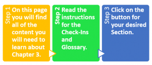
As with my homepage of the LMS, it was important to me to keep the unit’s homepage aesthetically simple so that students would not “get lost” in excessive text. Using Word, I created a three-step header that even the most scattered fifteen year-old should be able to understand and follow:

One comment that I regularly receive from students who are members of the “Mrs. Bjornson Fan Club”, is that they like it when I write out the steps: Step 1, Step 2, etc. Some students really like to have processes broken down and explained in a way that conveys that if the steps are followed as prescribed, the desired goal will be achieved. It was also important to me to have the steps colourful and prominent. Other than it adding a nice splash of colour to the page, it also forces the student’s eye to stop and read. All too often, when there is too much text or if the text is not emphasized, students will skim hastily past the instructions in an effort to get the work done as quickly as possible. Hence, I created a virtual billboard which will ideally reduce the amount of questions that individuals will have. The questions are potentially endless: “Mrs. B, what’s a check-in? Does it count for marks? What is the Glossary? …”
The Sections
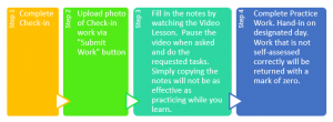
Following the same design format, each section has the same, bold, colourful header:

Using the same rational as previously mentioned, I wanted to an eye-stopping, step-by-step process for students to see before simply jumping blindly into each topic.
Check-ins. Each check-in poses two to three questions that assess learning that should have happened prior to starting the new section. Utilizing Moodle’s quiz generator, I was able to import screenshots of questions and multiple-choice responses, into these check-ins. Students will receive full-credit for these check-ins as long as they can provide the correct solutions to all questions. Students may re-attempt questions that were initially incorrect, as I choose not to penalize students for practicing, for check-ins or actual quizzes. I also attempted to give hints on each incorrect response, which should steer students toward the correct process.
Submit work. To eliminate the potential for randomly guessing until the Check-in is correct, students are required to upload a photo of their work and submit it via Moodle. Although I have not actually collected work in this manner, my assumption is that the files will be easily accessed via a spreadsheet of some kind.
Notes and video lessons. As the notes and videos will be available to students prior to coming to class, students will have the option to start scribing the notes, before class begins. For those students who struggle with math, having pre-access to content could be what they need to finally experience success in this subject, ideally with less pain and anguish. Students who miss class are also reaping the benefits of this by having access to a condensed version of my lesson, from the comfort of home, on an airplane, from a hospital room, or wherever they may be. English Language
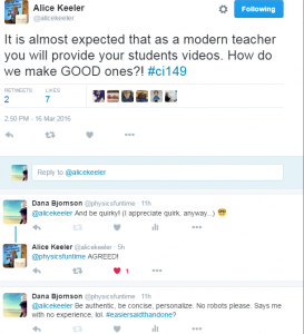
Learners may also be able to translate the lessons via technology or by simply pausing the video and looking up vocabulary, as they require. Google Classroom advocate and guru, Alice Keeler recently implied in a tweet that there is an expectation that educators embracing Web 2.0 create content videos for our students. Keeler also points out in an earlier tweet that in creating videos, educators can potentially cover the material in half of the time. In my experience with this project, I would estimate that I was able to reduce my teaching time by almost two-thirds!
But with promise, can often come peril. Will video casting of lessons inadvertently create a host of other issues, as it attempts to address existing ones? Can “screen teaching” be as effective and face-to-face? Are educators shooting themselves in the proverbial foot by creating a system that no longer requires face-to-face interactions, with qualified professionals? Perhaps in time, we will know definitively the answers to these questions; in the meantime, my teacher instincts are telling me that good teaching is good teaching, regardless of its modality. Whether an educator is “rocking the podium” or “rocking the screencast”, students are drawn towards passion, skill, and inspiration like moths to a light—who is to say what that light source needs to be?
On a technical note, my first two screencasts of video lessons ran into audio difficulty. The built-in microphone on my laptop was unable to maintain the volume level throughout these lessons. Frustration led me to halt video production, drive to Staples, purchase an external microphone and for approximately $60, my audio issues resolved themselves immediately.
Practice work and practice test. The Practice Work is a simple Word Document that students can download onto their phones or print off, depending on their preference. The Practice Test is a longer version of the actual test, which uses the same database as the test. Practicing questions that have a similar look to the test is a simple way that teachers can reduce the effects of exam anxiety (Salend, 2015).
A critical component to the Practice Work is that students self-assess their work thoroughly and in a timely manner. Missing from my initial site were instructions and expectations regarding the self-assessment process. I have since included a new page that is accessible from the course outline, which thoroughly explains this process.
The Functionality, Affordances and Limitations of Moodle
Although my Moodle site did not take advantage of all of Moodle’s greatness, such as the multitude of different modalities of test questions or the gamification of learning via badges, I was able to incorporate video, quizzes, links to websites, files, a class blog, a glossary, a forum, and a Google Calendar. Not having to add Plug-ins to make any of these design features work is unquestionably invaluable.
Having had absolutely no experience to begin with, I found that the instructional videos on YouTube were easy to follow and gave great tips to make my site look and feel in the manner I wanted it to. That being said, my experience with Weebly, has sadly ruined me; drag and drop features are profoundly superior to the never-ending clicking required to make even the simplest addition to a Moodle site. If my mouse-button had a click-counter on it, I am certain it would have been in the tens of thousands! Not having access to a math editor, forced me to utilize screen shots of questions— a process that became mind-numbing, very quickly. Another source of frustration was that I learned that I could not edit a check-in, once a quiz had been completed, hence having to re-do two check-ins from the beginning (and consequently, more screen shots!). In an attempt to be clever, I tried copying code from one section to another, which ended up being somewhat of a time saver, however, the images did not copy over, resulting in more, seemingly endless, mouse clicking.
I very much appreciated being able to turn my Moodle site into a site that looks like a website, as opposed to simply a webpage. In my own practice, I have been working with Google Classroom this semester. The Google Classroom is so simple, however, that it does not allow for any variation on the presentation format, other than a blog-style layout. I suspect that educators who have been “Moodled” will not be very keen to switch over to Google due to this significant layout restriction.
Minor irritations I had with Moodle included the performance of the software itself. As one may expect, after having done the same process over and over again, I began to do tasks with greater speed. On many occasions, Moodle was not able to handle my ninja-like, clicking hurricane skills with the mouse and would just get stuck, forcing me to log out of the program, in order to move forward again. I also did not appreciate having my activities and pages default to the “Hide” status. As the instructor, I could see all of these pages, however, in “student view”, I saw nothing. It took quite long time to figure out that bug!
Summary
An ode to Dr. Seuss: Now that I have “kanoodled” with Moodle, my noodle is admittedly not wanting the entire Moodle-caboodle.
I can see why educators do not wish to leave “Moodleland” since to get to Moodleland, you have click and plan yourself into a near coma! The effort to learn, master and create a working Moodle is arduously, epic in nature. That being said, once it is established, I believe it is also fair to say that eventually, an equally epic amount of the educator’s time will be saved for other activities such as undertaking a Master’s Degree in Educational Technology. A significant negative for me was that I found the quiz functionality to be too cumbersome and lacked the ability to efficiently add math text. Should Moodle allow data banks of math questions to be imported, I would consider altering my stance on this, however, as ease in assessment is important to my practice. Ultimately, since I can easily post videos and notes via the Google Classroom, I do not feel that investing time into creating a Moodle course is a path that I personally want to travel. Was this assignment a poor use of my time? Not at all! Being mindful of the effective design elements is a skill that every webpage, Google Doc, and YouTube educational video should incorporate and I look forward to building on what I learned in my journey to Moodleland!
References
Bates, A.W. (2014). Teaching in a digital age. Retrieved from https://opentextbc.ca/teachinginadigitalage/
Bourlova, T. (2015, November 20). Assignment #3 One Content Module of a Course Prototype. Retrieved from https://blogs.ubc.ca/etec565a66b/course-overview/assignments/assignment-3/
Keeler, A. [alicekeeler]. (2016, March 16). It is almost expected that as a modern teacher you will provide your students videos. How do we make GOOD ones?! #ci149 [Tweet]. Retrieved from https://twitter.com/alicekeeler/status/710221811124822016
Keeler, A. [alicekeeler]. (2016, March 17). One advantage to using video is you can say info in half the time from saying in class…. IF you do it right. #ci149 #videotips [Tweet]. Retrieved from https://twitter.com/alicekeeler/status/710467941184110596
Salend, S. J. (2011). Addressing test anxiety. TEACHING Exceptional Children, 44(2), 58-68.
