Photo by Ben Mitchell on July 11, 2011
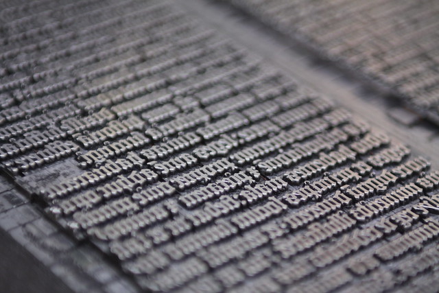
When Gutenberg developed the movable lead type printing press (the printing press already existed and movable types too), one of the first products of this new technology was the 42-lines bible, or “B42”. The B42 was printed in the first typeface that was developed for movable lead type, Blackletter, as it was known in England, or Gothic Textura.The Textura received that name as it intended to resemble a tight woven.
I selected this picture for two reasons. First, because I thought it could enrich the Module 1: Introduction and Defining Terms section. And second, because, being a book and magazine designer, a former design teacher and a typographer, I feel deeply attached to typography in every of its manifestations. This is part of who I am, a type lover… even beyond: a typophile.
Ernesto

Hi Ernesto,
It’s nice to meet you. I’ll be interested in seeing the perspective that a former magazine designer brings to this course. I don’t know a lot about type, but I do like the Gothic Textura. To me, it evokes a feeling of authority embedded in the text. Perhaps that’s because the letters are much bolder than we are used to today.
Chris
Hi Chris!
Well, I really don’t know how interesting it’s going to be to have me in the course. Right know I am overwhelmed with you guys and your experience as teachers. But, of course if I can be helpful somehow, I will try.
About Textura, yes, it is a pretty bossy font, everything written in Blackletter seems to be important and worth to be heard. The thing about Textura is that it has a lot in the bag. This was the first universities “official” font, imagine that. It was the “corporate identity” of the german Reich and banned by Hitler. In fact, the printing press arrive to America with this font.