I am working on a teaching and learning portfolio right now because I’m going up for promotion to Professor of Teaching (the highest rung in the “teaching” faculty track here at UBC). I decided to create it on my own domain I got with Reclaim Hosting, so I could have more control over the theme/plugins (and the freedom to break it, of course, that goes along with that).
Through this experience I’m beginning to understand why UBC Blogs only has a few themes available; I have tried numerous free themes on my own WordPress install, and have found several problems with many of them. Only after working hard to customize them the way I want, of course. Then I find out something is weird/buggy/doesn’t work the way I need, and I don’t have enough expertise to fix it.
I finally found a theme I think I can deal with, Moesia, which I first heard about through Alan Levine, and which was recommended when I took the You Show course (well, I participated a little bit at least), so I figured I was probably safe with it not having too much wrong.
Here’s the shell of the site so far (content to be inputted this week!): http://chendricks.org/portfolio
(On this domain I also have my DS106 blog: http://chendricks.org/ds106, but don’t try going to http://chendricks.org because you’ll just see a message about it being under construction. Later I’m going to make that my general hub of info/links about me, but it’s not ready yet).
Teaching myself CSS
So I liked a lot of things about Moesia, but there was still a problem. The menu items in the Section Widget (see here for plugin–made here at UBC!) were showing up with a different colour for links than the rest of the links on the site. What’s worse, they were a kind of medium-grey colour, and you couldn’t really tell they were links until you moused over them. I wanted to change those links to the same colour as the rest of the links on the site.
Enter web search for “change colour of links CSS.” That works fine if you want to change all the links on the site, which actually I wanted to do because I didn’t like the colour of the links on the main pages of the site. From this site I learned you can do this:
——————————–
/* unvisited link */
a:link {
color: #FF0000;
}
/* visited link */
a:visited {
color: #00FF00;
}
/* mouse over link */
a:hover {
color: #FF00FF;
}
/* selected link */
a:active {
color: #0000FF;
}
———————–
Of course, you just add in your own colour codes for what you want.
That would have worked fine except it changed not only the links in the body of the pages but also in the title and menu bar, which I didn’t want. The title and menu were white on black, and when I changed the rest of the links these looked bad on the black background.
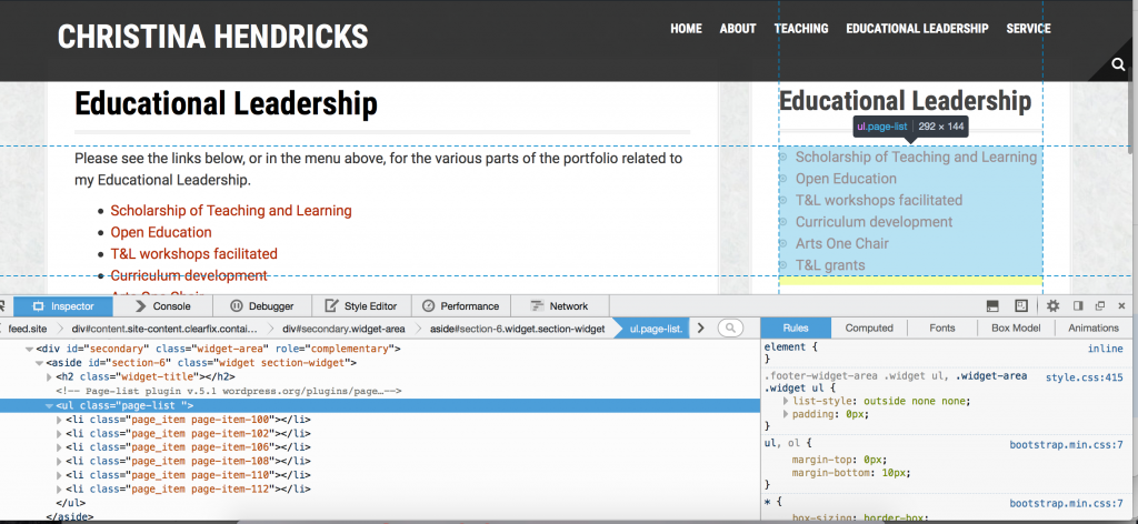
Enter “inspect element”: go to a place on a page, right click, and select “inspect element” (at least that’s what it says on Firefox). I learned this trick from the WordPress drop in sessions at UBC. Then you can mouse over various parts of the code on the bottom and see what they refer to on the page. Below I have the problematic section widget highlighted.

From this page I learned how to change the colour of links in a particular section of a site. And from here I learned the difference in the CSS for div vs. class.
I tried at first to change the colour in the “page-list” class, but that didn’t work. I can’t remember exactly what CSS I used, but it didn’t work anyway.
Here is what I finally came up with that worked, after many, many trials and errors. I figured this out by looking in the right pane on the screenshot above and finding where the colour was for the links.
—————————————-
/*changing colour of links in sidebar pagelist widget*/
.widget-area .widget a {
color: #B42C03;
text-decoration: none;
}
.widget-area .widget a:hover {
color: #2b7291;
text-decoration: underline;
}
.widget-area .widget a:active {
color: #000;
text-decoration: bold;
}
————————————-
Then I got bold and decided I wanted to change the colour of the other links in the site, but not the ones in the header bar–the title and menu. Using the same process as above, determining what the section was called for the body content of the pages (I tried “body,” but that didn’t work), I came up with this:
————————————-
/*changing colour of links*/
/* unvisited links */
.entry-content a:link {
color: #B42C03;
}
/* visited links */
.entry-content a:visited {
color: #B42C03;
}
/* user hovers */
.entry-content a:hover {
color: #2b7291;
text-decoration: underline;
}
/* active links */
.entry-content a:active {
color: #000;
text-decoration: bold;
}
———————————–
I left the “visited” and “unvisited” both there even though they’re the same colour, in case I want to change that colour later (the code is there and I don’t have to try to remember it later!).
Then I realized the comment forms still had the old link colour, so I changed those too:
———————————–
/*changing colour of links in comment form*/
.comment-form a:link {
color: #B42C03;
text-decoration: none;
}
.comment-form a:hover {
color: #2b7291;
text-decoration: underline;
}
————————————
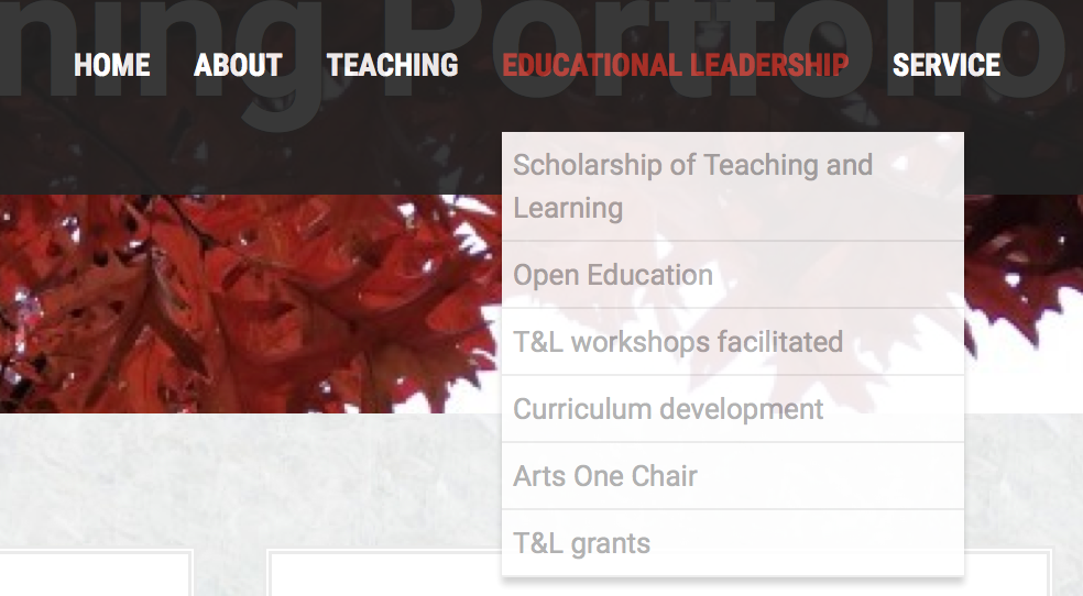
The last thing I wanted to change was the colour of the links in the sub-menus in the menu bar. Here is what it looked like before:

It’s not too bad blown up like this, but on a big screen those links were hard to see against the white background. I wanted them the same colour as the other links on the site.
When I did “inspect element” on that section it said <ul class=”sub menu” style=display: block;”>. So I tried the following, and it worked!
———————————-
/* unvisited links */
.sub-menu a:link {
color: #B42C03;
text-decoration: none;
}
/* visited links */
.sub-menu a:visited {
color: #B42C03;
}
/* user hovers */
.sub-menu a:hover {
color: #2b7291;
text-decoration: underline;
}
/* active links */
.sub-menu a:active {
color: #000;
text-decoration: bold;
}
————————————-
Again, I left the “visited” and “unvisited” links both there and both the same colour, in case I want to change the colour of one of them later.
Next steps
I really don’t know what I’m doing with CSS. This was the result of a lot of trial and error over the past couple of days. And I still don’t really know when to use something like .sub-menu versus #sub-menu (one is for a div and one for a class I think, but I don’t know which is which so I just test them out; and I don’t know what a div or a class is, actually).
I’m a total geek about this stuff. I really love being able to do this, to have control beyond what the theme allows under “customize”–if they haven’t provided me with the option to change the link colour with the free theme, I want to be able to do it anyway. I vividly remember my first coding experience in junior high school (grades 8-9), in BASIC (yes, I am that old). I loved it. It was like a puzzle and you got to see right away if you figured out the answer b/c things either worked or they didn’t. Then I learned some FORTRAN at university, but then didn’t do anything after that. And I kind of miss it.
If I had time I’d do a course on html and CSS, like this one from Code Academy.
But right now I’m busy working on my promotion portfolio. Maybe I’ll keep learning CSS as I go, as things come up that I want to do.
Like for instance I want to change the font size on this site (I’m getting old and can’t deal with small font)! Gotta figure out how to do that….
