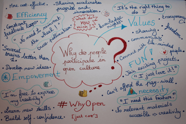
For week two of the Why Open? course I’m helping to facilitate, one of the things we asked participants to read and think about is similarities and differences between “open” and “free,” as these terms are currently used in discussions about openness. Of course, this just adds to the complexity, for now we have two terms that are used differently by different communities, and whose meanings are disputed.
One problem with the word “free” is that it can have many meanings (well, same problem with “open,” of course). Among them, there is “free” in the sense of no cost, or “gratis,” versus free in the sense of freedom, or “libre.”
Gratis with or without libre
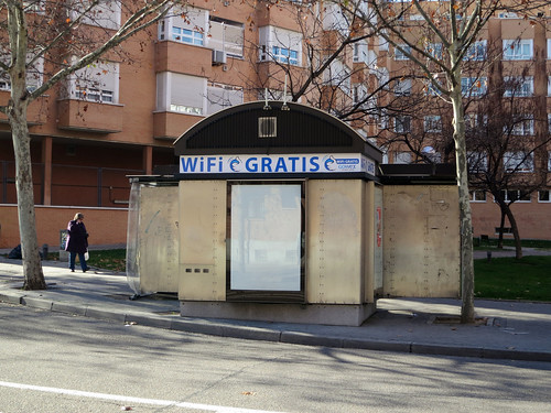
Wifi Gratis, flickr photo shared by Daniel Lobo, licensed CC-BY.
An example of something that is “open” mostly in the sense of “gratis” is at least some ways of thinking of open access publishing of research articles and books. Most of what one hears about in terms of fighting for open access for scholarly research has to do with being able to read, download, and distribute articles and books without cost–hence the emphasis on “access.” Here’s a quick and clear overview of what “open access” means, that focuses only on access.
But there are also arguments for making open access works at least somewhat libre, in the sense of allowing derivatives to be made. See, for example, the Bethesda and Berlin statements on what counts as open access works (I found these from this overview of open access by Peter Suber). An editorial in PLoS Biology by Catriona J. MacCallum entitled “When is Open Access Not Open Access?” delineates between free access to scholarly articles (without cost) and open access (derivatives are allowed). Why would allowing derivative works be important for scholarly articles? At least to allow unrestricted translation into other languages without gaining permission, but also things like using diagrams and figures in other works.
There is also the “How open is it?” guide put out by SPARC (Scholarly Publishing and Academic Resources Coalition), PLoS (Public Library of Science) and OASPA (Open Access Scholarly Publishers Association), which describes a spectrum of open access for research in terms of reading rights, reuse rights, copyright, authors’ posting rights, and more. This combines gratis (free access to read) with some elements of libre (such as posting on other sites besides the journals’ website, allowing derivative works). So proponents of open access for research need not be focused on gratis only.
Libre with or without gratis
“Libre” often denotes an ability to reuse, modify, remix things: the four R’s in the definition of open content by David Wiley, for example, might count as a description of “libre.” Chris Sakkas describes a “libre” work as one that can be shared and adapted by anyone in the world, possibly subject to some limitations, such as attribution of the original source and copyleft, or share-alike provisions. The Free Software Foundation defines free software as having four freedoms that fit “libre” rather than “gratis” (note that the four freedoms of the FSF and of Wiley’s “open content” are very similar; it’s just that Wiley makes a separate category for “remix,” or putting content together with other content to make something new, and the FSF separates distribution of the original and of revised versions into two categories). The definition of free cultural works by freedomdefined.org is very similar to the FSF’s definition of free software, but applied to works other than software.
In these discussions of “libre,” there is no requirement that works be free as in “no cost.” Indeed, the FSF definition of free software explicitly states that free software must be allowed to be revised and the original and revision distributed, with or without charging a fee for such. The FSF has a page explicitly explaining that and why it’s okay to sell free software, and also explaining that software given away without cost may or may not be “free software,” depending on what freedoms users have once they have it. So “libre,” at least in some discussions of it, seems to have little to do with “gratis.”
Which is interesting, because in our survey of meanings of open for this course, quite a few people mentioned that openness has to do in part with accessibility without barriers, including cost barriers. And it seems to me that the ability to reuse, revise, redistribute something depends fundamentally on the ability to access it in the first place, so if something is libre but not gratis it may allow for quite a bit of freedom, but not for everyone (though, of course, the definition of free software says it must allow users to distribute the original or derivatives, gratis or for a cost, so gratis versions may be available…or not). And even going beyond cost, there are of course other kinds of access barriers, such as technological ones, that make the “libre” freedoms unusable by some.
Some definitions of “free” and “open” and how they approach access
The FSF does address the issue of access to some degree in its definition of free software, by pointing out that
In order for freedoms 1 and 3 (the freedom to make changes and the freedom to publish the changed versions) to be meaningful, you must have access to the source code of the program. Therefore, accessibility of source code is a necessary condition for free software. Obfuscated “source code” is not real source code and does not count as source code.
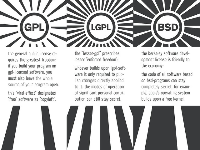
So even if a software program can be sold, the source code (if it is to count as free software) must be accessible. It’s not clear from the definition of free software page whether or not the source code must be accessible as in gratis, or if it can be accessible for a cost. I had to go searching a bit to find out. The last section of the article on why it’s okay to sell free software from the FSF says that nevertheless, there should be a limit on how much one can charge for the source code, or else one could say the source code is available in theory, but practically it may not be. So the GNU General Public License does include restrictions on how you can provide the source code (see section 6). This section of the GNU GPL FAQs was helpful too. From these documents I think the situation is this: for free software, at least for the GNU GPL license, you have to make the source code available to those to whom you distribute the software. So if they pay for the software, they get a copy of the source code along with that, for no extra cost. If you distribute it without cost, then you must also distribute the source code for no cost. So let’s say one person pays for a copy of the software and gets the source code. If they then distribute it for free on a network, they must also provide the source code in one of several possible ways, for free. So either way, the source code must be made available, without (extra) cost, to people who have a copy of the software.
This means that the four freedoms of free software may or may not be available without cost, because the source code may or may not be available without cost–that is, if I’m understanding all this correctly. Of course even if the source code costs nothing, some of the freedoms are still only available to some people–to those who can actually understand and edit the source code–but there will likely always be some restrictions in place in terms of use and adaption of “free” or “open” works.
The definition of free cultural works also includes something similar to availability of source code, for other kinds of works:
Availability of source data: Where a final work has been obtained through the compilation or processing of a source file or multiple source files, all underlying source data should be available alongside the work itself under the same conditions. This can be the score of a musical composition, the models used in a 3D scene, the data of a scientific publication, the source code of a computer application, or any other such information.
So according to the definition of free cultural works, the sources used to create a free work must themselves be free/libre in the same way as the works themselves are required to be. There isn’t much clarity here on how this should work (unlike for free software and the GNU GPL license), but perhaps it means that works can be sold but still be free as in libre, and the source files and data must be given to the recipient along with the final work (similar to source code for software, above). So whether you pay for it or can access it without cost, you must have access to the source data as well (for an extra price okay? included in the price of the original work?).
Here, too, the question about accessibility due to price could be mitigated by the fact that free cultural works (like free software) can be distributed by anyone who has a copy, to anyone else, with or without charging a fee. So it’s possible that there will be a copy available somewhere that can be accessed without cost. Or maybe not.
The Open Knowledge Foundation has a definition of open data and open content that includes a focus on access and price:
The work shall be available as a whole and at no more than a reasonable reproduction cost, preferably downloading via the Internet without charge. The work must also be available in a convenient and modifiable form.
While not quite gratis, this allows for distribution of works to recoup (reasonable) costs for that distribution, which could make sense in the case of physical copies such as on paper or on digital media like a thumb drive. It does raise the question whether it makes sense to charge people who download from the internet a fee for hosting information on a site (hosting data on a server does cost some money!).
A theoretical tension
Interestingly, this raises a bit of a potential paradox, as can be seen from this part of the Open Knowledge definition of open content:
The license shall not restrict any party from selling or giving away the work either on its own or as part of a package made from works from many different sources. The license shall not require a royalty or other fee for such sale or distribution.
The point here is that while a work that counts as open under this definition must not have a fee attached greater than a “reasonable reproduction cost,” that work must also permit users to sell the work for their own monetary gain.
I don’t have a problem with this provision, it’s just that it raises the issue that Stephen Downes has talked about quite a bit (see, e.g., here and here): views of openness that allow the user wide freedom to do whatever they wish with the open artifact can lead to that artifact being enclosed and no longer open (or free) in the sense of widely accessible. Downes argues here that we can think of freedom from the perspective of what the person who already has a work is free to do with it, and from the perspective of the person trying to access a work, and works that cost money may be free in the former but not the latter sense (because there may be quite a lot of people who can’t afford to access the work).
Of course, the counter to that is that the original must remain open and low- or no-cost (and other copies can be distributed for free too), so there should be at least one available without cost. Whether that one can be effectively hidden in internet searches through Search Engine Optimization practices, however, is an important question–which Scott Leslie addresses with an example, here.
What I want to emphasize here is the theoretical tension going on: the wide freedom of those who possess and use a work or program to do with it as they will could (theoretically, at least, though the degree to which it has or could happen in practice is debated) lead to fewer people being able to access the work, and wide freedom to access could limit freedoms of the user/possessor to do with a work what they want (e.g., by not allowing works to be sold for a profit, or by requiring they be in formats accessible by many, among other things).
I understand that the free software and free cultural works and other views of “libre” attempt to strike a balance by requiring that works be allowed to be distributed freely, with or without cost, but this may not ensure wide accessibility (e.g., if few distribute for free or if free copies are buried in search results). And I understand that proponents of requiring only “non-commercial” uses of works (such as Downes) attempt to strike a balance by restricting user freedoms in favour of wider accessibility (since, for those without access, user freedoms are moot).
Which balance is best? Is there a better balance to be struck than the ones we’ve come up with so far? I do think this is a difficult issue, which I’ve wrestled with before, when talking about CC licenses in particular. So far I’ve decided in favour of the balance that focuses on user freedoms, but I’m curious what others think of this issue.
I wanted to include another section of this post, talking about the language: “free” vs “open”–what are the benefits/drawbacks to using one or the other of these terms? But it’s late and I’m tired, and so that will have to wait for another post.