Category Archives: TeachWordPress

I taught myself some CSS! (and am very excited about it)

I am working on a teaching and learning portfolio right now because I’m going up for promotion to Professor of Teaching (the highest rung in the “teaching” faculty track here at UBC). I decided to create it on my own domain I got with Reclaim Hosting, so I could have more control over the theme/plugins (and the freedom to break it, of course, that goes along with that).

Through this experience I’m beginning to understand why UBC Blogs only has a few themes available; I have tried numerous free themes on my own WordPress install, and have found several problems with many of them. Only after working hard to customize them the way I want, of course. Then I find out something is weird/buggy/doesn’t work the way I need, and I don’t have enough expertise to fix it.

I finally found a theme I think I can deal with, Moesia, which I first heard about through Alan Levine, and which was recommended when I took the You Show course (well, I participated a little bit at least), so I figured I was probably safe with it not having too much wrong.

Here’s the shell of the site so far (content to be inputted this week!): http://chendricks.org/portfolio

(On this domain I also have my DS106 blog: http://chendricks.org/ds106, but don’t try going to http://chendricks.org because you’ll just see a message about it being under construction. Later I’m going to make that my general hub of info/links about me, but it’s not ready yet).

Teaching myself CSS

So I liked a lot of things about Moesia, but there was still a problem. The menu items in the Section Widget (see here for plugin–made here at UBC!) were showing up with a different colour for links than the rest of the links on the site. What’s worse, they were a kind of medium-grey colour, and you couldn’t really tell they were links until you moused over them. I wanted to change those links to the same colour as the rest of the links on the site.

Enter web search for “change colour of links CSS.” That works fine if you want to change all the links on the site, which actually I wanted to do because I didn’t like the colour of the links on the main pages of the site. From this site I learned you can do this:

——————————–

/* unvisited link */
a:link {
color: #FF0000;
}

/* visited link */
a:visited {
color: #00FF00;
}

/* mouse over link */
a:hover {
color: #FF00FF;
}

/* selected link */
a:active {
color: #0000FF;
}

———————–

Of course, you just add in your own colour codes for what you want.

That would have worked fine except it changed not only the links in the body of the pages but also in the title and menu bar, which I didn’t want. The title and menu were white on black, and when I changed the rest of the links these looked bad on the black background.

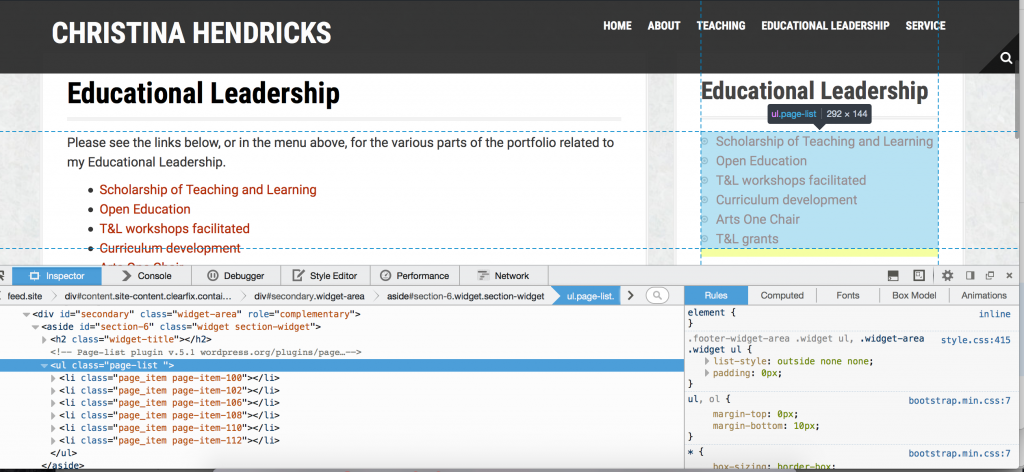
Enter “inspect element”: go to a place on a page, right click, and select “inspect element” (at least that’s what it says on Firefox). I learned this trick from the WordPress drop in sessions at UBC. Then you can mouse over various parts of the code on the bottom and see what they refer to on the page. Below I have the problematic section widget highlighted.


Screen Shot 2015-07-13 at 9.38.50 AM


From this page I learned how to change the colour of links in a particular section of a site. And from here I learned the difference in the CSS for div vs. class.

I tried at first to change the colour in the “page-list” class, but that didn’t work. I can’t remember exactly what CSS I used, but it didn’t work anyway.

Here is what I finally came up with that worked, after many, many trials and errors. I figured this out by looking in the right pane on the screenshot above and finding where the colour was for the links.

—————————————-

/*changing colour of links in sidebar pagelist widget*/
.widget-area .widget a {
color: #B42C03;
text-decoration: none;
}

.widget-area .widget a:hover {
color: #2b7291;
text-decoration: underline;
}

.widget-area .widget a:active {
color: #000;
text-decoration: bold;
}

————————————-

Then I got bold and decided I wanted to change the colour of the other links in the site, but not the ones in the header bar–the title and menu. Using the same process as above, determining what the section was called for the body content of the pages (I tried “body,” but that didn’t work), I came up with this:

————————————-

/*changing colour of links*/
/* unvisited links */
.entry-content a:link {
color: #B42C03;
}

/* visited links   */
.entry-content a:visited {
color: #B42C03;
}

/* user hovers     */
.entry-content a:hover {
color: #2b7291;
text-decoration: underline;
}

/* active links    */
.entry-content a:active {
color: #000;
text-decoration: bold;
}

———————————–

I left the “visited” and “unvisited” both there even though they’re the same colour, in case I want to change that colour later (the code is there and I don’t have to try to remember it later!).

Then I realized the comment forms still had the old link colour, so I changed those too:

———————————–

/*changing colour of links in comment form*/
.comment-form a:link {
color: #B42C03;
text-decoration: none;
}

.comment-form a:hover {
color: #2b7291;
text-decoration: underline;
}

————————————


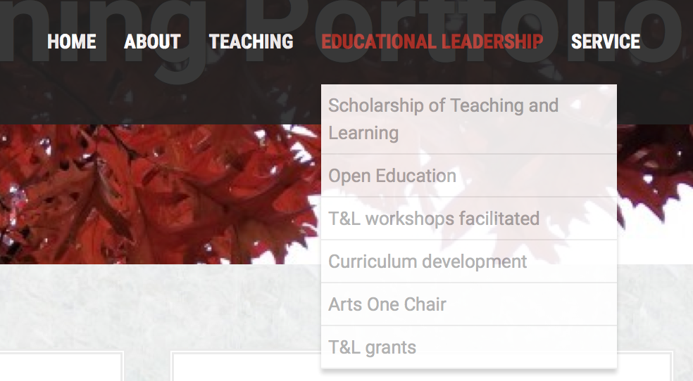
The last thing I wanted to change was the colour of the links in the sub-menus in the menu bar. Here is what it looked like before:


Screen Shot 2015-07-13 at 1.39.05 PM

It’s not too bad blown up like this, but on a big screen those links were hard to see against the white background. I wanted them the same colour as the other links on the site.

When I did “inspect element” on that section it said <ul class=”sub menu” style=display: block;”>.  So I tried the following, and it worked!

———————————-

/* unvisited links */
.sub-menu a:link {
color: #B42C03;
text-decoration: none;
}

/* visited links   */
.sub-menu a:visited {
color: #B42C03;
}

/* user hovers     */
.sub-menu a:hover {
color: #2b7291;
text-decoration: underline;
}

/* active links    */
.sub-menu a:active {
color: #000;
text-decoration: bold;
}

————————————-

Again, I left the “visited” and “unvisited” links both there and both the same colour, in case I want to change the colour of one of them later.


Next steps

I really don’t know what I’m doing with CSS. This was the result of a lot of trial and error over the past couple of days. And I still don’t really know when to use something like .sub-menu versus #sub-menu (one is for a div and one for a class I think, but I don’t know which is which so I just test them out; and I don’t know what a div or a class is, actually).

I’m a total geek about this stuff. I really love being able to do this, to have control beyond what the theme allows under “customize”–if they haven’t provided me with the option to change the link colour with the free theme, I want to be able to do it anyway. I vividly remember my first coding experience in junior high school (grades 8-9), in BASIC (yes, I am that old). I loved it. It was like a puzzle and you got to see right away if you figured out the answer b/c things either worked or they didn’t. Then I learned some FORTRAN at university, but then didn’t do anything after that. And I kind of miss it.

If I had time I’d do a course on html and CSS, like this one from Code Academy.

But right now I’m busy working on my promotion portfolio. Maybe I’ll keep learning CSS as I go, as things come up that I want to do.

Like for instance I want to change the font size on this site (I’m getting old and can’t deal with small font)! Gotta figure out how to do that….

Students posting on WordPress on the front end

I use WordPress for all of my course sites, and for some of my courses I ask students to post directly on the course site (for one they set up their own WordPress sites and they are syndicated to the course site). So far when I ask them to post to the course site I’ve had to teach them how to sign up as an author on the site, then log into the dashboard and make a post, how to add images, etc. It is quite a to-do, as the three screencasts I created for a course this summer attests to. I’ve decided to look into a front-end posting system and see how that would work.

The first thing I thought of was gravity forms, because that’s what we have used for the Directory in the Teaching with WordPress open online course I’m helping to facilitate. For that, we asked people to upload an image, gave them input boxes for text and also for a URL if they wish to connect a website. It seems I could use something like this to ask students to:

  • write a blog post on something associated with the course (differs according to different assignments)
  • include a URL or two if relevant
  • include an image if relevant

What I’d also like them to be able to do is to embed a video file from the front end, like you can do from the dashboard in WP where it just embeds automatically from YouTube and Vimeo (and maybe others too…those are the two I’ve used).

For example, this summer term I asked students to find and write about philosophical activity out there in the world beyond the course, and they had to include at least one image or video embed or audio file. It would have been great if they could just fill out a form on the front end to do so.

I don’t know how to use Gravity Forms for this; Rie Namba set it up for us on the Teaching with WordPress site. But I can go to a WordPress drop-in at UBC to learn (we have a two-hour drop-in time every week, which is just super cool to have).

And Pauline Ridley sent me this link on Twitter, which talks about how to set up a Gravity Form so users can submit a blog post with images through it: http://gravitywiz.com/use-gravity-forms-to-create-user-submitted-posts/ This looks really useful!

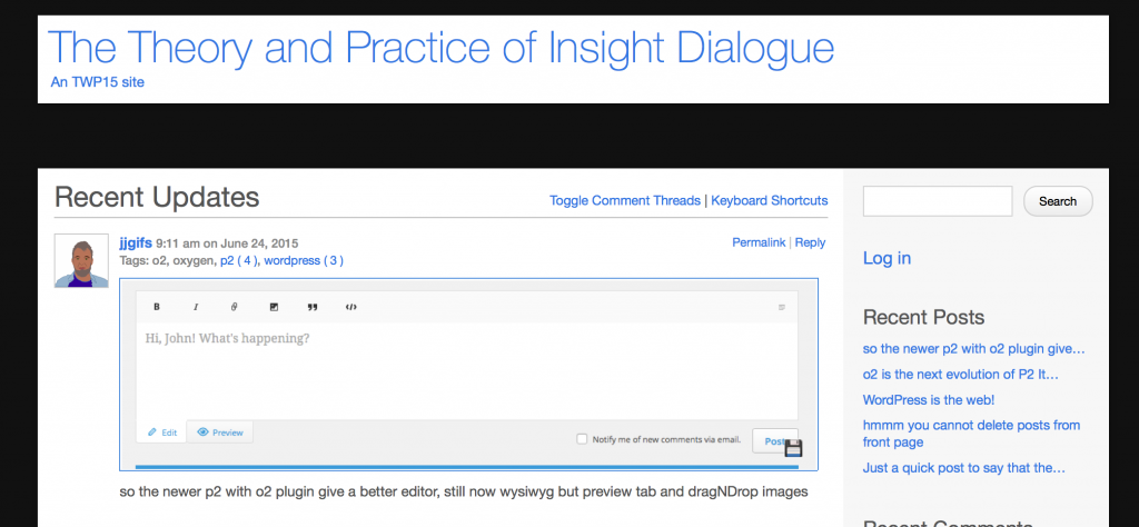
When I tweeted about this desire of mine, Mariana Funes reminded me about the P2 theme for WordPress. She and John Johnston have set up a P2 demo site for Teaching with WordPress, and anyone can play along if they contact Mariana or John (try Twitter, or if you want to contact them but don’t have a Twitter account, comment below and I’ll connect you to them!). I forgot about this site and haven’t tried it out yet. I’m going to as soon as I get my login credentials (again…can’t find them) from Mariana. Then I’ll be able to see if it can do all of what I want.

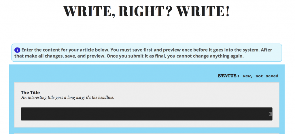
screen shot of TRU Writer

Screen shot of TRU Writer

Alan Levine created some things called SPLOTs for Thomson Rivers University, which are super excellent, easy way for people to make various kinds of posts on the front end of WordPress. The TRU Writer looks particularly good for my purposes. But it’s not (yet?) easily available as a WP theme; the source code is on Github, but that’s beyond my abilities to deal with. And plus, I can’t just upload new themes to our UBC Blogs site where my course sites are; the themes and plugins are controlled centrally. Hmmm…maybe I could convince them to try the SPLOT? :)


Editing after posting?

One thing I’m wondering, for all of these options; is there any way for students to edit their posts after posting from the front end? I know that’s not the case with the Gravity Form we used for the Directory for the Teaching with WordPress course. Any edits that needed to be done were done by one of us after it was posted. And the TRU Writer says the post is final once it’s submitted as well. Not sure about the P2 theme.


Anyone else have another idea to try for front-end posting?


A web, not a website

In Teaching with WordPress, one of the week 2 topics for discussion is to think about how to design a web. This comes from a quote from Stephen Downes in a presentation called “Design Elements in a Personal Learning Environment,” where he says: “A MOOC is a web, not a website.” Now, in this he is talking about what later came to be known as cMOOCs, or connectivist MOOCs (see my blog posts here and here for a discussion of cMOOCs). Many MOOCs today are more like websites than webs. But what does that mean, really?

To me, having experienced several open online courses that I would call “cMOOCs,” designing a course as a web means that one focuses more on providing opportunities for people to connect with each other than on providing content that they all need to get and be assessed on. The curriculum comes in large part from the participants, who shape what is talked about and how the course goes by what they write, what they link to, the questions they raise, etc. And perhaps most importantly, the best value for me in such courses is that the connections I have made continue onwards, long past the end of the courses. From my experience in various open online courses I have gone on to collaborate with people on designing and facilitating an open online course, on research projects, and, well, just on fun.

I will tell anyone who will listen that my experiences in connectivist-style open online courses has changed my life. For example, here’s a map of all the things that have changed in my professional activities as a result of taking my first open online course, ETMOOC, in early 2013. (The embed interface is not that great; I used MindMup for this map, and it’s a little clunky…it’s just that that is what I started with so I kept it in there!) This link should get you to a full page version of the mind map.


But my question is, how do I design my own on-campus courses so that they are more web-like and less website-like? I’m not thinking that my students’ lives are going to be changed in quite the same way as mine has been changed by my experiences in open online courses, but I would like for there to be more connections between students, and between students and myself, through online interactions. And there isn’t much that is doing that in my WordPress course websites right now.

Right now my WordPress sites for my on-campus courses don’t do a whole lot beyond giving content: here are the readings, here are the assignment instructions, etc. That’s a website. For example, see the website for the course I’m teaching right now, Introduction to Philosophy, here.

Sometimes I also ask students to do blog posts (depending on the course); so, for example, for Arts One their blog posts are aggregated onto our class website under “our blog posts,” here. Sometimes I ask them to post some of their work publicly (it’s always up to them whether or not to do it, though), such as with the “non-traditional artifacts” here or the “philosophy in the world” assignments here.

And for the first time ever, just this week I asked students to participate in a discussion on a WP site through comments, using a shortcode to get two pages with the discussions onto a single page: https://blogs.ubc.ca/phil102/weekly-schedule/week-5/ Here’s a short post on how I did that.


I guess I just feel like I’m mostly replicating an LMS with my WordPress sites. And I want to know how I can use the power of the WP blank slate to do more interesting things. That’s one of the things I am hoping to get help with. And a question I asked on Twitter earlier this week is a start!


I made discussions on WordPress!

Okay, so it’s not that fancy, but I’m pretty excited that I got the following to work.

So in my PHIL 102 (Introduction to Philosophy) course this summer, I took one of the sections of the course and did a little bit of a “flip” of it, where I asked students to watch some videos ahead of class, in addition to doing the reading, so I wouldn’t have to do all the lecture in class and we could spend more time face-to-face on what F2F is good at: discussion, interaction.

But I wanted them to also do some kind of activity with the videos so the material sinks in a bit better, and to connect the work outside of class with the videos to the work inside class with the activities. So I decided to ask them to post comments on one of two discussion questions, and I would bring their answers into class to share, and talk about them a bit. noun_17047_cc

But I didn’t know how to do that on WordPress until I became part of a team of designers and facilitators for a course on Teaching with WordPress. One of the people designing the site set up our front page so that we could show announcements on it, using a shortcode. I copied this idea for the PHIL 102 class. You can see the page where I embedded the discussions, here.

I made each of the two discussion questions a post under the category “discussions.” Then I used the following shortcode on the page linked above to get them onto the page: [loop query=”posts_per_page=3&category_name=discussions” view=”archive”] That requires a plugin that allows for the “loop” shortcode: loop shortcode plugin, made by people at UBC. That’s the same code we use on the front page of the Teaching with WordPress site to get the “latest updates” to show up.

Then, I just asked students to comment on those posts. I told them they could make up a fake name, or use their initials, or use their real name if they wanted. I always want to give them the option of not posting publicly if they choose.

I think it worked pretty well. There was good discussion on the two pages. I’m not sure how well it would work if I had a big class, though–this one is only 40 students, so the discussion didn’t get overwhelming where you have to scroll for days.

Open course design challenges (#TWP15)


One of the questions for the weekly discussion for week 1 of Teaching with WordPress is: “What’s your biggest challenge in designing for open?”

I have several course websites on WordPress, and one of the challenges I’ve faced in designing each of them is determining just where to put things and how to hierarchize them in menus so they can be easily found. I don’t know if this is my biggest challenge, but it is one I face each term as I think about redesigning my sites. It is made more important by the fact that the sites are public on the web, and I hope that others who visit them might find the information there useful. So they have to be clear even to people who are not in the course and don’t get the benefit of me talking about where things are on the site!

Here are the sites I have so far:

Introduction to Philosophy (PHIL 102): https://blogs.ubc.ca/phil102

Introduction to Moral Theory (PHIL 230): https://blogs.ubc.ca/phil230

Continental Philosophy seminar (PHIL 449): https://blogs.ubc.ca/phil449


Where are the lecture notes?

When I created the PHIL 102 site in the Fall of 2013 I made a mistake that I rectified when I taught that course again in the Summer of 2015.

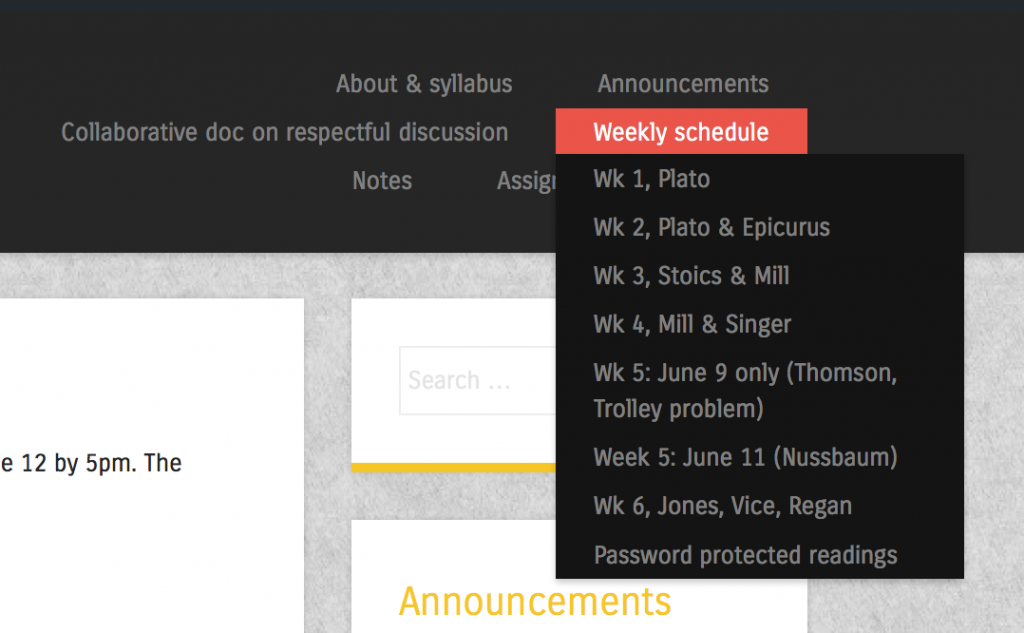
Screenshot 2015-06-06 18.17.03When I first created the site, I had a “weekly schedule” so students could find each week and see what they are supposed to read before class and what we’ll be doing in class. I created the weekly schedule as a way to be able to quickly update what students need to read/what we’re doing in case things change over the course of the class (which always happens!), rather than having a static syllabus/schedule. You can see the weekly schedule for the Summer 2015 version here: https://blogs.ubc.ca/phil102  Having a weekly schedule like this I still think is a good idea.

But I decided to put the lecture notes after each class on each of the weekly pages. So, the lecture notes for Plato’s Gorgias would be on the page that discusses what students are to read before the class in which we discuss the Gorgias. I honestly don’t know what I was thinking, because I can’t imagine that was very useful for students. They’d have to go to each page in the weekly schedule to download the lecture notes. And then I realized later that if anyone coming upon my site on the web wanted to see the lecture notes from the course they wouldn’t know where to look.

So now I’ve created a separate page in the course with just the lecture notes: https://blogs.ubc.ca/phil102/lecture-notes/  On the top menu of the course site I have a section called “notes,” and under that are the lecture notes and also notes from the students’ small group discussions in class. I think that’s pretty clear, though perhaps not perfect.


Too many menu items

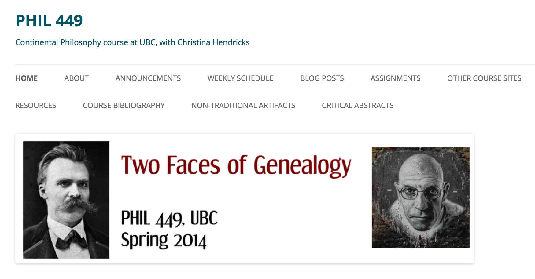
In my PHIL 449 course (https://blogs.ubc.ca/phil449) I have too many items in the top menu.

Screenshot 2015-06-06 18.18.36

It’s just hard to read/find things. There were some things I wanted students to be able to find right away, like the bibliography (which they needed for their research papers), the critical abstracts (where they could read each others’ summaries and reviews of research articles or books), and the “non-traditional artifacts” (which were assignments students chose to do instead of essays). And I couldn’t think of a good way to put those things under something else. I’m still struggling with that, even a year later–I’m not sure how I’d categorize things differently so that there are fewer items in the top menu.

One thing I did differently for the PHIL 102 site is to combine the “home” and “about” pages so I don’t have to have two menu items for that, like I did for the PHIL 449 site. I also put the syllabus on the “about” page for PHIL 102 so I don’t have to have that in a separate menu item either (the menu item is called “About & syllabus”).


Re-naming the weekly schedule

Screenshot 2015-06-06 18.20.55

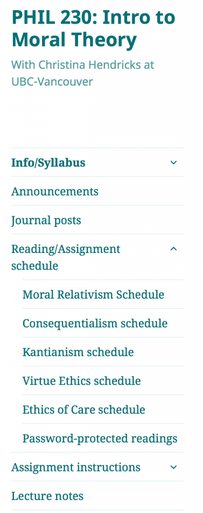
In my course site for Introduction to Moral Theory (PHIL 230), I didn’t make a “weekly” schedule, but instead did it by topic (moral relativism, utilitarianism, Kantianism, etc.). This was because I thought that students would be less likely to find things by remembering which week it was in, than by remembering the topic.

I think this was a good idea, but it also makes each page for each topic longer than they were before. And when I designed the PHIL 102 site for this summer, I went back to the “weekly” idea (but labelled each week in the menu with the author of the readings or the topic) because the pages were already pretty long just by having the schedule for two days on them. That’s because I include not only required readings, but lots of optional resources.


Where to put various resources?

In many of my courses I have handouts or links to other resources that are useful throughout the course. Sometimes I put them under a menu item called “resources” (see, e.g., the PHIL 449 site), but then I thought that students might not find them there. So for PHIL 102 for this summer I decided to put some of them under “assignments,” such as the page with “writing help.” If you click on “Assignments,” then “writing help” is part of the drop-down. And other resources I put directly on the pages where they are needed for assignments. For example, in PHIL 102 students need information on finding and using public domain and CC licensed works, so I put that directly on the page with the assignment they need this information for: https://blogs.ubc.ca/phil102/assignments/philosophy-in-the-world/

For that page I used the “wiki embed” plugin that UBC has installed on UBC Blogs, which allows me to write up the information on a wiki page and then use it in multiple sites. If I change the wiki page, then all the sites that have it embedded are updated. I did this with the public domain/CC licenses information because I figured I’d be using that in other courses as well.


Adding images

When designing the PHIL 102 site for this summer I added images to each of the pages in the weekly schedule. I realized that the pages were very boring with ust text, and I wanted a bit more visual appeal. So I found an image related to the readings for each class meeting and included it there. See, for example, the week we discussed John Stuart Mill and Peter Singer: https://blogs.ubc.ca/phil102/weekly-schedule/week-4/ They’re not the most interesting images, but at least it’s a start.

This is not really related to the issue in this post, which is where to put what/how to organize, but I thought I’d mention it as a change I made to try to improve my sites over time.

Screenshot 2015-06-06 18.25.51

Screen shot from PHIL 102 site, Summer 2015


What do you think?

I’m curious if anyone has thoughts about the issue of organizing/hierarchizing/making things easy to find for students and others, or any of the problems/solutions I’ve discussed above. I think I still have some ways to go to make my sites as clear as they can be.

What is open education?

Wordle of this blog post, from http://www.wordle.net

Wordle of this blog post, from http://www.wordle.net

I wrote the following narrative for a teaching award application, and someone has requested that I post it openly as well, as it may be useful to others. I’m happy to do so! (Update July 18, 2015: unfortunately, I didn’t get the award, but you can see my entire application for it in this post).

This was a section of the application where I describe the basics about what open education is. I then go on, after this, to talk about how I engage in open educational activities in my own work. I might post those sections here later, in separate posts.

If you want to learn more about open education, there is also a great ebook called The Open Education Handbook. David Wiley has created an open course on open education, here: https://learn.canvas.net/courses/4

And here is the open education course at the Open University in the UK that I took in 2013. My blog posts from that course are here.


What is open education?

Financial, legal, technological openness: open educational resources

What is open education? To start, it is useful to consider the various meanings the word “open” can have in “open education.” Hodgkinson-Williams and Gray (2009) give a useful overview of some of these meanings, including what they call “financial openness,” “legal openness,” “technological openness, and “social openness.”

A common understanding of “open” is “free,” as in free of cost, or what Hodgkinson-Williams and Gray (2009) call “financial openness.” This is the meaning one might immediately think of as associated with Massive, Open, Online Courses. These are courses that are available for anyone with a reliable internet connection to take, free of cost.[1] Financial openness is also exemplified when a teacher makes a set of lecture notes, essay topics, a video, an image, etc. available for others to use without a fee.

“Legal openness” refers to the degree to which teaching materials, student work, research and more are licensed to allow others to reuse, revise, and redistribute. Some MOOCs, for example, may only allow you to view materials, not download them to revise or share them with others.[2] The “Open Definition” by the Open Knowledge Foundation addresses this meaning of open directly: “Open means anyone can freely access, use, modify, and share for any purpose (subject, at most, to requirements that preserve provenance and openness)” (Open Knowledge Foundation, n.d.). David Wiley, in a widely-used definition of “open content,” lists similar requirements for openness, and labels them the “five R’s”:

  1. Retain – the right to make, own, and control copies of the content (e.g., download, duplicate, store, and manage)

  2. Reuse – the right to use the content in a wide range of ways (e.g., in a class, in a study group, on a website, in a video)

  3. Revise – the right to adapt, adjust, modify, or alter the content itself (e.g., translate the content into another language)

  4. Remix – the right to combine the original or revised content with other open content to create something new (e.g., incorporate the content into a mashup)

  5. Redistribute – the right to share copies of the original content, your revisions, or your remixes with others (e.g., give a copy of the content to a friend) (Wiley, n.d.)

Wiley argues that the more of these five activities that are allowed, the more “open” a work or set of materials is. How one alerts others to the possibility that they can use one’s work in such ways is through an open license, such as a Creative Commons license. [3] Giving one’s work an open license means that one retains copyright, but allows others to use, share, and sometimes also revise the work without asking permission each time.

Hodgkinson-Williams and Gray (2009) also discuss “technological openness,” which refers to the use of different sorts of software tools. Those that are open source are more open technologically than those that are not. In addition, tools that allow for easy editing by anyone, without having to purchase the software, are more open: thus, documents in Open Office or Google Documents are considered more open than those in Microsoft Word. Both David Wiley and “The Open Definition” also acknowledge the importance of technological openness: if a work can only be edited using tools that are very expensive, or that only run on certain platforms, or that require a high level of expertise, it is less open.

Open education is often discussed in terms of using or creating “open educational resources,” or OER—these combine financial, legal, and technological openness. According to the William and Flora Hewlett Foundation,

OER are teaching, learning, and research resources that reside in the public domain or have been released under an intellectual property license that permits their free use and re-purposing by others. Open educational resources include full courses, course materials, modules, textbooks, streaming videos, tests, software, and any other tools, materials, or techniques used to support access to knowledge (William and Flora Hewlett Foundation, n.d.).

Thus, syllabi, lecture notes, video recordings of lectures, slides, animations, assignments, podcasts, and more can be OER, so long as they are given an open license. Engaging in open education can be as simple as assigning one or more OER for students to read, hear, watch in one’s classes, or creating OER for others to use, revise and share themselves.

Social openness: open pedagogy and students as producers

Finally, Hodgkinson-Williams and Gray (2009) discuss “social openness”: “the willingness to make materials available beyond the confines of the classroom by lecturers, students and university management” (p. 105). Social openness not only involves making teaching materials available to a wider audience, but also engaging in more collaborative activities among students, between students and instructors, and between both and the wider community. Hodgkinson-Williams and Gray (2009) point to a range between (1) lecturer-centred openness, in which, for example, an instructor creates all curriculum materials and shares them openly, to (2) more student-centred openness, involving students contributing to the curriculum through adding content in things such as blogs and wikis, to (3) inviting contributions and collaborations between students, instructors, and members of the public—such as through connecting with professionals in the field (p. 105).

Similarly, the Cape Town Open Education Declaration, drafted in 2007 and currently signed by nearly 2500 individuals and over 250 organizations, focuses on creation and use of OER; but it also emphasizes changing one’s pedagogy to invite more collaboration between instructors, students and the public:

 We are on the cusp of a global revolution in teaching and learning. Educators worldwide are developing a vast pool of educational resources on the Internet, open and free for all to use. These educators are creating a world where each and every person on earth can access and contribute to the sum of all human knowledge. They are also planting the seeds of a new pedagogy where educators and learners create, shape and evolve knowledge together, deepening their skills and understanding as they go (“Cape Town Open Education Declaration,” 2007).

Such collaborative pedagogical approaches are sometimes referred to as “open pedagogy.” Wiley (2013) defines open pedagogy as educational activities that are only possible because materials are made available with an open license. Examples he gives include: asking students to revise and remix OER that are used in a course in order to create tutorials for aspects of the course that students often struggle with, and asking students to create or edit Wikipedia entries on topics discussed in a course. Similarly, though using a different term, Ehlers (2011) labels such activities “open educational practices”: “practices which support the (re)use and production of OER through institutional policies, promote innovative pedagogical models, and respect and empower learners as co-producers on their lifelong learning path” (p. 4). Open educational practices, like Wiley’s view of open education, involve the use and creation of OER in courses where learners are collaborators and co-producers of the curriculum. Thus, “[t]he pure usage of … open educational resources in a traditional closed and top-down, instructive, exam-focused learning environment is not open educational practice,” according to Ehlers (2011, p. 5), but doing so in the context of a course where students revise such materials and act as collaborators and co-producers of curriculum is.

Tom Woodward expands on this view of open pedagogy to refer to “a general philosophy of openness (and connection) in all elements of the pedagogical process,” where “[o]pen is a purposeful path towards connection and community” (Grush, 2013; italics in original). Thus, open pedagogy can also include open assignments, which allow students to shape how they will show evidence of learning (or even create assignments for other students to do); open course planning, in which one invites comments and contributions from others when planning a course; and what Woodward calls “open products,” where students publish their work “for an audience greater than their instructor. … Their work, being open, has the potential to be used for something larger than the course itself and to be part of a larger global conversation” (Grush, 2013).

Asking students to create open products, to do work openly and publicly and thereby contribute to knowledge production both inside and beyond the course, is also part of a pedagogical model that Neary and Winn (2009) call “the student as producer.” Contrasting with the idea of the student as a “consumer” of knowledge transmitted by an expert, and higher education as guided by market forces for the sake of students’ future employability, the student as producer model can be defined briefly as: “undergraduate students working collaboratively with academics to create work of social importance that is full of academic content and value, while at the same time reinvigorating the university beyond the logic of market economics” (Neary and Winn, 2009, p. 193). The student as producer approach “aims to radically democratize the process of knowledge production” (Neary and Winn, 2009, p. 201). Bruff (2013), citing Bass and Elmendorf (n.d.), emphasizes openness in the student as producer model, by arguing for the importance of students sharing their work with “authentic audiences,” people beyond just the instructor who can benefit from what they are producing. In addition, Bruff (2013) lists two other elements of his view of the student as producer model: students work on open-ended questions or problems, ones that don’t yet have a solution (rather than only working to get the “right” solution to a problem), and students have some autonomy in choosing and carrying out projects.

I am here linking the student as producer model with open pedagogy as discussed above, because I think there is significant overlap; I refer to all of these here as “open pedagogy.” Examples of open pedagogy include activities from asking students to make public blog posts (or posts that are at least shared with the rest of the class, even if they are not public), having students create websites or wikis that showcase a research project they have completed, encouraging students to revise OER and re-share them for other students, teachers and the public, to opening one’s classroom activities to participation by those not officially registered in the course (such as by having discussions on social media, opening up presentations by doing them on webinars, and more).

In my work in open education, I have used, created and shared open educational resources, and I have also engaged in various activities I am putting under the general label of open pedagogy.

[In the rest of the application I discuss my open educational activities…]

——————————————————–

[1] Many MOOCs currently are offered through central organizations such as EdX (https://www.edx.org/), Coursera (https://www.coursera.org/), Future Learn (https://www.futurelearn.com/), Iversity (https://iversity.org/), and UnX (courses offered in Spanish and Portuguese) (http://www.redunx.org/web/aprende/cursos). But there are also institutions of higher education that offer their own MOOCs on their own platforms, without connecting to one of these kinds of organizations.


[2] For example, the Coursera terms of use say: “You may download material from the Sites only for your own personal, non-commercial use. You may not otherwise copy, reproduce, retransmit, distribute, publish, commercially exploit or otherwise transfer any material, nor may you modify or create derivatives works of the material.” (Coursera, 2014).


[3] Creative Commons licenses provide a range of choices depending on how one wants to share one’s work (e.g., one can restrict the work to non-commercial uses, one can insist that any new works made from the original be shared also with an open license, or one can allow others to reuse the work but not allow any revisions). Finally, Creative Commons has a public domain license by which one can signal that they are releasing their work into the public domain, free to use, revise, redistribute without restriction on how and for what purpose, and without the requirement that the original creator be attributed. See Creative Commons, “About the licenses” for more: http://creativecommons.org/licenses/.


Works Cited

Bass, R. and Elmendorf, H. (n.d.). Social pedagogies: Teagle Foundation white paper. Retrieved from https://blogs.commons.georgetown.edu/bassr/social-pedagogies/

Bruff, D. (2013, September 3). Students as Producers: An Introduction [Blog post]. Retrieved from http://cft.vanderbilt.edu/2013/09/students-as-producers-an-introduction/

The Cape Town Open Education Declaration. (2007). Read the Declaration. Retrieved from http://www.capetowndeclaration.org/read-the-declaration

Coursera. (2014). Terms of Use. Retrieved from https://www.coursera.org/about/terms

Ehlers, U.-D. (2011). Extending the Territory: From Open Educational Resources to Open Educational Practices. Journal of Open, Flexible and Distance Learning, 15(2), 1–10.

Grush, M. (2013, November 12). Open Pedagogy: Connection, Community, and Transparency–A Q&A with Tom Woodward. Retrieved February 15, 2015, from http://campustechnology.com/articles/2014/11/12/open-pedagogy-connection-community-and-transparency.aspx

Hodgkinson-Williams, C., & Gray, E. (2009). Degrees of openness: The emergence of Open Educational Resources at the University of Cape Town. International Journal of Education and Development Using Information and Communication Technology, 5(5), 101–116. Retrieved from http://ijedict.dec.uwi.edu/viewarticle.php?id=864

Neary, M., & Winn, J. (2009). The student as producer: reinventing the student experience in higher education. In The Future of Higher Education: Policy, Pedagogy and the Student Experience (pp. 192–210). London, UK: Continuum International Publishing Group. Retrieved from http://eprints.lincoln.ac.uk/1675/

Open Knowledge Foundation. (n.d.). The Open Definition. Retrieved from http://opendefinition.org/od/

Wiley, D. (n.d.). The open content definition. Retrieved from http://opencontent.org/definition/

Wiley, D. (2013, October 21). What is Open Pedagogy? [Blog post]. Retrieved from http://opencontent.org/blog/archives/2975

William and Flora Hewlett Foundation. (n.d.). Open Educational Resources. Retrieved from http://www.hewlett.org/programs/education/open-educational-resources

Hello TWP15!

I’m part of a team designing and facilitating an open online course called “Teaching with Word Press,” which will be held in June 2015. You can see our developing site, complete with what we’ve come up with so far for modules, here: https://blogs.ubc.ca/teachwordpress/

And our twitter hashtag is #TWP15 (thus the title of this post!).

It’s still very much a work in progress, and we welcome comments, suggestions–just make comments on the pages/posts! Specifically, we’d love to have comments on our draft syllabus (and maybe we should call it something else, like “schedule”). You can comment on each of the three modules linked there as well.

A little about me and Word Press

I’ve been using Word Press for many years for this blog, but only recently started using it for my courses. Right now I manage sites for my on-campus courses, including the following:

Philosophy 102, Introduction to Philosophy (soon to be updated for Summer 2015)

Philosophy 230, Introduction to Moral Theory (last taught Fall 2014)

Philosophy 449, Continental Philosophy (last taught Spring 2014)

Arts One seminar (a group of 20 students)

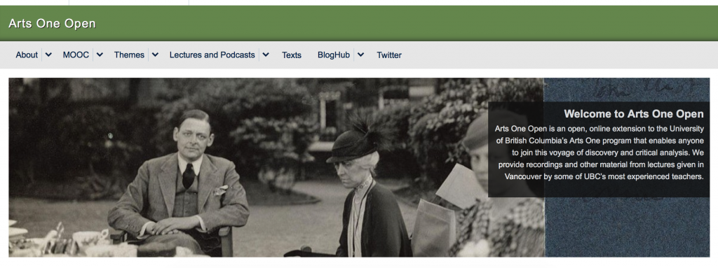
Arts One Open (a site where we publish video recordings of lectures, podcasts, blog posts by students and profs, and more)

Screen Shot 2015-04-05 at 1.44.58 PM

On the Arts One sites, students and professors make blog posts on their own blog sites and we aggregate them to the main site. On the Philosophy course sites, I’ve just asked students to do posts on the main course site, rather than creating their own blogs (mostly because Arts One is a year-long course, so it makes more sense to ask them to o through the work of creating their own site!).

For all of the sites, I post most of my course materials publicly on the site, and the sites have a general site-wide license (excepting student posts) of CC BY.

On my Arts One seminar site, I’ve been working with some developers here at UBC to create a system where students can submit essays through Gravity Forms, and have those essays only be accessible to me and the members of their small groups. The small group members can then comment on the essays on the site.

What I’d like to learn how to do

I really want to start incorporating online quizzes, or comprehension checks–whether for marks or just for formative purposes. I have worked with Gravity Forms only a little bit, and would like to learn more.

Some people at UBC have been experimenting with Learning Wrappers around videos, such as can be seen on the UBC Digital Tatoo site, here. Below the video on that link, there are sections for “think,” “explore,” and “discuss,” which take you to places where you can answer questions, find more resources, and engage in discussion. That site is run on Word Press too, so this sort of thing is possible!

I’d also like to learn how to optimize the organization of materials on my sites. I think I could improve that, and I’d love to hear from participants how to do so.


One of my favourite things about facilitating courses like this is actually participating alongside others, and learning from them. I’m looking forward to that!