
What would you do if you are the emperor of a territory so big that includes almost all Europe in 800 a.c. and you want to give all this people something in common? You design a typeface.
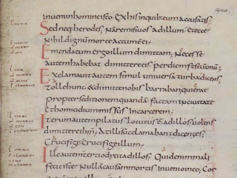
Page of text (folio 160v) from a Carolingian Gospel Book (British Library, MS Add. 11848), written in Carolingian minuscule. — The text is Luke 23:14-26 124.148.163.20 00:56, 15 December 2010 (UTC).
One of the legacies of the Carolingian Empire was the Caroline minuscule, a calligraphic standard during almost 400 years in Europe. A big part of the credit for this great script is for Alcuin of York, a scholar and close friend of Charlemagne. York, being “insular” (English) was pretty experienced in the use of both majuscule and minuscule alphabets (unused in continental Europe, but already common in british scriptoria) and developed, under the patronage of Charlemagne, the antecesor of the Blackletter script (or Gothic Textura) used after to print the first Bible.
The carolingian minuscule was seen as a representative of the Carolingian Renaissance and the Blackletter as a representative of the middle ages. After the Black Death, and with the italian Renaissance it seemed pretty logical to look back and rescue the Alcuin’s script. This “new” script model was named Humanist.
At the end, Charlemagne did more than he pretended to. The carolingian minuscule gave the final form to the letters of the roman alphabet. Pretty good for an almost illiterate emperor. In fact, if the Bible wasn’t printed in humanist typeface was because Germany kept the gothic script as an important part of their identity, the same that Charlemagne was trying to give to his empire through the Carolingian Script.
Ernesto
