Categories
Business Strategy Design Insight Marketing Strategies Product Positioning & Branding Tips and tricks

Brand Architecture Building: A Step-by-Step Guide (Step 1)


What counts as a sub-brand? How can  I make it easier for the consumers to navigate my offerings? Heck, what is a brand, really? If you’re asking these questions, you are not alone. This is a live challenge I am facing at work, and I wanted to share my key branding insights in a multi-step case study. Let’s do this!

Step 1: Understand what a brand really means.

Before we define a brand architecture, let’s wrap our heads around what a brand really is. I have developed a formula to help tell the brand story: Let’s break this down. Id, ego, and super-ego, as defined by Sigmund Freud, are the three components of human psyche that govern the way you think and make decisions. The id is present with us when we are born, and represents our basic human drive: the unorganized instinct and sometimes irrational impulse. An entity is simply the item, service, or person that is the subject of branding. Is it your personal brand? A corporate identity? A product or service? When you give birth to a brand, you must first think of your entity’s id – peel back the layers of beautiful design, extraordinary functionality, and your price tag. What are you left with? On first impulse, what is the fundamental word that breathes life into your brand?

INDULGENCE

SPEED

BALANCE

As if it were not obvious already, id and entity make up the word identity, and that is the final piece of the puzzle. A brand is an identity – it’s an embodiment of your core offering, a definition of your entity, a way to link associations together, and a promise from you to the world to hold yourself accountable for delivering your core offering.

Only when you understand what makes up your identity will you be able to build a powerful, believable brand!

NOURISHING

I have chosen the word nourishing to represent the corporate brand because of two reasons – 1) Nature’s Path Foods products are  delightfully nourishing – both good tasting and good for you. They choose nourishing, superfood, organic ingredients that you can trust to put in your body. 2) Nature’s Path Foods is also about enriching the community and the land, giving back to everything that has made the company what it is today.


Stay tuned for Step 2.

Categories
Design Infographic Insight Marketing Strategies Product Positioning & Branding Technology Top News

The Business of Online Dating Infographic

Completed for my COMM 365 Market Research class. Spent about 3 days putting this together from research to design (in PowerPoint of all programs). While it isn’t perfect yet, I thought it would be neat to share! Here’s my two cents on the online dating industry.

Categories
Design Product Positioning & Branding Tips and tricks

Font Faves #1: Hipster Series

Well, someone had to do it! Here’s my super round-up of super hipster fonts. They are 100% free, of course, because… when do hipsters not like free things?

When hipsters make videos for Vimeo…

http://www.behance.net/gallery/Vintage-LogoInisignia-Collection-2/8997889

When hipsters make posters…

http://www.behance.net/gallery/Metropolis-1920/3244285

When hipsters teach kindergarten…

http://www.behance.net/gallery/Primary-Sans/9205391

When hipsters design magazines spreads…

http://fontfabric.com/code-pro/

When hipsters make scrapbooks…

http://www.behance.net/gallery/Musket-Free-Font/5535461

When hipsters write fashion blogs…

http://dribbble.com/shots/759587-COCO-Free-Fashion-Typefamily

When hipsters handwrite…

http://www.dafont.com/note-this.font

When hipsters meet the 50s…

http://juliuscsurgo.org/free-font-hipster/

When #hipsters caption their Instagram photos…

http://www.floodfonts.com/freefont/moby.html

When hipsters write books…

http://www.bariol.com/

http://www.behance.net/gallery/Casper-Typeface/4919301

If hipsters opened a bar (besides robbing the liquor stores of all their Pabst)…

http://www.behance.net/gallery/The-Kabel-Font-free/1912005

When hipsters roll the end credits…

Categories
Marketing Strategies Product Positioning & Branding

The “Canada Goose Phenomenon”

Raised in B.C. Canada, I had no idea what the Canada Goose brand was. After making a few trips out to Toronto, I was exposed to the brand for what I thought was the first time. Walking down Yonge Street near Dundas Square, I was intrigued to see many pedestrians wearing thick parkas and jackets with the fluffy fur hood and a circular logo stitched into the arm. The experience literally looked like this (caution: profanity in video):

YouTube Preview Image

I needed to know what brand it was. At one point, I was so curious that I snuck up beside a stranger to look at what the logo read. Here is what I saw:

Canada Goose is a Canadian company founded in 1957 that manufactures outdoor clothing. They started fulfilling custom orders for jobs in frigid conditions that required high quality and warmth retention. On top of maintaining consistency in being the best of style and performance, the jackets started out being worn by Arctic explorers and high-altitude mountain climbers. The trend caught on after celebrities were spotted wearing these coats in movies and on the streets. Their signature coats today nestle in a sweet spot between fashion, luxury, and utility, using coyote fur for hood trims and white duck down filling. Since 2005, Canada Goose claims revenues of more than $225 million in coats and accessories across Canada, and that doesn’t include the millions of lost revenue from mass counterfeiting. The craziest part of this phenomenon are that these jackets sell anywhere from $350 to $885.

Young CEO and entrepreneur, Dani Reiss

Looking at this phenomenon from a marketer’s point of view, there are really a few different consumer behaviour concepts at play here:

1) PHYSICAL AND PERCEPTUAL POSITIONING 

The big blow-up in fashion trends started after being featured in multiple movies like The Day After Tomorrow, Eight Below, National Treasure, Good Luck Chuck and Whiteout where actors in extremely cold and harsh environments were seen wearing these high-performance parkas. Since then, many celebrities have been spotted wearing these jackets too. Eventually, students in Toronto caught on to the trend and began sporting their very expensive coats to school. Using a combination of physical positioning with its insulating layers, hand-warming pockets, and warm fur hood, and perceptual positioning techniques aforementioned, these jackets have become a fashion staple for Torontonians, much like Uggs, Hunter rainboots, and black tights are to Vancouverites.

Drake wearing an all-black Canada Goose parka.

2) SOCIAL PROOF AND MERE EXPOSURE

I must admit, I found myself a victim. At first, I found the jackets pretty typical; however, after seeing everyone all the time on the streets and in magazines with these jackets, I ended up wanting one myself. Many people would agree, and have worked countless hours waiting tables to pay for these jackets. I looked at what other people were wearing, was exposed to a lot of it, and eventually started perceiving an increase in the validity of the brand as more and more people support the brand.

Nicolas Cage in National Treasure wearing a Canada Goose parka.

3) SOCIAL MARKETING AND MISATTRIBUTION OF AROUSAL

Canada Goose partnered with Polar Bears International to create an exclusive line which donates a percentage of proceeds to save the world’s endangered polar bears, a representative symbol for Canada. A lot of supporters of the Canada Goose brand are happy and boast that by buying Canada Goose, they have helped a polar bear in need and feel good about it. While the charity is a good cause, Canada Goose does unfortunately use animal fur in some of its parka production. The social marketing technique is a great selling point, but people have perhaps wrongly projected positive feelings onto the brand.

Canada Goose’s success really branches out from creating an amazing brand, telling an authentic story, and using ingenious product placement. The funny thing is that Dani Reiss, the CEO of Canada Goose, does not claim to be a “brand guy” or businessman. As the leader, he really made some great decisions, first and foremost in sewing on “Made in Canada” tags that add to the jacket’s premium pricing and believable brand.

Categories
Business Ethics Insight Marketing Strategies Product Positioning & Branding

Macklemore’s Thrift Shop affects Consumer Behaviour…?

Macklemore

Who hasn’t heard of Macklemore’s 99-cent leopard mink coat from his smash hit, Thrift Shop?

“Vintage” is the new class.


After the financial crisis in 2008, there seems to be a large rise in price sensitivity amongst consumers. Even thrifting, an endearing abbreviation which modern-day hipsters have coined for thrift shopping, has transformed from a shameful to shameless activity. Celebrities have been advocating it in music videos like Thrift Shop, in sitcoms like 2 Broke Girls, and even in fashion magazines like GQ Magazine. YouTube  personalities and beauty gurus have also been showing off their great buys and pretty looks using drugstore, on sale or thrift store items. Heck, as someone who had never thrifted before, I have even gone out to find some clever buys of myself. And, as I did so last Friday after studying for my consumer behaviour midterm, I had the sudden realization that I had been subject to a form of observational learning.


There are four conditions to modelling, which is a significant type of observational learning. In “self-diagnosis,” I found that I managed to satisfy all of them:

  1. ATTENTION: the model must be desirable to emulate: I followed and took note of the trend amongst big time celebrities in pop culture, beautiful makeup and beauty gurus on YouTube, magazine guides, friends who come back with awesome clothes
  2. RETENTION: the consumer must remember what model says or does: magazine guides give you the “top 3 rules to keep in mind while thrifting”
  3. PRODUCTION PROCESSES: the consumer must convert information into action: I went out to an actual thrift store to try out those tips
  4. MOTIVATION: the consumer must be motivated to perform these actions: I felt motivated because… well hey, who wouldn’t like to get trendy clothes for a fraction of the price? It’s what I like to call a guilt-free deal-steal. It gave me a kind of thrill, and I would do it again. 


I learned, through observing the personalities that I follow online and my peers, that thrift shopping is the new, “in” thing to do, and throughout this time, I have not even seen one single thrift shop advertisement. In hindsight, it could almost be a type of negative reinforcement created unintentionally by social pressures; in this era, you are applauded for a clever, thrifty purchase and have also avoided the unpleasantness of  overpaying.

Who knew that marketing could be applied  in such a non-conventional way!

Categories
Product Positioning & Branding Technology Top News

My Top 5 Most Anticipated New Touchscreen Laptops of 2012

On a crazy new hunt to find a new personal laptop, I have been roaming the tech forums. According Computex reports, the trend this year is a series of hybrid, multi-purpose Windows 8 laptops that boast of their light weight, long battery life, and high processing power. I personally believe that, with the rise of Windows 8, the trend for computers in the future will move towards not just touch screen now, but towards “All-In-One” –  screens not restricted to phone/tablet/laptop that allow multiple inputs (fingers, palms, pens) by multiple users at a time, allowing more use for the laptop. The new Microsoft Office was an upgrade long overdue, and it will be the perfect finishing touch.

1. ASUS Taichi

I first saw this laptop on Tech2’s post. After some intense Googling, I came across Engadget’s photos and reviews of the beast.

  • Two screens (one of which is a touchscreen), both LED backlit, IPS panels with Full HD resolution
  • tablet when notebook is closed, but apparently Asus claims you can use both screens at the same time
  • lightweight, offered in  11.6-inch and 13.3-inch
  •  Intel’s 3rd Generation Ivy Bridge CPUs
  • matte silver and black interior, backlit keyboard
  • SSD


2. Samsung  Series 5 and 7 Hybrid PC

I have personally never been a fan of any Korean electronic product for their constant poor quality and short life span, but I’m trying to be hopeful about this hybrid PC for its pen integration. Crossing my fingers that it will not be laggy. This is supposed to be a Transformer-style tablet PC with a S-Pen (yes, like the ones from Galaxy Note).

3. Surface by Microsoft

So this doesn’t officially count as a tablet PC, but its amazing specs and functionality have rendered it onto my consideration list. The difference with this compared to other tablets, regardless of Android or iOS, is that besides Windows RTS, it will also offer Windows 8 Pro, which means that it should have capabilities comparable to a laptop. With a quad core and up to 128GB of internal storage, it should be an extremely amazing student companion device. It is set to release October 26, 2012.

4. Asus Transformer AiO

What astounds me is ASUS’s ability to dual boot Android and Windows 8 on a tablet. Surprisingly, this device is neither laptop nor tablet; it is a giant 18.4 inch desktop.

5. Acer Aspire S7

A beautiful, sexy and sleek laptop that duals as a tablet! Good thing they offer it in 13.3 inch models, as tablets are usually 10-some-odd inches. Not many specs have been released about this laptop yet, but it looks very promising. However, as ultrabooks as this usually use SSD, I am gauging prices to be expensive even for 128 GB. Still better than 32GB on a tablet though!


That’s it for now. I’m sure there will be more as the time goes on, but I am very excited to see how this trend progresses. Perhaps I’ll make an update entry!

Categories
Insight Marketing Strategies Product Positioning & Branding Top News

Will.i.am Revives Vinyl Records

YouTube Preview Image

“Even in media, sometimes an old idea is worth revisiting. Budweiser’s latest campaign in Brazil is actually a collection of old ideas. Securing a high profile musician to front a campaign has been a standard advertising tool for many years, but when the combination fits, it works perfectly.” – Cream Global


Before I was even born in the early 90’s, vinyl records had disappeared from mainstream music. With our generation came the rise of car radios, CD walkmans, mp3 music players, iPods, iTouches, and eventually even smartphones.


Beer, as we all know and love, is the go-to drink for TV, sports, and the “occasional” game of beer pong. Budweiser, the Anheuser-Busch InBev brand, had a major challenge at hand. Their solution?


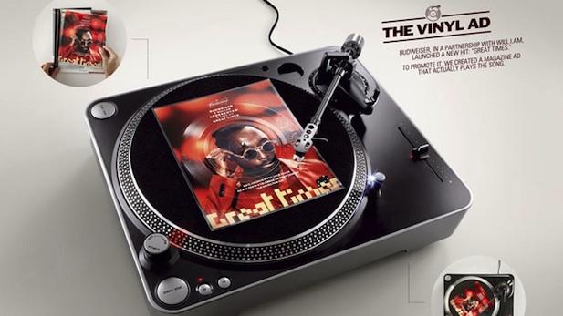
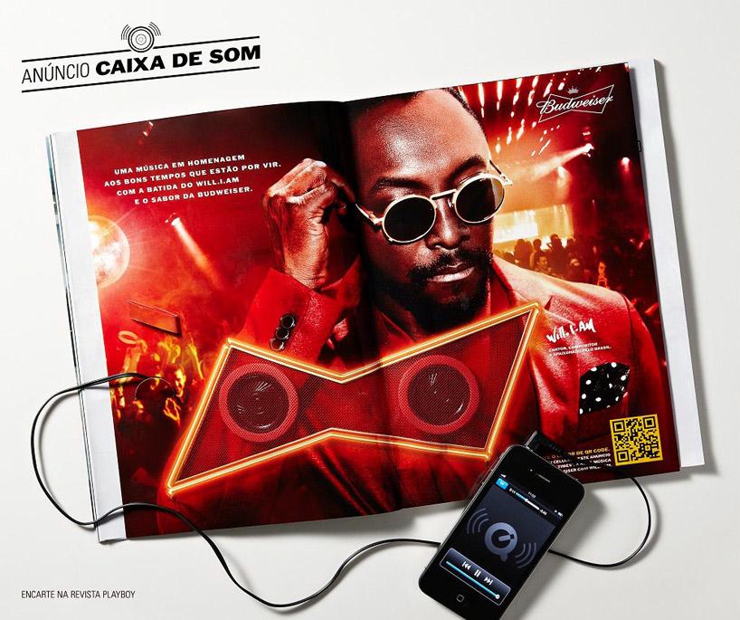
Budweiser made some music fusion in Brazil by promoting modern club music sensation Will.i.am through a hipster retro music format. They made a print ad that could be inserted into magazines as well as on a vinyl record player! The first use of such disposable vinyl records was actually in 1930, so it is nothing new… but the way that Budweiser used this technique added to the song’s exclusivity, helping both the singer debut his new song “Great Times” as well as helping the magazine sell out. Of course, Bud’s name also gained massive popularity during that time. Alternate versions of the ad were made into rudimentary speakers that you could plug smartphones into, as well as a scannable QR code for exclusive online access.


What a smart way to mash together something old and something new.


Hi Blog, it’s been a while. I hope to update you more often now.


Categories
Insight Marketing Strategies Product Positioning & Branding

Business Cards: The Brand in Your Hand

A student’s guide to the business card design and printing process.


First of all, I want to follow up on my previous blogpost. I find it fascinating that within days after publishing it, I already received comments from web surfers as well as peers, and even an employee from a business I blogged about. Businesses are constantly monitoring social media just as often as consumers follow businesses. Tiffany Pai’s blog explores such effects of web presence and specifically its impact on the consumer population. It is evident that establishing a strong web presence is important, but we mustn’t forget personal branding in the “physical” world as well.


‘Tis the season for personal branding. Business cards are every Sauder student’s quintessential must-have tool, and with the profusion of great networking events in the New Year from Style in the City 2012 and BizzComm to NIBC and Enterprize, this winter break is the perfect time to brainstorm, design, and print your own business cards.
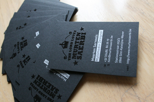


As a design and networking addict, the Sauder business cards were not distinctive enough for my tastes. Thus, I set out on a journey to research and develop my own business cards. Here are, from my experience, the top 3 tips for creating personal business cards with respect to the design and printing process:


1.      Remember the purpose of your card.

Business cards should be memorable, simple and informative. Think about how long you would look at a card if someone were to hand their card to you. Keep your content basic and visible; never clutter with all your Twitter, Facebook, and LinkedIn accounts. If you’re a student with no business or clubs, just include your name, phone number, and e-mail. If you are an executive of a club or owner of a business, include your company name and title, fax, mailing address, as well as a corporate website. Make sure the phone you use is direct; there’s a reason why you see businessmen with a Blackberry, iPhone and Android.
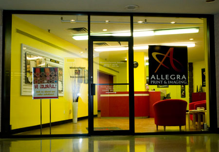


2.      Do your research and don’t be afraid to spend a little more – pick your printing company carefully.

My advice is either to read customer reviews, or to go to the store to meet the employees and check their printed samples before ordering from a company, because the “more-for-more” strategy doesn’t always apply. I recently had experience with a 3 – 4 day print service at a printing company in Downtown Vancouver that had a very clean and professional website, priced between $55 and $60. Although the staff was kind, the overall service and quality lacked the professionalism and promptness I expected for their price point.


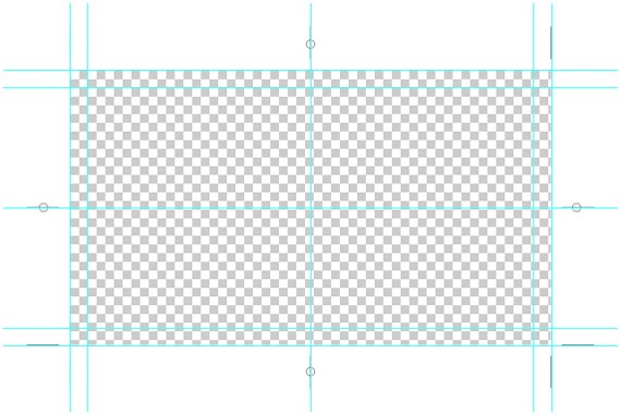
Also, something to take note of is that different printing companies will have different specifications on how to prep your business card design for print. Generally, make sure your design in Adobe Illustrator or Photoshop is prepared with:


·         300 ppi (resolution)

·         canvas size at the standard cut size 3.5 x 2 inches (89 x 51 mm)

·         add an additional quarter inch bleed all around (always add guides to show where bleeds are)

·         produce CMYK colour mode.
Another reason why choosing a good printing company is extremely important is that different places will offer different paper textures, paper thickness, and printing techniques. Generally, I’d go with a heavier matte card stock (at least 12pt, and at best, 14 or 16 pt) so people it is easier to write on. Silk lamination is a current trend because of their durability (tear and water-resistant) and elegance (smooth, matte finish).  This, combined with either spot UV or metal foil printing (overlaying either a gloss with a shiny embossing effect or a metallic sheen) can create a spectacular and elegant effect:
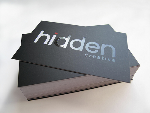
16 pt card, silk finish, spot UV
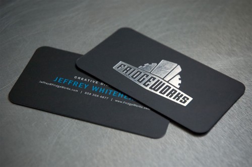
16 pt card, silk finish, UV coating over text, silver foil


3.       Remember that there are FREE resources everywhere.
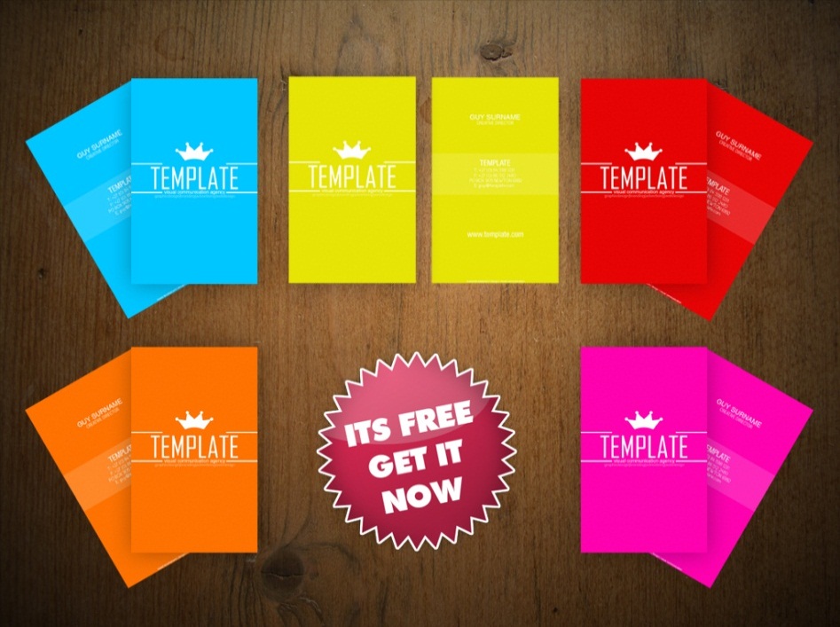


If you are unsure how to set up your file or even just where to start, there are free templates everywhere on the web. Refer to other people for inspiration, or browse for templates on sites like DeviantArt. Find a beautiful colour scheme on Kuler, and then choose a premium font like Quicksand or Zag. Remember the different connotations colours give, and ensure that the font is simple


(usually sans serif), and readable (no less than 8 pt). A good font is pretty much the difference between an amateur and professional business card. The current trend in business card revolves around minimalism, simple icons, clean vector lines, and a uniting colour (often tri-colour) or pattern theme on front and back. Here’s a great example:
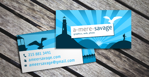
 

Finally, be sure to read up on business card etiquette. Keep your cards clean and unfolded. Generally, present and receive business cards with both hands, palms up. Always look at the card you are given before putting it away in your cardholder, give thanks, and makes notes on it inconspicuously.


To sum it all up quickly, remember that in addition to the actual design (colours and fonts) of the business card, you can play around with the actual print and card stock itself. Make it simple but to the point, with a unifying colour scheme or even text-as-a-logo. Make the card bilingual if your environment requires so, or if you want to show diversity. I hope that after reading this, you have gotten a better grasp of business card designs, and I leave you with one last bonus tip – NEVER START LATE. Business cards may be small, but take hours and hours to perfect.
Categories
Insight Product Positioning & Branding

Walt Disney: Entrepreneur

If you can dream it, you can do it.”-Walter Elias Disney

Once Upon A Time,

there was a man who started off with a small but brilliant idea. Walt Disney was an entrepreneur who left behind a legacy, not to mention an entrepreneurial company now worth more than $72 billion, that triggered a snowball effect which lead to huge advancements in motion pictures, animation, and eventually three dimensional cartoons (Pixar Animations). In addition, Disney also started the first of the themed parks or “playlands.”

To put into perspective the huge impact and success the Walt Disney Company has made since it’s inception in the 1920’s, one can simply ask: “what is one thing that repeatedly comes to mind whenever someone mentions princesses, fairytales, or children’s Halloweens?”

The company is extremely unique in that each new princess, animal, or toy movie it releases basically launches its own franchise; within a short amount of time, one movie produced by Disney could create a substantial amount of wealth. No other company comes close to producing as many universally renowned icons as Disney: Mickey Mouse, Tinkerbell, Winnie the Pooh, Toy Story, Hannah Montanna, 101 Dalmations… and the list goes on. Most importantly, though, the motifs and images consistently maintained is a crucial component to the company’s connotations of happiness, integrity, devotion, and love.

Spam prevention powered by Akismet