
When beginning this project, I did not fully grasp how something like typeface could incite passionate debate. I had considered font selection as a message carrier, certainly, but I underestimated how important typography is to how information is processed, particularly in an educational context. What became salient is that visual text, ensconced in fastidiously designed font, envelopes and manipulates the mind in ways minimally understood, but intensely researched. For the sake of this paper, the terms ‘font’ and ‘typeface’ will be used synonymously as the distinctions are perceived by many as minimal (Ambrose & Harris, 2006, p. 40). The primary role of font is to convey a message. Designer Emil Ruder says it best: “Typography has one plain duty before it and that is to convey information in writing” (Ambrose & Harris, p. 38). Jay Bolter discusses the ‘natural correspondence’ pictures have in what they communicate (2001, p. 58), and font styles too embody subtle, organic visual messages. Designer Rick Poynor reminds the unsuspecting that type speaks to us relentlessly and subtly informs the basis for how we understand the visual world (Hustwit, 2007). English author and typography super fan Simon Garfield equally respects the complexity of typefaces. He cares about their context, use, and abuse, and reminds readers that selected typeface communicates a clear message, whether humans are aware of this or not; graphic designer Neville Brody argues, “The choice of typeface is the primary weapon, if you want, in that communication” (Hustwit, 2007). How people choose to present text embodies a type of liberation not to be underestimated (Garfield, 2010. p. 13). Font styles, mechanical in how they are constructed, share poignant similarities with humans. They communicate constantly, emitting messages that can be construed as elegant, simple, fancy, obnoxious, quiet, gracious, inappropriate, loud, passive, erotic, and more. As you should note, this messaging is highly subjective. Typeface is complex and simple, simultaneously; it rests silently on a surface, but acts on us all. If this is the case, surely typeface is more than an aesthetic feature and can provide service within an educational context. Research will suggest that typeface construction can be used in many ways to assist with cognitive functions like semantic decoding. More specifically, if typeface impacts how text is cognitively experienced, to what extent can different fonts help those with a learning disability such as dyslexia process text more effectively?
Before continuing, please take a few minutes to explore terminology related to typeface design. It is beyond the scope of this paper to discuss typeface anatomy and historical development in-depth, however it is interesting to reflect on how lettering structure has changed through the millennia. Creating font from physical means is clearly preceded by physical development of the written word. The first examples of ‘true writing’ were developed by Mesopotamian culture in approximately 3500 BC (Diringer 1953; Gelb 1963, as cited in Ong, 1982, p. 82-83). From that point, writing systems spread among cultures with relatively few people having skills needed to beset writing surfaces with culturally significant items. As Walter Ong notes, early word and pictorial shapes were birthed through intention as scribes had to physically commit to the process of ‘writing something down’, an action we now barely register in terms of effort expenditure. Before papyrus and paper was invented, writing took place on anything from animal skin to tree bark (Ong, p. 93). Regardless of surface, core cognitive processes like memory, reading and learning developed with increased exposure to, and interaction with, pictorial and written texts. As writing systems developed, so too did innovations about how to present and distribute text.
The printing press and typeface emergence
Pivotal to typeface development was German inventor Johannes Gutenberg’s 15th century printing press, the earliest ‘playground’ for design. He wished for printed books to appear handwritten, and so developed the first font, an early Gothic lettering.
Figure 1: Excerpt from ‘The Gutenberg Bible’; first use of moveable type [http://www.flickr.com/photos/nlscotland/5371921755/]

Financial gain was one of Gutenberg’s primary goal with the press, and little could he have known how the aesthetic element of typeface would impact learning processes. As Bolter notes, Gutenberg ‘inaugurated’ a new age, one of print, choice, and creativity (2011, p. 8). Important to consider is how intention behind writing changed due to this technology. Emphasis shifted from what to write down and where, to how what was written should be presented. The Industrial Revolution and progress in mechanization further impacted typeface development, allowing for a wider range of styles to proliferate (Ambrose & Harris, p. 20).This shift is what situates typography in a relevant context as educationalists and psychologists learn more about how simple design choices can impact information processing. This brief historical glance at the shift from written to print technology in no way captures the rich, complex history of how typeface emerged from rudimentary technology, but this brief clip provides a visual for how Gutenberg’s early Gothic font served as a starting point for more modern styles.
Dyslexia: some facts
In modern education, typeface has received increased attention due to its potential as a learning tool. Fonts developed rapidly in the past 600 years, particularly after computerized design programs emerged, allowing professionals and amateurs alike to experiment with different styles. Relevant to this discussion are two major typeface families: serif and sans serif font types, meaning that a structural component at the bottom or top of the stem either elongates or truncates a visual aspect. Research will show how small adjustments to leading, bowl thickness, and stem length can simplify how dyslexics process visual information.
According to the National Centre for Learning Disorders, dyslexia is a language processing disorder, one that has organic roots in the brain as visual information is processed differently in the left hemisphere, and in terms of how information is relayed by the thalmus compared with those of unchallenged readers. Dyslexia is reported to be the most common form of learning disability in special education programs, affecting one if five people (Flynn & Rahbar, 1994, as cited in Sykes, 2004, p. 1). The dyslexic brain will often experience difficulty recognizing letter orientation and order. Symptoms may take form of semantic substitutions and inversions, for example ‘glass’ might be used instead of ‘cup’, and ‘dog’ and ‘god’ may be confused. Dyslexics often have trouble recognizing mirrored letters like ‘p’ and ‘q’ or ‘b’ and ‘d’; letters can physically rotate on the page and appear in three dimensional form (Sklar & Hanley, 1972, p. 160; Nalewicki, 2011). Reading rates are slower, spelling is problematic, and simple class activities like reading aloud can take on nightmarish proportion. To obtain a slight sense of dyslexic experience, please click here. Interestingly, researchers report that dyslexia is prevalent across cultures and socioeconomic backgrounds, although prevalence in Japan, curiously, is significantly lower than Western countries’ reported rates, possibly due to the lack of mirror-figure symbols in KANA script (Makita 1968, as cited in Sklar & Hanley, 1972; Sykes, 2008). Such was the case with Sklar and Hanley’s proposal for further experimentation into how multi-fontal alphabets may assist dyslexic reading, the mid 20th century investigations called for increased research funding into how font types and alphabetic presentation could help with dyslexic complications. In a broader social context, this movement paralleled increased computer use in the workplace, and, importantly, in schools. By the turn of the 21st century, Scottish researchers Peter Gregor and Alan Newell’s difficulty in defining dyslexia reflects complex understanding of such an individualized neurobiological dysfunction. They refer to it as a ‘language disorder which is very difficult to define…The fact that dyslexia has had no single clear definition is that the term has been, and in some cases still is, loosely applied to many varying cases of word dysfunction’ (2000, p. 85). Implicit in this quasi-definition is how difficult it is to treat a cognitive disability that manifests differently in individuals. Thankfully, modern concurrent research illustrates that adjusted typeface can positively impact how dyslexics process written text.
Typography assists learning
In the mid 1950s, Miles Tinker, a psychologist from the University of Minnesota, conducted one of the most significant early bodies of work that aimed to understand how typography and other environmental factors assist with reading functions. He investigated how altered font could affect reading speeds related to eye movements, and he examined how a reader`s physical position and accessibility to light could impact reading rates (Sutherland, 1989, p. 11-12). Although focused primarily on readability and legibility and not on how meaning was constructed, Tinker’s work hallmarked the need to scrutinize how typeface choice could impact a reader on a neurobiological level (Brumberger, 2003, p. 224). Years later, organizations like ReadHowYouWant advocate simple adjustments to font size and spacing to increase readability for general readers, and those with learning disabilities (Beidler, 2000, p. 3). However, sample sizes used in Beidler’s related research are small (n=14), and do not generalize beyond a small target population. Compiling qualitative data was paramount for understanding lived dyslexic experience, but replicable experimental work was and still is needed to infer direct cause and effect around which typeface style works best for dyslexic readers’ processing efficiency.
Targeted font design
Research indicates that typeface appropriateness is partly determined by the qualities shared with the ideas being presented (Bolter, p. 67; Brumberger, p. 225). This is interesting to consider in context of typeface innovation – if dyslexic readers struggle with qualitatively similar letters, it is intuitive that differentiating these aspects of design could assist with the decoding process. In 2003, Dutch designer and dyslexic reader, Natascha Frensch, designed a font specific to this differentiation. As of May 2012, her Read Regular typeface is now licensed to a Dutch publishing house Zwijsen, which has renamed it Zwijsen Dyslexiefont. Regardless of ownership, it is clear that careful adjustments in leading, or the vertical space between lines of type, can help a reader distinguish characters. Ascenders and descenders are lengthened for clarity, and the overall presentation is diversified. Historically, typeface design advocates uniformity however in the case of dyslexic reading, it appears this integral hallmark of good design – uniformity – could actually be contributing to symptoms of dyslexic reading.
Christian Boer, a 30 year old dyslexic graphic designer, released Dyslexie, a font that embodies these minor adjustments and inconsistencies within form that would likely enflame tempers of traditionalist designers, but simplifies and anchors lettering for dyslexics. Boer’s research stems from the University of Twente in The Netherlands where his success with dyslexic font design emerged from graduate work.
Figure 2: Dyslexie font [http://www.flickr.com/photos/dmiwench/6284911092/]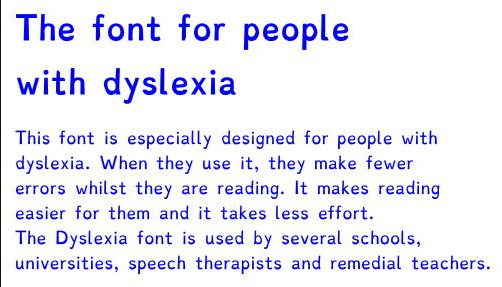 Granted, methodology is imperfect as Boer partially built a knowledge base from an opportunity sample of dyslexic colleagues, however what better way to understand dyslexic needs than to run qualitative research on a dyslexic sub-population. Boer provides little information about diagnostic procedures or the severity of dyslexia his font may serve, but he makes no claim that his font is curative – it is meant to function as an assistive tool, and qualitative results suggests this is the case. Despite flaws in methodology or sampling procedures, it is clear that typeface design offers one more tool in the kit for how to assist dyslexic readers.
Conclusion
As information processors, humans have long been using visual cues like letter size and ink colour to maintain orientation within texts (Bolter, p. 66-67). Visuals techniques for text de-coding have clearly evolved through print technology, and the democratization of alphabetized literacy that Walter Ong speaks of in Orality and Literacy can easily be furthered to include more dyslexic readers if academic institutions are willing to accommodate typeface innovations (Ong, p. 88). Learning support teachers world wide use a plethora of well-researched and effective strategies to help dyslexic students decode text, however in the age of digitized reading, schools should take note that emergent and targeted typeface design offer a relatively inexpensive and readily available helping hand in the process. Experimental laboratory and field research must be conducted with larger, cross cultural samples to lend credibility, reliability and external validity to claims that typography can assist with dyslexic learning, but a hopeful starting point for this exploration has clearly been established.
Works Cited
Ambrose, G. & Harris, P. (2011). The Fundamentals of Typography. [2nd edition]. Lausanne, Switzerland: AVA Publishing SA.
Beidler, P. (not found) Optimized Typesetting by ReadHowYouWant. Retrieved from: http://www.peytonstafford.com/images/ReadHowYouWant_White_Paper.pdf
Bolter, J (2001). Writing space: Computers, hypertext, and the remediation of print [2nd edition]. Mahwah, NJ: Lawrence Erlbaum.
Garfield, S. (2010). Just My Type. London, England: Profile Books.
Gregor, P & Newell, A. (2000). An Empirical Investigation of Ways in Which Some of the Problems Encountered by Some Dyslexics May be Alleviated using Computer Techniques. Assets ’00 Proceedings of the fourth international ACM conference on Assistive technologies, 85-91. Doi: 10.1145/354324.354347
Hustwit, G., Siegel, S., Geissbuhler, L., Swiss Dots Ltd., & Plexifilm (Firm). (2007). Helvetica: A documentary film. S.l.: Plexifilm.
Moody, S. (2004). Dyslexia: A Teenager’s Guide. London, England: Vermilion, Random House.
Nalewicki, J. (2011). Bold Stroke: New font Helps Dyslexics Read. Scientific American. Retrieved from: http://www.scientificamerican.com/article.cfm?id=new-font-helps-dyslexics-read
Ong, W. (1982) Orality and Literacy. New York, New York: Methuen & Co. Ltd.
Sklar, B & Hanley, J. (1972). A Multi-Fontal Alphabet for Dyslexic Children. Journal of Learning Disabilities, 5, 160-164. Doi:10.1177/002221947200500306 1972.03.005
Sutherland, S. (1989) The Forgotten research of Miles Albert Tinker. Retrieved from: http://www.ohio.edu/visualliteracy/JVL_ISSUE_ARCHIVES/JVL9%281%29/JVL9%281%29_pp.10-25.pdf
Sykes, J. (2008). Dyslexia, Design and Reading: Making Print Work for College Students with Dyslexia, A Qualitative Interaction Design Study (Doctoral dissertation). Retrieved from: ProQuest LLC (UMI: 3305924)

Ginelle,
I found this to be such an interesting read. Thank you for sharing the information about dislexia. I liked trying to read with the dislexia on that Read Regular site and I found it interesting and exciting that there is a font that can help people with dislexia read more easily. Great job!
Hi Ginelle,
Aren’t you fascinated now about typography? I know, it seems to be a boring topic at the beginning, but once you get really into it you just can escape. Dyslexia is actually just one of the many issues that typeface designer have tried to deal with… Sassoon primary was developed to help kids to learn how to read and write, some typefaces like Conduit or Interstate are designed to improve legibility in road signs and I understand that there are other typefaces being designed or already designed to help elderly people to read easily.
If you are interested please let me know!!!