Category Archives: ds106

Blogging on blogging again: more meta!

Screen shot of the title of this blog, You're the Teacher, set against an image of misty mountains with a tree in the foreground.

Metapic

I’m joining the DS106 Radio Summer Camp this week, and Jim Groom put out an invitation to all of us to join in a session today about blogging called “Blog or Die!” Why does blogging rule all media, as Jim asked? I thought I’d blog a few notes about blogging as prep for joining this session.

I seem incapable of writing blog posts under 2000 words, but for this one I’m really gonna try!

Benefits of blogging myself

I started blogging in 2006, after learning about WordPress and blogs from the amazing Brian Lamb (who was at the University of British Columbia at the time, but who is now doing fantastic work over at Thompson Rivers University). Funny enough, one of my first posts was called “Why blog?”. Coming around to the same theme I guess!

In reading over that post I find it still resonates with me eighteen years later. Benefits of blogging I wrote back then:

  • Reflecting on teaching and learning so as to improve
  • Sharing back with others, since I have learned so much from those who have shared their reflections
  • Connecting with a community
  • Thinking things out for oneself and being able to find those reflections fairly quickly later

Continue reading

Values-based tugging

Okay, so the title of this post may seem a little strange but bear with me. Yesterday I listened to a fantastic session by Dave Cormier for the DS106 Radio Summer Camp this week, called “A year of uncertainty – fighting the fight against the RAND corporation.” I wasn’t entirely sure what to expect, as I hadn’t managed to find the abstract/description of this session until after it was over (click on the session link on the schedule for the summer camp), but I knew Dave is amazing, so of course I had to listen! And it was very thought-provoking as I figured it would be.

Problem solving and uncertainty

One of the main points Dave was talking about was in how many aspects of our social, political, educational, and other lives are focused on problem-solving, on addressing well-defined problems that can have well-defined answers that we just need to work hard to find. This is not necessarily a problem in itself, Dave noted, as there do exist such problems and there can be very useful methods for working to address them. The issue is if we focus on that to ignore the less-easily-defined problems, the messier issues, the more uncertain situations where a single right answer is not going to be forthcoming no matter what kinds of problem-solving methodologies we throw at it.

Dave mentioned medical students coming out of their education into practice and, when confronted with complex, uncertain, grey areas where a medical solution isn’t immediately forthcoming they tended to focus on blaming themselves, as if it was their failure for not finding an answer where none was to be found. He also noted how, at least in English, it is common when someone asks a question like “what is your view of X,” or “is Y right or wrong,” you feel like you have to answer, even if you aren’t sure, or there isn’t a clear-cut answer. It’s just part of the accepted norms of speaking that you should have an answer.

Both of these resonated with me, and perhaps especially the second; I have sometimes been asked, in various contexts, to provide my view on something that is of a more uncertain nature, or to say if I think it’s right, or to say what I think the future will bring, and I do feel pressured to respond. But maybe because of my background in philosophy I’m actually pretty comfortable with saying that I am not sure, or I’d need to look into it more, because such situations really do require more thought, research, reflection before coming to a conclusion.

There is the danger of jumping in too quickly with an answer, but there is also a danger in spending too much time in the thinking and reflection and not moving past that towards making some kind of decision or other. And sometimes I get stuck in that latter step when faced with really complex issues–there is so much to consider and so much value in multiple perspectives that it can be hard to “land” somewhere, as it were. It’s tempting to remain up in the air while not being sure of which alternatives are best (because there are no easy answers).

Landing on values and pulling from there

I really appreciated where Dave landed in his presentation: rather than only feeling stuck, suspended, we can consult our values and make a move based on those, we can tug the rope in a tug of war in the direction of our values and work to move things from there. The focus on values is key here: ask yourself what are your values as they relate to this situation, and make decisions and act based on those, knowing that’s enough in uncertain situations. Which doesn’t mean, of course, that you can’t revisit your values and how they apply to the situation if either of those things changes, but that it’s a landing place and it’s solid enough for the moment. He talked about how we can have conversations with students and others about why we would do something in a particular situation, rather than what the right answer is, focusing on the values that are moving us.

To do so requires that we are clear about what our values are, which is in some cases more easily said than done. This is something near and dear to my heart as a philosopher, as trying to distill what is underlying our views and our decisions, what kinds of reasons and values, is part of our bread and butter. But when I reflect on how I’ve taught over the years, I’m not sure I’ve focused as much as I could have on helping students be clear about their values, instead focusing on the “content” of course quite a bit. The latter has been in the service of helping students understand that when we make ethical choices there are (or should be) reasons behind those, and some options as to what kinds of reasons those could be. I, like many other philosophers, have then also asked students to provide their own arguments related to various ethical and other philosophical questions, which does at times mean providing reasons based on values. But how much have I really spent time supporting students to  define and articulate their own values in addition to applying them through writing arguments? I’m not sure, and this session was really generative for me in thinking about that (as well as being generative in multiple other ways!).

A couple of years ago I wrote a blog post as part of MYFest 2022, talking about how I had a hard time imagining a more just future for education just because I kept focusing on all of the structural complexities involved in educational systems and how changing one thing would require changing many more interconnected aspects and … it all felt pretty overwhelming. The metaphor I used was of rocks and boulders, which came to me as I was passing multiple rock formations on a walk. Some piles rocks are fairly easy to move; others are locked into network like shapes where to move one would require moving all the others, and they are after all very heavy. If I think in these terms then of course it’s hard to imagine change. Things are literally set in stone!


But what if we thought about complex issues and structures more like flexible webs? (Which is an image that reminds me of other of Dave Cormier’s work such as that on rhizomatic learning.) So that if you tug on one part it can still move and the other parts will move as well (or break I suppose, which in some cases may not be a bad thing).

This feels more hopeful to me–it still respects the interconnectedness of structures but also notes there can be some movement, some wiggle room. Perhaps the spider web is too flexible to respect the challenges of moving some of the more entrenched structures, though. Even though spider silk is incredibly strong, it seems a bit too easy to just sweep away with the swoosh of one’s hand.

How about a net:

This feels stronger, and like a spider web, meant to catch and hold things tight, but which can still be moved, shaped, morphed, or even broken. I like the image above because a piece of the net is fraying, noting its fragility amidst the otherwise tight knots.

A line that Dave ended on will stick with me: “Ask yourself what you care about, and then do what you can.” That feels empowering.

Applying to AI

One of the things that feels uncertain to me in this moment is where things are going with AI, what the future holds, and what the best approaches are to using AI (or not!) in education. How might those of us who are educators address the question of whether and/or how to adopt AI in our courses, in our teaching practices, to encourage our students to use it, etc.? Of course, all of this is going to differ according to context, discipline, teaching and learning goals, and more. But I think Dave’s session provides a fruitful way to approach this question. This is a complicated and uncertain situation but what we can do is consult our values: what do we value, what do we care about, what do we want to promote and avoid?

This may seem fairly elementary in a way–might we already frequently act from our values? Maybe, but there are also times when I know I have done things in teaching because they just seemed like the usual thing to do, what I had experienced, that they just seemed right and “normal,” but when I took a step back to think about my values and what I care about then things changed. For example, I used to get upset when people would leave during the middle of class, until I reflected on how I care about supporting students to learn in the ways that are helpful for them, coupled with learning about how some students need to move around, or to take breaks from stimulation, or need to leave for other reasons. It’s still not easy, especially in small courses, but I’m focusing less on how I feel in that situation and more on how being able to take a break may be helpful for some students more than sitting in one place for 50-80 minutes.

It’s perhaps that previous point about taking some time to reflect on one’s values, what is important, what one cares about, and then applying to one’s teaching practice. At one point last year I took the time to write out my values in terms of leadership, and that was immensely helpful in focusing my attention on areas I wanted to work on. I may have acted from some of those automatically, but bringing them to the surface helped me not only see what was grounding some of my actions but also where I professed values but that my actions could do a better job of supporting.

Now, this process isn’t going to lead to easy answers (there are none for the kinds of issues Dave was talking about), and our values may lead to conflicting viewpoints. For example, I care about allowing students to use technology that will support their learning, and I think that generative AI may be helpful for student learning in some cases–I’ve been looking into how it can support students with various disabilities, for example, and should blog about that later. Then there is the value of equity and how not all students have equal access to generative AI tools, so some may get supports that others don’t. But digging into what one values can help clarify why to go one direction or another, putting one on more solid footing while starting to tug, even if one isn’t entirely sure that is the best direction. It is the best one for this moment while recognizing the complexity that makes it a difficult, but at least grounded, choice.

And if we go with the net metaphor, then tugging in one place can pull other threads, moving things in a local area to start, and maybe in larger areas over time. Particularly if more people are tugging in similar directions (organized action, e.g.). One person can make a difference, but it is more likely that many, working together, can make a larger difference. And we may fray that net to the point of finding ways to morph or break some of the confining structures we find ourselves in.

All of this is also bringing to mind the idea of “entangled pedagogy” from Tim Fawns, which I wrote a blog post about in 2022. Rather than reviewing that blog post, I’ll just say that he has an aspirational view of the relationship between technology and pedagogy in which we focus on purposes, values, and contexts in an entangled relationship with technology and pedagogy. Rather than trying to emphasize pedagogy over technology or vice versa, or even how they are connected to each other, we focus instead on the purposes and the values we have in teaching and learning, and the specificity of our contexts, and how those can shape our choices in both pedagogy and technology (and how they intertwine).

In a quote that resonates with some of what Dave said and what I’ve written here, Tim notes:

Attending to values, purposes and context can help us identify problematic assumptions, such as those embedded in simple solutions to complex problems, reductive characterisations of students (e.g. as ‘digital natives’, see Oliver 2011), or assertions that teachers should conform to modern digital culture and practices (Clegg 2011).

Conclusion

I really appreciated the opportunity to participate in this session with Dave. There was a lot more than what I’ve been able to talk about above, so I highly suggest you listen to the recording when it’s posted on the DS106 Radio Summer Camp recordings page (and check out other fantastic sessions while you’re at it of course!). Big thank you to Dave for a thought-provoking session!

Springtime photoblitz

For the online digital storytelling course called DS106, week 3 (last week) was all about telling stories in photos. I managed to do one of the assignments for that week, just yesterday: a photoblitzing safari. For this assignment, one has 15 minutes to take pictures, trying to fit as many of the following categories as one can:

  • Take a photo dominated by a single color.
  • Take a photo of an interesting shadow.
  • Take a photo of something futuristic.
  • Take a photo at an unusual angle, e.g. looking looking up at something or looking down at something, or from the view of an ant.
  • Take a photo into bright light.
  • Take a photo of someone else’s shoe or foot.
  • Make an inanimate object look alive.
  • Make a photo that uses converging lines to draw us into the photo
  • Take a photo of two things that do not belong together.
  • Take a photo that shows a repeating pattern.
  • Take a photo where you move the camera as you take the photo, so it gives the subject a suggestion of motion.
  • Take a photo that is looking through a frame or opening to something else.
  • Take a photo that represents joy.
  • Make a photo that is abstract, that would make someone ask, “Is that a photograph?”
  • Take a photo that represents a metaphor for complexity.

I did a similar kind of photoblitz about six months ago, for the Headless version of ds106 that ran in the Fall of 2013. Here’s my post on that one on Tumblr. Most of my ds106 stuff is on that Tumblelog, but this time I wanted to do it on a Word Press site so I could take advantage of something else I learned from this week’s ds106 assignments: creating a gallery of images in Word Press. These instructions from Word Press work a bit differently than what I had to do here on this blog, because this one has an extra step when uploading media, during which one has to avow that what one is uploading doesn’t violate copyright. But I figured out how to do a gallery nevertheless.

So here it is …

 Now, it looked fine until I realized I didn’t have the right version of one of the photos, and when I changed it out the whole gallery went into reverse order (the “end time” photo is at the beginning and the “start time” at the end). Now, no matter what I do, no matter whether I say “ascending” or “descending” order, it won’t change the order. There seem to be little boxes where I could put numbers in to force the order, but I don’t seem to be able to type into those boxes. So now I’m stuck with this order unless I delete the whole gallery and start over (which is not an option at this point, given that actually creating the gallery was not terribly straightforward and I might have to re-upload all the images). 

So while this might work very well on WordPress.com blogs, on UBC Blogs it’s not working very well. Alas. I also can’t seem to control the fact that all one can see are thumbnails until clicking on the images; this is the only option I have for a gallery on this blog; there are more options for WordPress.com blogs.

Thoughts on these images

I went to about the same place where I did my photoblitz last Fall, not because I thought it was the best place, but because it is on the way to and from my home to work (yes, I work on Sundays too!), and it has the most variety of things. I tried a different place on my walk home, but as I was looking around there just wasn’t that much in the way of variety of things, patterns, colours, etc.

The light was not great (again, just like last Fall). It was cloudy rather than sunny, so I couldn’t get bright light or shadows–whaddya want, it’s Vancouver. I kept all the photos just as they came out on my phone, except the one of the tree with pink and white blossoms. It was just so utterly dull without a little apping up; all I did was play around a bit with iPhoto on my computer, adjusting things like exposure, contrast and saturation.

The “From below” image was taken under one of the frames in the “Double frame” image. I was going for something like the rule of thirds, with the top line at the top third and the leaf on the left third, but the top line is a little too high. Still, I think that (with the caveat of the crappy light), that’s kind of a nice image. We have lots of awnings made of glass here in Vancouver that get all dirty from the rain and debris from trees, and they look kind of yucky. But this image made it look less yucky and more kind of interesting, possibly abstract.

The picture of the daffodil was supposed to be one dominated by a single colour, not just b/c the flower takes up so much of the frame, but also because it is such a bright and vibrant colour. I didn’t have to mess around with any settings on that one; it’s just how it came out on my phone. Not the best closeup image by far, but not bad for an iPhone. There’s even a little bokeh in the background!

My “abstract” photo was of a waterfall. It didn’t come out quite as abstract as I wanted; you can still tell pretty easily that it’s a photograph, and one that is blurry where the water is moving. It looked cool when I took the photo, but not as great when it came out on the computer. Part of the problem is that whenever I zoom in with my phone, the image comes out blurry and pixellated a bit. I needed to have a real camera with me to do this image well. It also represents complexity, as fluid dynamics is extremely complex!

The first repeating pattern image is not really all that repeating–I just thought the bark looked interesting, with the lichen on it. I think this is a cedar tree of some kind.

My second colour and complexity image, the one I adjusted a bit in iPhoto, looks closer to what these flowers look like in good light (not in cloudy light). It’s also an image of complexity, given how branches buds grow (fractals and such).

With the last repeating pattern image, I liked how the lines curved in the foreground and then started converging in the background. There isn’t as much convergence as I wanted in the background, though.

Of all these images, I think I like the “From below” one best. It is just the most interesting image, to me, visually. It’s not that easy to tell what it is, why there’s a leaf in it. And it’s close to the rule of thirds, just not quite!


Concluding thoughts

I really like doing these photoblitzes–they are challenging but fun, and they definitely get you to pay close attention to your surroundings in a way you wouldn’t do before. I found myself looking at lampposts and rubbish bins to see if any angle on them might lead to an image of something “futuristic,” for example (didn’t come up with anything), or whether any inanimate object around me could be photographed in a way that made it look alive (again, nothing). I played around with moving my phone while taking a picture to simulate motion (didn’t work), and I was looking for converging lines, repeating patters, and complexity all over!

I’ve decided that it’s definitely time for me to take #phonar and finally get my photography skills in better shape. Looks like the next one isn’t until Sept/Oct 2014, though, when I’ll be super busy with teaching again. Sigh.


The shape of things falling apart

I’m participating in the open online digital storytelling course called DS106, which is happening on a shortened, 7 week schedule until about mid-May. For the first week, we were asked (among other things that I didn’t have time to do because I’m still teaching right now) to think about the shapes of stories. Two things we could look at were a video in which Kurt Vonnegut explains some familiar story shapes, and a web page in which Kenn Adams talk about the idea of a “story spine.” We were asked to think about a story familiar to us in terms of these ideas.

In a course I’m teaching called Arts One (a team-taught, interdisciplinary course for first-year students at the University of British Columbia), we’re reading and discussing Chinua Achebe’s Things Fall Apart this upcoming week. So I figured I’d try to analyze this text using these two discussions of the shapes of stories.

Vonnegut’s story shapes

In this video by Vonnegut, several story arcs are described:

1. “Man in a hole”: someone starts of being above average in terms of good/bad fortune, then goes significantly downwards, then gets out of the hole by the end, back to approximately where s/he started.

2. “Boy meets girl”: someone starts off in a pretty average position of good/bad fortune, then finds something great or something amazing happens to him/her, then they lose it, then they get it back again (or something else that brings them back up).

3. Cinderella: someone starts off very low on the good/bad fortune scale, climbs upward, then falls down, then goes back up. In Cinderella’s case, she ends up with ultimate, off the scale happiness.

Of course, a pattern is easily recognized here: one somehow at some point goes downward in the good/bad fortune scale, and then goes back up. Maybe they go up before they go down, but regardless there is some downward movement and back upward movement.

Can we read Achebe’s Things Fall Apart as fitting one of these shapes? I don’t think so, because it has more of a tragic story shape. To me, that means that someone starts off pretty high up on the good/bad fortune scale, or starts off middling and moves up, and then goes downward…and the story ends. That’s pretty much what happens here. Of course, perhaps that’s one of Vonnegut’s story shapes too, it’s just that we don’t see the whole talk from which this video is taken. He’s only talking about the “comedies” (happy endings) rather than the “tragedies.” This seems pretty clear a tragedy.

At the beginning of the story, Okonkwo is said already to be famous as a wrestler. He has excelled in life far beyond his father, Unoka, who was “lazy and improvident and quite incapable of thinking about tomorrow” (4). He is also mired in debt, and his wives and children “barely had enough to eat” (5). Onkonkwo is ashamed of his father and has done much better for himself by the beginning of the novel. He is not only renowned as a wrestler, he has also “shown incredible prowess in two inter-tribal wars,” has “two barns full of yams,” has just married his third wife, and has taken two titles (8). He starts off in a very good position in his society.

Things start going downhill for him after he takes part in killing a boy who has lived with him for several years. Ikemefuna was sent to live in Okonkwo’s village as part of a settlement between clans, when another clan murdered a girl of Okonkwo’s clan. Ikemefuna lived in Okonkwo’s household for several years, when an oracle decrees that he must be killed. An elder tells Okonkwo not to participate in the killing (57), but he ends up doing so when Ikemefuna runs to him after someone else strikes him first, and Okonkwo, fearing “being thought weak,” strikes him as well and kills him (61).

Things start going downhill after this. During a funeral ceremony for one of the men of the village, Okonkwo’s gun accidentally goes off and kills the 16 year old son of the dead man (124). He has to leave the clan for seven years. He goes back to the village of his mother and works there during that time, and is upset because he is not rising higher in his clan like he had hoped. During this time missionaries come to his old village and the one he is living in as well, and he gets the devastating news that one of his sons has joined the new religion.

When at the end of his seven years of exile Okonkwo returns to his village, he finds that the clan is broken apart, with some people going over to the new religion and a new rule of law and court system run by the missionaries. Okonkwo’s full downfall comes when he kills one of the new converts who is enforcing the laws of the missionaries, hoping that the rest of his clan will join him in rebellion against them. But the clan does not act; instead, they ask why Okonkwo killed the man (204-205). The next we hear about Okonkwo his body is dangling from a tree, after he has chosen to hang himself.

This story starts from a place of relative prosperity, and the protagonist simply goes downhill. We might even think about him having a character flaw, a “hamartia” in the ancient Greek language of tragedy, that leads him to this downfall. In Okonkwo’s case it could be his temper, his ruling of his household with a heavy hand (13). He beats one of his wives during the “Week of Peace” (29), which is against the rules of their religion, and even shoots at one of his wives at one point (39). It could also be his overbearing fear of weakness and effeminateness, which is what leads him to kill Ikemefuna. But then again, this could just be me approaching the story from my 21st century, North American values.

Kenn Adams and the story spine

According to this post, the story spine is a way to come up with ideas for a well-crafted story. It is just the backbone, just the basics, on which other elements of the story can be hung. It goes something like this:

1. The beginning: establishes the main character’s world and everyday routine. “Once upon a time…” and “Every day…”

2. The event: but one day, the routine is broken.

3. The middle: the consequences of breaking the routine. “Because of that…” and “because of that…” and “because of that…”

4. The climax: “until finally…” the character “embarks on success or failure.”

5. The end: success or failure occurs, and “a new routine is established”

This fits quite well with Achebe’s novel. The first few chapters establish Okonkwo’s world, the daily routines, the rituals, the seasonal festivals, and more. Then one day he kills Ikemefuna. Or maybe the event in this story should be thought of as accidentally killing the son of a man during that man’s funeral, since that really breaks up his routine: because of that, Okonkwo has to go into exile. Because of that he does not prosper in his clan as he had planned.

Then there was also the arrival of the missionaries, which doesn’t have any direct causal connection to what Okonkwo has done (no “because of that” here), but which ends up “breaking the routine” in an entirely different and much more destructive way. Because of the missionaries’ arrival, Okonkwo’s son ends up estranged from his father. And the missionaries end up jailing Okonkwo and others at one point until the village pays a fine. And then on top of that there was the killing of the religious spirit by a convert, and all of this seems to lead to the climax: Okonkwo killing one of the converts and hoping the rest of the clan will join him in a war. But he has misread them; they are as weak as his son, and he cannot face his life anymore. The end: failure.

This is, at least, how I’m reading the text before hearing one of our teaching team lecture on it tomorrow…maybe I’ll change my mind about the story and its shape later.

Concluding thoughts

This was a really interesting exercise–I discovered that there are certain shapes of stories that are common, that you can find within many stories, such as the up-down movement of fortune or the story spine. I can see how practice in finding these sorts of shapes in stories might help one better construct stories oneself. Interesting that there are some very regular shapes that work, that are repeated over and over.

When I started doing ds106 about a year ago (this is my third iteration already!) I was convinced I had no artistic talent. That myth got busted very quickly. I’m still pretty convinced I don’t know how to create a fictional story that works. Most of my ds106 artworks aren’t really full narrative stories, but images, animated gifs, short videos that don’t really fit any of these kinds of shapes. But maybe it’s time to start busting the idea that I’m just no good at telling stories like this and that it’s some kind of mysterious power that some people have and others don’t. Maybe there’s some kind of basic rules or shapes that one can start with and then fill out. Hmmm… for now, I think I’ll just stick to finding those shapes in others’ stories and slowly work towards maybe one tell telling my own.

Work cited

Achebe, Chinua. Things Fall Apart. Anchor Canada, 2009.


I hate it when spiders just sit there

[I usually do my ds106 stuff on Tumblr, but animated gifs over 1 MB become just gifs there, and I couldn’t make this one small enough without changing it substantially. Damn Tumblr.]

So there’s a new visual assignment for ds106 called “Illustrating odd autocompletes.” I think it’s pretty self-explanatory, especially with the example I’ve made here. I won’t comment on the last autocomplete above.

The idea of hating it when “spiders just sit there” struck me as very odd. I mean, what does one want them to do instead? Wave their legs and scream at you? I think I’d kinda rather they just sit there than, say, jump around wildly.

Of course, having a spider just sit there would be a plain static image. But I wanted to make it so the spider is sitting there doing something. I came up with the idea of having its eyes move, like it’s just waiting for you to do something, or for you to go away, and looking around in the meantime.

I wasn’t sure exactly which way to make the eyes move. At first I thought about making them move in different directions, but that seemed like it would just make the spider look like it had lost its mind, and that wasn’t really the effect I was going for. I thought about trying to make the eyes move back and forth sideways, but wasn’t sure how to do it. I could figure out how to rotate them (see below), but having the white part of the eyes move back and forth in the middle would have been trickier because I would have had to just move the white “glare”, and there is glare on the top of the eye as well as around the bottom. It just wouldn’t look right, I feared. So turning in the same direction it was. I was going to have the eyes go further around, but got tired of dealing with so many layers!

I made a version with just the two front eyes moving and was going to leave it at that, but then my 6-year-old son said: “Mommy, you should make the other eyes blink.” Sure, I thought, that’d be cool, but not gonna happen. But of course, once he planted the idea, I had to figure out how to do it. The blinking doesn’t look like real eyelids, but that wasn’t what I was going for. I just wanted to see if I could make it look like blinking at all! When I was done, my son said: “that’s pretty cool, but why doesn’t the blinking part go all the way down?” I had to tell him that I was just too lazy.

So I found a CC-licensed closeup of a spider (there are some really gorgeous ones on Flickr when you search for “spider close up”!): “Bearded Jumping Spider,” by Thomas Quine, licensed CC-BY. I then set to work on it in GIMP.

The process

I’m out of practice. I learned the first time I did ds106 that I should take screenshots during the process so I can explain what I mean in images rather than only in words. But now that I’ve merged most of the layers (steps 5-7, below), I can’t take any useful screen shots showing the various layers I made.

1. I made a duplicate or two of the original image, so that I could mess around with one and have at least one other one that was intact.

2. To make the eyes move, I needed to isolate them and put them on their own layers. I used the “lasso” or “free select” tool in GIMP to go around the spider’s right front eye, and then I went to Selection->Float, which made a floating layer with the selection. I then went to Layer->To New Layer, which put the floating layer onto a new transparent layer. I did the same thing with the front left eye, and made numerous copies of these (7 or 8, I think). That way I could do a gradual rotation with the layers.

3. But then I discovered a problem. When I floated the selections and put them on new transparent layers, what happened was that those portions of the original image were removed, leaving white space for the eyes. Not a problem if the layers above just cover over that space completely, but when you start to rotate them the white shows through (because they aren’t perfectly round. Given that the eyes are black, this was easily fixed. I just painted in the white areas on the original image with black, using first the “fuzzy select” tool to get most of the white area and then the bucket fill tool, and then, since there was a pixel or two still white around the edges, I used the paintbrush tool to cover over the rest of the white with black.

4. So now I had 7 or 8 each of the right eye and left eye layers, with the eyes surrounded by transparent areas, all stacked on top of the original image with the eye sockets now painted black. Time to rotate. I selected the first right eye layer and used the “rotate” tool to rotate it a certain number of degrees, and then did the same number with the left eye layer above it. Repeat, with the next right eye layer being a little more rotated, etc. Then, about halfway through I reduced the rotation of each eye so that the eyes would go back to their original position.

5. In GIMP, if you try Filters->Animation->Playback with things on different layers like they were, it will animate each layer separately, which means I’d get the right layer, then the left eye layer, then the right eye layer, etc., which doesn’t really show me what it looks like. So I merged the first right eye layer with the first left eye layer, the second right eye with the second left eye, etc. (by control-clicking on the one on top and choosing “merge down”). I also had to merge the first right eye/left eye layer (those two layers now merged) onto the original image, because the original had just black eye sockets and GIMP was animating that separately from the eye layers above it.

6. But there was a slight problem that I wanted to fix. The spider’s left eye isn’t as round as its right in this image, and when I rotated the left it covered over part of the hairy part around the eye, and then when it went back to the original this part showed through again. It was bugging me. So I used the paintbrush tool and painted some of that hairy part around the left eye black, where the eye rotated. Now you can’t see that happening at all.

7. So at this point is when my son said, hey, why don’t you make the eyes on the sides blink? To do this, I had to duplicate the original image that now had the black painted around the left eye as noted in #6, and with the first eye layers merged onto it. I made as many copies of this as I had eye layers. I then gradually painted brown onto the new spider image layers in a way that would look like the brown was going down, then up.

8. Last step was to merge the eye layers with the new spider layers that had brown eyelids painted on them. This was because the new spider layers had eyes rather than black eye sockets (given what I did in #5). And when I animated the layers I got the rotated eye layers interspersed with the original eye positions, so it was going back and forth strangely.


The ds106 daily create for today is to make the most boring video on YouTube. When I asked my son for what would make for a really boring video, he looked at this animated gif and said, “well, that’s pretty boring.”


My first (but certainly not last) ds106 experience

A recent ds106 creation of mine, playing off of one by another participant, and off of an earlier assignment. See here for an explanation!

The title of this post is not entirely true. Before I took a synchronous version of ds106, I did some daily creates, which certainly counts as a ds106 experience!

But, I did have my first full, synchronous course experience with ds106 in May and June of 2013, when it was being given as a summer course at the University of Mary Washington in Virginia (USA). This particular iteration had a “Twilight Zone” theme, focused around the US television series of that name that ran from 1959-1964. Thus, it was called the “ds106zone.”

I wanted to write a post explaining a bit about this course and why I found it such a great experience. I’m not sure I’ll be able to do it justice, but I’ll try. Sometimes these things are hard to put into words, or explain to those who haven’t had the same experience.

If you don’t know anything about ds106 and want a few basics, you could take a look at the “about” page for ds106, and/or this blog post I wrote a few months ago, before doing ds106 myself. I was looking at it from a more outside perspective, trying to figure it out, and it gives a fairly decent overview of how it works. That’s important for understanding what follows, I think.

The basics–themes and instructions for each week

Here is the syllabus for the students enrolled for credit in Summer 2013. As an open online participant, not much of this applied to me!

This was a five-week course–a very compressed schedule, since usually it runs for about 12 weeks or so when students are taking it for credit (as they were during the summer course as well). So for the enrolled students, each week had a whole lot of things to do. For those of us who were open online students, of course, we could pick and choose what we wanted to do.

You can find links to each weeks’ instructions and assignments here, which provides a good sense of the kinds of things we did during the course. We began with visual projects, then moved to design, then audio, then video, and then mashups. For each week we were all to watch a set of 3-4 The Twilight Zone episodes, and, if we wanted, we could base some of our work on those (for the UMW students, a certain number of their projects had to be focused on the week’s Twilight Zone episodes.

You can see from each week that the students had to do a certain number of “stars” worth of assignments in a particular category from the assignment bank. So, for example, for week 2, UMW students were required to do 15 stars of design assignments, at least 8 of which had to be based around one or more of the Twilight Zone episodes for that week. These stars refer to the number of stars on each assignment in the ds106 assignment bank.

You can click on any category of assignments in the assignment bank and see all the possible assignments there, along with the number of stars attached. Where do these assignments come from? From the community of participants and instructors–more from the former than the latter. During each iteration of ds106 the students registered for credit have to submit new assignments for later students to choose from, and anyone is welcome to submit an assignment at any time, here. (linked at the bottom of the assignment bank page)

The stars refer to the perceived level of difficulty of the assignment, and they come from the person who created it. However, Jim Groom, who was the main instructor for the ds106zone, made it clear that students could argue for a particular assignment being worth more stars, with evidence showing what they did and how complicated it was.

We were also asked to blog about each assignment we did, explaining not only what we did and why (what sort of story we were trying to tell), but also how we did it–the particular process we engaged in to make it happen. For me, this was one of the most valuable parts of the course–I not only had to remember and document what I did, which made me pay more attention to what I was doing and why, but I learned so much from what others did and their explanations of how they did it.

My ds106 projects

I put a couple of my works on this blog, here and here, but most of them ended up on another blog on Tumblr, which is devoted only to my ds106 work.

My favourite parts of the course had to do with audio…I’m not sure why I was so excited about audio, but I really got into it. Perhaps it is because I used to be a college radio dj, and did a fair bit of audio editing in those days (e.g., creating station and event announcements, by cutting and taping actual, physical tape!). Here are a few of my audio assignments: a commercial for ds106, a ds106 radio “bumper,” and a “bird call” for a character from a Twlight Zone episode. My absolute favourite part was collaboratively writing, performing and editing a radio show with other open online participants, all within seven days! You can hear it here, as well as read a blog post about our process.

What I found especially intriguing about ds106

First of all, the course really gives a lot of space for students to guide their own learning. Yes, there are themes and certain kinds of assignments to do each week, but which of those assignments students do, and how, is really up to them. There is quite a bit of leeway in many of the assignments, which of course makes sense for a course that thrives on creativity. And the fact that students create the assignments themselves really adds to the student-driven nature of the course.

In fact, overall, I found and really loved how the course was community-centred. By that I mean that the instructor was not the main or only person driving the course forward. Sure, he provided the main structure in the sense of telling the for-credit students what they had to do each week, and he also had open office hours on Google Hangouts or Skype that anyone could join. Further, he provided a presentation each week that gave some tips and ideas for one or more of the assignments for that week (e.g., here is a broadcast by Jim Groom and Tim Owens about photo editing tools, and here is one where they talk about design).

I don’t want to suggest that Jim Groom’s presence wasn’t that important–far from it. I learned a lot from his presentations/tutorials, and what he created himself for the course. In addition, getting thumbs-up comments from him was extremely motivating. As I noted in the podcast linked towards the end of this post, he was a very, very supportive instructor, even when he was smack talking! Rather, I want to say that Jim was part of a great community that worked together to help make this course a success.

One thing that struck me as great in this regard was that Jim Groom was not only the instructor, he also did as many of the assignments as he could during each week. So he, too, was posting assignments on his blog and counting starts to get up to the requisite number. He thereby played a participant role as well as that of an instructor.

The course was also run in part by Scottlo, who, on his own, decided to start doing a daily podcast for the course, in which he gave some tips about various assignments and also played student audio work. You can hear his podcast, called the LoDown, on his radio blog (see archives from May and June 2013). Jim Groom made this daily podcast required listening for the UMW students, and I never missed an episode. I learned a lot about doing audio from Scottlo’s examples of different ways to do a podcast, and from his specific advice for doing audio and other assignments. In addition, it was so exciting when your own work gets showcased in a forum like this!

For various reasons, Scottlo had to stop doing the podcast before the course finished, and some of us wanted it to go on…so, in what to me really exemplifies ds106, we just continued it ourselves! Rochelle Lockridge (Rockylou) did a number of podcasts (e.g., here and here), Alan Levine did one (here, though he did one earlier in the course as well) Jim Groom did one (and also an earlier one too), and I did one in conversation with Rockylou. Editing that podcast was a really fun and valuable experience.

In addition, a character named Talky Tina showed up (though actually, she had had her own blog for months by then), and started to become a very big presence in the course. She helped immensely, partly by encouraging the UMW students to update their blogs with useful information like an “about” page, to Tweet out their blog posts/assignments, and more. She also created a storyline to the course itself, managing to get into fights with those who called her “creepy” (especially one Mr. Savvy, who went back and forth with her a few times on Twitter and on assignments, such as discussed here).

Her identity was (and remains) a mystery (though one or two claimed to know it fairly early on), so of course at one point several people claimed to be her (documented here). Alan Levine continued to claim to have been her, (and still might if you ask him) and then to have exorcised her from his mind, and thereafter would not acknowledge her tweets or allow her to comment on his blog (according to Talky Tina).

Things really came to a fantastic head when Tina started doing audio assignments, such as her “Tina Don’t Like the Mean Word song, which is brilliant, and her podcast calling out all pretender Tina’s and engaging them in a rumble (part 1 and part 2), which was over the top.

In the end, many of us ended up doing assignments about Talky Tina and her creepiness or lack thereof, such as here and here and here, among others. And many of us still do not know who is “playing” her! Further, she is continuing her storyline, having added a “puppetmaster” and a “brother” to the cast of characters. I expect she will continue to play a role in the upcoming Fall 2013 ds106 course (more on that below).

Not to mention the most important thing of all–all those participants who helped move the course along by creating great art, and playing off each others’ works, and encouraging each other with comments on blogs and Twitter, which kept us all excited and encouraged us to work even harder. The best part for me was when someone picked up on an assignment I did and tweaked it, did something new with it, such as when Vivien Rolfe added music to one of my first gifs! And this sort of “riffing” was encouraged and valued, and people often created things specifically for others to use and play with (as Brian Short did with a meme template, and as Andrew Forgrave did with ds106zone trading card templates).

I found in ds106 a group of extremely engaged, extremely supportive people who love to do this stuff and love to provide help and advice to others. All it takes is a Tweeted question on the #ds106 hashtag and someone will answer pretty darn quickly. Or a blog post asking for help. It’s amazing.

An acephalous ds106, Fall 2013

It is not surprising, then, that the Fall 2013 ds106 course will be “Headless,” meaning it will have no particular instructor, but will be run by a community of volunteers. As Jim Groom notes, this is quite fitting for how ds106 runs anyway. See an explanation of the Fall 2013 headless course here, a syllabus here, and a sign-up sheet for volunteers here. I am really, really excited about this, though sad that I won’t be able to participate this Fall as much as I could during the Spring, as I’ll be back to teaching full time (no longer on sabbatical!).

Why don’t you join us for this acephalous course starting in a few weeks? There is also a new Google+ group in addition to the #ds106 hashtag on Twitter, if you want to get announcements about it and meet some people before it starts. As with my other favourite online course experience, etmooc, the best part of ds106 has been the people involved. I got hooked on the creativity, the creations, and most especially the community.

I can’t quit ds106–I am still creating things whenever I can, including daily create assignments. I found it incredibly addictive and so, so much fun. I now understand how it’s #4life: not only do you continually learn more and more as you do these things, but it’s quite possible you’ll love it so much you’ll want to continue #4life. And the community will, I think, be there with you. My podcast discussion with Rockylou acts as a final reflective piece for my ds106 experience, in which I try to explain just why I loved it so much, even though it’s hard for me to see a direct link to my everyday teaching and learning in philosophy.

Why not give it a try? You can do as much or as little as you’d like. Just start!


ds106–audio assignments

In case any readers of this blog are interested in what I’m doing for ds106 lately, all my audio work from the last week can be found here, including a radio play written and produced by a great group of open online participants in ds106!

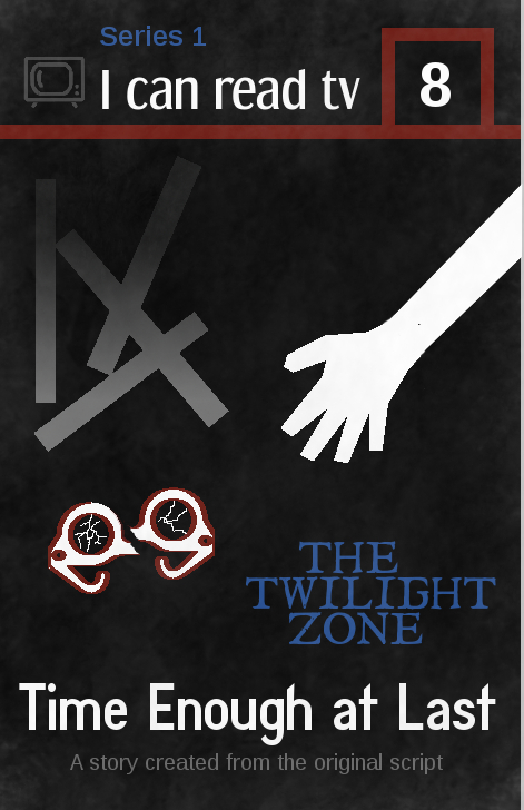
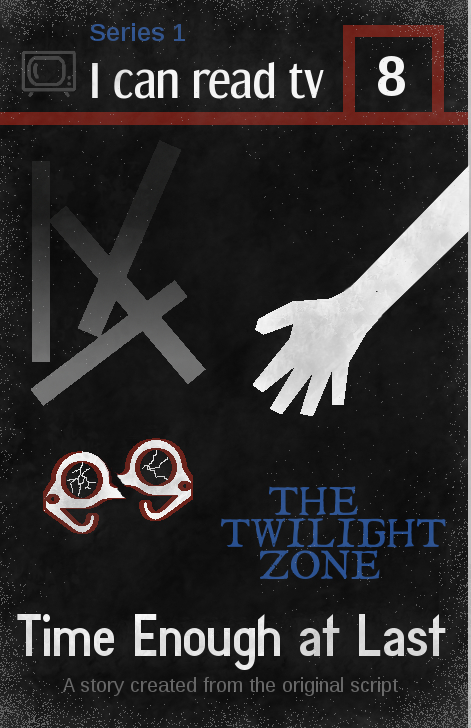
“I can read tv” book cover–Time Enough at Last (ds106zone)

For the second week of ds106zone, the Summer 2013 edition of ds106, we were working in part on design assignments. I had a few ideas of things I wanted to do, but only managed to get one thing done because it took me so long. I decided to take on a difficult assignment, knowingly, because I wanted to force myself to learn about more things in GIMP to do it. That definitely worked–the learning about stuff part. The final product is not quite what I wanted, but it’s pretty close, which I’m happy about.

I thought about doing the “Wait, where’d that guy come from?” assignment, which I thought I could do fairly easily in GIMP, or the “Lyric typography poster,” which would give me a chance to play around with fonts, but decided that what would be most challenging, and therefore would push me most to learn lots of things, is the “I can read movies” book cover assignment. That requires looking at & choosing fonts, as well as adding things into images, and more, so it is a bunch of things I wanted to learn rolled into one. It is also quite difficult to pull off well.

I looked at Spacesick’s original “I can read movies” covers, and most of the ds106 versions on the assignment page, and decided I wanted to go with a black background with a couple of colours. It reminded me of a kind of 60s/early 70s aesthetic that I thought would work for my idea to do a Twilight Zone episode version.

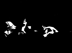
Here’s the finished product.

What I was trying to do:

  • I wanted to capture an idea, a feeling, or a scene in 2-3 images, and when I first thought of this assignment what came to mind was the scene where Bemis’ glasses have just fallen off and broken, and he is reaching down to them. He doesn’t yet know they’re broken, and his vision is completely blurred, just like it will be for the rest of this life. It’s the moment just before he finds out, and I find that powerful. I originally created the rectangles to represent rubble–I was thinking of those skeletal remains of buildings you sometimes see in rubble, with just some beams left over. But later, I thought they could also be book spines, perhaps–a jumble of them.
  • I included “Series 1” and the number “8” to fit the season/episode.
  • I wanted to include a tv icon on the top left, instead of the movie icon that Spacesick used for the book covers.
  • I wanted to make it look old and worn, and somewhat “paper-y,” as it’s supposed to be a paperback, and one that was printed decades ago.

What I’m happy with

  • The design of the three images–hand, glasses, rubble–turned out almost exactly as I meant it to. It’s what I pictured. Except for some details, as noted below.
  • I like the fonts I found for the “I can read tv” (Dream Orphanage) and the “Time Enough at Last” (Diamante Fresko). I wanted them to look like they’d fit a book from the 60s. I’m not 100% happy with them, but I think they work all right. I tried to find one that fit The Twilight Zone original font, and the closest thing I found was I Still Know. It’s pretty good, but “The Twilight Zone” on the book doesn’t quite look how I wanted (see below).
  • I think I managed to make the book look dusty and a bit worn, which I’m happy with. I wanted to do some other things to make it look more worn, though, as noted below.

What I’m not happy with

There are a number of things I’d like to change, but I just needed to finish this so I could move on to week 3!

  • The thing I worked hardest at was dealing with the pixelation of the glasses and hand. As you can see, I didn’t end up managing to fix it. The rubble ended up pixelating too, which was weird b/c I drew that myself. Saga on all that below.
  • I’m not happy with the colour of the tv icon at the top left. I struggled with what colour to make it, as I wanted this to have only a couple of colours beyond black/white/grey (given the b/w of the original show). I didn’t want anything really bright, as again, I wanted to stick fairly close to a b/w feeling (that’s why the colours that are there are pretty dark). The problem was I had to colour this thing by hand, as discussed below.
  • I think the font for the “Series 1” at the top, and the “A story created from the original script” at the bottom (both are Liberation Sans) doesn’t really fit the rest. It’s too modern-looking.
  • I’d like to have more spacing between the lines of “The Twilight Zone,” so the three words are separated a bit more. But when I hit “return” after each word in the “text” tool, the spacing was too large. Beyond putting each word on a separate layer and moving them, I don’t know how to fix this. I decided not to put each on a separate layer and move, but just leave as is.
  • I didn’t manage to make the book look as old and worn as I wanted, nor to look like it was made of paper. I like the look of the one on the assignment page for this assignment, with the light pixels on the edges that makes it look like the top part of the paper is flaking off a bit. See below for how I tried to do this, without a lot of success.

The process

Since this was a complicated process, the discussion will be a bit long. As with my post on selective colourization, mostly I’m documenting this in such detail for my own future reference, and for anyone else who is very new to GIMP like me.

Creating the hand and glasses

I got the hand and glasses from The Noun Project site. They were svg (scalable vector graphics) files, as are all the files on that site. I had watched the presentation on design for ds106zone and learned that svg files are useful because they don’t pixelate when scaled. So I thought: hey, great! I’ll put them in my image and scale them up a bit and they’ll look fine. 

No. I didn’t watch the presentation carefully enough. Tim Owens and Jim Groom noted that when you import svg files into GIMP they get turned into something else (jpegs, I think), and so when you try to scale them up they DO pixelate. Tim suggested we could import them into GIMP as bigger images (you can choose the pixel size when you open them in GIMP) and scale down, and they’d look okay. Which I did, and they did.

But the problem came when I tried to colour the svg files from The Noun Project. They were black to begin with, and I needed them white. It was when I coloured them that they pixelated. I used the “fuzzy select” tool and then the bucket tool to colour them white, and I got weird pixels. I don’t know any way to fix this except to use an svg editor like Inkscape (thanks to Brian Bennett for suggesting that to me via Twitter). But I just didn’t want to try to figure out a new image editor at this point. So I lived with the pixels.

I drew an arm to attach to the hand with the lasso tool and filled it with with with the bucket tool. I then wanted some kind of colour on the glasses, so I tried colouring them entirely red, but I didn’t like the look. So I used “stroke selection” to do an outline on them, Which was also pixelated b/c they were pixelated. I used the pencil tool, I think, to draw in some “cracks” on the glasses lenses.

To break the glasses in half, I selected one half of them and used “cut” and then “paste” to get a floating layer. Then I created a new layer and anchored the floating layer to it (if I remember correctly). Then I could move that half of the glasses separately from the other half. I know Henry Bemis’ glasses didn’t break in half in the episode, but I did this to emphasize their brokenness.

Creating the rubble

I drew rectangles with the rectangle select tool, and filled them in with grey. But they were all vertical, and I wanted them rotated a bit. This turned out to be difficult, because when I used the rotate tool I got white where the bars used to be. I didn’t know what to do, so I started trying to paint black over that white part, which was a pain. I can’t remember exactly where the bars were–I think on the background layer, rather than on their own separate layer. I did an extensive web search to solve the problem, and finally found an answer here. I discovered I could put the rectangles on a floating layer and then move them, either using a combination of key strokes or “cut” then “paste” to create a floating selection. I can’t recall if I could rotate them on the floating selection or whether I had to anchor them to a new layer first.

I originally made the rubble just grey (to fit the b/w show, and grey seems a good colour for rubble), but it looked really flat. So I used the “gradient” tool in GIMP to add a darker/lighter gradient–picking the foreground and background colours and making the gradient go from one to the other.

Creating the top of the image

I just used the rectangle select and bucket fill tools to do the red lines at the top. The tv icon was also from The Noun Project, and was also black to begin with. When I used the fuzzy select tool to try to recolour it, the pixelation was really, really bad. It looked awful. So, I used the lasso tool and selected around each part of it and then used the bucket fill to change the colour. I tested a few colours and decided on grey. It took awhile to hand select and colour in the whole icon, so when I was done and didn’t like the colour I couldn’t bring myself to do it again.

Adding the dust

At first I tried the following. I first downloaded some new brushes, from the Deviant Art site. I downloaded some texture brushes and some “grunge” brushes. Then I created a new layer and coloured it white, lowering the opacity. Then I used the eraser tool and played around with some of the texture and grunge brushes to erase away parts of the white layer. This looked pretty good, except that there was then no “dust” on the white parts of the image. I realized I needed to add grey “dust” to make the white parts look a little old and worn as well.

So I used some of the texture and grunge brushes and painted on a grey colour. I played around with the colours and the opacity, as well as the brush characteristics, including size, spacing, dynamics, and more. Here is a nice tutorial on brushes that I found very helpful.

As noted above, I wanted to try to make the book cover look like parts of the paper were flaking off because it was old. I tried to do this with the “dissolve” mode on various brushes, playing with the colour and opacity, and the best I could do is at left and below. I used white at first, but it just looked weird, so I went with grey. It’s okay, but it looks like grey speckles rather than flaking paper. 

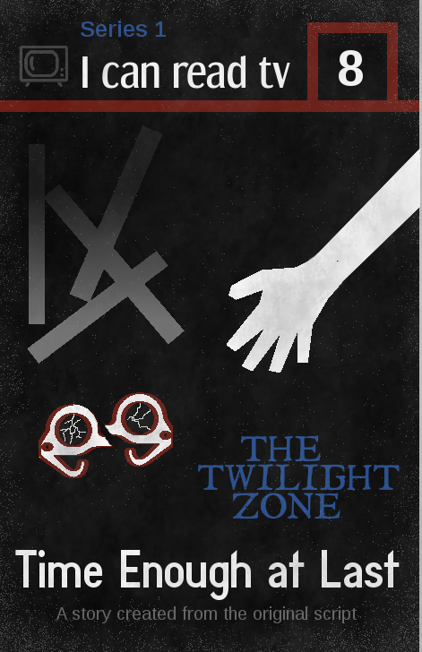
I tried a few different ways of doing the speckles, with different colours and opacities, and here’s one with brighter speckles. I still don’t think it looks like paper flaking off. Not sure what else I could have done.


Well, I think that’s it for process. I’m pretty happy with the way it turned out, but it took me a LONG time because I still don’t know that much about GIMP. But doing this project taught me a whole lot of things I didn’t know before, so I’m very happy about that!


Cmdr Hendricks’ final transmission

I have not been doing any ds106 “daily creates” for a few days, so I figured it was time to get back to them. Today’s was a lot of fun. Here’s the text of today’s daily create (actually yesterday’s, for me here in Australia…by the time I get the daily create announcements (the next day here) it’s already much of the way through that day over in N. America!):

Review the photos fromthe Daily Create of May 21, 2013 “Take a picture of where you are right now from a weird point of view, like an ant, an alien, or a ghost.” Pick one image, and write up a report to headquarters from the creature that was observing one of these humans. Be sure to include the URL of the image so HQ can verify your observations.

You can see all the submissions here, including mine. But I goofed bigtime. I pasted the link to the wrong image! Or rather, I pasted a link to a blog post I had in my “clipboard,” and didn’t realize I had failed to copy the link I wanted into the clipboard until after it was submitted. And you can’t edit post submission.

So here it is, with the correct image link. It will make more sense if you go look at the image!

—————————————————————-

Investigation file #562-9945x-00y

Regarding the disappearance of Cmdr. Hendricks

Contents:

  1. transcript of Cmdr. Hendricks’ last transmission
  2. last image sent by Cmdr. Hendricks before transmission ended: http://www.flickr.com/photos/71428177@N00/8776588388/

 [This is a selection of the last transmission, showing the last few minutes before the transmission ended abruptly. The entire transmission can be found in file #562-9945x-00z]


HQ: Sorry, we couldn’t hear that; too much interference. Please repeat. Over.

Cmdr. H: [speaking softly] I have somehow been beamed into an extremely hostile area. Coordinates must be mistaken. This is not, repeat, NOT the experimental garden. It is full of artificial structures, not plant life. Over.

HQ: We triple-checked the coordinates and are doing so again as we speak. We need to figure out where you are. Please describe your surroundings. Over.

CH: [speaking softly] I just escaped from a huge, round metal structure with steep sides. There was a hostile inhabitant who was using an enormous stream of water that is pushing me towards a hole in the bottom of the metal structure. I managed to climb out using a long, wooden, cylindrical item that resembles a log with the bark stripped off. I am hiding at the moment behind a giant, black box. Over.

HQ: Stay put, Hendricks, until we can lock onto your position. Over.

CH: Damn, I think the creature has seen me. AAAAAAAAAHHHHHHH  NOOOOOOOOOOOO  [muffled sounds]

HQ: Cmdr. Hendricks? Cmdr. Hendricks? Do you copy? Come in, Cmdr. Hendricks. Over.

[there are a few moments of radio silence]

CH: [out of breath] [whispering] The creature grabbed hold of me and tried to stuff me inside the giant black box through a swinging door on the front of it. It had several buttons and dials. I have no idea what the box does, but given the hostility shown me so far I can only guess the creature meant to do away with me by putting me inside. I wriggled free and am hiding near a large metal field with a grid across it. I am going to try to cross the beams on the grid. Over.

HQ: We just checked the coordinates and someone forgot to account for leap years. You’re in the right place, but the wrong time. We are firing up the transporter and just need to get your current coordinates. We’re working as fast as we can, but it will take 5 minutes. You need to find a way to keep safe. Over.

CH: [whispering] I am crossing the black beams over the metal field. The field is strange…it has circular patterns with holes… Oh *&#$!!! This is a death trap! The creature has ignited flames in the holes, heating up the entire grid! I’ve got to make a run for it! [3 seconds of breathing hard] Okay, I’m safe for the moment behind a tall, shiny metal box. Over.

HQ: Just 4 more minutes and we’ll have you. Hang on. Over.

CH: Wait; I’ve climbed up the tall, shiny box to get a look inside, and I think I can shut this whole area down. It’s just like HAL in here, and if I can get it powered down, the creature can’t use any more of these weapons until you get me out. I’ll just climb in for a closer loo…[end of transmission]


Street art — selective colourization (#ds106 assignment)

I’m participating in ds106 at the moment, as an open, online participant. It’s a crazy, compacted summer course for students taking it on campus at the University of Mary Washington–just see what they need to do for week 1 (which has just finished). Here’s the full syllabus for the on campus participants.

As an open participant, I’m free to do what I want (a lot) and have time for (not much). I’ve managed to do two assignments so far, an animated gif assignment and the one discussed here. Plus, I did quite a few “daily creates” from last week, which are posted in my daily create set on flickr. But this is a tiny fraction of what many people are doing. I have to cram all my ds106 work into 2-3 hours after my son goes to bed at night, and I’ve been staying up pretty late to get even these things done. Having a blast doing them, though.

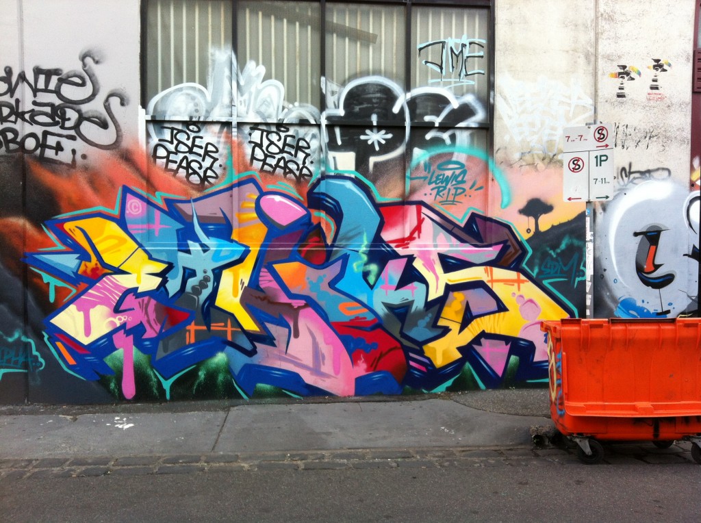
The image below was done for theFocus on one colourassignment: “Either in your room or a room in your house [take a photo] and use gimp or any other photo editor to focus on one color in the room.” Well, looking around the apartment I’m renting in Melbourne, Australia right now, most of the rooms are really dull in colour–white, grey, brown. Not much colour happening here. So I decided to use a photo of some street art I had taken earlier and do selective colourization on that. I realize it doesn’t quite fit the assignment, but I doubt anyone will mind much.

Here’s the original image:

Street art in the Fitzroy neighbourhood, Melbourne, Australia


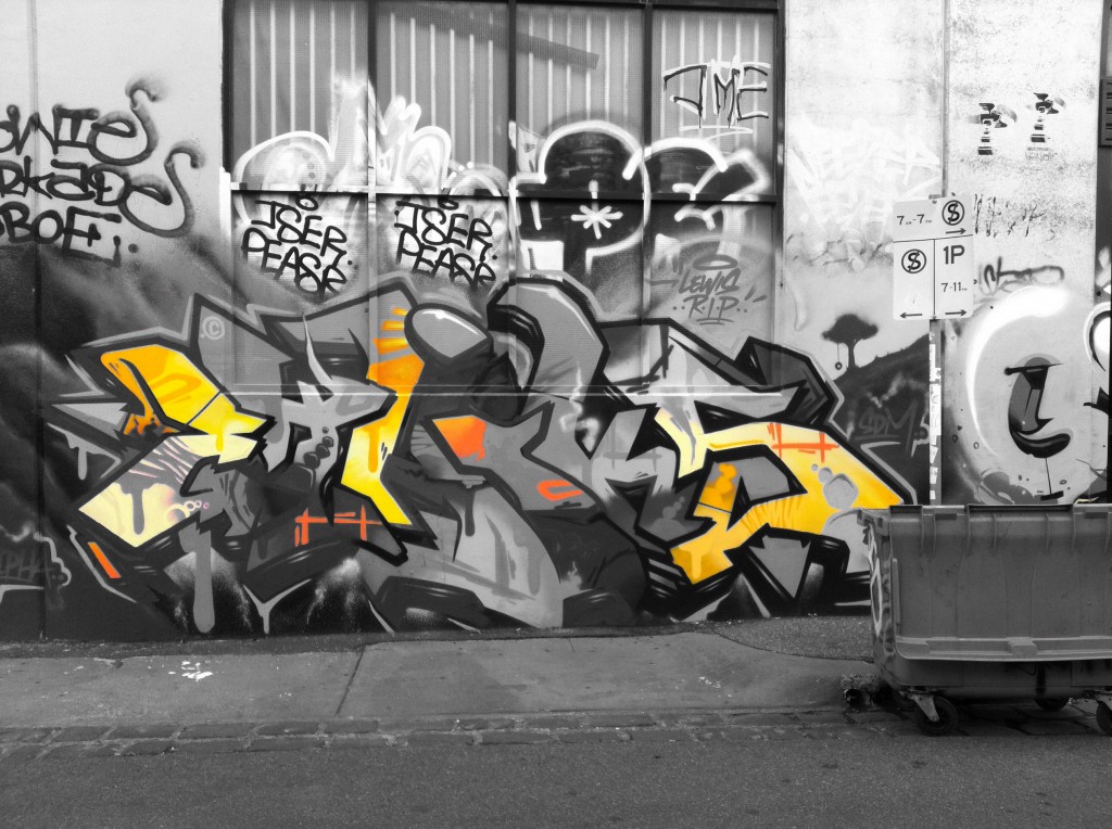
And here’s the selectively colourized version:


Street art selectively colourized

There were quite a few colours in the image, so first off I had to choose which one to focus on. I picked the yellow first, because: it was spaced pretty evenly over the image, there was enough of it to stand out (not so with some of the colours), there was not too much of it (which was important too, because it woudn’t stand out from the greyscale as well if there were a lot of it; this would have been the case if I did all the shades of blue, for example), and I thought it would look pretty nice against the greyscale image. Of course, the pink could have worked too, or just the light shade of blue alone. I didn’t do red because there just wasn’t that much of it.

I was just going to do the yellow, but thought the orange would look nice with it as a colour (and much of the yellow was close to an orange shade anyway). Plus, doing the orange too  would highlight a couple of other areas in the image that I thought would provide a nice balance. So not only did I not follow the assignment instructions for taking a photo of a room, I also didn’t follow them for picking one colour.

Process

I did this the hard way, I think. I used GIMP and wanted to work a bit more with layer masks, which I had only tried once before. So even though there are lots of tutorials like this one about how to do selective colourization with GIMP using the eraser tool, I thought I’d try to do it with a layer mask. Which meant I came up with a process on my own (partly because I couldn’t easily find a tutorial on selective colourization with layer masks, and partly because I wanted to see if I could figure it out on my own). If there are easier ways to do this with a layer mask, or better ways for some reason, please let me know!

I’ll be explaining in detail, because I don’t yet really understand all this and need to explain it in detail to firm it up in my own mind. It might also be helpful for other total novices like me!

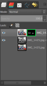
First I created a duplicate layer of the original image; actually, I created two duplicates so I always had the original image without touching it, just in case I messed something up with the two layers I was going to use (most people won’t need to do this, and it’s probably unnecessary, but I wanted to make sure I could always go back to the original easily, w/o having to do “undo” a bunch of times). I turned off the original layer (or whatever it’s called: I clicked the “eye” button next to the layer so it’s not visible) so I just had two layers with the same image.

On the top layer I created a layer mask. I’m pretty sure I did this backwards: I had the top layer coloured and the bottom layer greyscale (I used Image>desaturate to make the bottom one greyscale), and then I used a layer mask on the top image to make transparent all the colours except the yellow and orange–thus the greyscale from beneath would show through and the yellow/orange would stay from the top layer. Here’s a screenshot of my layers:

It would have been more intuitive, probably, to have the top layer greyscale and create a mask so that the only the yellow/orange parts were transparent and thus showed through from the bottom image. But it ended up working fine.

Here’s a screenshot of my layer mask, with white for the stuff that’s opaque (the yellow and orange) so that the greyscale from beneath doesn’t show through, and black for the transparent stuff that ends up greyscale.

I could have used the paintbrush tool to paint white all of the stuff I wanted to be coloured–the yellow & orange bits–or I could have used the lasso tool to select those bits. But I wanted to play around with the fuzzy select and colour select tools, so I used those instead. The colour select selects everything in the image that is the same colour as what you click on, and the fuzzy select selects everything that is that colour that is also contiguous to that colour. That was a LOT of work, as it turned out, because what seems like one colour is actually many different colours, so when you use either of these tools you only get a small portion of the “yellow” or “orange” sections. There was a whole lot of clicking going on to get all of it, and I still missed some of the edges of the colours. So really, the paintbrush or lasso tool would have been better. But I’m not yet proficient at using the lasso tool with a mouse for detailed work.

I would have liked to have selected some of the yellow right below the street sign in the original image, near the tree part of the painting, but it was really fuzzily blended with the pink on top of it. I didn’t know how to do a fuzzy selection where it blends into the next section. I would have gotten this hard line where there isn’t a hard line. Can anyone help me with getting a more fuzzy line for my selection? Or is that only possible if I used the paintbrush to paint the white parts rather than a selection tool?

I then created a layer mask on the top, coloured layer and set it to “selection.” It automatically made the selection white and the background black, which is what I wanted, but I think you can invert that pretty easily if you want it to be the opposite (haven’t tried, so not sure how–anyone know how?).

And that was it, really–I had two layers, coloured on top with a mask that had white on the yellow and orange bits so they were opaque, and black for the rest so the greyscale image below showed through.

Happy to hear any comments on the image or process!