The Aesthetics of Text

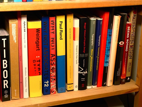
Design Book Library 01 4, originally uploaded by Outofprint.
I chose this photo because the bookshelf contains a collection of resources related to design, typography, text, and technologies. In the Module 1 course content, we are challenged to think about text and technologies in their varying forms and how it has evolved, become part of innovation and is being re-innovated. Not only are these books resources, but simple as they look, they also exemplify elements of design in the spines – creative ways of arranging text to convey typography.
My name is Marjorie del Mundo. I have a background in interaction design and have worked in marketing and graphic design. Currently, I am completing my final week as an Educational Programmer for UBC Student Development and am looking forward to the launch of the Discover Your Major guide for undergraduate Arts students which I helped develop over the summer. During my design studies, I had to investigate and explore the use of text and typography as a foundation for creating layouts and spreads. In this course, I hope to expand my knowledge on how text and technologies impact the way we share information and communicate in various contexts.


1 comment
1 Erin Gillespie { 09.10.09 at 5:52 am }
I like this colourful image and how you linked the words through their etymology and common stems.I always picture “black and white” when I hear the word text. Yet, text leads us to a vividly colourful world! EG
You must log in to post a comment.