What motivated you to explore the appliction(s) you used?
This was a tongue in cheek experiment with one particular web-based tool called “easl.ly”, which is intended to help “create and share visual ideas online”. This reminded me of some of our discussion about Edward Tufte and the visual presentation of information. I am really love (well-designed) infographs and the simplicity and aesthetic of information presented this way. This tool looked easy to use and like it could produce a fairly polished product, without requiring a high level of technical skill or money (buying and learning Adobe Indesign or some other more complicated software).
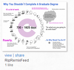
I took a cartoon image by Ennokni called “A Day in The Life” and edited the text on the image to “school” and “work”, to rework this into a day in the life of graduate student. However, as I working on it, I thought “What else would I say about the life of a grad student?” The animation, while funny, didn’t capture it all, so I supplemented it with text to elaborate on the image and ‘gist’ of it.
What are the particular affordances (for knowledge mobilization, learning, etc) of the form of production you’ve selected in relation to previous forms of production we’ve considered in this course?
This could be a useful tool for creating infographs or posters, where it is useful to simplify complex information and make stats more interesting and engaging (than excel sheets or tables).
Other benefits include that:
- It is easy to share the final product, and the audience does not require an account to view it.
- There are templates available which could provide ideas and inspiration.
- Sharing options are apparent and it is possible to share a link or attain an embed code.
- You have public and private sharing options.
- You can also download copies of the poster.
- There is a community (apparent from the number of public visuals displayed and there are “like” buttons), but at this point it isn’t possible to see the public posters.
What are the potential drawbacks?
This tool is still in beta mode, I believe, so if it endures, it will likely evolve. At this point, there are a few drawbacks.
- The number of themes is limited and may actually confine people to certain layouts which may not make sense.
- The interface is pretty easy to use, but it is easy to accidentally delete a project. The size of the canvas is limited.
- It doesn’t automatically save your work so you must save it continually or risk losing it if you lose connection.
- Information may be too simplified or truncated
Click on the image below to the view the larger size poster.
Stacey


Great info graphic. It clearly illustrates how I have been feeling the last few weeks between work, report cards and working on 2 courses!
What a great tool that allows for representing ideas through graphics/visuals and text. I will have to bookmark this one for sure. Thanks for sharing it!
Hi,
Thanks for sharing that tool! I have always been looking for a great tool like that to use when creating images but could never find one and would resort to Microsoft Word!
Your graphic clearly illustrates the journey, haha!
Exact representation of the thoughts that often run through my mind working full-time, taking this course, procrastinating with report cards…..cool tool!