Media Representations of the Attacks on the World Trade Center

by Grant Sorensen and Andrew Lemon

Introduction

The media and methods for reporting important events have evolved over time. Initial communication was oral, but this method was limited to the context of the speaker and listeners and stories needed to be continually retold. Later, details were represented pictorially, making them more permanent, but recording methods such as the papyrus scroll were cumbersome and not accessible to everyone. The invention of the codex and printing press increased accessibility and permanency and altered how information was communicated. The invention of photography and video altered communication once again, allowing information to be communicated visually in addition to print. Today, Web 2.0 technology and social media enable the immediate sharing and dissemination of written text and images on a much wider scale than ever before. This presentation examines the September 11th, 2001 attacks on the World Trade Center from the perspective of various media, including print, still images, video and audio, and the internet as it was in 2001. The presentation concludes with speculation of how reporting of the attacks and spread of information would be different with current technology.

Jay David Bolter (2001) purports that we are living in a visual, not a print, culture. Therefore, print is attempting to remediate still and moving images and the ratio of text to image is decreasing. He also states that this readjustment is leading to changes to prose as it attempts to be more “visual and sensuous” to show it can depict reality as accurately and fully as visual images. Below we examine the front page of the New York Times for September 12th, 2001 for indications of Bolter’s theories.

Print Representation of 9/11

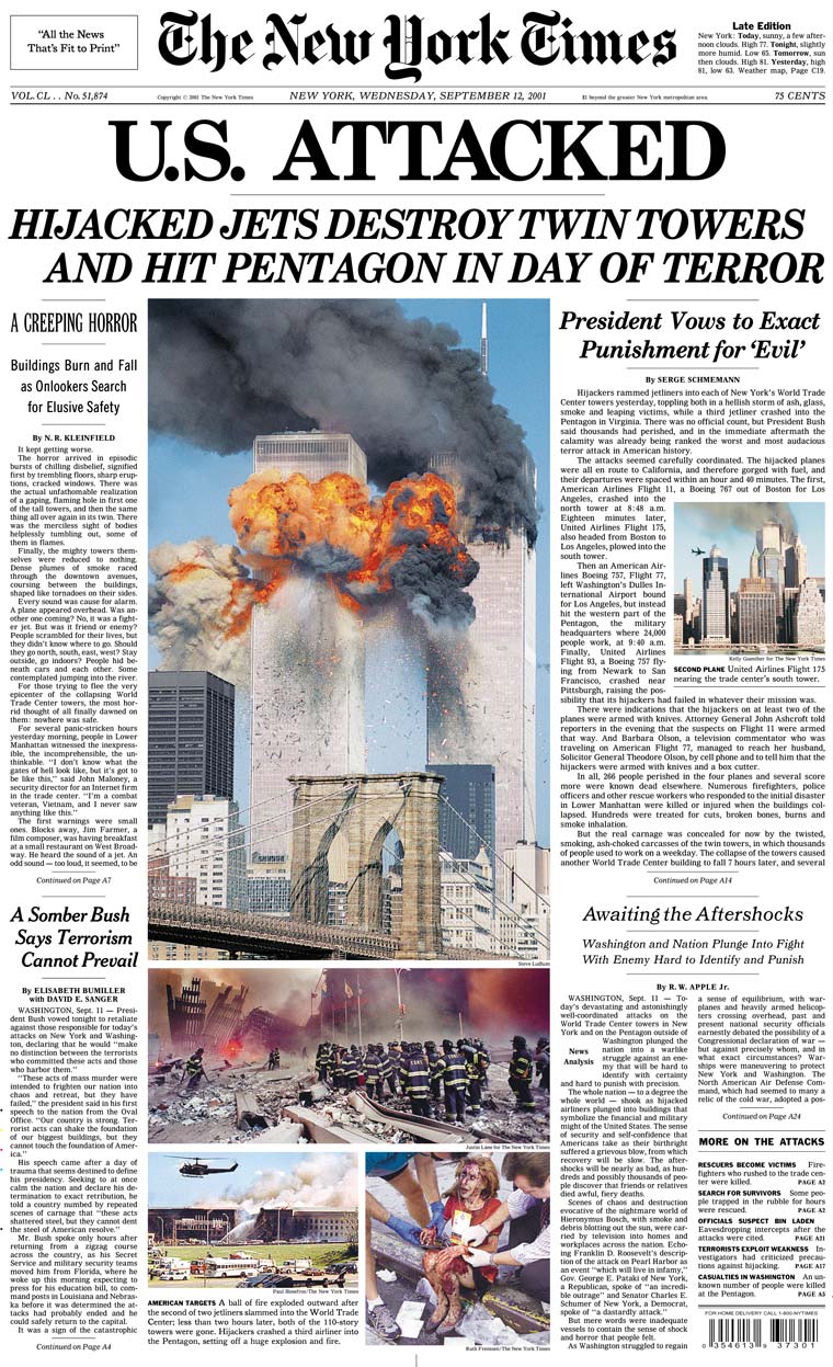
Retrieved from http://www.nytimes.com/packages/html/nyregion/9-11imagemap.html

Although the headline is very large, the eye is immediately drawn from the text to the dominant image of the burning and smoking twin towers occupying a full third of the page. Because the image of the fiery and smoking towers is so centrally located on the page, there is no need to read the article, or even the headline, to know they have been badly damaged. Due to the size, dominance, and shocking clarity of the image, one can almost hear the explosions, smell the choking smoke, and feel the extreme heat emanating from the towers. The bridge in the foreground of the image is dwarfed by the buildings in the background, providing a perspective of the enormity of the towers behind and, therefore, the widespread devastation and loss of life caused by their collapse. This devastation is further evidenced by the vast amount of of debris seen emanating from the towers.

Although smaller, the images at the bottom of the page also draw readers’ attention, as they depict both the mass destruction and the individual suffering inflicted by the crashes. The inclusion of these images supports Bolter’s (2001) contention that the function of the newspaper is no longer merely to impart information, but to give readers “an appropriate visual experience”, thereby impacting their response to the story. In this case, the images have been chosen to support the headline’s pronouncement that America has been attacked and to elicit a response of outrage, and perhaps, fear. Bolter (1989) notes that an author can fashion images “into a structure just as he fashions words. He can write with images, in the sense that he can direct one topical image to refer to another. He can also join visual and verbal topics in the same structure. Thus, a journalist can select examples from a library of digitized still pictures and form them into a pictorial essay”. (p. 139). Here the author is telling a story of death, destruction and tragedy; the main focus is on the explosion (the climax of the story), with the smaller pictures providing an introduction (the plane moments before it strikes the building), a conclusion (the injured woman and the wreckage of the building), and the possibility of additional information to come (the damage to the Pentagon). Through the use of images, the author has told the story of what happened that morning.

Bolter’s theory that the text to image ratio is decreasing is supported by the proportion and placement of text and images on the front page. The print description of events is relegated to the margins on either side of the page, pushed out of the central spot by the predominant images. The language of the headline and subheadings seems subdued compared to the violence and destruction evident in the pictorial representation of events. However, much of the language used in the written description is intended to evoke strong visual images of the morning of September 11th. In this language, we can see evidence of Bolter’s (2001) notion that prose must now “speak the language” of film, television and computer graphics and return to its previous function of picture writing. The excerpts below are examples of the evocative language used in the cover stories of the attacks, providing the reader with descriptive visual imagery within the print text.

·         bodies helplessly tumbling out, some of them in flames

·         Some tripped, fell, got knocked down, were pulled up

·        a … woman, hair caked with blood, … sitting on the curb, shaking uncontrollably

·         Bodies fell on top of him — not all of them … alive

·         The air rained white ash and plaster dust, coating people until they looked ghostlike

·         a hellish storm of ash, glass, smoke and leaping victims

·           the twisted, smoking, ash-choked carcasses of the twin towers

·         (Each) explosion, people would start screaming and thronging again

Image Representation of 9/11

The story of the attacks on the World Trade Center can also be told through still images taken the morning of September 11th.

*Warning: images contained in the slideshow below may be considered disturbing to some viewers. Viewer discretion is advised!

Images of the attacks on the World Trade Centre

It is open to interpretation whether the print or image representation is more impactful and which version portrays the reality of events more fully or clearly. The written text allows readers to use their imagination to envision the pictures described in the image-rich prose, while the photographs provide snapshots of each event as it occurred within the context of the attacks and their aftermath. To some extent, the answer to which mode is more efficient lies in the literacy skills of the reader. Some readers are more skilled at applying their imagination to written text and constructing their personal understanding of events, while others are more proficient at interpreting images for an understanding of the events they represent.

As Allen (2001) has found, communicating through images aids authors and readers in that it allows them to better see relationships between ideas and topics as opposed to the use of text, which relies more on a defined, linear narrative. After the events of 9/11, there was a near-constant barrage of images used to both display the trauma of the attacks and link them to terrorist actions, thereby illustrating Bolter’s notion that newspapers seek to dictate an appropriate response to the graphics displayed within them. For example, these images were used to remind viewers of the carnage and destruction of September 11, 2001, and lead them to see a relationship between this tragedy and the Patriot Act and the War on Terror.

Because they each have strengths which are unique to individuals, we shouldn’t ask which mode of representation is superior, print or imagery. Instead, the focus should be on how the modes can be used together most efficiently to impart information clearly and completely. This suggestion is supported by Kress (2005) who contends that communication is always multimodal and that each mode has strengths and weaknesses. The task of the reader, he proposes, is to fill words with personal meaning. In addition, he stresses that images have potential to equal writing as a mode of representing information. Bolter (1989) also suggests that journalists can write effectively visually, verbally, or by combining both.

Although Stephens (1998) believes that the use of still images is on the ascent and words on the decline, he agrees with Kress that there are advantages for both, contending that there are functions that images fulfill better than words and vice versa.

For example, he describes images as “accessible” (p.61), even to people with low literacy skills or those who don’t speak the dominant language. He states that images are concise, capable of expressing a lot of information in a brief time, and convey deep meanings that are difficult to put into words. However, he also asserts that there are language functions, such as asking questions and expressing negatives, that still images cannot do alone and, therefore, must depend on written words for explanation. Finally, Stephens posits that images are better at conveying concrete ideas, while words are more efficient at expressing abstractions that cannot be conveyed by images.

We can see evidence of Stephens’ ideas in the newspaper coverage of 9/11. The images included on the front page of the September 12th, 2001 edition of the New York Times and other publications are readily understood by all who see them, regardless of language or literacy level. For example, there is nothing ambiguous about the picture of a plane flying directly at the south tower or people leaping from the smoking building. However, what is less clear, and in need of written  explanation, is the context of these events, why they happened, and how they unfolded. One must read the articles to get this information and other non-visual details that cannot be conveyed through images. For example, the specific details of the following excerpts could not be captured or interpreted by still images alone:

·         “trembling floors, sharp eruptions”

·         “the … thought … dawned on them: nowhere was safe”

·         “sirens blaring”

·         “the incomprehension had struck them mute”

·         “People gasped. They trembled. They sobbed”

·         “an ear-splitting noise”

Video Representation of 9/11

Moving images and audio are able to capture some, but not all, of these details since some include the frantic thoughts of people as they rushed to safety and attempted to make sense of the incomprehensible. Much of the video coverage was recorded from a distance in an attempt to focus on the twin towers, and doesn’t always illustrate the street level pandemonium, panic, and individual impact conveyed in the print description of events. In these cases, the video coverage shows what was visually and audibly captured by technology, while the print representation feels more like what was witnessed and experienced by victims and bystanders.

The first analysis of video media coverage is based on a collection of clips retrieved from the Internet Archive at https://archive.org/details/911  and is made up of examples from various news stations, including ABC, CBS, NBC, CNN, BBC, and CBC. The coverage begins at 8:30 a.m. with a clip from NBC’s Today Show which illustrates the impact of context when viewing video images and the power inherent in capturing events that can be relived later. The scene is of a crowd of happy, joyful people smiling and waving at the cameras, while the host announces the date is September 11, 2011. Hearing the date and seeing the crowd’s excitement, oblivious to the horror they are about to witness, is a jarring juxtaposition for viewers witnessing it from a post-attack perspective. Captured permanently on video, the sights and sounds of the carefree crowd just moments before the attacks are a stark illustration of how the events of 9/11 irrevocably changed the world.

In the second clip, CNN programming is interrupted to show a live shot of the north tower shortly after the first plane hit. The fast moving, seemingly endless, billowing black smoke emanating from all sides of the tower makes the damage appear more extensive and illustrates it more clearly than in the still images. Because mass media has subsequently made this image so familiar around the world, it is surprising to hear the commentators’ shock and lack of knowledge as they try to put into words what they are witnessing.  These images and events have become so pervasive in our culture that it’s easy to forget they haven’t always been a part of our lives.

The third clip from ABC news illustrates a sharp contrast between the audio and video depiction of the same event. The visual clearly shows the destruction that has occurred to the smoking north tower while the announcer explains with professional detachment what he is seeing and surmises what is happening on the top floors of the tower. His spoken words alone are insufficient for the task of describing the scene and those hearing only the audio would not comprehend the full impact of what has occurred.

This would become much more clear to listeners, however, when the second plane hits the south tower as the commentators’ shock and disbelief are apparent. The full impact of what has happened doesn’t immediately register for the reporters or viewers because the image of the plane suddenly appearing and flying directly into the south tower seems unreal, perhaps influenced by our exposure to movies and video games in which special effects make such sights possible, but seemingly implausible. Sounding dazed, the commentator announces that they will show an instant replay of the crash to make sure they can believe what they’ve seen. As shocking as the still image of this scene is, it lacks the full impact afforded by video of the sudden appearance of the plane and the determined speed and focus with which it flies into the south tower. Print would also have difficulty putting into words the full impact of this scene.

The fourth clip features live footage of the collapse of the south tower. The image is striking as the huge 110 story building crumbles, seemingly in slow motion, accompanied by so much ash and debris that the broadcasters aren’t sure what they’ve witnessed. This slow motion, oddly graceful collapse is not apparent in still images as they capture individual frames of the tower’s collapse, but not the full-scale destruction apparent in the depiction of the skyscraper slumping to its knees.

A clip from NKH news from Japan provides a street level view of the collapse. The accompanying sound of concrete crashing and bystanders’ panic to escape the area as they are  chased by a huge cloud of ash and debris which obliterates the entire street brings a heightened reality to the removed disbelief of those witnessing the scene from a distance. Blaring sirens, the well-known sounds of distress and disaster, add further aural proof of the severity of the events. Illustrating the lasting resonance of visuals, these pictures of panic, destruction, and huge clouds of debris bring to mind similar images of the bombing of Hiroshima.

CBC Newsworld provides footage of the collapse of the north tower and the calm voice of the reporter assures Canadians that Canada is on alert for similar attacks. The oral recounting of events belies the accompanying images, as though the enormity of the occasion cannot be fully comprehended or related through spoken word alone. This is further evidenced when the reporter loses his relaxed, professional demeanor, exclaiming “Oh, my God!” several times as the north tower collapses and the sound of numerous other shocked voices can be heard in the background. His narration of “the second tower collapsing as rescue officials were trying to evacuate the building” a hollow statement that can’t encompass the loss of life that has just occurred or rival the impact of seeing a 110 story building collapse.

This example supports Bolter’s statement that “Words no longer seem to carry conviction without the reappearance as a picture of the imagery that was latent in them.” (2001). Further examples of this can be seen in the BBC summary in which reporters summarize the day’s events, and it is difficult for their words alone to fully convey the horror of the events they attempt to describe. For example, phrases such as “huge explosion”, “debris showering down from the tower”, and “the north tower was ablaze at the top” strain to explain the enormity of what has happened and require the accompanying images to fully describe the destruction . Similarly, phrases like“those trapped inside went to desperate lengths in hope of rescue”, and “desperation led others to jump to an inevitable death” don’t have full impact without the startling video of victims hanging outside of windows or bodies plummeting hundreds of metres to the ground. Throughout this broadcast, a small print banner appears at the bottom of the screen relaying the basic facts of the attacks, another example of Bolter’s view that the power of the written word is decreasing in today’s media.

The next clip previews the role of emerging technology in coverage of news events. The anchor explains that the footage just broadcast was taken by a bystander who was so close to the action that he needed to get air from a firefighter’s respirator. The chaos of the day is apparent as the two anchors talk over each other in an effort to report the latest updates. As the shot changes to live coverage of a third building collapsing, the anchor expresses what he feels to be a problem with new technology, namely that “the pictures advance the facts”, meaning technology enables them to show live coverage of the building imploding without being able to identify the building (World Trade Center 7) and confirm the reason for its collapse.

This illustrates an important contrast between video and print coverage of the same news event. While print lacks the immediacy of live video, it reports completed events and can confirm details prior to publication. Therefore, print coverage gives a sense of wholeness, reporting all the details of the story as known at the time printed. Live video coverage, in contrast, shows events as they happen, but is subject to ambiguity as details are not always apparent as the story unfolds.  As Allen (2001) found, a greater emphasis on images and video will “involve us in learning new skills of interpretation” (p. 189). For example, viewers will need to learn how to place the images they view into a narrative without knowing the full context of the story.

The second analysis of video coverage of 9/11, is a summary of clips from Good Morning America, retrieved from http://abcnews.go.com/WNT/video/reporting-911-attacks-14491835. It begins with footage of a warm, sunny idyllic New York morning, with the upbeat atmosphere typical of morning shows. From today’s perspective, it is shocking to hear Diane Sawyer matter-of-factly announce the date, oblivious to the weight and notoriety it will soon possess. Word of the first crash comes in gradually and it seems unfathomable that these now so familiar facts and pervasive images were ever unknown. It is an indication of how technology has changed since 2001 that Sawyer keeps stressing that what they are reporting is based on rumour and they can’t confirm the details. Today, with the ubiquity of cameras and social media, confirmation would be much more immediate. Unlike some of the anchors in other clips, Sawyer and her colleague, Charlie Gibson, are clearly incredulous at what they are witnessing, which adds to the horror of the video images, but also confirms for the viewer that what they are watching is real. Their words “This is terrifying, awful” and ‘to watch powerless is a horror”, are understatements, which again illustrate the difficulty of conveying the content of such images orally.

The summary of clips includes numerous scenes from ground level, the impact of putting viewers in the middle of the chaos much more powerful than watching events unfold from a distance or hearing about them second-hand. The authority and determination with which police officers command bystanders to move as horns honk and emergency sirens blare around them strikingly illustrates the severity of the situation. One of the most haunting and telling images is of a woman looking up at the tower as it collapses. Her anguished wail of “Oh, no!” an indelible aural image of what she is witnessing.  As the south tower collapses, crowds of people run in panic, chased by a black cloud that fills the entire screen, indicating the futility of their attempt to escape.

How Coverage of 9/11 might differ Today

The media landscape and the methods of reporting the news have changed significantly since September 11th, 2001. Social media has become pervasive, with most media outlets now having a presence on sites like Facebook, Twitter, and a whole host of blogging sites. News is no longer exclusively transmitted through the traditional channels (articles in papers, news broadcasts, etc.); instead media outlets have started to use social media more and more to inform their viewers. There are a number of reasons for this transition; one is that social media relies on users sharing information. Therefore, by having their own voice in the social media maelstrom, news outlets are able to disseminate stories in a much more expedient and efficient fashion. Another reason is that many people now want their information in a succinct format – they no longer have the time to read through an entire article or watch an entire broadcast. Instead, they look for the condensed version of the story, wanting to know as much as possible with as little time and effort as possible. Perhaps the most important reason for the increased use of social media is that people want to be able to respond to what they are seeing. Social media allows everyone to add their voice to the conversation, which makes them feel more involved. Although there are multiple social media sites that serve all of these purposes, the most popular seems to be Twitter.

One of the biggest differences in reporting major events such as 9/11 is the use of the micro-blogging site Twitter to “break” the news. Most, if not all, major news organizations have their own Twitter accounts, and virtually all reporters for these organizations also have active Twitter accounts. Many news stories (particularly those of high public interest) are first disseminated through Twitter and then followed up by “traditional” news articles and videos. The immediacy that Twitter provides allows information to travel much quicker than waiting for articles to be written, websites to be updated, and newspapers to be delivered.  Hu et al (2012) noted how the death of Osama Bin Laden (who played a significant role in 9/11) was first broadcast on the Twitter account of Keith Urbahn, then an aide for Donald Rumsfeld. Instead of the event being disclosed through an intermediary (an organization like CNN for example), the announcement was made directly to those who happened to follow this particular account. Once the information was released it spread much faster than virtually any traditional method of reporting was able to match. Even the White House could not compete with the speed of Twitter – they made the announcement more than an hour after the information first appeared on Urbahn’s account. Although television and radio both afford flexible programming and the ability to disseminate information expediently, neither is able to compete with Twitter, which doesn’t have to rely on people watching television or listening to the radio. Instead of viewers looking for the information, the information finds them.

During 9/11, most people had little to no information as to what was going on. Most news outlets were waiting for information like everyone else; unlike today, there were few tools that would allow those witnessing or involved in the incident to report what they were seeing and experiencing to the rest of the world. Had a site like Twitter been around in 2001, it is certain that information would have been pouring out of Manhattan, from people witnessing the event to people experiencing the event. It is possible (and entirely likely) that some of the passengers on the ill-fated flights would have “tweeted” information about the event from their point of view. One of the major affordances of Twitter to benefit the media and aid in the dissemination of information is that it encourages users to “retweet” information – effectively spreading breaking news to all the people following their accounts. This allows for a much more efficient distribution of the news, as a previously passive audience now has the ability to extend the reach of the media. This also allows information vital to public safety to be dispersed quickly. For example, confirmation of the capture of the Boston Bombing suspect was released via Twitter by the Boston police department. When a massive earthquake struck China in 2008, Twitter users were able to announce its occurrence long before the mainstream media had had a chance to break the news (Times of Oman, 2008).

Interestingly, Twitter limits its users to 140 characters, but also provides users the ability to add images and video. It is an amalgamation of the three methods of relaying information (text, image, video) but does place a limit the amount a user can write. This points to the shift that seems to be occurring in how people communicate – text is less important now than it once was. If a user has something they would like to “say” they are forced to say it in 140 characters or break it into several different messages. Images are used more than ever to tell news stories now, both because of their efficiency in doing so and because of the ubiquitousness of the digital camera. Reporters are almost as likely to “pen” a story using 140 characters and a picture taken with a cell phone as they are to write several hundred words with no accompanying photo.

Conclusion

An event like 9/11 garnered an incredible amount of coverage through a variety of different media. Text, audio, images and video were all used to convey what happened that day. Each one presented the event in a unique style – text tried to capture the enormity of the situation, images tried to explain the story, audio tried to provide a sense of the shock and disbelief, and video replayed the events in a near-endless loop. While each of these mediums have their advantages and disadvantages, viewers needed all of them to gain a full understanding of what had happened that day. Despite there being an increase in the use of images and video to tell a story, it is evident that text still has a place in the dissemination of information. Now, 12 years later, new tools have evolved to aid in the reporting of major events such as this one. Tools like Facebook, Snapchat, Vine, and particularly Twitter allow both major media institutions and the average person to “break” major news stories. These also allow everyone to add their voice to the conversation, making the reporting process more democratic than ever. As Bolter (2001) mentions, we are now living in a more visual culture. Although this may be the case, there is still a place for text in the reporting of news, the dissemination of ideas, and the telling of stories. Perhaps the greatest lesson to be learned from an analysis of the various ways in which 9/11 was covered in the media is the need for multimedia literacy in order to fully understand and benefit from all of the methods of receiving and sharing information.

*Note: reference list is fairly long so we have chosen to post it as a word document instead.

References final project

Posted in Final Project | Tagged , , | 6 Comments

Final Project – Collaboration In Digital Enviroments

Hi All,

For our final project, Christine, Eva and I decided to build a website in order to unpack the topic of Collaboration.

Our Purpose:

  • To unpack Collaboration from a corporate, mainstream, and educational perspective
  • Provide a “space” for all to share ideas via a “rip, mix, feed” approach
  • Provide useful tools and conversation to impact and transform personal educational practice
  • Situate Text & Technology within an important societal and cultural theme (Collaboration)

Questions, Comments, or Concerns?? Collaborate with us on our site.

Best

Steve Holmberg, Christine Hulme, Eva Perez.

Collaboration In Digital Environments

http://stevechristineeva.weebly.com/index.html

Posted in Final Project | Tagged , | 4 Comments

Social Media and Literacy: Exploring how social media is changing our definition of literacy

Social Media and Literacy: Exploring how social media is changing our definition of literacy

For this assignment, our group has explored social media and how it is changing our definition of literacy. We have chosen to present our information through a variety of modalities, including videos and Prezi, which are hosted on our project website. Our homepage is set up as a blog which provides an overview of the creative and collaborative process that we took to create our final website. We then explore what it means to be literate in the 21st century and the influence of social media on literacy learning and development. Our research for this assignment led us to what we believe are three main themes related to the impact that social media has had on literacy learning: the promotion of collaborative learning, the motivational effect social media has on student engagement in writing, and the changing meaning of author and audience.

We have included opportunities for you to participate in social media by adding your thoughts and comments on the different pages of our site. Please click on the image below to access our site!

Mel Burgess, Emma Sarbit & Lauren MacDonald

https://blogs.ubc.ca/socialmediaandliteracy/


Posted in Final Project | Tagged , , , , | 4 Comments

Communication

Click on the word “communication at the bottom of this post to access the presentation.

What motivated you to explore the appliction(s) you used?
I wanted to use an application I was unfamiliar with to expand my knowledge. I have used ppt but not Slideshare or mp3 personal recordings. I also felt this was something I might be able to use in my own classroom. I also used flickr to find all of my images.

What have you attempted to achieve in your project?
With my presentation I have attempted to share a little bit about what I have learned about the evolution of communication and the power of images.

What are the particular affordances (for knowledge mobilization, learning, etc) of the form of production you’ve selected in relation to previous forms of production we’ve considered in this course?
Slideshare allows audio to be added to a ppt presentation. I can see this being useful for students to practice visual, textual and oral communication together with this application.

What are the potential drawbacks?
It is necessary to find an effective way to record an mp3 audio file. This is not always easy with noise levels in a learning environment or for me in a household with three boys.

Posted in Uncategorized | Tagged , | 1 Comment

Rip.Mix.Feed

Hello everyone,
Since no one has chosen to use Gliffy yet as their medium for the Rip.Mix.Feed activity, I decided to give it a try. This was my first time using this communication tool and I found it appealing because I enjoy presenting content visually and organizing information categorically. I decided to use examples, ideas and arguments from the three readings for this week on social networking to create the diagram. I also used images from Flickr to visually augment the flow chart.

While this tool provided an excellent medium for presenting text and images in a unique way that helps individuals view information systematically, I found certain production aspects frustrating; for instance, when using the connector tool, the line created overlaps with previous shapes, rather than being drawn around them. An advantage, however, is that there are other ways to link content, such as using the line function. Overall, I found Gliffy an interesting new way to convey information!

The following is the link to my project:  http://www.gliffy.com/go/publish/5125224
Please note that it takes a minute to load.

Lindsay

Posted in Uncategorized | Tagged , , | 3 Comments

Technology Literacy Using Digital Storytelling and Podcasts

Nicholas Graves and I wrote about technology literacy in the 21st century through the use of podcasts and digital storytelling in the classroom. Since wordpress.com does not support Prezi embedded presentations, please click on the link below to see our presentation:

Technology Literacy Using Digital Storytelling and Podcasts

In summary, our findings are that:

  • Technological literacy is an important criteria for success in the 21st century.
  • Modern education must be multifaceted and give students the skills they need to be successful, digital storytelling and podcasts are important tools for meeting this criteria.
  • Digital storytelling and podcasts help develop skills that students need to be successful in the modern world.
  • Both of these technologies are also strong tools in developing active learning and knowledge building.
Posted in Final Project | Comments Off on Technology Literacy Using Digital Storytelling and Podcasts

Dynamic Text Presentations

Visual Transformation Through Creative Semantics

Created by Marc Aubanel, Mike Singh & Kimberly Wagner

YouTube Preview Image

The art and technology studioSoso Limited, complete innovative projects that “incorporate elements of dynamic typography, video manipulation, computer vision, sensor technologies and sound design” (Soso Limited, n.d.a). Their dynamic text presentation, Reconstitution 2008 (Mead, n.d.;Soso Limited, 2008), was a live audiovisual remix of the Presidential debate. They designed the software to analyse the audio and video and represent it through dynamic text. Their project Semantic Sabotage is an open source platform “for creating live typographic YouTube transformations” (Soso Limited, Semantic Sabotage, n.d.b). It is possible to experiment with a variety of transformations in the gallery, and to get the source code to make your own tool. We had the idea of creating our own text transformation tool, but due to logistical barriers decided to create a fixed dynamic text presentation to present our findings.

There is little research specifically on dynamic text presentations. There were three studies that were more directly relatable: one, a study on designing efficient text presentations (with multimedia) for improved memory (Huang & Lin, 2001); two, a graduate thesis study of one prosody-enriched dynamic text presentation technique to determine if it enhanced the reading of electronic text (Marks, 2009); and, three, an eye movement study to determine if reading on a mobile device using the rapid serial visual presentation (RSVP) format instead of the page format (Oquist, Hein, Ygge, & Goldstein, 2004). There is also relevant relatable research in the area of representing emotion with animated text (Rashid, 2005), emotive captioning (Lee, Fels, & Udo, 2007), and improving closed captioning for the hearing impaired through dynamic captioning (Hong, Wang, Xu, Yan, & Chua, 2010). We discovered that dynamic text presentations can increase reading speed and comprehension if the method is focused and not distracting. The use of semantics can improve understanding and add meaning visually.

Walter Ong (1982), outlines the history of orality and the development of print literacy which provides the background and foundation for paper text forms. He also develops the concept of “secondary orality” which refers to new oral mediums that reach large audiences, but are still carefully controlled like print. New digital mediums are less controlled and in the hands of individual users. In Bolter’s (2001, Ch. 4) Writing Space, he does not refer directly to the term dynamic text but the umbrella term “hypermedia” which integrates both image, sound and text. He states,  “In presenting animation and digitized video, a webpage can supplement or bypass prose altogether” (Bolter, p.47).  Our video strives to show the effectiveness of dynamic text. Our topic dynamic text represents writing breaking free from its static, fixed position on a printed page as it becomes capable of movement, flexible-positioning, shape, image, and hyperlinking. It is a part of the new digital medium for reading and writing and the building on past developments in writing (Dobson & Willinsky, 2009).

Bolter (2001, Ch. 4) also outlines the concept of “remediation” when discussing the ever changing concept of print and image.  Initially, print always took precedence and control over the image.  Traditionally, print was produced by one means and pictures were done by another.  Through the use of the computer, this is no longer the case.  Authors now can easily incorporate both text and image which gives them a new found freedom of expression.  He advocates that we now live in a visually dominant culture, and that even in printed media, images are changing the way prose is presented. Ekphrasis and reverse ekphrasis in terms of new media designers’ urge to “redefine the balance between word and image” (Ch. 4) is described by Bolter; we extend this idea to a ‘semantic ekphrasis’ meaning to make the words themselves visually meaningful in shape, colour and style.

Landow (2006) in Hypertext 3.0 states, “The code-based existence of electronic text that makes it virtual also makes it infinitely variable. If one changes the code, one changes the text (p. 36). There is code sitting invisible behind the dynamic text we see on the screen which makes this visual text possible. Design elements are no longer in the domain of the typesetter but in the hands of the author. There is a long history of visual embellishment on paper, but now anyone has the capability of “manipulating visual effects” (p. 88). Animated text “entirely controls the reader’s access to information at the speed and at the time the author wishes” (p. 93). Dynamic text is a combination of modes: written language, visual representation, and spatial representation. The multiliteracies (Cope & Kalantzis, 2009; New London Group, 1996) concept calls for an expanded understanding of what it means to be literate. Dynamic text requires active creating and viewing as a person makes sense of its semantics.

This centrality and importance of the image is also a recurring theme in many of the web 2.0 platforms showcased in our video.  Alexander (2013) states that “the open nature of Web 2.0 platforms, connected by hyperlinking, lets learners pursue connections across multiple lines of thought … multiple browsers or tabs within a browser lets learners pursue multiple inquiries in rapid and almost sequential sequence” (p.156). This idea of pursuing multiple connections at a rapid pace is exemplified in the visual representations in both Gap Minder and Visible Tweets. With a few keystrokes, one can see a visual representation of data which makes it much more effective that the written word itself. These web applications also expound the concept of transforming data into visualizations extends the concept of word visualization being examples of searching a large data set and then representing that text and information dynamically. Data visualizations, such as the MIT Health Infoscape, represent a large set of data presented in a way that people can understand (PBS, 2013). David Talbot (2013a; 2013b) of MIT Technology Review describes and demonstrates the frequency of a tweeted word in sped up video to show how a new software chip has been developed to allow real time display of data from a large data set. Memes, which are the ultimate combination of image and text, use multi-media to look at things from a humorous standpoint.  Although they may seem quite simple, their viral nature demonstrates their lasting impact.

We devised the following thesis for our multi-media compilation:

Text is no longer constrained by its physical tools and mediums. Hypertext allows for new methods of representation as we build on traditional text forms within digital environments.

Sub-Topics:

  1. Changing relationship between word and text

  2. Visualization online tools

  3. Kinetic Typography

  4. Hypertext and linking

  5. Memes

  6. RSVP

We planned our dynamic text presentation video in Google Spreadsheet indicating the segment, text, images, animations, and sounds. We project planned in a Google Document, meeting there and in Skype once a week, and communicating in the document as needed. Marc decided that due to limited time, that we would create a linear, non-interactive piece.  Using a combination of Adobe After Effects and Premiere, he challenge himself to create animated text and visuals. Kim learned how to use Powerpoint to create a dynamic text presentation using PowerPoint Spice (2012; 2013) tutorials as the files could be finalized as video. Kim and Marc completed video screen captures to demonstrate several online visual text tools. We brainstormed ideas for how we could give words a visual aspect, like the brain in ‘cognitive’ and the conversion of the words ‘image,’ “emotion,’ ‘transformed,’ and ‘visually’ being inspired by the Visual Text Project (2012) and Ji Lee’s dynamic word e-book (2011; n.d.). Mike completed a storyboard for his segments and Marc created them for him. We reviewed 11 video drafts during the process. An open source, free to use, background music was chosen to compliment the content of the presentation. We made a decision to not include direct references to the reading in our artistic product because we wanted the dynamic text techniques to creatively inform and enlighten the viewer.

Bibliography

Alexander, Bryan. (2013). Web 2.0 and emergent multiliteracies: Theory into Practice. 47(2), pp. 150-160. Retrieved November 23, 2013, from http://www.tandfonline.com.ezproxy.library.ubc.ca/doi/pdf/10.1080/00405840801992371

Bolter, Jay David. (2001). Writing space: Computers, hypertext, and the remediation of print [2nd edition]. Mahwah, NJ: Lawrence Erlbaum. Retrieved November 1, 2013, from http://www.adamjrichards.com/the_death_of_rock_n_roll/resources/html_format/Bolter_-_Writing_Space.html

Cope, B., & Kalantzis, M. (2009).  “Multiliteracies”: New Literacies, New Learning.  Pedagogies: An International Journal, 4(3), 164-195. Retrieved November 1, 2013, from http://search.ebscohost.com.ezproxy.library.ubc.ca/login.aspx?direct=true&db=ehh&AN=43440672&site=ehost-live&scope=site.

Dobson,T. & Willinsky, J. (2009).  Digital Literacy [chapter, preprint version].  The Cambridge Handbook of Literacy. Cambridge:  Cambridge University Press. Retrieved November 5, 2013, from ETEC 540 Course Content.

Hong, R., Wang, M., Xu, M., Yan, S., & Chua, T.  (2010).  Dynamic captioning: video accessibility enhancement for hearing impaired.  MM ‘10 [Proceedings of the international conference on Multimedia], pp. 421-430. Retrieved November 1, 2013, from http://dl.acm.org.ezproxy.library.ubc.ca/citation.cfm?id=1874013.

Huang, S. & Lin, M. (2001).  Designing efficient text presentation of multimedia CAI – the evaluation of dynamic text patterns and the negative repetition effect on memory.  Computers & Education, 37(2), pp. 127-140. Retrieved November 1, 2013, from http://www.sciencedirect.com.ezproxy.library.ubc.ca/science/article/pii/S0360131501000434.

Landow, G.  (2006).  Hypertext 3.0:  Critical Theory and New Media in an Era of Globalization.   Baltimore:  The John Hopkins University Press.

Lee, D., Fels, D., & Udo, J.  (2007).  Emotive captioning.  Computers in Entertainment (CIE), 5(2), article 11, pp. 1-15.  doi: 10.1145/1279540.1279551.

Lee, J. (2011, Oct 6).  Word as Image [visually animated words; video].  YouTube.  Retrieved November 1, 2013, from https://www.youtube.com/watch?v=J59n8FsoRLE.

Lee, J. (n.d.). Word as Image [website]. URL redirects to Facebook page.  Retrieved November 5, 2013, from http://wordasimage.com.

Marks, E.  (2009).  A Prosody-Enriched Dynamic Text Presentation Technique for Enhanced Reading of Electronic Text.  A thesis submitted to the Faculty of the Graduate School at Howard University.  Retrieved November 1, 2013, from http://www.academia.edu/435771/A_Prosody-Enriched_Dynamic_Text_Presentation_Technique_for_Enhanced_Reading_of_Electronic_Text.

Mayer, R.  (2009).  Multimedia Learning.  2nd Edition.  Santa Barbara, California:  Cambridge University Press.

Mead, D.  (n.d.).  Motherboard TV:  Sosolimited Video-Hacks the Presidential Debate [article and video].  Motherboard.  Retrieved November 1, 2013, from http://motherboard.vice.com/blog/motherboard-tv-sosolimited-video-hacks-the-presidential-debate.

New London Group. (1996).   A pedagogy of multiliteracies: Designing social futures.    Educational Review, 66(1), 60-92. Retrieved November 5, 2013, from http://wwwstatic.kern.org/filer/blogWrite44ManilaWebsite/paul/articles/A_Pedagogy_of_Multiliteracies_Designing_Social_Futures.htm.

Ong, W.J. (1982). Orality and Literacy: 30th Anniversary Edition (2012). Forwarded by J. Hartley.  London & New York: Routledge.

Oquist, G., Hein, A., Ygge, J. and Goldstein, M.  (2004).  Eye Movement Study of Reading on a Mobile Device Using the Page and RSVP Text Presentation Formats.  Mobile human-computer interaction–MobileHCI 2004:  6th international symposium, Glasgow, UK, pp. 108-119.  Retrieved November 1, 2013, from http://download.springer.com.ezproxy.library.ubc.ca/static/pdf/640/bok%253A978-3-540-28637-0.pdf?auth66=1384055128_3739773034e7c22a52530be4ab4051df&ext=.pdf.

PBS.  (2013, May 9).  The Art of Data Visualization .  Offbook series production. Retrieved November 20, 2013, from http://video.pbs.org/video/2365039781/.

PowerPoint Spice.  (2012, Dec 13).  How to Make Kinetic Typography Effects – Advanced Powerpoint Animation Tutorial.  YouTube.  Retrieved November 5, 2013, from https://www.youtube.com/watch?v=kI39o2K3KD4.

PowerPoint Spice.  (2013, Jul 26).  Amazing Motion, Fire, and Shiny Text Effects in PowerPoint – Advanced Animation Tutoriall.  YouTube.  Retrieved November 5, 2013, from https://www.youtube.com/watch?v=ITXGGEMdpE0&feature=c4-overview&list=UUIWglTtslnzN3rSEUbldzag.

Rashid, R. (2005).  Representing Emotions with Animated Text. A thesis submitted to the Faculty of Information Studies at University of Toronto.  Retrieved November 1, 2013, from http://search.proquest.com.ezproxy.library.ubc.ca/docview/250989857.

Soso Limited. (2008).  Reconstitution 2008 .  Retrieved November 1, 2013, from http://sosolimited.com/reconstitution/.

Soso Limited. (n.d.a).  Info.  Retrieved November 20, 2013, from http://sosolimited.com/info/.

Soso Limited. (n.d.b). Semantic Sabotage [web tool]. Retrieved November 2, 2013, from http://sabotage.sosolimited.com/.

Talbot, D. (2013a, Oct 18).  Graphics Chips Help Process Big Data Sets in Milliseconds. MIT Technology Review.  Retrieved November 1, 2013 from http://www.technologyreview.com/news/520021/graphics-chips-help-process-big-data-sets-in-milliseconds/.

Talbot, D. (2013b, Oct 18).  Visualizing Big Data in Milliseconds on Cheap Computers .  MIT Technology Review.  Retrieved November 10, 2013, from http://www.technologyreview.com/video/520481/visualizing-big-data-in-milliseconds-on-cheap-computers/.

Visual Text Project.  (2012).  Visual Text Project [website]. Retrieved November 12, 2013, from http://www.visualtextproject.org/.


Multimedia Credits  

Aubanel, M. (2013).  Facebook page.  Retrieved November 10, from https://www.facebook.com/marc.aubanel.75.

Apple Calendar App. (2013).  Marc Aubanel’s Apple Calendar [video_capture].

Cheezburger. (n.d.).  Cheezeburger Cat [screen capture]. Retrieved November 9, 2013 from  https://i.chzbgr.com/maxW500/1658715904/h7CB1AF70/.

Cheezburger. (n.d.). Samuel L. Jackson [screen capture]. Retrieved November 18, 2013 from https://i.chzbgr.com/maxW500/7893491200/h17B2C038/.

Cheezeburger Fail Blog. (n.d.).  Sail Fail [screen capture]. Retireved November 17, 2013, from http://failblog.cheezburger.com/.

Free Great Picture.  (n.d.).  HD colour background wallpaper 18429 [image].  Retrieved November 10, 2013, from http://www.freegreatpicture.com/background-color-theme/hd-color-background-wallpaper-18429.

Free Great Picture. (n.d.). High-resolution color background 14928 [image].  Retrieved November 21, 2013, from http://www.freegreatpicture.com/background-color-theme/high-resolution-color-background-14928

funny junk. (n.d.).  Ermahgerd Kerrets [screen capture]. Retireved November 15, 2013 from http://www.funnyjunk.com/funny_pictures/4125604/Ermahgerd.

Gapminder. (n.d.).  Gapminder World: Health and Wealth of Nations [video_capture].  Retrieved November 16, 2013, from http://www.gapminder.org/.

MIT Senseable City Lab.  (2011).  Health InfoScape web page [video_capture].  Directed by Carlo Ratti. Collaboration with General Electric.  Retrieved November 20, 2013, from http://senseable.mit.edu/healthinfoscape/.

Ong, W. (1982). Chapter 1.  Ong’s Orality and Literacy: 30th Anniversary Edition (2012) [screen capture].  Retrieved November 2, 2013, from http://lib.myilibrary.com.ezproxy.library.ubc.ca/Open.aspx?id=1960.

Open Clip Art Library.  (2011, May 7).  Fish forming letter m [image].  Retrieved November 10, 2013, from http://openclipart.org/detail/137053/fish-forming-letter-m-by-moini.

Open Clip Art Library.  (2010, Apr 16).  Light Bulb On [image].  Retrieved November 10, 2013.  http://openclipart.org/detail/48397/light-bulb-on-by-palomaironique.

Spell with flickr.  (n.d.).  Transformed [image].  Created and retrieved November 15, 2013, from http://metaatem.net/words/transformed.

Spell with flickr.  (n.d.).  Visually [image].  Created and retrieved November 15, 2013, from http://metaatem.net/words/visually.

Spreeder. (2013).  Web app demonstration [video_capture].  Retrieved on November 19, 2013, from http://spreeder.com.

Team Little Guy. (2008).  I Gotta Have More Cowbell!! [screen capture]. Retrieved November 12, 2013, from http://teamlittleguy.files.wordpress.com/2008/08/more-cowbell-tshirt.jpg.

The Atlantic. (1945).  ‘As We May Think’ article [video_capture].  Retrieved November 15, from http://www.theatlantic.com/magazine/archive/1945/07/as-we-may-think/303881/.

Thinkmap Visual Thesaurus. (2013).  VocabGrabber web page [video_capture]. Retrieved November  16, 2013, from http://www.visualthesaurus.com/vocabgrabber/#.

Tweet Beam. (n.d.).  Tweet Beam web page [video_capture].  Retrieved November 16, 2013, from http://www.tweetbeam.com/.

Twistori.  (n.d.).  Twistori web page [video_capture].  Retrieved November 16, 2013, from http://www.twistori.com/.

Tsyolin. (2012, Apr. 7). Tsyolin Befriends Wooden Toaster Overture [instrumental music]. YouTube.  Retrieved November 21, 2013, from https://www.youtube.com/watch?v=D6Jfctt1b8o.

Video Copilot. (2013).  Vintage paper textures [image].  Retrieved November 9, 2013, from http://www.videocopilot.net/blog/2013/08/vintage-paper-textures/.

Visible Tweets. (n.d.). Visible Tweets web page [video_capture].  Retrieved November 16, 2013, from http://visibletweets.com/.

Wolfram Alpha. (n.d.).  Wolfram Alpha computational engine [video_capture].  Retrieved November 16, 2013, from http://www.wolframalpha.com/.


Appendix A:  Dynamic Text Presentation Examples

Beaudoin, O. (2007, Apr 19). Typolution [pollution text animation; video].  YouTube.  Posted by graphkzr1234. Retrieved November 1, 2013, from https://www.youtube.com/watch?v=zVPfTlpCKaw&noredirect=1.

Canal, C. & Baptista, S.  (2011, Jun 14).  Im Gonna Make it Better (After Effects Animation) [text animation; video].  YouTube.  Posted by Manuel Garcia.  Retrieved November 1, 2013, from https://www.youtube.com/watch?v=p5_WkM7S5U0.

Dover, B.  (2010, Jan 8).  Emotional Lines Kinetic Typography [kinetic typography; video].  YouTube.  Retrieved November 1, 2013, from https://www.youtube.com/watch?v=ABsNUoA3g-0.

Heaton, J.  (2008, Oct 15).  Kinetic Typography – Everywhere You Look (Full House) [kinetic topography; video].  YouTube. Retrieved November 1, 2013, from https://www.youtube.com/watch?v=7onvQf9IC1M.

jessportfolio.  (2009, May 5).  hypertext [concert text animation; video].  YouTube.  Retrieved November 1, 2013, from https://www.youtube.com/watch?v=GCfs9nOMXIE.

mgicboy18.  (2013, Jan 6).  What teachers make (Kinetic Typography) [poetry kinetic typography; video].  YouTube.  Poem and performance by Taylor Mali. Retrieved November 1, 2013, from https://www.youtube.com/watch?v=t-FUTp_oO5s.

Shuster, E.  (2009, Oct 14).  Helvetical in Motion – Kinetic Typography [kinetic text presentation; video].  YouTube.  Posted by solidus1985.  Retrieved November 1, 2013, from https://www.youtube.com/watch?v=R1ZBknDPlu4.

Wesch, M. (2007, Mar 8).  The Machine is Us/ing Us (Final Version) .  YouTube.  Retrieved November 1, 2013, from https://www.youtube.com/watch?v=NLlGopyXT_g.

Posted in Final Project | Tagged , , , | Comments Off on Dynamic Text Presentations

Merry Christmas from Dumpr and Photoshop!

What motivated you to explore the appliction(s) you used?

I just decided to quickly play around with Dumpr  because I had never heard of it before and a few people had used it already.

What have you attempted to achieve in your project?

It actually gave me a great solution to a problem I have been trying to figure out lately. My problem is this: I wanted to give all my coworkers a little Christmas card attached to a mini candy cane (I was really excited that the import store sold Candy Canes as last year I couldn’t find them ANYWHERE). I have been trying to figure out how to make the cards, but Dumpr has a Christmas Ornament option so I put in a photo of me from my recent trip to Machu Picchu and voila! However, I felt it wasn’t quite Christmasy enough, so I added a santa hat to the photo using Photoshop and then put it in Dumpr for the final result. I am not great a Photoshop so I didn’t take out the hat I was wearing or fix my hair or anything, but I think it adds a bit of humour to the photo, so I quite like it.

What are the particular affordances (for knowledge mobilization, learning, etc) of the form of production you’ve selected in relation to previous forms of production we’ve considered in this course?

I this form of production is good for assessment for learning because it is such a quick system to use that student wont get caught up in the actual production of the product and can focus on the content within it. That being said, it is a good site for inspiration because it has some really creative projects you can work on and can use as a jumping off point.

What are the potential drawbacks?

Potential drawbacks is the limited control over the final product and the need to pay for the image. For example, I would have had to pay for my image, so instead I took a screenshot of it, but then it is a very low resolution image I have.Secondly, because of the limited functionality I had to use Photoshop to add in the santa hat. I have more creative control in Photoshop over the final product and how it is presented. In the end, I used the Dumpr image as inspiration and created a similar image in Photoshop. However, without Dumpr I never would have had the idea or motivation to create this in Photoshop.

Here is my Dumpr Christmas Ornament:


Here is my Photoshop Christmas Ornament:


As you can see, the two results look fairly similar in a web setting, but the Photoshop image I can print a high resolution to make a Christmas card.

Posted in Uncategorized | Tagged , , , , , , | 3 Comments

Multi-Literacies in a Digital Age

Multi-literacies

What motivated you to explore the appliction(s) you used?

I wanted to present a brief description of Multi-Literacies in Technology and decided to try a few different Web 2.0 tools. I first tried SmileBox, but found that it had limited options in the free version and through trial and error, found that I could not manipulate my text as I wanted to. It had nice templates, but they are static and leave little room for arrangement. I then tried Slidebomb. It was easy enough to use and allowed me to insert images and text by cut-and-paste. Again, options are limited, but they were all up front and free to use.

What are the particular affordances (for knowledge mobilization, learning, etc) of the form of production you’ve selected in relation to previous forms of production we’ve considered in this course?

Slidebomb would be a great tool to use in the classroom to motivate students to write and create. It would be easy for students to do digital journals, projects, and other assignments that require text, images, and video. It also has many other slide shows that students can watch for examples, seeing others’ ideas, and for finding information through the search tool.

What are the potential drawbacks?

The main drawback that I found was that it does not allow to add just music to go along with the slide show. I had chosen a piece of music to go along with mine, but found out later that I could not add it. Another drawback would be that it is required to publish your slide show and I did not find an option to share it selectively.

Posted in Uncategorized | Comments Off on Multi-Literacies in a Digital Age

YouTube Annotations

Hi Everyone,

I decided to create a Weebly website and posted my Rip.Mix.Feed project on there.  I used YouTube Annotations on an Animoto video I had created before.  I also posted my comments on the Website.

I added two videos I had created for two other ETEC courses to show what they looked like.  One was created on Animoto and the other on Sparkol VideoScribe (thanks Stacy Boon for introducing me to this program).

The site is called Lisa’s Site.

Lisa

Posted in Uncategorized | Tagged , , , | 6 Comments